Table of Content
Discover How the Liverpool Logo and Shield Has Evolved Since Its Inception
Liverpool Football Club, of Liverpool FC, is one of the mainstays of English club football. Ask any Premier League fan, or just any football fan in general, and they will be able to list of a half-dozen or so famous players from Liverpool’s rosters over the years. And why not? The club has been around since the late 19th century, making it well on its way towards completing 150 years or more in the game.
Talking about the Liverpool FC, we cannot not discuss the Liverpool logo. The iconic symbol is one that is considered among the most well-known football club logos in the world, alongside the likes of Real Madrid FC, Manchester United, Arsenal FC, and Barcelona.
With a rich and illustrious history stretching back to its formation in 1892, the club has not only collected an enviable collection of silverware but has also cultivated a deeply passionate and worldwide fanbase. And integral to this enduring legacy is the club’s iconic crest, a visual emblem that has evolved alongside the team. More than just a badge, it serves as a powerful symbol, instantly recognizable and deeply entrenched with the club’s values, traditions, and the collective memories of generations.
In this article, we will dive into the intricate details of the Liverpool logo’s evolution, deciphering the symbolism and historical context behind each significant design change. And we will also learn why professional logo design services make sure that your brand symbol accurately represents you for a long time. Let’s begin.
History of the Liverpool Football Club and Its Role in English Club Football
The Liverpool Football Club was founded on 15 March 1892 following a dispute between the Everton committee and John Houlding, Lord Mayor of Liverpool and owner of Anfield stadium. When Everton relocated to Goodison Park, Houlding was left with an empty stadium, and decided to form a new football club to play there.
Initially, the proposed name was “Everton F.C. and Athletic Grounds Ltd,” but the Football League refused to recognize this name. Consequently, the club was officially named Liverpool Football Club and Athletic Grounds Ltd in June 1892, thus intrinsically linking the club to the city and its sporting ambitions right from its inception.
Liverpool quickly established itself as a dominant force in English football, winning its first League Championship title in 1901. The early decades saw the club build a strong foundation of success, characterized by passionate support and a commitment to attacking football. The appointment of legendary managers like Bill Shankly in 1959 marked a transformative period, ushering in an era of unprecedented success both domestically and in European competitions. Shankly instilled a strong sense of unity, professionalism, and belief within the club, laying the groundwork for future triumphs. His famous quote, “Liverpool was made for me and I was made for Liverpool,” encapsulates the deep connection between the club and its identity.
Throughout the 20th and into the 21st century, Liverpool has consistently remained at the forefront of English football, experiencing periods of both dominance and rebuilding. The club’s history is punctuated by iconic moments, legendary players, and a fervent fanbase known as the “Kop,” renowned for their passionate support and the singing of the club’s anthem, “You’ll Never Walk Alone.” Liverpool’s commitment to attacking football, its strong community ties, and its enduring legacy of success have solidified its position as one of the most iconic and influential football clubs in the world, playing a pivotal role in shaping the landscape of English club football.
Evolution of the Primary Liverpool Logo Over the Decades
The primary Liverpool logo has undergone several distinct transformations over the years, each reflecting subtle shifts in design aesthetics and the club’s evolving identity. Often considered among the best soccer logos in the football world, the various iterations showcase the team’s evolution, and its history over the decades. Let’s take a look at them in greater detail.
1892-1950
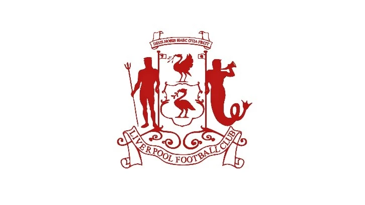
The initial emblems associated with Liverpool Football Club in its early years were not formalized logos in the modern sense but rather civic symbols and representations of the city. Given the club’s direct origin from the city of Liverpool, it naturally adopted elements from the city’s coat of arms.
- During this period, the most prominent symbol associated with the club was the Liver Bird, the mythical creature that is the emblem of the city of Liverpool. This was often depicted in a detailed, heraldic style, reflecting its civic origins. The focus was less on a distinct, branded logo and more on establishing the club’s identity within the city.
- Early depictions of the Liver Bird varied slightly but generally adhered to its traditional representation: a cormorant-like bird holding a piece of seaweed in its beak, often crowned. These early representations emphasized the club’s deep connection to the city’s heritage and its maritime history.
1950-1955
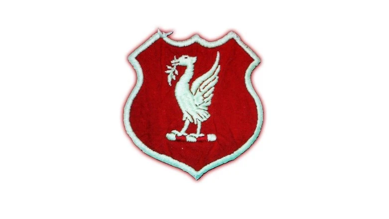
The 1950s marked a subtle shift towards a more formalized club emblem, although still closely tied to the civic symbol. For a brief period, a more distinct, though still relatively simple, representation began to appear more consistently.
- During this short timeframe, the Liver Bird started to become more consistently featured as a specific Liverpool logo. The design of the Liver Bird became slightly more stylized and less heraldic than earlier depictions. It was presented on its own, without the full city coat of arms surrounding it.
- The presentation of this Liver Bird emblem was still relatively straightforward, often appearing in a single color (typically red or white) depending on the background. This period represents a transitional phase where the club began to solidify its visual identity around the Liver Bird, moving towards a more recognizable and consistently applied emblem.
1955-1968
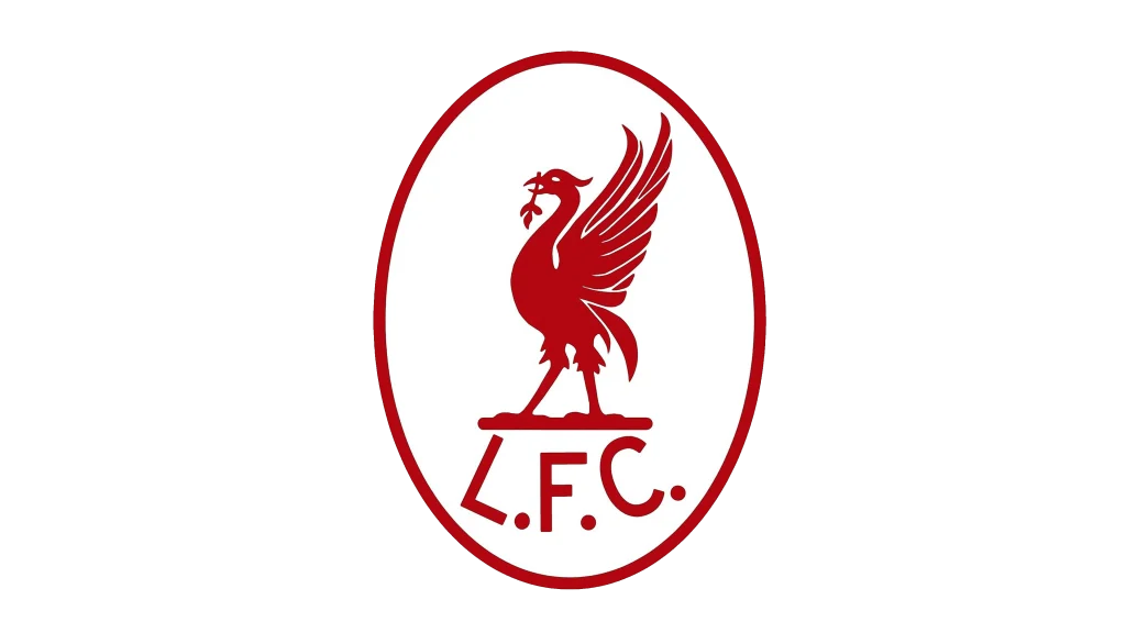
The mid-1950s to the late 1960s saw the emergence of a more clearly defined and consistently used club crest. This era marked a significant step towards the modern understanding of a football club logo.
- The Liver Bird remained the central element, but it was now frequently enclosed within a shield or a circular design. This provided a more structured and unified visual mark. The design of the Liver Bird became slightly more abstract and streamlined. The use of color became more consistent, with red and white being the dominant colors of the crest, reflecting the club’s home kit.
- Accompanying the Liver Bird within the shield or circle, the letters “L.F.C.” (Liverpool Football Club) began to appear more regularly. The style of the shield varied somewhat over this period, but the core elements of the Liver Bird and the club initials remained consistent. This era saw the crest become more prominently featured on playing jerseys and official club merchandise, signifying a growing emphasis on brand identity.
1968-1987
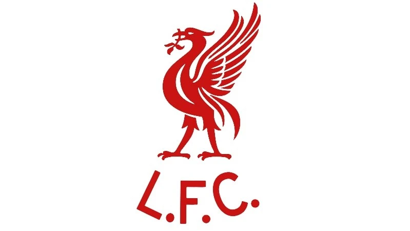
This period witnessed the introduction of a more elaborate and recognizable crest that would become strongly associated with the club’s successes under managers like Bill Shankly and Bob Paisley.
- The Liverpool logo introduced in 1968 featured a more detailed Liver Bird. It was typically rendered in white or gold against a red background within a more ornate shield shape.
- Below the Liver Bird and scroll, the letters “L.F.C.” were prominently displayed. This crest became a powerful symbol of the club’s resurgence and dominance during this golden era. This design was consistently featured on the club’s kits and became instantly recognizable as the emblem of Liverpool Football Club during a period of unprecedented success.
1987-1992
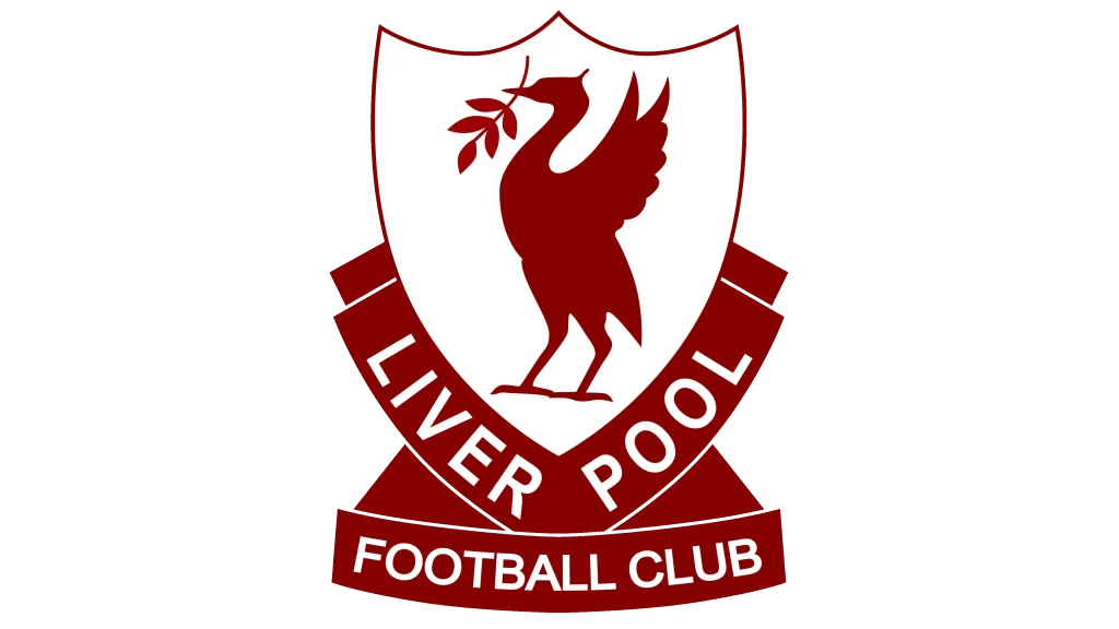
A slightly simplified version of the previous crest was adopted during this period. While retaining the core elements, some of the ornate detailing was removed, resulting in a cleaner and more modern appearance.
- The Liver Bird, the name scroll, and the “Liverpool Football Club” lettering remained central to the design. However, the shield shape became less elaborate, often taking on a more streamlined and geometric form. Some of the finer details in the Liver Bird’s depiction were also simplified. This move towards a more minimalist aesthetic reflected broader trends in graphic design and aimed to improve the logo’s reproducibility across various media.
- The color scheme generally remained consistent with the previous era, with white elements against a red background. This subtle redesign aimed to maintain the established and successful visual identity while giving it a slightly more contemporary feel. This version of the crest continued to be proudly displayed on the club’s kits as they continued to compete at the highest levels of English football.
1992-1993
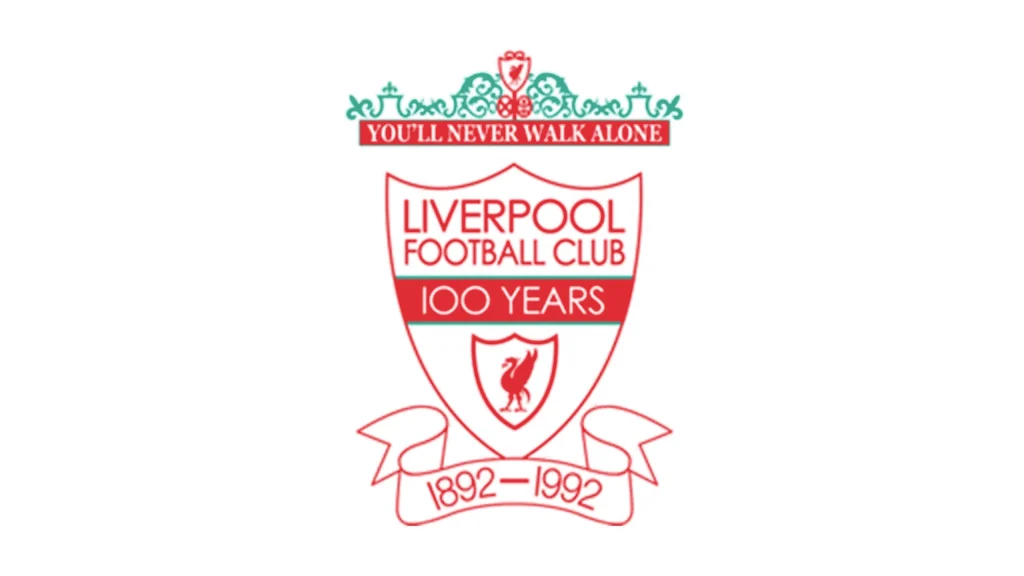
For a single season, coinciding with the club’s centenary in 1992, a special commemorative crest was introduced. This design incorporated elements from previous logos and celebrated the club’s 100-year history.
- The centenary crest featured a circular design with the Liver Bird prominently displayed in the center. Surrounding the Liver Bird were elements referencing the club’s founding year (1892) and the centenary year (1992). The “You’ll Never Walk Alone” scroll was also often incorporated. This design served as a visual tribute to the club’s rich heritage and its century of existence.
- The color scheme typically involved red, white, teal, and gold, reflecting the club’s traditional colors and often incorporating a sense of celebratory grandeur. This special crest was a one-off design, created specifically to mark the significant milestone of the club’s 100th anniversary and was worn with pride by the players during the 1992-1993 season.
1993-1999
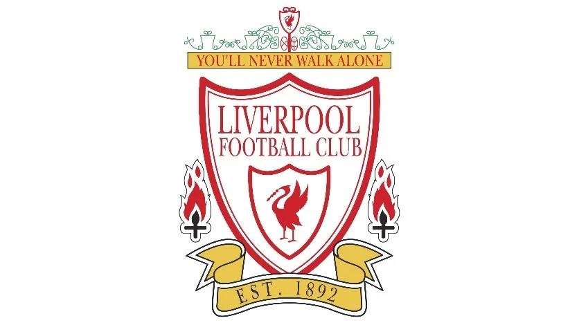
Following the centenary, the club reverted to a more traditional crest, but with a renewed emphasis on a bold and impactful design.
- The crest adopted in 1993 featured a prominent Liver Bird, often larger and more centrally positioned within a shield-like shape. The “You’ll Never Walk Alone” scroll remained a key element, usually placed beneath the Liver Bird. The “L.F.C.” lettering was typically positioned above the Liver Bird.
- The use of color remained consistent with the club’s traditional red and white (or gold) palette. This iteration of the crest aimed to build upon the established iconography while presenting it in a clear and impactful manner for the modern era. It served as the club’s primary visual identifier throughout the latter half of the 1990s.
1999-Present
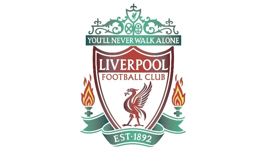
The crest introduced in 1999 marked a further simplification and modernization of the Liverpool logo, focusing on the core elements of the Liver Bird, the “You’ll Never Walk Alone” scroll, and a more streamlined shield design. This made it one of the most popular sports logos in the world at that time, and even today.
- The current primary Liverpool logo features a more stylized and contemporary depiction of the Liver Bird, prominently positioned above the “You’ll Never Walk Alone” scroll. The shield shape is cleaner and less ornate than previous versions. The “L.F.C.” lettering is often placed above the Liver Bird in a bold, sans-serif typeface. The overall design emphasizes clarity, impact, and immediate recognition.
- The color scheme is predominantly red and white, with occasional gold accents. This modern iteration of the crest retains the key symbolic elements that have defined the Liverpool logo for decades while presenting them in a visually appealing and contemporary style suitable for the digital age and global brand recognition. This is the logo that is currently proudly displayed on the club’s kits, merchandise, and across all official club platforms.
Alternative and Commemorative Liverpool Logo Seen Over the Years
In addition to the primary logo, Liverpool Football Club has utilized alternative and special commemorative logos throughout its history, often for specific occasions or on particular merchandise.
1940s-1980 (Alternate Liverpool Logo)
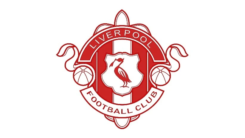
During the mid to late 20th century, particularly on certain merchandise and less formally on some materials, a simpler, more graphic representation of the Liver Bird was often used as an alternative emblem.
- This alternate logo typically featured a very stylized, often almost cartoonish, depiction of the Liver Bird. It was usually a single-color silhouette, most commonly red or white. This version lacked the detail of the heraldic Liver Bird and the surrounding shield or scroll elements of the primary crest. Its simplicity made it easily reproducible and recognizable, particularly on smaller items or in less formal contexts.
- This graphic Liver Bird served as a more informal and sometimes more playful representation of the club. It was often seen on fan merchandise like scarves, badges, and casual wear. While not the official crest worn by the players on the pitch, it was a widely recognized and beloved symbol associated with Liverpool Football Club for several decades, offering a less formal and more accessible visual representation of the team.
2012-Present
Since 2012, coinciding with the adoption of a new kit manufacturer, Liverpool has often utilized a stripped-back version of its primary crest on the playing jerseys. This version focuses solely on the Liver Bird emblem without the surrounding shield or the “L.F.C.” lettering.
- This minimalist approach features a single-color (usually white or red depending on the kit color) rendition of the Liver Bird, directly embroidered or applied to the jersey. The “You’ll Never Walk Alone” scroll is also sometimes included beneath the Liver Bird in this simplified format. This design choice reflects a trend towards cleaner and more iconic branding in sports apparel, allowing the instantly recognizable Liver Bird to take center stage.
- While the full primary crest continues to be used on official club documentation, merchandise, and around Anfield, the use of the standalone Liver Bird on the playing kit provides a modern and impactful visual statement. It underscores the power of the Liver Bird as the core and most recognizable symbol of Liverpool Football Club, instantly identifiable to fans around the world.
2017-2018 (125 Years Anniversary Commemorative Logo)
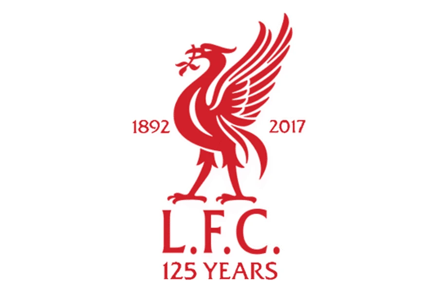
For the 2017-2018 season, marking the 125th anniversary of Liverpool Football Club’s formation, a special commemorative logo was created and featured on the playing jerseys.
- This anniversary logo was a unique design that incorporated the standard Liver Bird emblem within a circular frame. The frame featured the years “1892” and “2017” to denote the anniversary, along with the words “125 Years” prominently displayed. The overall design aimed to celebrate the club’s long and distinguished history.
- The color scheme of the commemorative logo typically utilized the club’s traditional red and white, often with gold accents to signify the special occasion. This logo was a limited-edition design, worn by the team throughout the 2017-2018 season as a mark of respect for the club’s rich heritage and its significant milestone. It served as a visual reminder of Liverpool’s enduring legacy and its deep roots within the city and the world of football.
FAQs
| What is the bird on the Liverpool logo? Known as the Liver bird, it is the symbol of the city of Liverpool in England. |
| Has Liverpool recently changed its logo? The start of the 2024-2025 season saw the team introduce a simplified version of their badge, not the primary logo, for better visibility on merchandise. |
| What is the mascot from Liverpool called? The mascot for Liverpool FC is called the Mighty Red. |
Conclusion
The evolution of the Liverpool logo is a fascinating journey that mirrors the club’s rich history and enduring legacy. From its early reliance on the civic symbol of the Liver Bird to the modern, streamlined crest, each iteration reflects both artistic trends and significant moments in the club’s story. The consistent presence of the Liver Bird, often accompanied by the powerful motto “You’ll Never Walk Alone,” firmly anchors the logo to the city and the unwavering spirit of the club and its supporters. The various alternative and commemorative logos further highlight the deep connection between the visual identity and the club’s heritage. The Liverpool Football Club logo, in all its forms, stands as a potent and instantly recognizable symbol, embodying the triumphs, traditions, and unwavering passion that define one of the world’s most iconic football clubs.

Logopoppin
Logopoppin is a graphic design agency that specializes in logo designing, web development, video production and advanced branding services. We love to innovate businesses with new age technologies, allowing them to improve their visual reputation.


