
Discover How Each Logo Color Meaning Affects Consumer-Brand Interactions
Logo color meanings shape the way your audience perceives your brand before they read a single word. Research shows that up to 90% of snap judgments about a product can be based on color psychology alone — which means the shades you choose for your brand symbol carry enormous weight.
But here’s the challenge: finding the right logo colors isn’t as simple as picking your favorite shade. Different color associations trigger different emotional responses, and those responses directly influence whether consumers trust your business, feel drawn to your products, or scroll right past.
To help you navigate these decisions, we’ve put together a comprehensive guide covering nine major color groups, what each one communicates, and how to choose a palette that strengthens your brand design. Whether you’re building a brand from scratch or rethinking your current identity, understanding color meanings is the first step to creating a logo that genuinely connects with your audience.
So let’s take a look at how a professional logo design company uses color theory to find the right shades to enhance your brand’s look.
What Is Logo Color Psychology, and Why Does It Matter?
Logo color psychology is the study of how different hues influence human emotions, behavior, and perception — specifically in the context of brand identity. It goes beyond simply knowing that blue feels calm or red feels energetic. It’s about understanding why those reactions happen, and how to use them strategically in your logo.
Color Symbolism in Logo Design
Color symbolism is the foundation that logo color psychology is built on. Every shade carries associations that have developed over centuries of cultural and biological experience. When you see gold, you think of wealth. When you see green, you think of nature. These aren’t accidental — they’re deeply embedded in how humans process the visual world.
For logo designers, this means that every color choice is a message. A tech startup using electric blue signals innovation and trust. A wellness brand using soft green signals balance and health. The symbolism isn’t always conscious for the viewer, but it’s always working.
How Color Associations Shape Brand Perception
Color associations operate on three levels. First, there are physiological responses — warm colors like red genuinely raise heart rate and sharpen appetite, while cool colors like blue slow things down. Second, there are cultural associations — white represents purity in Western cultures but mourning in parts of Asia. And third, there are learned associations — you’ve seen so many banks use blue that blue now feels trustworthy to you, almost automatically.
Understanding all three layers helps you choose colors that don’t just look good, but actually work for your brand’s goals.
Building Your Color Palette – Finding Shades with the Right Color Meanings for Logos
There are a few major color groups, each containing a number of different shades. For example, both Coca-Cola and McDonald’s use red in their logo color palette, yet the specific shade of red they use is quite different.
Similarly, you have the choice to use the shade that best suits your brand’s aesthetic in order to portray what your business is all about. A designer, depending on the color model they use, can choose from primary, secondary, and even tertiary colors. Let’s take a look at some of the more popular color groups, and find out the logo color meanings they embody.
Red Color’s Meaning in Logo Design

Red is often considered the color of passion, love, and energy. It’s a color group equally loved by men and women, although it may be for different aspects of this color group. The shades of red are often intense, deep, and powerful in their effect — which is why you see the color used so commonly among the different types of logos of brands across a variety of business niches.
Reds also have a physiological effect on viewers. They raise pulse rates, boost blood pressure, and sharpen appetite. And it’s a color guaranteed to grab attention. Ever wondered why so many popular fast food places use red within their branding palette? Or why fire truck red is such a visually striking shade that instantly catches your eye?
That’s because red demands action. From call-to-actions like “Click Here” or “Buy Now” to restaurant menus and color themes, red adds a sense of dynamic energy and passion into a brand. If you want to see how major brands have made this work, check out our roundup of famous red logos.
Best for: Food and beverage brands, entertainment companies, fitness brands, sales-driven businesses, and any brand that wants to project boldness and urgency.
Yellow and Its Importance in Logo Color Psychology
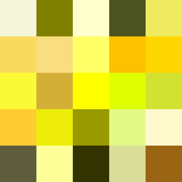
Yellow is one of the brightest and most vibrant colors available to brands. It’s most often associated with warmth, light, and sunshine. Yellow is the color of happiness and joy — shades like canary yellow instantly evoke feelings of optimism. And that feeling doesn’t just stimulate our emotions — it sparks our cognitive faculties too.
It’s another great color for grabbing consumer attention. However, designers need to use caution when implementing it. While the logo color meanings of different shades of yellow are mostly about energy and warmth, too much of it tends to make viewers impatient and agitated.
So the best way to balance yellow within your logo colors is by mixing it with another shade that counteracts its negative aspects without taking away from the impact of your design.
Best for: Children’s brands, creative agencies, food companies, and brands that want to project optimism and accessibility.
Shades of Blue and Their Logo Color Meanings

Blue is the color of tranquility and calm. It’s the sea, the river, and the sky. Different shades of blue are used to reflect calm and are a great addition to your design if you want to portray a soothing vibe.
Blue is also strongly associated with confidence and intelligence. That’s why you’ll often see technology companies and those in the IT sector using various shades of blue in their logos — and why research shows blue is the most trusted color among consumers, preferred by about 54% of people when it comes to brand trust.
However, be careful about how you use different shades. Brighter blues can be dynamic and energetic, but too much — especially the darker shades — can drag out feelings of melancholy. For more on how top brands have leveraged blue, explore our collection of famous blue logos.
Best for: Technology, finance, healthcare, corporate services, SaaS companies, and any brand that wants to build trust and dependability.
Green and The Use of Its Shades in Logo Design

Green is the color of life, spring, rebirth, and new beginnings. Shades like alpine green are also associated with fertility, safety, plentiful resources, and the open environment. On the flip side, it can also represent sentiments like greed, envy, and a lack of experience.
However, the way you use different shades of green within your design will influence its vibe. By leveraging its positive feelings, green can be soothing and healing for those who view it — and not just mentally. Green has also been proven to have physical health benefits for people.
Moreover, as humans are used to the overabundance of green in our surroundings, it makes for a great backdrop for your design.
Best for: Sustainability brands, health and wellness companies, organic food businesses, outdoor and adventure brands, and financial services.
Purple and Violet, and the Perception Behind Their Use
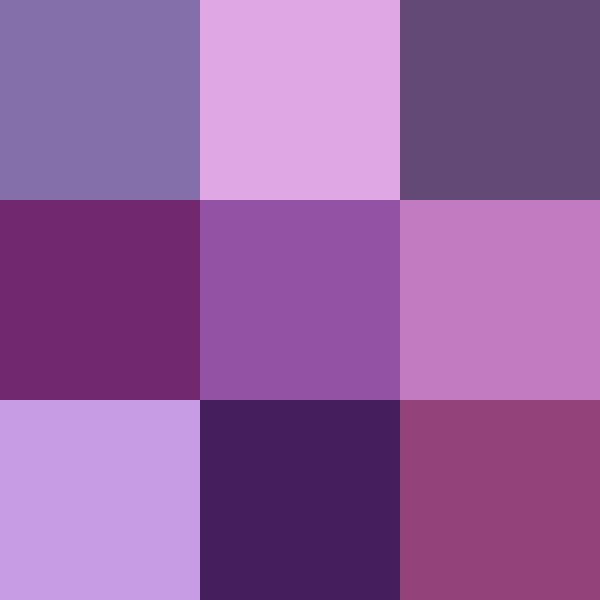
Purples are created by mixing the elements of two colors we discussed earlier — blue and red. This union allows purple to embody both the fierce energy of reds and the calm serenity of blues. However, if you look at shades like eggplant purple, you’ll see it has a vastly different visual impact from its parent colors.
Purple is also often used to portray opulence, richness, regality, and an elevated self. It represents power, nobility, and luxury. Logo designs that use purple portray themselves as elegance personified. Take a look at how brands have made this work in our showcase of purple logos.
The various shades can have different effects — from lighter shades that represent spirituality, to deeper shades that represent sophistication and a regal demeanor.
Best for: Luxury brands, beauty and cosmetics, creative agencies, spiritual or wellness products, and premium service providers.
White Color’s Meaning in Logo Design

White is the color most often associated with purity, innocence, and cleanliness. From shades like light cream to egg shell, there are a number of tones that make up the color family of white. White is often used for a cleaner contrast to dark and passionate colors — yet that doesn’t mean it isn’t powerful.
White is the color that cuts through gloom, giving your logo a refreshing breath of light and life. It’s cool, calm, and simple — which is exactly what makes different shades of white so effective at providing balance in design and reaching mental clarity.
And with simplicity and minimalism in vogue right now, you could do well by incorporating different shades of white into your design.
Best for: Tech companies, healthcare, fashion, minimalist brands, and brands seeking a clean, modern aesthetic.
Orange Color’s Meaning in Logo Design
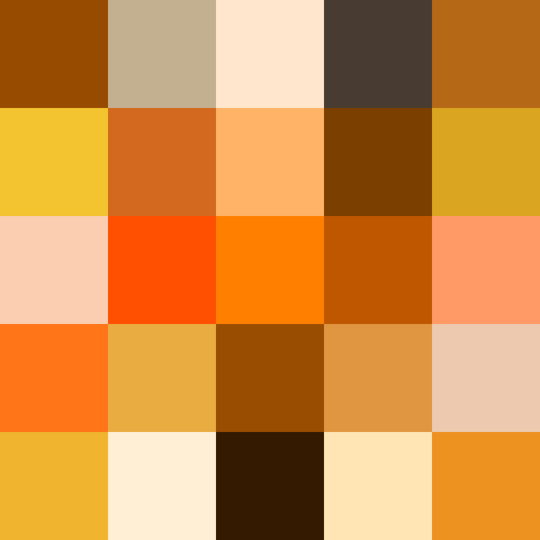
Just like purple is a mix of red and blue, orange is born from the union between yellow and red. An iconic family of shades, made famous by the citrus fruit named for it, orange automatically brings to mind a fruity mix of tangy and sweet.
Unlike purple, which leans cool, orange is warmer. It’s considered a color of change, joy, and creativity, and is most often associated with the season of autumn. This makes it perfect for brands looking to embody a sense of life, energy, and the circle of renewal.
It’s also been proven that besides its associations with compassion and warmth, orange gives your appetite a boost. You’ll see this reflected in many restaurant logos and their decor.
Best for: Food and beverage, youth-oriented brands, creative services, sports and adventure, and brands that want to feel energetic but approachable.
Shades of Brown and Their Logo Color Meanings
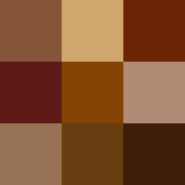
Browns are colors used to portray something stable, hardworking, and reliable. The warm earth tones provide the perfect grounding to brighter, more expressive colors, helping balance out any design.
The comfortable earthy tones are all about being authentic — shades like dusty rose, which has distinctive brown overtones, showcase this perfectly. There’s no sense of showing off when you use brown. Rather, it’s about accepting who you are and taking it from there.
And when you combine these shades of brown with a nature-first design motif, they provide a depth of expression unmatched by other colors.
Best for: Coffee and chocolate brands, construction, outdoor and adventure companies, artisan and handmade products, law firms, and brands emphasizing heritage and reliability.
Black and Its Color Meanings
Finally, we get to black. This group of colors is often an enigma for design philosophers. Is black an absence of light, or is it a lack of color? Whatever the answer, the fact is that black today is the color most commonly associated with sophistication and austerity.
However, this is one color that changes its logo color meanings based on culture. In some cultures, it’s considered an ill omen and often associated with death. While in others it may go even further and be considered outright evil.
But in most of the Western world today, black is the color for corporate brands. It shows that you are serious about your business, and that’s what attracts your target consumers. So if you want to give your logo a sense of strength, professionalism, and elegance, adding black to your palette is a strong choice.
Best for: Luxury fashion, corporate services, technology, automotive, and any brand that wants to project authority, sophistication, and premium quality.
Gold Color Meaning in Logo Design

Gold is a color that demands respect. Associated with wealth, success, prestige, and achievement, it’s the shade brands reach for when they want to communicate premium value. Think of luxury hotels, high-end jewelry brands, and award ceremonies — gold is woven into every one of them.
In logo design, the shades of gold range from warm, muted champagne tones to bright, metallic finishes. The muted end suggests understated elegance, while the brighter end projects confidence and ambition. Gold pairs beautifully with black for a classic luxury feel, or with deep navy blue for a more contemporary premium look.
One thing to keep in mind: gold can be tricky in digital contexts. Metallic sheens don’t always translate well on screens, so work with your designer to find a flat gold shade that carries the same prestige without relying on texture effects.
Best for: Luxury and premium brands, financial services, jewelry, real estate, high-end hospitality, and brands that want to project prestige and achievement.
What Does a Black and White Logo Mean?
A black and white logo communicates timelessness, sophistication, and versatility. Stripping away color forces the design to stand on its shape, typography, and composition alone — and that’s a test not every logo can pass.
Brands that use black and white logos — like Apple, Nike, and Chanel — project confidence in their identity. The absence of color says, “Our brand is strong enough that it doesn’t need color to be recognized.”
From a practical standpoint, black and white logos are also incredibly functional. They reproduce cleanly on any material, from business cards to billboards, without color matching issues. If you’re aiming for a minimalist logo design, mastering the black and white version is essential.
How are Logo Color Meanings Established, and Are They Universal?
Now that you know what different colors offer in terms of value to your logo, you might be wondering how these logo color meanings came to be. For the most part, these associations are a mix of cultural, physiological, and learned behaviors, which is why two people from different areas and background might react differently to a specific color.
Let’s look at some of the common ways that people associate different shades with their respective color meanings.
Cultural Color Associations
Learned associations are those we see practiced around us every day. Dressing in black for a funeral, for instance, is something we all observe over our lives. We see it at different moments, and soon our minds start to connect the two as correlated. For global brands, understanding these cultural differences is critical — a color that signals celebration in one market may send an entirely different message in another.
Instinctual and Physiological Color Responses
Some color associations are built into our biology. Shades of red are some of the most prevalent attention-grabbers in nature — from the plumage of exotic birds to warning signs in the animal kingdom. These instinctual responses pre-date branding by millions of years, but modern designers leverage them every day.
Visual Aesthetics and Contrast
Color aesthetics are about what colors we feel work well together in a given scenario. You’ll often find yourself in a situation where a specific shade of blue feels lackluster, while in another context that same color works perfectly. Our minds are designed to pick up good contrasts, and if colors blend or clash too violently, it causes a visual dissonance that weakens your design’s impact.
How to Choose the Best Color for Your Logo
Choosing the right color for your business logo can feel overwhelming, but it becomes much easier when you approach it systematically. Here’s a framework that works.
Start with Your Brand’s Core Message
Before opening any color picker, get clear on what you want your brand to communicate. Are you going for trust and reliability? Blue is your starting point. Energy and excitement? Look at reds and oranges. Luxury and exclusivity? Purple, black, or gold should be on your shortlist.
What Colors Work Best for Business Logos?
There’s no single “best” color for every business, but data tells us some patterns. Blue and black dominate the Fortune 500 because they project stability and professionalism. Red is preferred by brands in food, entertainment, and retail because it drives action. Green has become the default for sustainability-focused businesses.
The key isn’t choosing the most popular color — it’s choosing the one that aligns with your audience’s expectations while still differentiating you from competitors. Take a look at what colors your direct competitors use, and then find a shade or combination that makes you stand out.
Limit Your Palette to 2–3 Colors
Avoid using too many colors in your design. Generally, logo designers tend to use a maximum of three shades. Too many colors can end up muddling the intended impact of the relevant color meanings, making your logo less effective. Data from top brands confirms this — about 95% of leading brands use just one or two colors in their logos.
Do You Need a Monochrome Logo Variant?
One important point: a logo needs to be displayed on a variety of mediums, from small merchandise and stationery to large billboards. Not all mediums support full-color printing.
That’s why you need to ensure your design works well in a monochrome setting without losing its impact. This allows your logo to be truly versatile, making it a valuable branding asset. When we talk about monochrome, we usually mean black on white or vice versa — giving you a version that works equally well across all mediums. Learn more about versatile logo design in our guide to logo variations.
What Emotions and Perceptions Do Your Logo Color Meanings Portray?
Now that we’ve explored the various color groups and how each family impacts its viewers, here’s a quick reference to help you match your brand’s message with the right color:
- Energy and excitement: Red gets hearts racing.
- Confidence and warmth: Orange is your go-to.
- Creativity and imagination: Purple brings the regal touch.
- Trust and dependability: Blue is the proven choice.
- Growth and sustainability: Green up your brand palette.
- Prestige and luxury: Gold and black deliver the premium feel.
- Classic simplicity: Nothing beats the black and white combo.
Depending on your brand messaging, you can choose from one or more of these shades to showcase your vibe. With each of these color families offering a number of shades to choose from, you’ll be able to find ones that complement each other easily.
Frequently Asked Questions
| 1- What Is the Best Color for a Logo? Blue and red are statistically the two most popular colors in logo design. However, the best color depends entirely on your brand, your industry, and the audience you’re trying to reach. A financial services firm will have very different needs than a children’s toy brand. The only way to find the right answer is to study your brand’s values, your competitive landscape, and the emotional response you want to trigger. |
| 2- What Colors Stand Out Most in a Logo? According to color psychology, several colors have a particularly powerful impact: red for powerful emotions, blue for calm and logic, green for health and life, yellow for warmth and joy, orange for energy, purple for elegance and royalty, brown for safety and security, black for austerity, and white for purity and clarity. The key is not just choosing a bold color, but choosing one that contrasts well with its context. |
| 3- How Many Colors Should a Logo Have? Most professional logo designers recommend limiting your palette to two or three colors. Research shows that 95% of top brands use just one or two. Fewer colors create stronger recognition, cleaner reproduction across mediums, and more focused messaging. If you need more variety, save it for your broader brand palette rather than cramming it all into the logo itself. |
| 4- What Do Colors Mean in Branding? Colors are a design element that help your branding strategy boost its impact by appealing to the innate sensibilities of your target market. Through learned and instinctual associations, the right colors can make even a simple logo look attractive and effective. They’re not decoration — they’re a strategic tool that shapes how people feel about your business. |
Conclusion
Leveraging the right logo color meanings can make your logo design genuinely impactful. But if you choose shades with color meanings that don’t complement your brand aesthetics, then no matter how great your logo looks, it will fail to have the intended impact.
The good news? You don’t have to figure this out alone. If you want to hire a professional logo design services provider to help you create a logo that suits your brand, Logo Poppin is here to help. Our designers have helped many businesses establish an effective brand identity, expanding their reach and boosting revenue.
Latest news you want to know!
Subscribe for cutting-edge design inspiration at Logo Poppin! Elevate your brand with updates on logos, branding, web design, and video animation.
Note that by clicking “subscribe,” users may agree to our privacy policy and consent to Logo Poppin to use your contact data for newsletter purposes.
Logopoppin
Logopoppin is a graphic design agency that specializes in logo designing, web development, video production and advanced branding services. We love to innovate businesses with new age technologies, allowing them to improve their visual reputation.

