
Table of Content
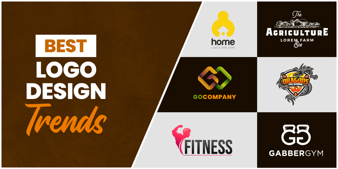
Discover the Latest Logo Design Trends Leading the Design World
Businesses are always in need to represent their identity using a creative logo. It is the most important thing for them when it comes to the branding of the company. They just cannot compromise anything on their design, whether its color, font or any other attribute. To keep them updated, they regularly look at modern design trends popular in the market. It helps them to analyze their logo and perform modifications in it as per the requirements of the brand.
It is therefore advised to the designers to always keep themselves updated with the latest logo design trends. They need to cater to the demands of different clients, which definitely requires thorough knowledge about the ongoing trends in the industry. It lets them know what type of design is being currently used in the industry, and how they can use it in their own logo.
If you are also looking to know about the design trends that are being targeted by people in the logo design industry, read this article in detail. It has summed up different types of practices you can consider for your logos, depending on the requirements of your brand.
Let’s first understand why these logo trends matter and how you could keep up with them regularly.
Why Do You Need to Regularly Monitor the Modern Design Trends?
Being a logo design agency, you always have to keep on learning new things to facilitate customers with the best products. It is necessary to make your profile prominent and give your design work a great boost to outclass others. This learning process gets much stronger when you continuously monitor the ongoing trends. It defines the type of designs that are continuously being used in the industry. This gives you a good opportunity to analyze and use them in your logos effectively.
Monitoring the trends also helps to find the shortcomings in your current logo design. It provides plenty of information about how you could optimize your logo according to the standards, so that it can grab more eyeballs. You can certainly know about these best trends by searching them over the internet. It is the perfect place where you can easily find the ongoing trends and their popularity among the people.
Latest Logo Design Trends Popular Today
It is wisely advised to learn about the important logo design trends at the start of the year. It lets you know which type of designs will get more value and how you can use them in the logos.
Here are some logo design trends that will get more precedence in the market this year. Try to optimize or recreate your logo according to them, so that it can get vast audience attention.
Negative Spaces
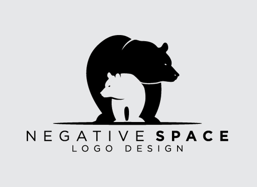
Logo designing is an art in which you have to showcase your creativity using different types of practices. Negative spacing is certainly one of them that allows you to design the logos with a stunning level of creativity. It brings a flare of uniqueness in the logos, if designed accurately with the right strategy.
Normally, the logos that are made using negative spaces, contain only one color. This is done to bring the balance between the white spaces and the colored areas. It helps the viewers to understand the concept of the negative space logo.
Meanwhile, it is also recommended to not use more than one area for negative spacing. It is a very exclusive technique that should be done at a particular area, giving a glimpse of uniqueness. You can find many examples of this logo design available in the market, such as WWF, USA Network and more others. All of them are designed with an elusive negative space touch, rightly to enhance the creativity of the design.
Unique Typefaces
Typefaces are an important element of logo designing. They always play a vital part in designing logos as well as other branding materials. People generally look at these typefaces before analyzing the overall design. That is why it is recommended to pick them wisely, so that your logos can look engaging.
Nowadays, designers do not prefer to use conventional logos. They tend to go for unique typefaces, such as masculine fonts, recursive typography and more, which technically does not make it one of the modern logo design trends. Nevertheless, these fonts provide a touch of boldness to the logos, making them highly attractive.
Besides that, the colors chosen for the logo fonts also play a crucial role. It makes the logo typography prominent, if selected perfectly using the right gradient.
It should be noted here that flashy colors are not recommended for logo fonts. Instead, you have to pick those colors that can define your brand theme and look catchy while being decent to the eye. The best way to do that is by looking at the trending logo colors on the internet. It will help you to pick the right colors that suit best with logos for almost every category.
Vintage Design
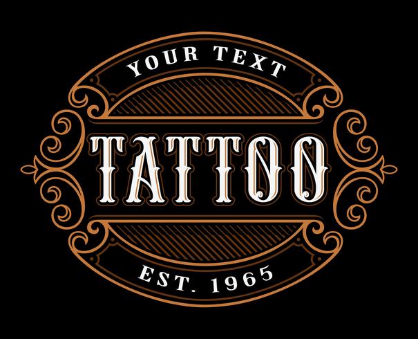
We all know that vintage fonts and artwork design will never go out of fashion. They are preferred by many designers due to a variety of reasons. Some people think that they are more catchy, while some use them to precisely bring a feel of classic 80s.
Either way, you can pick any of these reasons and use vintage design in your brand logos. This will require a bit of knowledge about their relevance with your modern day brand. A lot of time people only select the vintage artwork based on their own choices. Eventually, when they fail to portray or connect with the brand image, then all of the efforts and time goes into vain.
It is therefore best recommended to wisely choose the vintage design that can truly connect and transform your logo. Look at the examples of other competitors to see how they have used this trend and made their logos flawlessly great.
Animated Design
Adding animation in a logo design is generally not a well-perceived concept. But, as the tides of trends are changing, you can expect a rise in this practice this year. Designers have now started to add a bit of creativity in the logo design, in which animated design is quickly becoming a top choice.
Generally, people only think that animation can be applied to bigger forms of artwork. This is certainly not a definite thing because you can always use it in any design depending on the requirements. If you have got the right technique that can showcase the creativity perfectly, you can always use the animation.
For logos, animated logo design trends are certainly a good idea, when done well. It can help to make them look dynamic, allowing the design to instantly grab people’s attention. It will be perfect for digital branding, giving any company identity an interactive look. Yes, you might have to create a static version for the print materials, but that is pretty fine when your digital channels are glaring up with a creative logo animation.
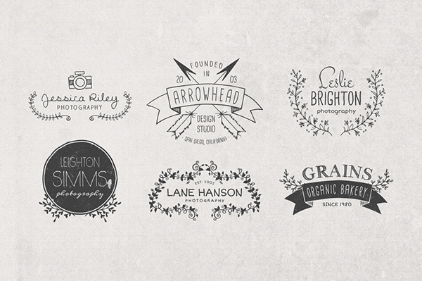
Sketched Design
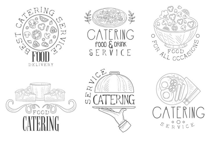
Sketched design has long remained a top practice to create company logos. It looks minimal yet very decent to portray any company’s professional identity. Many businesses have chosen this style of logo to make their business representation sophisticated. It is an evergreen practice that gives any company’s identity an attractive look.
Sketched logos are generally designed using a single color tone. They are mostly created on a white background, so that the design could have better contrast. Normally, designers prefer to use the combination of black and white to create sketched logo design. It is a very spectacular combination that provides the whole logo design an engaging look.
Meanwhile, depending upon the brand requirements, you can also choose other color combinations such as red/white, blue/white and more others. Just make sure to use the colors that perfectly portrays your brand theme, so that people can understand their true relevance.
Color Gradient
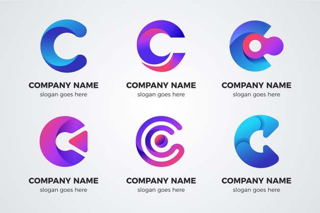
While designing logos, you can always play with various types of colors. It requires detailed knowledge about different color meanings and how they should be put together. Using a combination of colors in a logo allows them to look creative, if designed properly with the right gradients.
The brand logos based on color gradient are certainly becoming a top trend in the industry. Many businesses are picking this idea to design their logos. They prefer to use different color combinations of their brand theme in the logo, so that it can showcase the right relevance.
To design red logos with color gradients, make sure to not use too flashy colors. The reason is that glitzy colors can easily kill the flare of contrast in the logo. It doesn’t provide any sort of attraction which eventually makes the whole logo design absurd.
The best way to use the color gradient in the logo is by learning its art through different sources. There are many sites available on the internet where you can find handy stuff about it. It will help you to learn their basics, so that you can use them perfectly in the design.
Monochromatic Colors
Monochromatic colors are always preferred by designers in creating different types of artwork. They look decent and neat to the eye, providing the whole design a stunning appearance. For logos, they are specifically a great choice, provided you use them appropriately in the overall design.
There are many ways with which you can use monochromatic colors. It all depends on your brand theme and how simple you want to keep the logo design, making it one of the evergreen modern logo design trends. Normally, people prefer to use black color in their logos. It has become a standard choice to represent the idea of monochromatic colors in the design. Yes, you can use different gradients of black color to bring uniqueness in the design, but the overall concept of singularity will remain the same.
Hand Drawn Logos
The trend of hand drawn logos will also rise more in the coming days. It has always remained a very creative practice to design any type of artwork. People pay high regard to the designs that are drawn from hand, as they showcase a much greater level of creativity. They are not too flashy nor very simple, but are flawlessly made with a balanced design to portray the right brand image.
Just like the signature, these hand drawn logos are made with extreme perfection. They exhibit pinpoint details, allowing people to fully understand the concept of the logo. These types of logos bring a more personal touch to the design, showcasing a stunning level of brand relativity.
Meanwhile, it should also be noted that hand drawn logos should always be created by professional designers. They are well versed in creating these types of logos that require dedicated perfection in each area. As a brand owner, you are more comfortable while working with these designers. They can help you create logos according to the custom requirements, so that they can better portray the image of the business.
Layered Design Logos
The trends and practices of logo designing have changed quite a lot in the last couple of years. Today, layered design logos are also becoming a top trend in the market. They are a bit different from the conventional logo design, specifically due to the presence of multiple layers. This makes their designing a little difficult, as you have to plan and align every layer with perfection. However, they are still getting popular in the market as they look more modernistic as compared to others.
Looking at the latest logo design trends, the layered logo style is definitely getting more attention. From transparent effects to new contours, designers are now creating these generic logos using different practices. Basically, it depends on their brand requirements and what type of audience their identity will cater to. These logos are designed after evaluating these factors, so that they can become properly relevant.
The advantage of layered design is that it gives an opportunity to mix or detach different elements in the logo accurately. This makes the different objects included in the logo much clearer, allowing users to understand them precisely.
Overlapped Logos
Another practice that is coming into the trend rapidly is the usage of overlapped logo design. This is indeed very creative, and sometimes a bit complicated as well. It is the core reason why designers need to create them with full attention. They need to firmly design each and every area of the logo with repeated checks, so that no errors could be found in the final design.
The good thing about this design is that overlapping can be done at any area of the design. There are no specific guidelines that you have to follow while creating these logos. You can either use overlapped letters or layers in the logo depending on the requirements. If you are confused about how to do it, take a look at the various examples given on the internet. It will offer different types of ideas to create overlapped design, rightly as per your custom needs.
Sometimes, designers also make muddle designs while creating overlapped logos. This mostly happens when they do not have the right idea about designing. These beginners can use handy tips given on the web to design these logos. Alternatively, they can also look at the logo designs of other companies, as how they have used the overlay design to perfection.
Vivid and Catchy Colors
Colors always bring an added flare of attraction in the logos. But to make that happen, you have to select them wisely and accurately. Nowadays, you cannot just use simple colors in the brand logos. Instead, it requires a higher level of creativity by using different types of vivid and catchy colors.
Using vigorous shades, your design makes sure to grab people’s attention at the first glance. Whether used digitally or on printed materials, the vivid colors always offer a striking view. Though you have to pick them according to the brand theme, but make sure to choose the right shade that can attract eyeballs instantly.
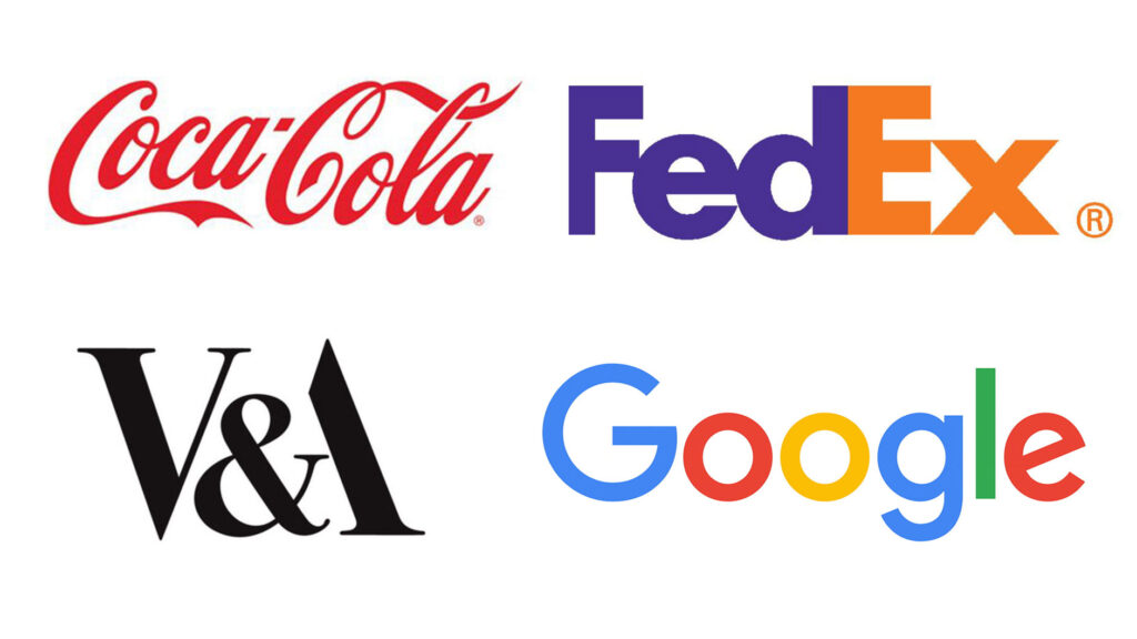
For instance, brand logos like Slack, Google and more could be a good choice to learn in this regard. The color selection in their logos is perfect, which is why they always look different from others. Though they are not flashy, but still have some vigorous ingredients that make them stand apart.
Geometric Shapes
Many businesses like to include some sort of geometric shapes in their logos. You can find many such examples available on the web. From fashion brands to online retail stores, geometrics shapes in logos are preferred by different types of businesses.
Latest logo design trends like these are going to rise up in the coming days. The reason is that companies do like to include a specific shape in the logo that can become their official symbol. Most of the time, they use these symbols as a standalone logo. Some of the famous logo examples including Renault, Hotjar and more very explanatory in this regard. They use their logo symbols at multiple places to demonstrate their identity, showcasing a perfect illustration of their brand.
Classic Black & White
Some logo design trends are meant to live forever in the market. Their essence and popularity is not dependent on time, making them an ever-green practice to follow by the designers. One of those techniques that always remains a top choice of designers is the usage of black and white logo colors. Many businesses still prefer to make their logos using this color combination, rightly due to its great classical value.
You must have seen different fashion brands using the white and black as their base logo colors. Some of the top names among them include Balenciaga, Gucci, Chanel and more others. They have historically remained firm on the selection of these colors as it suits more to their brand identity.
Besides the typeface, many businesses also prefer to design their symbols using black and white color. It offers a very simple and decent look to the logos, provided you have chosen the right design as well.
Flat Design
Another simple way that makes the logos look great is the usage of a flat design. It is a conventional but very strong technique to design brand logos. Many people think that this practice will become obsolete in the coming days as the market is now moving towards other kinds of design. But looking at the preference and past experience, flat designed logos will still remain in the trend this year.
The reason is that these logos offer a very minimalistic view of the brand. They do not bring any type of flashy or vogue styling, but are very strong in looks. Many times, businesses just prefer to use typefaces in their flat logo design. It makes them look more robust, giving the overall design a catchy appearance.
Meanwhile, it should also be noted that flat logo design uses a monotone color scheme. It suits more to their design, especially when the typefaces are used. So, if you are looking to design a simple yet attractive logo that can get people’s attention effectively, use the flat logo design. It is a very fine technique to design creative brand logos with a neat yet bold touch.
Frequently Asked Questions
| 1. Why do you need to monitor logo design trends regularly? Every designer must need to monitor logo design trends. It is crucial for them because these trends provide them an idea how to design quality logos. They can know which type of practices are being used and how you can utilize them in the logos. |
| 2. How do modern design trends help to create engaging logos? When you will monitor the latest design trends, you will come to know different types of modern practices. It will help you to design engaging logos having all the traits of the current trends. |
| 3. What are the 5 elements of a good logo? In order to design a good logo, you have to consider a few important elements. Generally, there are five significant things that help to make a great logo. These factors include simplicity, memorability, timeless design, versatility, and proper structure. |
| 4. What are the best colors for logos nowadays? Nowadays, designers use different types of colors for logos. It basically depends on the theme of the logo and what type of services it is promoting. Meanwhile, some of the best colors for logos that are still preferred by the designers include red, blue, orange and green. They offer a creative way to showcase logos that can grab eyeballs quickly. |
| 5. What are the best modern logo design trends? There are various logo design trends you need to follow today. However, some of the best design practices that should be precisely marked include negative spaces, creative fonts, animated design and more. |
Conclusion
The logo design trends are continuously evolving with the change of practices in graphic designing. People are now taking a more proactive approach to design logos, so that they can portray the identity of the relevant company properly. Today, logos are not just treated as symbols, but are referred to as an illustration of a complete brand theme.
If you are looking for an agency that can design logos perfectly according to the modern trends, get in touch with us today. We will help you to design spectacular brand logos having all the elements needed to showcase stunning creativity.
Latest news you want to know!
Subscribe for cutting-edge design inspiration at Logo Poppin! Elevate your brand with updates on logos, branding, web design, and video animation.
Note that by clicking “subscribe,” users may agree to our privacy policy and consent to Logo Poppin to use your contact data for newsletter purposes.
Logopoppin
Logopoppin is a graphic design agency that specializes in logo designing, web development, video production and advanced branding services. We love to innovate businesses with new age technologies, allowing them to improve their visual reputation.

