
Table of Content
Find Out How These Business Logo Examples Represent Their Brand
Logos are some of the most common brand art we see around us every day, from billboards to flyers, digital ads, and more. And essentially every brand that wants to make it big, aims to create an appealing logo, and looks for inspiration among various business logo examples around them.
And while many brands end up making brand symbols that are the perfect representation of their business, the fact of the matter is that there are many generic looking logos out there too. However, in this sea of mediocrity and generic designs, there are a few logo examples that stand out, due to the sheer artistry and creativity of the logo design company they hired for it.
These brands not only stand out, but have established themselves as here to stay. Let’s take a look at some of these grand brand symbols, and see what it is about them that makes them so great.
Hallmarks of a Good Logo Found in The Best Logo Examples
Before we discuss the various logo examples that inspire, we need to first understand what actually makes these logos so great.
To put it simply, there are many factors common among great types of logos, which ensure that the logo that embodies those features will have a high chance of success. However, some of the most common factors, that are easy to see and understand, are the three mentioned below.
Simple
Simplicity in design is a great tool if you want to want to make sure that the generic logo you are creating will be iconic and popular. However, there is a fine line between simple, and basic. A basic design is just that – basic and boring. It fails to capture the essence of the brand it represents.
However, a simple design aims to reduce the chances of visually confusing the viewers, and uses easy to follow lines and design elements to convey their intended message.
Memorable
Memorability is intrinsically linked with the concept of simplicity. Simple logo examples are easier to comprehend, which in turn makes it easier to remember and recognize it later when seen again. And if we think about it logically, if a logo design is easier to remember, it will automatically fulfill one of its primary branding function – being memorable.
Abstract Yet Related
Logos are rarely direct about the message they want conveyed. However, when you go for an abstract design, it is important that it connects with your brand’s message without going through a lot of hoops. Because while a little mystery and disconnect is good for building hype, too much is going to end up confusing the viewers, making it a harder to connect with them as intended.
Best Logo Examples of Great and Timeless Logos
Now that we know some of the most common factors that make some of the greatest logos so timeless, let’s take a look at some logo examples that personify these elements. From simple logo fonts, to basic color palettes, these logos show that it doesn’t take intricate designs or gaudy color schemes to make a logo memorable.
Lego
The Lego brand has long used a simple wordmark logo, which not only looks good, but perfectly conveys the essence of childhood playfulness and fun. The color scheme is bright, with eye-popping colors like orange and yellow combining to highlight the big white letters that make up the perfect square logo. The color scheme is bright, with eye-popping colors like orange and yellow combining to highlight the big white letters that make up the perfect square logo. All in all, the vibe is perfect for a company that makes arguably one of the most popular type of kids toys.
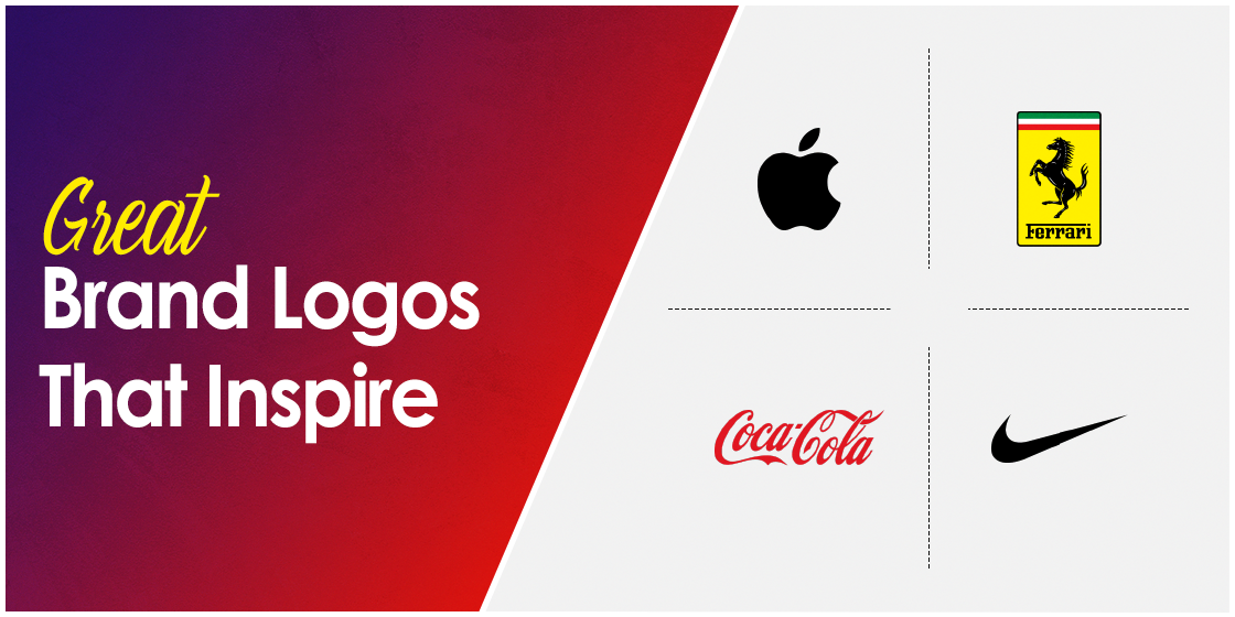
Ferrari
Ferrari has one of the most iconic car logos of all time, with the prancing horse adorning some of the most beautiful cars in history, from the current Ferrari LaFerrari to the classic Ferrari F40 and the iconic Ferrari 288GTO. With a focus on the horses, the company even calls their racing team Scuderia Ferrari, Italian for Ferrari stable, and focuses on producing cars that are the union of peak automotive design and engineering.
2.FedEx
FedEx is another brand that looks simple at a glance, yet there is a small element hidden within its simplicity that elevates its impact. First, it’s the color combinations used by the company that automatically attracts the gaze. The sharp contrast between the purple and the orange provides visual stimulation that intrigues, as well as emphasizes the hidden arrow created by negative space between the E and the X.
McDonald’s
The bright yellow double arches of America’s first true fast food chain restaurant are one of the most iconic restaurant logos of all time. Their inclusion on this list of inspiring logo examples is due to the history behind this iconic design, which not only represents the brand’s initials, but also pays homage to the original design of the company’s visuals.
Coca-Cola
The logo for Coca Cola isn’t just iconic due to its intricate wordmark logo. That is because the design is so iconic, that the current version is still quite similar to the one used decades ago. The brand leveraged the color meanings behind different shades of red to find out which one would help them portray their brand as one for the people who are looking for fun and excitement. And finally landed on a design and color palette that is still going strong today.
Apple
The Apple logo – so simple, yet elegant. Over the years Apple has fostered a reputation for its sleek, elegant tech products, from the new latest MacBook to the new IPhone on the market. As such, their logo too displays a design aesthetic that screams minimalist elite. The simple illustration of an apple with a bite taken out of it, and colored black, fits perfectly with their brand aesthetic, while having a highly memorable symbol represent it to its viewers.
Nike
With one of the simplest logos on this list, nay one of the simplest logos ever to represent a brand, Nike’s swoosh is a lesson in simplicity. The image is arguably more famous than the Nike wordmark that often appears with it. The black colored symbol is a mix of curves, straight lines, and sharp edges. And with a concept as simple as a stylized check mark, it is not only easy to remember, but also fits perfectly with their slogan – Just Do It!
Volkswagen
Volkswagen, more often called the VW in the US, is a German automobile manufacturer with its origins around the Second World War. Their most popular car, and the most sold car ever in the world, was the Volkswagen Beetle, which was chartered by Hitler himself as a model of mass-produced commuter car for the masses. In true German fashion, the logo is a stylized logomark of the company’s name, and is used in various different forms, with the same base design of the original, even today.
Shell
Shell Petroleum is one of the oldest petroleum companies in the world, and supplies fuel and other hydrocarbon compounds to a variety of industries. Their 3D logo design is a stylized, yellow and orange colored image of a bivalve’s shell, as a way to pay homage to their name. And if we consider the major oil drilling activities of petroleum companies in the oceans of the world, the logo takes on an even deeper meaning.
Domino’s
Looking at the logo of the Domino’s Pizza chain, one couldn’t exactly tell what type of brand the logo represents. However, the blue and red logo is designed to look like a domino piece, and can also be taken as a single pizza on the red table, to a pair of pizza pies on the blue table. Whether the company itself tried to embody a deeper meaning besides the domino itself into the logo is a matter of much debate among aficionados of great logo examples.
Types of Logo Designs
Now that we’ve taken a look at some of the best looking logo examples out there, the next step is to learn how to design a logo that embodies the same characteristics as the ones above. But in order to do that, we need to understand the different kinds of logo design types in order to take maximum advantage for our brand.
Lettermarks
Lettermarks are simple logos that incorporate the initials of the company within the design. They are often considered the simpler versions of wordmarks. However, unlike wordmarks, lettermarks are more stylized in terms of design.
Wordmarks
Wordmarks are logos that incorporate the company’s name within their design. This type of logo is often preferred by those who want to promote the brand name as a central part of their strategy, unhindered by any abstract designs.
Abstract
Abstract logo examples are some of the most versatile and effective in terms of memorable branding, if executed well. They can be used to subtly connect with your brand name and message, while providing a compelling visual stimulus to viewers.
Mascot
Mascot logo symbols rely on a mascot, a character that embodies their brand identity, to promote their company or product. Chester Cheetah, Count Choculla, and many other famous mascots are used by brands to provide a medium to connect with their consumers.
Combination
Combination logos are designs that use a combination of these other logotypes to create a logo that makes the best of both worlds. By using design elements from different types of logo styles, the designer can target different visual consumers, thus boosting the logo’s impact.
Pictographs
Pictographs are logos that use a standalone symbol for their brand symbol. Apple, Nike, and other such brands use a picture without a wordmark or lettermark, which is still easily understood by their target market.
Frequently Asked Questions
| 1. What are the five characteristics of a logo? The five characteristics of a good logo include: – Simplicity – Relevance – Memorability – Timelessness – Versatility |
| 2. What are good logos? Good logos by definition are those that are simple, yet are perfectly capable of expressing their brand’s message when representing it. They are usually designed after careful planning, and are not the result of whims. |
| 3. Can a logo be just words? Yes, a logo can be just words. However, they shouldn’t be too long, and they should be easy to pronounce. This type of logo is called a wordmark. |
| 4. What is the most famous logo in the world? The Apple logo is arguably the most famous logo in the world today. |
Conclusion
Finding the right logo examples to find the inspiration can be a little daunting, especially if you are unsure about the direction of your intended logo. However, if you follow the tips and take a look at the logos listed above, you will be able to have a good idea about what you need to incorporate within your design.
If you want a professional logo design services to help you create a brand logo, Logo Poppin’s expert designers are here to help you create a logo that will boost your brand’s impact.
Latest news you want to know!
Subscribe for cutting-edge design inspiration at Logo Poppin! Elevate your brand with updates on logos, branding, web design, and video animation.
Note that by clicking “subscribe,” users may agree to our privacy policy and consent to Logo Poppin to use your contact data for newsletter purposes.
Logopoppin
Logopoppin is a graphic design agency that specializes in logo designing, web development, video production and advanced branding services. We love to innovate businesses with new age technologies, allowing them to improve their visual reputation.

