
Table of Content
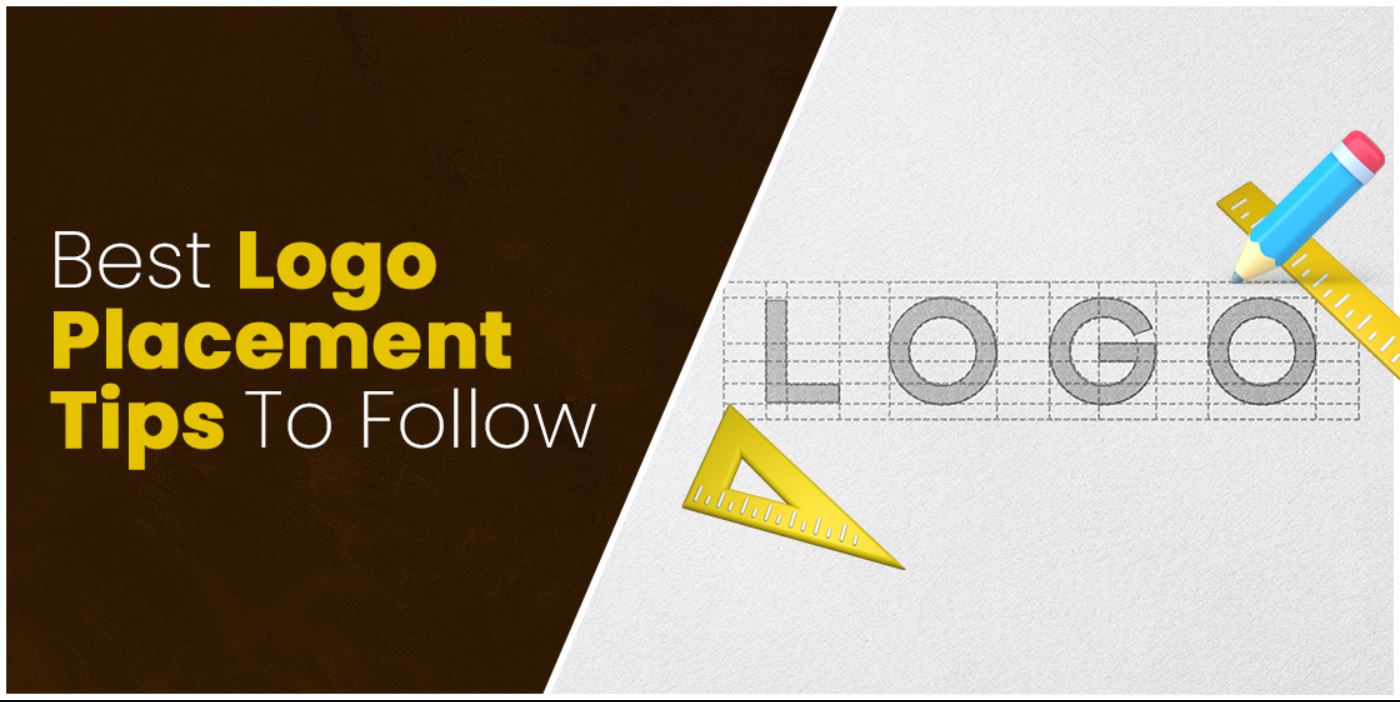
Discover How to Position Your Logos for the Best Results on Various Mediums
We all know how significant brand logos are for any company. They are an integral part of their brand identity, allowing people to know about the brand and its offerings. Therefore, using your brand logo for marketing and branding requires a delicate and careful hand.
Any mistake can derail the impact of your logo, no matter how attractive it looks to consumers. Being a brand owner, you need to be aware of the logo placement guide, as it comprehensively defines the best ways to place your logo for maximum impact.
The logo placement guide is essential for a company’s branding strategy. And it should be consulted every time before your logo is used on any medium, digital or print. That is because there are some rules that need to be followed for the logo to represent the brand well. And following these rules and guidelines is what makes a professional branding services agency a success.
So, if you too are looking to know about this all-important logo placement guide, then read on. Let’s begin then.
Why is it Important to Focus on Logo Placement for Branding?
Every brand marketer needs to know about the correct placement of logos for effective brand positioning and marketing. It is an integral part of branding which cannot be compromised at any cost. Some marketers think that the logo placement guide is only important for print materials. They only pay attention towards it when it comes to using logos on merchandising products, such as t-shirts, caps, bags, drinkware and more.
However, that is where they are wrong. There are many other avenues where the logo placement guide is important. Choosing where to place your logos on digital channels and mediums is also important, as they are a major source of attracting consumer traffic.
From company websites to social media channels, you have to look into everything where your official logos are showcased. These sources act as your marketing platform, hence your identity representation via logos on them should be perfect.
Keep in mind that logo placement doesn’t just mean using logos in specific places. It also gives an idea how to create logos and their variants by following some basic guidelines. Therefore, this topic is also very handy for the people offering logo design services, as they often work hand in hand with brand teams.
Important Factors for Logo Placement on Documents (Print or Digital)
There are different things you need to consider while designing and placing a logo. If you are not aware of them, here are some important tips you must need to consider.
It is quite important to know correct tips about placing logos in documents. Let’s take a look at them below.
Look at the Spacing around the Logo
When creating a logo, it should be the top priority of every designer to keep the entire design clean. It makes the whole logo representation decent, allowing people to understand its theme better. However, to do that, you need to consider some specific practices, such as adding the white spaces.
It is the most important thing to make any design clean and neat. The reason is that nobody wants to see a cluttered logo having a messy design. These types of logos do not bring any value for the brand, instead makes their representation more absurd.
Therefore, it is advised to look at the spacing around your logo always. It should be evenly balanced, allowing all the elements to represent clearly in the design. This standard practice should be followed no matter which type of logo you are creating for the clients.
Size of the Logo
The logo placement guide also refers to the size of the logo. It should be noted that logos are often made in different sizes, hence the popularity of vector logo files in logo design. This is done because of their usage on multiple mediums, such as print, websites, mobile applications, social media, and more.
Designers are specifically advised to create different sizes of the logo to cover its various application needs. While doing so, they must need to keep in mind the appropriate sizes and spacing required for every channel. It is a very delicate task that needs thorough attention and continuous dedication to the work. If any logo is created with the wrong dimensions, then it can certainly affect the whole demonstration.
It is therefore recommended to pay attention to minute details while designing different sizes of the logo, so that their placement on various channels could look great.
Font Usage
Being a designer, you would know the crucial importance of using the right masculine fonts in the logos. They are often very significant in representing your brand identity, specifically when it comes to typeface logos. Any font you are using in them should be appropriately picked according to the standard logo placement guidelines. It makes the logos engaging, giving the audience a perfect look of them.
Analyzing the current logo design trends, you can use different types of fonts available on the internet. Nowadays, many online marketplaces are offering logo fonts for this particular purpose. You can choose anyone from them depending on the needed requirements. Just make sure to pick the font that can relate with the brand theme.
Sometimes, people select wrong typefaces just for the sake of bringing creativity in the logos. These types of fonts do not offer any type of benefit to the logos. They look non-relevant, making the whole logo design theme weird and absurd.
Critical Elements for Logo Placement on Posters
When you are printing company posters or banners, you must know about the correct places to display logos. Here are some tips that will help you to do so.
Color Selection & Placement
Next thing that is very important in logo designing and placement is the selection of colors. We all know that colors hold an important value for all types of logos. They represent some sort of meaning, giving people a clue to understand their usage in the logos. That is why it is always said to pick them wisely after knowing the exact color meanings. It can help to use the right colors that can portray the brand values perfectly to the audience.
Meanwhile, after color selection, it is also very important to learn its correct placement in the logo. Many times, designers use colors at the wrong places on the logo. This precisely kills all the creativity in the design, offering zero attraction to the targeted audience.
In this case, knowing about color combinations is pretty important. It will let you know which type of colors should be used at particular places. That is how you can place different colors on the logo better, precisely by knowing their exact usage and meanings.
Logo Versions
Another important thing that should be considered is the preparation of multiple logo variations. It is an important point referred to in the logo placement guide. The designing of multiple logo versions helps marketers to use them at different places. A very wise technique, it provides proper explanation between the primary and secondary logos.
For instance, if a parent company wants to highlight its relevance with the sister companies, they can precisely do that by preparing different logo versions having similar themes. This will allow the parent company to place its original and secondary logos separately. Both of them will show a different image, but their theme will eventually point to the theme of the parent company.
Many companies use this strategy to bring a bit of uniqueness in their original and sister company logos. You can also use this technique in particular places, where multiple logos of the same company are required to be showcased in a group.
Design Guidelines for Logo Placement Websites
When positioning your brand logos on websites, you have to keep in mind some important tips. Here are some of them discussed in detail below.
Proper Scaling
Scaling is also an important element you must consider while placing any logo in the design. It is one of those often-ignored factors by amateur designers. They do not think about the scaling process, and how it could affect the overall design later if logos are required to be scaled.
It is therefore recommended to think preemptively about the logo scaling process, so that the design cannot be disrupted later in the stage. Ideally, your logo should be created in the vector format. It allows the designers to easily scale up or down the logos as per the emerging requirements.
The best option is to have your logo images for the most common application already sized and ready to go, with only the unorthodox applications being resized and exported later. For example, for an athletic business, you should have a properly scaled option for the various sports website design ideas the brand may use. That way you will avoid a lot of hassle later, especially if you are not skilled in graphic design tools
Left vs. Right Placement Decision
Sometimes, it also becomes a bit difficult to decide the place where the logo should be displayed. It specially comes into the question when you are displaying logos on different digital marketing materials, like websites, social media banners and more others. People often ask where to place their logos on these materials, as every place looks confusing to them.
The debate of left and right logo positioning certainly becomes more prominent. Some people recommend using logos on the right, while some say that it looks best on the left. Ideally, it is advised to place the brand logos on the upper left corner. The reason is that the left position makes the logo more prominent as compared to using it on the center or right corner.
It comes quickly into the notice whenever a user visits the page. Majority of the websites prefer to use logos on the upper left corner. It is a standard approach to showcase your brand identity, especially when it is displayed on a digital platform.
Design Guidelines for Logo Placement in Emails
Emails are one of the most common forms of communication between consumers and businesses, and they too have some specific logo placement guidelines in order to achieve maximum impact.
Primary Placement of Your Logo
When it comes to emails, they too have some specific logo placement guidelines considering that it too is used in a similar fashion to the website. That is why the best place to position your logo is the top left of the email, or the top middle.
Both these places are one of the first areas that consumers’ eyes go to when they first view an email. Therefore, with your logo there, you will ensure that your consumer immediately connects that email with your brand, thus strengthening the connection between you and your consumers.
Secondary Logo Placement for Long-Form Emails
Now, if you email is long, then you can use your logo again at the bottom of the email. However, you will need to find a balance, as using your full logo twice will not be considered visually appealing. That is where your logo variations come in.
One way to manage using your logo twice is to use your full logo at the top, and then use just the logomark or the wordmark at the bottom. Now if you have your wordmark as the primary logo, you can use that at the top, and your logo symbol at the bottom. At the end, if you follow the multiple logo placement guidelines described above, you will be able to manage the process successfully.
Negative Space Can Be Your Friend
In long emails, there is a chance that your content and bottom logo gets squeezed together. However, that is where negative or white space comes in. Using white space bars can help you break up the content into easily digestible chunks, helping you separate different sections from one another, including your logo from your body text. That will make you holiday email marketing strategies more effective in the long run.
Design Guidelines for Logo Placement on Billboards and Brochures
Billboards and brochures are two of the classic marketing mediums that have been in use for decades now. When showcasing your logo on them, you need to follow the given logo placement tenets.
Scale and Placement of Logo on Large Mediums like Billboards
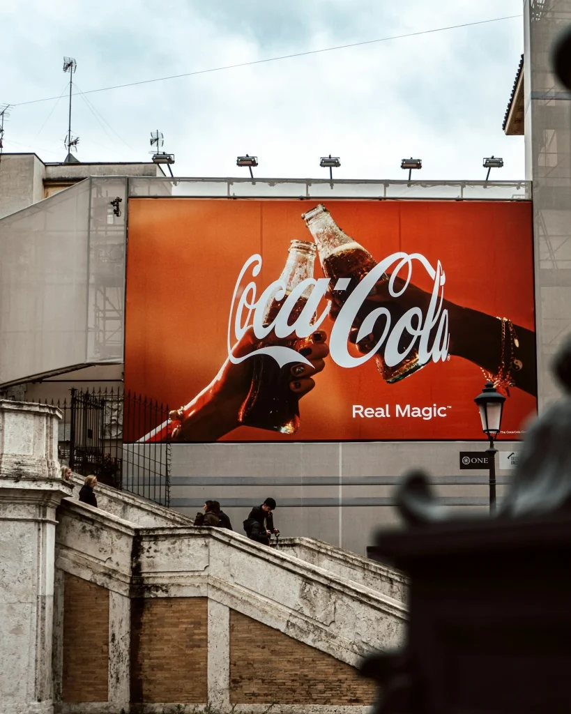
You might think that for a medium as large and visually striking as billboards, readability will be the last thing to cause problems. However, with billboards often featuring an array of striking visuals, there is a chance that your logo could be swallowed up if not placed properly
That is why you will see that most successful billboard designs are focused around the logo, which is displayed prominently to draw the eye immediately. Billboards that incorporate the logo as an afterthought in the design, fail to capitalize on the symbol’s potential impact.
Logo Placement of Small Mediums like Brochures
On brochures, your logo should be displayed prominently on the front fold of your medium. Just like billboards, try to focus the design of that front page around your logo and wordmark, in order to establish a strong connection between your business and the consumer.
Next, you can use just your symbol at the bottom of each fold, or you can end the last page with just your logo symbols. That way your logo begins and closes the consumer’s journey through the brochure with your logo, improving your chances of conversion.
Colors and Typography Choices
For both billboards and brochures, bright, vibrant color combinations are the name of the game. You want your logo to be displayed in all its glory, without nothing hindering or even slightly affecting its potential impact on the consumers.
Moreover, you should use professional logo fonts that are clean and easy to read, no matter the size of the medium. And as most formal fonts today have some sort of serifs, it allows you to establish a strong authority in the consumers’ minds.
Design Guidelines for Logo Placement on Apparel
The most common form of logo printing on apparel is on t-shirts. And there are multiple ways to print your logo on it, depending on how prominently you want it displayed. Let’s look at the logo placement guide for printing business t-shirts with logo.
The Various Ways of Logo Placement on Apparel (Mainly T-Shirts and Jackets)
On average, there are eight different ways to use your logo in an average t-shirt logo placement guide. Your choice can vary depending on what you want to achieve with that logo, and purpose of that logo’s use in that apparel’s design.
This allows you to have a little bit of fun with the logo placement, and allows you to use a wider range of t-shirt styles to accomplish what you are after. For example, you can portray your logo front and center on your giveaway merchandise, at a convention let’s say. Or, you can print your logo in the area of the left breast pocket as monograms on employee wear, using a comprehensive left chest logo placement guide. Alternatively, you can also print it on the shirtsleeves of the uniforms of a local sports team your company sponsors.
Variations of Your Brand Logo

Among the various logo placement styles, you will need to use different variations of your brand logo to portray the desired impact. For example, you can use the full logo with the wordmark for placements such as full chest or back. Similarly, you can easily find a detailed right or left chest logo size and placement guide if that’s what you are after.
However, for smaller mediums such as collar or breast pocket placement, you will need to use just your monogram logos. Similarly, for areas that are taller than they are wider, such as shirtsleeves, you will need to use a vertical variant of your brand symbol.
Guidelines for Logo Placement on Office Supplies and Merchandise
With the more prominent avenues of your logo placement guide covered, here are a few smaller, yet no less important mediums where you need to know how to showcase your logo.
Logo Placement on Company Stationary
On company stationary, you can place your logo symbols in a number of different ways. For letterheads, placing your logo prominently at the top is the way to go. For business cards, it can vary based on the design. For double sided, display it front and center on one side, while for single sided, you can display it at the top as per your design.
Placing Your Logo on Company Merch Like Mugs, Desk Accessories etc.
For merchandise such as mugs, keychains, and more, you have as much freedom as you require. You can play with various formations and styles of the logo, only making sure that wherever its placed, its displayed prominently.
Common Logo Placement Pitfalls and How to Avoid Them
Due to the dynamic nature of logo design and placement, even the most experienced designers and branding experts sometimes make mistakes. However, if you know what you are looking for, you can easily spot these oversights during QA.
But what are these pitfalls? And how can we rectify them on the fly?
Let’s find out.
- The Logo is Too Small, Can’t Make Out Details à Make the logo larger.
- Logo Appears to Cut Off/Is Cropped à Adjust the margins around it until logo appears whole.
- Logo Blending Into the Surroundings à Reduce visual clutter around the logo to make it pop.
- Logo Dimensions Seem Distorted à Be sure to maintain aspect ratio when resizing logo.
- Logo Not Visible Strongly à Use contrasting background that helps the design pop.
- Inconsistent with Logo Style on Social Media/Website à Ensure consistency across mediums.
Frequently Asked Questions
| 1. Why are logos considered important for branding? Logos always play an important part in the branding of any company. They represent the identity of any organization, allowing people to understand its background and services appropriately. |
| 2. Why is logo placement termed crucial to represent any brand properly? Placing logos at the right places is pretty important for brand representation. It showcases your branding practices, allowing people to understand the true professional values of your company. |
| 3. What are the best tips to place any logo on branding materials? When you are printing the logo on any branding material, make sure to place it at the top left corner to make the representation bold. Furthermore, also try to use the logos in bigger sizes, so that it can become prominent. |
| 4. What is the best position to place a logo in a banner? Usually, banners are quite big which is why you have to print the logo wisely on them. It is best recommended to print the logo on the center or upper left corner of banners. It makes them more prominent and allows the design to attract people’s attention. |
| 5. Where do you place a logo on a shirt? When it comes to merchandise, the placement of logos is quite important. Keep in mind to always print the logo on the right chest side of the t-shirt. It is a standard practice for printing logos on t-shirts made for brand marketing. |
Conclusion
Logos are an important part of branding, which is why cannot be ignored at any stage. Besides their designing, it is also crucial to know how to use them at the correct places. Their impact becomes more powerful when they are placed appropriately on branding materials. As a marketer, you need to know this fact because all of the brand representation and marketing lies upon your head.
This logo placement guide has discussed in detail how you can use brand logos at the right places. It has defined some important tips that will let you know the correct placement practices as per the professional standards.
Meanwhile, if you are looking for an agency that is experienced in creating quality brand logos, get in touch with us today. We will simplify your designing hassles by offering stunning logos showcasing the right identity of your business.
Latest news you want to know!
Subscribe for cutting-edge design inspiration at Logo Poppin! Elevate your brand with updates on logos, branding, web design, and video animation.
Note that by clicking “subscribe,” users may agree to our privacy policy and consent to Logo Poppin to use your contact data for newsletter purposes.
Logopoppin
Logopoppin is a graphic design agency that specializes in logo designing, web development, video production and advanced branding services. We love to innovate businesses with new age technologies, allowing them to improve their visual reputation.

