
Table of Content
Discover the Importance of Different Logo Variations for Business Branding Like Experts
Every brand marketer knows about the importance of logos. It has always remained a crucial part of their branding, no matter how quickly the trends have changed. They represent the core identity of a business, if designed smartly with the right attributes. Many modern day marketers also recommend to get different logo variations from any logo design agency. It allows them to use these variations at multiple places, rightly according to the given requirements.
Nowadays, the mediums for branding have evolved drastically. Gone are the days when there were only a few conventional channels to market any business. Today, you can find multiple mediums where any business can be promoted. These channels require different practices to promote any business. That is why different versions of logos are created. It suits their diverse requirements, allowing the branding to look perfect at all stages.
Speaking about the usage of these variations, each platform requires a unique type of logo. For example, the social media sites will need a conventional logo design, whereas the branding stationary will need a different alteration. As a marketer, you can easily understand these changes as why they are always different from others.
In this blog, we will take a brief look into different logo variations used in the market. But before doing that, let’s first understand why marketers prefer to use these variations at different places.
What are Logo Variations and Why are They Used in Branding?
Logo variations are used to cater different types of branding needs. Some people think that these variations are created just to bring another rendition in the logo design. Factually, this is not the case because these versions are used at different places. Their sizes and fonts are precisely picked, so that they can suit well according to the given requirements.
Meanwhile, some people also think that these variations are also designed with a new concept. This is certainly not the right perception, because logo variations are just changed in terms of sizes and color combinations. The basic purpose of creating these variations is to offer room to the marketers to use them at different places. It provides them ease to manage them at social media sites, business cards, websites and other places efficiently.
Keeping these things in mind, these variations are created accordingly. It has become a standard practice of all the companies to follow this exercise and manage their branding at all places accurately.
Common Types of Logo Variations Used by Businesses Today
As a designer, it is important for you to know about different variations of a logo. It helps you to design them with perfection, knowing their usage at different places.
However, if you are a beginner and don’t know much about them, take a look at the different variations given below. Commonly, there are 4 logo variations that most businesses use. However, there are a few more that can help you establish a strong brand identity, both in the digital sphere and otherwise. So, lets understand the different types of logos used as variations and why they are termed important for particular purposes.
The Primary Logo
As the name suggests, the primary logo refers to the main emblem that is representing any brand. It is always designed very carefully keeping all the main attributes in mind. The primary logo is used for all the main branding elements of the company. This includes business cards, websites, and more others.
Looking at its vast usage, the designers are always instructed to create these logos with high dedication. It is quite important for the branding of companies, as they can’t compromise anything on its quality. Usually, companies try to hire known logo design agencies to take care of their primary logos. These agencies are well versed in designing different logotypes according to the given requirements.
The primary logo also takes a lot of time in finalization. Designers often communicate frequently with the clients to get feedback on raw concepts. Once getting the approval, they start to design them as per the given demands. This includes a lot of effort, as designers always try to come up with the best artwork that can appeal to clients. They often create different renditions of the same logo, so that clients can choose anyone of them depending on their requirements.
The Secondary Logo
The secondary logo is created as an alternative to the main logo. Many companies often require this logo variation for a variety of purposes. Some of them want to use these logo versions at particular occasions, while some want to show another aspect of their business identity with them.
Talking about the difference, it totally depends on the companies how much they want their primary and secondary logo to differ. Generally, it is recommended to not design them with a big change, so that people can find little relevance in them of the main company logo.
The process to design a secondary logo is also the same. Designers are asked to follow the same practice to create these logos. Starting from research to finalization, each stage is very crucial in the designing of secondary logos. As a designer, you have to pay attention to every phase, so that you can design the final logo perfectly.
The usage of secondary logos could be decided on the preferred priorities. Normally, companies use their primary illustrated logos at the main branding events. It includes trade shows, conferences, award shows and more others. The secondary logos are used at the places that remain less in the limelight, or they could also be used as an alternative to represent any sister company of a known business conglomerate.
The Submarks
The submarks are a type of logo variations that are designed diligently in the shape of a symbol. It is precisely created in this manner, so that the logo can be used at specific places. The color and overall theme of the submark remain same as the primary logo, besides having few changes in the color gradient.
Normally, submark is used at those places where a conventional logo looks difficult to fit. It is therefore designed in a shape of short signature, so that it can be used easily anywhere. Not only on business cards, but they can be used on stamps as it is also a medium that needs a shorter type of logo.
To design a submark, you need to pick a precise font that can showcase uniqueness in the design. It is not necessary to choose bold or recursive fonts for this purpose. You can select any other type that relates perfectly with your brand. There are plenty of options you can find for it on the internet, as there are tons of sites available that offer free submark styles.
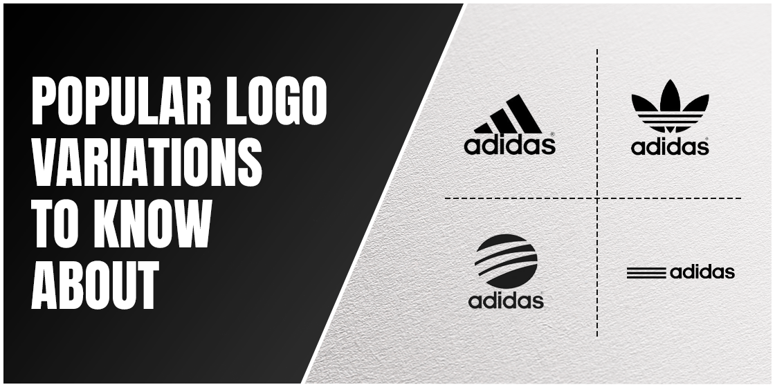
The Stacked Logo
Unlike the other entries on this list, you might be wondering – what is a stacked logo? Well, when it comes to the stacked logo meaning, it’s quite straightforward, as the name suggests. Stacked logos look very different to the other variations of the logo. They are vertically designed with a fine measurement of a straight line. The font used in this type of logo is generally big because it is responsible for showcasing the brand name in bold.
Some logos also use an icon on top of the lettermark. This type of stacked logo looks very sophisticated and decent to the eye. Their usage in different branding materials has become very common. Many new age companies are designing stacked logos to give their branding a catchy look. Though it is vertically a bit bigger in size, but does offers a great representation of the brand in a diligent manner.
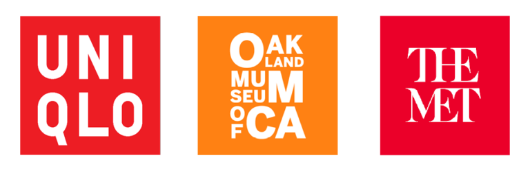
Wordmark Only Logos
Another important one among logo variations that is hugely popular among the marketers is the wordmark emblem. It is a specific type of logo that precisely consists of lettermarks only. Many companies prefer to use this logo as it looks highly elegant and sophisticated, offering a simple aesthetic that is unmatched. These logos always use creative fonts to strongly portray the identity of the company. This could include a variety of fonts, such as Sans Serif, Helvetica and more others.
Today, you can find many renowned brands using the specific wordmark logos. Some of the notable ones among them include Balenciaga, Samsung, Nokia, Haier and more. Their stylish lettermarks have become the main identity of their brands. It provides them a classy look, allowing the whole emblem to present a bold professional image.
Meanwhile, the designing of these logo versions requires some important things to consider. The background of the wordmark should be chosen in contrast to the main lettermark. This means that if the wordmark is in black, then the background should be in white. It is an important practice that you must need to keep in mind while designing these logos, especially when they are related to any fashion brand.
The Favicon
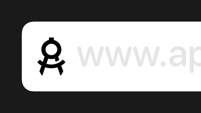
Favicons are a special type of logo variations that are only used for websites and other web-based applications. A lot of people who are aware of this term would be unable to point out an example of this logo type, until you point out the small icon appearing in the upper left tab of the browser. This icon is called Favicon and it is mostly designed with the same theme of the main logo.
The only difference is that these logos are pretty small and only used as a website icon on browser tabs. Many times people even do not notice them until their mouse unintentionally hovers on the tab. This doesn’t mean that the Favicons are not important among logo variations. They are certainly very crucial because their presence on the tab defines the professional design values of the website.
While designing the favicon, you must keep its color selection in mind. It is generally recommended to pick any strong color, so that this little icon can be highlighted on the tab. This color should be similar to your main logo, but its gradient should be comparatively much higher.
Frequently Asked Questions
| 1. What are logo variations? Logo variation is a term that defines different versions of the same logo. It is usually preferred by those companies that always look for different branding practices based on the given requirements. |
| 2. Why are different logo variations important? Logo variations are important because they allow you to choose the best logo type based on the emerging needs. This gives ease to the marketer to use different logos when different alternatives are required in branding. |
| 3. How to create different logo variations? To create different logo variations, you need to first analyze the main concept of the brand. It is necessary because you have to make all those renditions based on it. Though you can change a bit of shape, but the actual color theme will still remain the same. |
| 4. What key factors should be considered while designing logo variations? There are different key factors you need to keep in mind while designing logo variations. First of all, you need to keep the colors the same in the design, so that the secondary version can look relevant to the main logo. |
| 5. Name some of the famous examples of company logo variations? You can find examples of different companies opting for various logo variations in the market. Some of the most popular among them include the logo of Nike, Adidas, McDonalds and more others. |
| 6. What are some common logo variations used? Some of the common logo variations used include: Primary Secondary/Stacked Submark Favicon |
| 7. How to make a different version of my logo quick? One of the simplest ways to make logo variations to change the alignment. For example, if you have a horizontally placed logo, make a vertically stacked logo for your logo variant, and vice versa. |
Final Words
To sum it up, logo variations play an important role in various aspects of business branding. As a designer or a business owner, it is important for you to know about different versions of the logo and how they help you achieve specific goals. And based on business requirements, you may be required to design one or more of these logo versions.
Logo variations are therefore used to cater the demands of different branding practices. Some logos are specifically created for business cards, whereas some are designed for digital applications like websites. This article has defined some of the popular logo versions that are used in the market. You can get a good idea of them by looking at their design. It will let you understand their overall concept and where these logos could be used perfectly for branding purposes.
Meanwhile, if you are looking for an agency that is well versed in designing different types of logo, contact us today. We will help your brand to get spectacular logos, precisely as per the custom requirements.
Latest news you want to know!
Subscribe for cutting-edge design inspiration at Logo Poppin! Elevate your brand with updates on logos, branding, web design, and video animation.
Note that by clicking “subscribe,” users may agree to our privacy policy and consent to Logo Poppin to use your contact data for newsletter purposes.
Logopoppin
Logopoppin is a graphic design agency that specializes in logo designing, web development, video production and advanced branding services. We love to innovate businesses with new age technologies, allowing them to improve their visual reputation.

