Table of Content
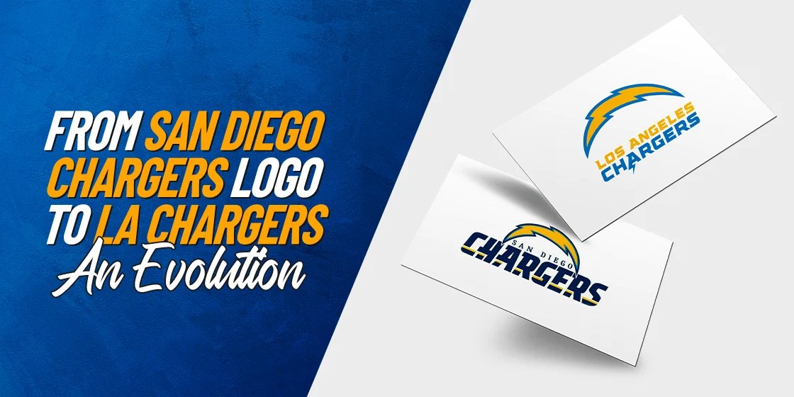
Transformation of the Chargers Logo, from San Diego to its Original Home in LA
Just like the Giants and the Jets from New York, Los Angeles too has the honor of playing host to two teams from the NFL – the Rams and the Chargers. Now, we are all familiar with the LA Rams logo with its iconic blue and yellow color scheme, and an abstract design that merges a grandfathered design element with a modern design technique. But if we talk about the Chargers logo, do you know what it represents?
The Chargers, now known as the LA Chargers, spent a vast majority of their time in the sport of football as the San Diego Chargers. With a playing period that spans across sic decades, its obvious there their would have been several version of the San Diego Chargers logo. In fact, since returning to LA less than a decade ago, the Chargers have sported two different versions of their symbol.
So let’s dive in and discover the evolution of this iconic team’s symbol, and discover how the help of a professional los angeles logo design service helped it grow into a big sports brand from 1960 to today.
The Chargers Logo Today – A Retrospect
If we talk about the LA Chargers logo today, there are a lot of things to unpack. The color scheme of powder blue and yellow, accented with white is amazing, and separates the brand identity of the Rams and the Chargers despite an unplanned similarity in color palettes.
Today, the logo features an amazing design which features a thunderbolt with a flatter, less rounded appearance, and a dynamic and stylized font that perfectly represents the brand image. The change in the style of the thunderbolt makes it appear more aggressive and sharper, which is the perception desired.
Overall, the modern LA Chargers logo may be not considered the best in the League, but there is no doubt that it is one of the sleekest NFL logos today.
Elements of the San Diego Chargers Logo Carried Over From the Old LA Chargers Logo
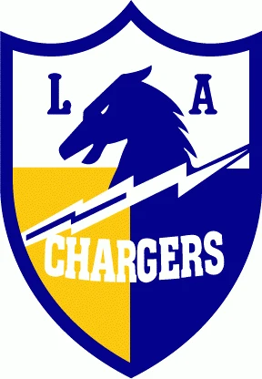
While the Chargers started out from Los Angeles in 1960; it was only a year later that they moved to San Diego, where they played for the next six decades. However, at the end of the 2016 season, the franchise decided to return to its original hometown, becoming the LA Chargers for the 2017 season and onwards.
With that in mind, let’s talk about the design elements that the franchise retained despite their move from San Diego to LA recently.
The first of these is the retention of the lightning bolt as the primary design element of the Chargers logo. In use for such a long time, the imagery of that lightning bolt even without a wordmark, served to identify the team.
When the team moved to Los Angeles in 2017, they retained the navy blue and yellow lightning streak, which was redone slightly according to modern design aesthetics for a callback to their history. Besides that, the earliest imagery of a snorting horse used in the very first LA Chargers logo above, and the subsequent San Diego version, was relegated as a secondary logo, surrounded by a shield design.
Lastly, the biggest element that has been retained is the color combinations, with the iconic powder blue, yellow, and white making a comeback for the current iteration of the logo.
The San Diego Chargers Logo Evolution – Six Decades of Transforming Brand Identity
So now that we know the elements that make up the current Chargers logo, let’s take a look at the evolution of the symbol since the team’s inception in 1960. From the earliest San Diego Chargers logo, to the last design sported by the team before moving back to their original home of LA, here are the different sports logos used by the San Diego Chargers.
1961 – 1973
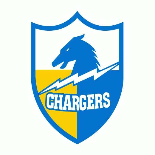
The first true San Diego Chargers logo was revealed in 1961, for the team’s first season playing for the city. It used the same design as the original LA Chargers logo, with some slight yet significant changes in the design. Incidentally, this was before another team symbol from the American Football League, the Denver Broncos logo, started to feature a horse as a central element of their logo design.
The navy blue color was replaced with a lighter powder blue, the design of the lightning bolt was tweaked, and the word “LA” was removed from the shield. Otherwise, the two logos looked the same, with the latter having a slightly softer feel than the predecessor.
1974 – 1987
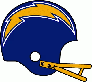
More than a decade after the first San Diego Chargers logo was revealed, the franchise decided to release a new design that was both subtler and more aggressive at the same time. The result was the reveal of a thick, jagged lightning bolt added to the dark blue helmets of the Chargers players.
The darker shade of golden yellow used for the bolt, outlined in an alternating band of dark blue and white, stood out starkly even during a fast play. Moreover, the absence of the wordmark made the design subtler, with the sharp edges of the bolt making it look more aggressive than the previous design.
1988 – 2001
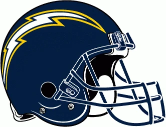
The third logo for the San Diego Chargers featured a redesigned lightning bolt, as well as a revamped color palette. The dark blue of the previous design was changed to a dark navy blue, similar to the Dallas Cowboys logo of today.
Moreover, the lightning bolt itself was redesigned for a thinner, wickedly sharp profile that curved along the curve of the helmet better. With the middle of the lightning bolt now white, outlined in an alternating band of navy blue and yellow, the resultant logo gave the team a more aggressive profile, perfect for the new style of helmets.
2002 – 2006
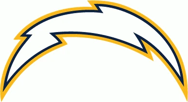
With the start of a new millennium, the visual aesthetics of consumers and businesses had started to change. Minimalism was starting to take hold in the world of logo design, and brands were going for simple logo symbols that reflected their identity without too complicated a design.
Thus the new San Diego Chargers logo released in 2002 featured that same lightning bolt used in the previous logo variant, and gave it its own independent charm. The new logo featured a thicker design for the bolt, with a more rounded shape that was quite close to a hemisphere. Used without the wordmark, this was one of the top minimalist logos used by the NFL.
2007 – 2016
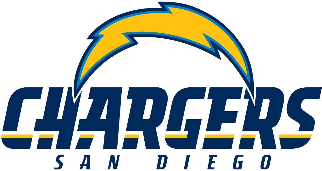
The final Chargers logo used by the team in San Diego, before their move to LA, was an elaboration of the previous design. Starting with the thunderbolt itself, the bolt was a solid golden-yellow, with an alternating powder blue and navy blue outline.
The wordmark featured the name of the team in large, serif letters using a set of modern, rounded logo fonts. The bottom half of the wordmark featured a thin band of white and yellow going through them horizontally and underneath the wordmark was the name of the city in smaller letters
Return of the LA Chargers Logo – Going Back to the Team’s Roots
The end of the 2016 season the Chargers moving back to LA after six long decades playing for San Diego. Although the team had played only one season here before moving to San Diego for the better part of the next sixty years, Los Angeles was their home, and for the franchise, this move was a long time coming.
The move was marred by the introduction of a new logo, which highlighted their new host city. Yet its similarity to another popular sports franchise led to massive online backlash from fans and other NFL franchises, leading the Chargers to pull it just two days later.
Let’s take a look at the various shapes the Chargers logo has taken since their move back.
2017 – 2019
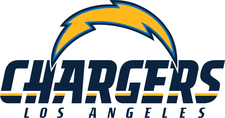
Their first season back in LA was the 2017 NFL season. This year, the team used the previous year’s design for the new LA Chargers logo, with the name of the city at the bottom changed to Los Angeles from San Diego.
The longer name of the new host city offered a better balance in design, at least visually, making it look more natural than it did in San Diego. Overall, the first two seasons for the new LA Chargers featured this design as their franchise symbol.
2020 – Today
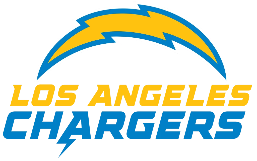
For the 2020 season, the Chargers unveiled a new logo design that was markedly different from the previous iteration. The first thing that stuck out was the color scheme. The dark navy blue was now replaced with a lighter powder blue, a shade similar to the second to last Detroit Lions logo.
Next, the lightning bolt now had a thicker outline done in just powder blue, albeit covering the same area as the previous double-lined outline. Moreover, the wordmark was now quite different too. Using a lighter shade of yellow than the bolt, the top line featured the wordmark “LOS ANGELES”, underneath which was the name of the team “CHARGERS” done in powder blue.
Finally, the “A” of the Chargers had a small lightning bolt flair at its trailing arm, giving the logo a dynamic feel. And despite the somewhat lackluster response to this design, the team has used this logo since then.
FAQs
| What was the Chargers old logo? The oldest logo for the Chargers featured a shield-like design, with the image of a charger horse, also known as a warhorse, on it, and the name of the team at the bottom. |
| Why does the Rams logo and the Chargers logo look similar? While there has been some talk about both NFL teams from LA having similar looking logos and color schemes, the fact is that it is nothing more than coincidence. |
Conclusion
To sum it up, the Chargers logo has seen a number of changes to its design, despite the fact that the team has remained with the same hometown for the vast majority of their career. Despite that, their newest logo has many people claiming a definitive lack of creativity in its design.
However, despite that, the franchise, and the design community at large, believes that the modern LA Chargers logo represents the team’s brand perfectly.

Logopoppin
Logopoppin is a graphic design agency that specializes in logo designing, web development, video production and advanced branding services. We love to innovate businesses with new age technologies, allowing them to improve their visual reputation.

