
Table of Content
Discover the Idea Behind the Lucid Motors Logo and How It Established Its Brand
Lucid Motors, a California-based electric vehicle (EV) manufacturer, has emerged as a prominent player in the automotive industry, challenging established automakers with its innovative technology and luxurious offerings.
The company’s rapid growth and success can be attributed to a combination of factors, including its cutting-edge electric powertrains, advanced battery technology, and stylish designs. However, one often-overlooked aspect of Lucid Motors’ success is its iconic logo, a visual representation of the brand’s identity and values.
The Lucid Motors logo, a sleek and minimalist design, has become synonymous with the company’s commitment to innovation, luxury, and sustainability. The logo’s clean lines, modern typography, and distinctive shape have helped to establish Lucid Motors as a premium EV brand, attracting a discerning clientele.
In this article, we will explore the history and concept of the Lucid Motors logo, analyzing its design elements and its impact on the company’s brand identity and market positioning. We will also understand identify how a professional logo design agency can help even the simplest of brand symbols become memorable icons.
Let’s begin.
The History of Lucid Motors and Its Rise in the Industry
Lucid Motors, formerly Atieva, was founded in 2007 with the goal of developing electric vehicles that would redefine the luxury car market. The company’s CEO and CTO, Peter Rawlinson, VP of Engineering at Tesla and the Chief Engineer for Tesla’s Model S at that time, joined the company in 2013.
He had a vision of creating electric vehicles that were not only environmentally friendly but also offered exceptional performance, luxury, and technology. Thus, he renamed the company to Lucid Motors, and got to work on turning that dream into reality.
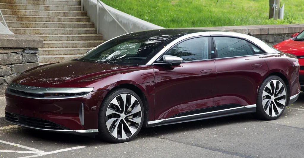
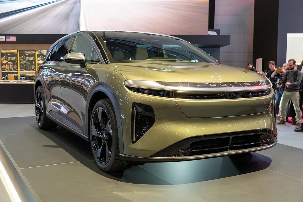
After years of research and development, Lucid Motors unveiled its first production vehicle, the Lucid Air, in 2021. The Lucid Air received widespread acclaim for its range, performance, and luxurious interior, putting its minimalist brand symbol amongst the top electric car brand logos of that time. The car’s success solidified Lucid Motors’ position as a leading player in the electric vehicle market.
Lucid Motors’ rise to prominence can be attributed to several factors, including the following:
- Innovation
- Efficiency
- Luxury
- Sustainability
Let’s take a look at them in greater detail.
Innovative Electric Powertrains:
Lucid Motors has developed cutting-edge electric powertrains that offer exceptional range, performance, and efficiency. They have invested heavily in research and development, resulting in cutting-edge technology in areas various automotive areas including autonomous driving systems.
Advanced Battery Technology:
The company has invested heavily in research and development, resulting in vehicles with cutting-edge technology, such as long-range batteries. In fact, the company’s battery technology is among the most advanced in the industry, enabling Lucid Motors to produce vehicles with impressive range and charging capabilities.
Luxurious Design and Interior:
Lucid Motors vehicles are known for their stylish, environmentally friendly designs and luxurious interiors, appealing to discerning customers who demand the best. Its vehicles are designed to offer a premium experience, combining exceptional performance with luxury and advanced technological features. The company’s attention to detail and commitment to design excellence have resonated with discerning customers.
Focus on Sustainability:
Lucid Motors is committed to sustainability and has made significant efforts to reduce its environmental impact. The company’s focus on sustainability aligns with the growing demand for eco-friendly products. This includes using renewable energy sources and implementing sustainable manufacturing practices.
Understanding the Lucid Motors Logo – Taking a Closer Look At the Unassuming Design
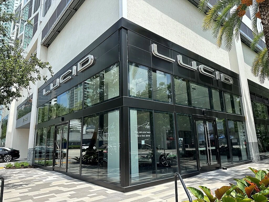
The Lucid Motors logo is a simple yet striking design among the top car logos that effectively conveys the brand’s identity and values. The logo is a minimalist design featuring the word “Lucid” in a bold, sans-serif font. While the overall design may seem simple, there are several subtle elements that contribute to its effectiveness.
The Lucid Motors Logo Font
The font used for the word “Lucid” is a custom typeface designed specifically for the company. Hailing from the sans serif fonts’ family, it is clean, modern, and easily legible. It conveys a sense of sophistication and innovation, reflecting Lucid Motors’ commitment to cutting-edge technology.
The Color Gradient
The word “Lucid” is set against a subtle gradient background, which adds depth and dimension to the logo. The gradient transitions from a lighter shade to a darker shade, suggesting the idea of movement and progress with its minimalist color combinations. This aligns with Lucid Motors’ vision of shaping the future of electric transportation.
The Letter Spacing
The spacing of and between the letters in the word “Lucid” is carefully calculated for aesthetics, similar to many modern monospaced fonts. The letters are slightly spaced apart, creating a sense of airiness and openness. This reflects the company’s commitment to sustainability and its focus on creating vehicles that are environmentally friendly and spacious.
The Overall Aesthetic
The Lucid Motors wordmark logo design is meant to be clean, modern, and minimalist. The simplicity of the design allows the word “Lucid” to take center stage, emphasizing the company’s name and brand identity. The logo’s overall aesthetic is consistent with Lucid Motors’ focus on luxury, innovation, and sustainability.
The Concept Behind the Lucid Motors Logo Wordmark
The Lucid Motors logo is a simple yet powerful design that effectively conveys the company’s values and aspirations. The logo features the word “Lucid” in a bold, sans serif font, with a subtle gradient effect that adds depth and dimension. The overall design is clean and uncluttered, emphasizing the company’s focus on innovation and efficiency, serving as a great example of expressive minimalist logos.
The choice of the word “Lucid” in the logo is significant. Lucid means clear, rational, and easily understood. This aligns with Lucid Motors’ commitment to creating vehicles that are intuitive, efficient, and easy to operate. The logo’s clean and minimalist design further reinforces this concept, suggesting that the company’s products are straightforward and easy to understand.
The gradient effect in the logo adds a touch of sophistication and modernity. It also suggests the idea of progress and movement, reflecting Lucid Motors’ forward-thinking approach to automotive design and technology.
Conclusion
The Lucid Motors logo is a powerful symbol that represents the company’s values and aspirations. It embodies the brand’s commitment to innovation, luxury, and sustainability. As Lucid Motors continues to expand its operations and introduce new models, the logo will play a crucial role in reinforcing its brand identity and attracting new customers. The logo’s distinctive design and symbolic meaning make it a memorable and effective representation of the Lucid Motors brand.
Latest news you want to know!
Subscribe for cutting-edge design inspiration at Logo Poppin! Elevate your brand with updates on logos, branding, web design, and video animation.
Note that by clicking “subscribe,” users may agree to our privacy policy and consent to Logo Poppin to use your contact data for newsletter purposes.
Logopoppin
Logopoppin is a graphic design agency that specializes in logo designing, web development, video production and advanced branding services. We love to innovate businesses with new age technologies, allowing them to improve their visual reputation.
