
Table of Content
Know the Complete History and Meaning of Lululemon Logo Below
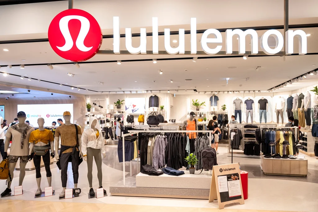
In the industry of sportswear, the name of Lululemon doesn’t need any second introduction. It is a renowned sportswear and activewear brand that is popular in different parts of the world. The Lululemon logo has therefore become a symbol of trust for many professional athletes. It represents an exceptional line of sportswear products that are created with perfection using high-quality material.
Created by reputed logo design services, the emblem of Lululemon exhibits a creative style. It is also one of those logos that has not seen much changes during the last couple of decades. The Lululemon logo that was first introduced in late 90’s has been hardly changed since. This speaks a lot about the solid branding of the company that didn’t required much changes throughout all these years. If you want to know more such interesting facts related to the Lululemon logo, read this blog in detail.
The article will let you know the complete history of Lululemon logo, as how it was created and launched in the sportswear market to create curiosity among the fans. Let’s start from the basics understanding why sportswear brands need a creative logo to promote their branding in the market.
Importance of Logos for Sportswear Brands

Logos play a crucial role in sportswear brands by acting as a symbol of identity and recognition. In a competitive market, where numerous companies offer similar products, a distinct and well-designed logo helps a brand stand out. The logo often serves as the first point of contact between the consumer and the brand, making it essential for creating an instant visual connection. A memorable logo can help establish a brand’s reputation and presence in the minds of athletes and consumers, building trust and loyalty over time.
Beyond recognition, illustrated logos are also an important tool for conveying a brand’s values, ethos, and target audience. For sportswear brands, the logo can communicate qualities like strength, performance, and innovation, all of which resonate with athletes and active individuals. A well-crafted logo can encapsulate the essence of a brand’s mission, whether it’s about pushing athletic limits, embracing a lifestyle of fitness, or focusing on high-tech fabric performance.
In addition, logos are integral to a brand’s marketing and advertising efforts, appearing on everything from clothing and footwear to promotional materials and social media. A consistent logo across various platforms reinforces the brand’s message and creates a sense of unity and professionalism. As sportswear brands often endorse high-profile athletes or teams, the logo becomes a symbol of their achievement and prestige.
What is Lululemon?
Lululemon is a Canadian-based athletic apparel company that specializes in high-quality sportswear designed for yoga, running, and other fitness activities. Founded in 1998 by Chip Wilson, Lululemon initially focused on providing functional yet fashionable yoga clothing, but it has since expanded to include a wide range of activewear for both men and women. The company is known for its innovative fabrics, stylish designs, and commitment to performance, making it a go-to brand for fitness enthusiasts around the world.
One of the main reasons Lululemon’s sportswear products are so popular is their emphasis on comfort and functionality. The brand uses advanced fabric technologies such as Luon, Nulu, and Everlux, which are designed to provide superior moisture-wicking, breathability, and stretch. These fabrics are ideal for high-intensity workouts, as they allow for maximum mobility while also keeping athletes dry and comfortable. Additionally, Lululemon pays great attention to the fit and design of their garments, offering a wide variety of styles that cater to different body types, preferences, and activity levels.
Lululemon’s popularity is also driven by its strong brand identity and community-focused approach. The company has cultivated a loyal following by fostering a sense of community through local fitness events, partnerships with yoga instructors, and a focus on promoting a healthy lifestyle. This sense of connection has turned Lululemon into more than just an activewear brand. Its ability to blend fashion and performance has made it a leader in the global sportswear market, attracting a wide range of customers from different classes.
History of Lululemon Logo
Just like Louis Vuitton logo, the history of the Lululemon logo is deeply tied to the brand’s evolution and its founder’s vision. When Chip Wilson founded the company in 1998, he wanted to create a brand that embodied the fusion of athleticism, and premium quality. Wilson and his design team worked on developing a simple yet powerful logo that would represent both the functionality of their products and the lifestyle they were promoting. The result was the Lululemon logo, a stylized “A” symbol that looks like an abstract human figure in a yoga pose.
Interestingly, the Lululemon logo was not immediately embraced by the public. There was some controversy surrounding the design, as many people misinterpreted the logo to be a stylized “L,” or they simply didn’t understand its intended meaning. The logo’s distinctive shape, coupled with its association with yoga, however, eventually allowed it to gain recognition as a symbol of well-being, and high-performance athletic wear. Over time, Lululemon embraced its minimalist aesthetic, and the logo became widely known as an emblem of high-quality sportswear.
In addition to its visual design, the Lululemon logo’s simplicity helped it become iconic and easily recognizable. The logo appears prominently on the brand’s products, making it a statement of both style and functionality. The logo’s minimalistic nature aligned with the growing trend of athleisure, where consumers sought sportswear that could seamlessly transition from workouts to daily life. Lululemon’s commitment to promoting a healthy, active lifestyle, paired with its instantly recognizable logo, helped the company grow into a global brand.
Font of Lululemon Logo
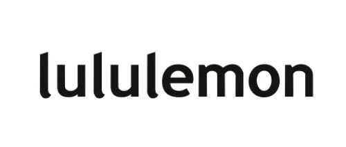
The Lululemon wordmark is intentionally designed in lowercase letters, which gives it an approachable and friendly aesthetic. This choice softens the overall appearance of the brand name, creating a sense of warmth and accessibility. In contrast to uppercase wordmarks, Lululemon’s lowercase design invites customers into a space that feels casual yet refined. The lowercase lettering aligns with the brand’s core values of mindfulness, reflecting its commitment to fostering an inviting environment for fitness enthusiasts and lifestyle consumers alike.
At first glance, the wordmark appears minimalist, but it carries an understated elegance that speaks to thoughtful design choices. Each letter is carefully crafted, with smooth curves and consistent proportions, ensuring a seamless visual flow across the brand name. The spacing between the letters is meticulously balanced, preventing any overcrowded or disconnected appearance. This attention to detail ensures that the wordmark remains visually appealing across various mediums, from apparel tags and store signage to digital platforms and social media.
What makes the Lululemon wordmark truly timeless is its versatility and simplicity. The uniform thickness of the lines strikes a perfect balance between boldness and subtlety, making the wordmark easily recognizable without overpowering other design elements. Whether displayed in large format on storefronts or subtly embroidered on clothing, the wordmark maintains its clarity and elegance. This timeless design ensures that the Lululemon brand can effortlessly adapt to changing design trends while retaining its strong visual identity.
Color of Lululemon Logo
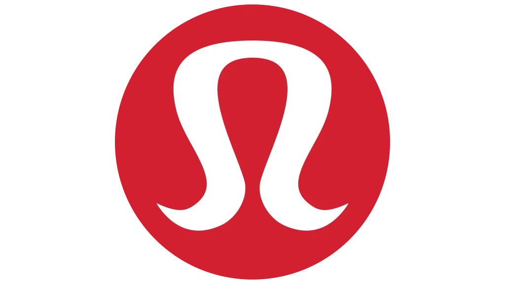
The Lululemon logo primarily features a bold red and white color combination. The vibrant red background represents energy, passion, and vitality—qualities that align with the brand’s focus on active lifestyles, fitness, and empowerment. Red is often associated with strength, courage, and determination, all of which are essential traits in athletic performance and personal growth. Meanwhile, the white emblem and text provide a striking contrast against the red, symbolizing purity, clarity, and simplicity.
The contrast between red and white in the Lululemon logo serves a functional purpose as well. This high-contrast pairing ensures that the logo remains easily recognizable across a variety of surfaces, fabrics, and lighting conditions. Whether displayed on a store sign, embroidered on sportswear, or featured on digital platforms, the red-and-white palette maintains its bold and clean appearance. The color choice also aligns with the premium and modern feel of the brand, reinforcing its identity as a leader in the activewear market.
While the primary colors of the logo are red and white, Lululemon occasionally adapts its logo color to suit different product lines. In these cases, the brand might use neutral tones such as black, gray, or even metallic shades to convey luxury, or exclusivity. Despite these variations, the core identity remains rooted in the iconic red-and-white pairing. This flexibility allows Lululemon to remain innovative and responsive to fashion trends without losing the visual consistency and emotional connection established by its signature colors.
Frequently Asked Questions
| Why sportswear brands need a creative logo? Sportswear brands need a creative logo to establish a strong visual identity. It helps them to foster an instant recognition which eventually allows their products to become known in the market. |
| Why Lululemon logo is popular in the market? The Lululemon logo is popular in the market for its minimalist yet striking design. Its symbolizes balance and quality, and its association with premium, performance-driven activewear resonates with a modern lifestyle. |
| What is the color combination used in the Lululemon logo? The Lululemon logo primarily features a red and white color combination, symbolizing energy, passion, and clarity. |
Final Words
That sums up our entire article in which we have discussed the history and prominence of Lululemon logo. It is one of those emblems that is highly famous in the activewear and sportswear industry. Just like Nike, Adidas and other brands, Lululemon has also built a distinctive presence in the industry, hence its logo has become a popular entity among the fans. It is therefore safe to say that Lululemon logo has become a symbol of trust in the sportswear industry, primarily due to its offering of high-quality athletic apparel.
Logopoppin
Logopoppin is a graphic design agency that specializes in logo designing, web development, video production and advanced branding services. We love to innovate businesses with new age technologies, allowing them to improve their visual reputation.
