
Table of Content
Discover How the Marvel Logo has Evolved to Represent the Giant Media Franchise
When we talk about comics books, especially for the superhero genre, there are two names that pop up predominantly – Marvel and DC. These two comic book companies control over 70% of the comic book readers in the west, excluding graphic novels. It may come as a surprise, but the company we now know as Marvel Comics has been in the industry for nearly eight and a half decades!
So how has it stayed relevant though all those years? How has their brand, business model, and brand elements like the Marvel logo managed to adapt to the changing dynamics of the customer aesthetic?
Those are some crucial questions that, if answered at the right time, can help any business survive and grow in a tough and unforgiving market. And despite their intense rivalry through the years, including lawsuits regarding the names and concepts of various characters, both DC and Marvel have shown that they have and will adapt when needed.
So, let’s take a look at the evolution of the Marvel logo, learn how it managed to adapt for its users, and discover how the help of a professional designer or logo design agency can help establish a brand.
A Brief Overview of Marvel Comics and Its Inception
The Marvel Comics we know and love today didn’t start out as Marvel Comics. Just like its primary rival DC, it has its inception in another company, which in Marvel’s case was called Timely Comics. Initiated in 1939 by pulp-magazine publisher Martin Goodman, the company was developed to cash in on the new yet increasingly popular comic book niche.
As an established magazine publisher specializing in western pulp, he launched and ran the company from his already existing premises in New York. Naming his brother Abraham as publisher, he managed the other aspect of the business as its editor, managing editor, and business manager.
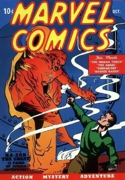
Their first release was titled Marvel Comics #1, in October 1939. It introduced the classic era superhero the Human Torch (not the one from the Fantastic Four) as well as the antihero Namor the Submariner. And it was an instant success. This first edition, and a second one released a month later, sold a combined 900,000 copies, an unprecedented amount for a new comic book company.
A year later, they had a proper staff of comic creators and editors to simplify and streamline their production. And in early 1941, staff writer/artist collaborated with now famed artist Jack Kirby, to create the titular all-American patriotic superhero, Captain America. That issue alone sold nearly a million copies.
Unfortunately, many of the other characters would not reach the fame and popularity of these three characters, despite the fact that many of them would carry over into the mainstream Marvel Universe.
In 1939, Martin hired his wife’s 16-year old cousin as a general office assistant at the company. The kid was named Stanley Lieber, and he was assigned to help in general administrative tasks, as well as in writing comics. Writing under the pseudonym “Stan Lee”, he was also made interim editor for the magazine when editor Simon left the company in 1941. That interim position turned into a permanent one that he held for decades, except for the years spent as a soldier during the Second World War.
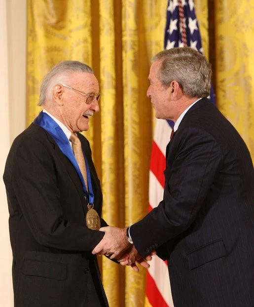
Today, Stan Lee is considered a legend among comic book fans, DC or Marvel. All that is due to the interesting characters and storylines created during the early 60s, which was then known as the Marvel age of comics. It was during that time Stan Lee, along with Jack Kirby, came up with comic runs like The Amazing Spiderman or Fantastic Four, which targeted more of an older generation rather than kids.
And despite the harsh times the company faced in the late forties and throughout the fifties as Atlas Comics, these relatable characters and their stories resulted in the revival of Marvel Comics. And over the next few decades, other popular characters developed in the same vein helped make Marvel the giant that it is today.
Another reason, besides the amazing and complex characters and storylines, is the expansion of both DC and Marvel into animated TV series and films, as well as live-action cinematic adaptations of their characters and storylines. That helped them adapt and grow with the world. This adaptability helped them create individual and highly lucrative brands of their characters, which allows them more business opportunities such as licensing.
The History of the Marvel Logo Featured on Comics
Now that we have looked at Marvel as a brand, let us look at the various designs sported by what would eventually become the Marvel logo. Since its inception was as Timely Comics rather than Marvel itself, the initial logo and the concept behind it would have little to do with the logo we see today.
Moreover, as the fans of the comics know, Marvel is more about the human nature, while DC has characterization that is more symbolical, as evidenced by the idea behind the Punisher or Batman logo.
So, let’s dive in and discover the evolution of the brand symbol we know today as Marvel Comics logo.
Timely Comics (1939 – 1951)
At the inception of the company in 1939, the organization was named as Timely Comics. The logo for that company was enclosed within a blue and white shield design, which made for quick visibility among various copies of newsprint. This design was used for nearly 12 years, before the company folded and merged with Martin’s Atlas Publications to form Atlas Comics.
The lower part of the shield featured alternating vertical blue and white bars, which had a small red rectangle centered within it. Written on that rectangle in white was the word “INC”. The top part of the shield had the name of the company in thin, uppercase serif typeface, in white over a blue background.
Atlas Comics (1951 – 1957)
In 1951, almost 12 years after the formation of Timely Comics, cash flow problems and the post-war inflation resulted in the venture closing shop. Martin, who owned a number of companies including a news company called Atlas, decided to publish the comics under that name. For six years, Marvel Comics featured the globe-logo of Atlas on its front page.
This post-war era was the time when the superhero genre was facing a dying interest. With the comic book company having to diversify towards a different direction, this era was one of sustainment, not growth. It wasn’t until the very end of the 50s or the early 60s, that the superhero genre again started to gain traction, giving the company a chance to bounce back from the setback.
MC Symbol (1961 – 1963)
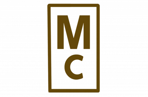
After DC Comics successfully revived the superhero industry, Marvel too followed suit. The new logo featured the letters “M” and “C” in a vertical rectangle. This rebrand was the result of Martin taking the name of their most popular comic run, aka Marvel Comics, and incorporating it into the brand identity.
Gone were the different designed logos and shell companies. The fans now witnessed their favorite comic book producer named exactly what they usually called it; Marvel Comics. That is because since the day they published their first comic in 1959, they added the name Marvel Comics on every copy of the comics published. And while this Marvel logo was new for them, the name it referenced certainly wasn’t.
Initial Marvel Comics Group Design (1963 – 1966)
Next, in 1963, just a couple of years after the MC logo, Marvel released a new design that was more of an elaboration on the previous logo. Now instead of the small symbol presenting the initials of the new company, the new design featured the full name of the company in clear, simple letters.
The new wordmark was written in three lines, and spelled “MARVEL COMICS GROUP”, with each word in a separate line. The core name of the company, Marvel, was in a larger font, and was bolded for a stronger impact. As for the typeface, the wordmark was written entirely in a san-serif font, making it easier to read.
Bold Marvel Comics Group Logo (1966 – 1971)
Just three years later, the logo was again given a design refresh. The logo still had the wordmark with the company’s complete name in a three-lined design. However, the typeface and style was changed quite drastically.
For one, the font for the word “MARVEL” was written in a different font compared to the rest of the wordmark. It was closer in style and writing to the logo wordmark we are used to today, but with a rougher edge. The purpose was to make the logo more prominent, and they succeeded.
Horizontal Marvel Comics Group Design (1971 – 1983)
Five years later, with the design aesthetic of the comic fans changing, along with the comic book publishing quality, the company felt that the logo needed to be refreshed again. The new design now featured the entire wordmark in a single line, with the font size and style now uniform across it.
The overall size was also reduced for a subtler visual impact, and this design was popular enough to be used for more than a decade.
Simple Marvel Logo (1983 – 1987)
12 years after the last revamp, the company decided that the Marvel logo needed a fresher, simpler design. The result was the simplification of the wordmark. Gone were the extra words from the logo, and in its place; simply “MARVEL”.
The design of the new logo was similar to the “MARVEL” wordmark of 1966, but with cleaner lines, and a more prominent profile. The space between each character was increased so that the lines could be made cleaner. This design was successful enough to be used for almost a decade with a minor change midway, as well as inspiring the new design of the company logo for the 21st century.
Italicizing the Marvel Logo (1987 – 1990)
As we mentioned earlier, this simpler “MARVEL” wordmark was used for almost a decade with one minor change midway. And that change was making the letters italic, and decreasing the space between each letter for a tighter, and more modern-looking logo design. The resultant logo was used from 1987 up until 1990, when the sudden change in reader aesthetic resulted in another major logo revamp.
Marvel Comics Emblem (1990 – 2002)
The inspiration for the 1990s Marvel logo would be instantly apparent to anyone who was at least a teen or a tween at that time. The new design looked heavily inspired by the MTV logo, with the style and dimensions of the brand symbol instantly bringing the music channel’s logo to mind.
The new design featured the wordmark “MARVEL COMICS” in different typefaces, styles, and colors. At the top of the logo, the word “MARVEL” was written in the style of the 1983 design, colored bright red. Below it was a large stylized “M” in the style of MTV, also colored red. Over it, in bright yellow, was the word “COMICS” written in a comic-style font.
Now, it might look like a massive departure from the Marvel logos we had seen before it, or had witnessed since, but it was a massive success, and used for nearly 12 years. And it was the perfect representation for younger characters like the Spiderman logo.
Modern Marvel Logo Badge (2002 – Now)
In 2002, in the early days of the 21st century, the Marvel logo again had another revamp. This time, the logo was again simplified, in the style of the 1983 design. The letters of the wordmark were large and bold, and were designed close to each other, in some cases with their lines overlapping. The color scheme was now white on red, with the wordmark colored white, and the rectangular background behind it red.
This design has been in use by Marvel Comics since 2002, and as of 2023, is still the one being used by the company, albeit with some minor changes. In fact, the design has been such a massive success that it even represented the entire Marvel group, before it was sold to the Walt Disney Corporation.
Evolution of the Marvel Studios Logo
As we discussed earlier, Marvel is now more than just a comic book company. It has expanded into the animation and even the cinematic world, with their characters gracing TV and cinema screens for the past few decades.
Let’s take a look at the Marvel Studios logo, the company subsidiary that oversees the media and animation production, as well as character licensing to studios.
Marvel Films (1993 – 1996)
In 1993, using the same style of logo as the MTV-inspired design used by Marvel Comics since 1990, Marvel Studios released its first brand logo. At that time however, it was called Marvel Films, and the design had a distinctively different color scheme to separate it from the comic book part of the business.
The majority of the logo was colored a dark, deep metallic blue, with the word “Films” written in a classic noir style and colored red. This color theme is a popular one among superhero-related media, with the cinematic Superman logo using a similar shading and color combination.
Marvel Studios (1996 – 2002)
However, just three years later, the company revamped the Marvel logo for the film studio again. The biggest change was the replacement of the word “Films” with “Studios”. Moreover, the background color scheme was also modified. A color gradient was now featured with the bottom left colored a dark steel gray which slowly travelled towards the top right of the logo, transforming into the blue of the previous design.
This is similar to the style of dark and gritty comic book logos like the Justice League logo from the last DC cinematic movie.
Marvel Logo (2002 – 2008)
In 2002, the company decided to eschew their custom logo in favor of the design used by the Marvel Comics at that time. The white on red wordmark was adopted for all subsidiaries of Marvel, including the Marvel Studios.
This was perfect for the start of the franchise proper, as this design had to represent the cinematic variants of many of Marvel’s top superhero logos and storylines.
Modern Marvel Studios First Logo Variant (2008 – 2013)
However, in 2008, the logo for the studio was slightly revamped with a set of bold horizontal lines beneath the Marvel wordmark. Between those two lines was the word “STUDIOS”, with the characters spaced out the entire width of the logo.
This change was done in time for the Iron Man 1 movie, which is often considered the official start of Marvel’s Phase 1 of films that culminated in the Phase 3 of this saga post-Endgame and Infinity War.
Modern Marvel Studios Logo Second Iteration (2013 – 2016)
In 2013, around the start of Marvel’s Phase 2, the Marvel logo for its film studios was changed again. The double lined addition in the previous iteration was removed, with the same “STUDIOS” wordmark now placed beneath the white on red Marvel symbol, in clear black font.
Current Marvel Studios Logo (2016 – Now)
Similarly, at the start of Phase 3, the logo was changed again. Combining the styles of the wordmark “STUDIOS” from the previous two iterations, the new logo design featured the “STUDIOS” wordmark to the right of the Marvel wordmark, with the word between two horizontal lines.
Now despite the two parts of the wordmark being different in font style, typeface, and even color scheme, the height of both words is the same, which makes for a subtle, yet effective modern Marvel logo for their film studios.
FAQs
| What does the current Marvel logo represent? It represents a unique and all-encompassing identity that covers everything related to Marvel including comics, animated movies & series, cinematic offerings, merchandise, and more under a single umbrella. |
| Why is Marvel’s logo so simple? The reason Marvel’s logo is so simple is because its characters have their own brands and symbols, which precludes the need for a more elaborate parent logo. |
| Why did the Marvel logo have a 10 in its design? For Avengers: Infinity War, the Marvel Studios logo has the IO of Studios change into a red 10, which represented the MCU’s 10th anniversary. |
Explore Related Superhero Logos History:
Conclusion
To sum up this discussion, the evolution of the Marvel logo is one of tenacity, hardship, and an amalgamation of sheer will and skill. Considering that this is the comic book company that has a cinematic universe with movies that have grossed in the billions for the past decade or so, is a truly remarkable feat.
And with comic book legends like Stan Lee, Kirby, and more associated with the brand, this simple yet highly effective wordmark logo has come to represent one of the biggest corporations in the world.
It is true that the DC Comics logo has been featured on comics featuring some of the biggest character names in comic book history. However, it is Marvel that succeeded in bringing the majority of its biggest characters to life, including the X-Men, Fantastic Four, Spiderman, the Avengers, and many more.
Latest news you want to know!
Subscribe for cutting-edge design inspiration at Logo Poppin! Elevate your brand with updates on logos, branding, web design, and video animation.
Note that by clicking “subscribe,” users may agree to our privacy policy and consent to Logo Poppin to use your contact data for newsletter purposes.
Logopoppin
Logopoppin is a graphic design agency that specializes in logo designing, web development, video production and advanced branding services. We love to innovate businesses with new age technologies, allowing them to improve their visual reputation.

