
Table of Content
Take a Look How the Legendary Mercedes Benz Logo Evolved
In the world of elite car manufacturing, the name of Mercedes Benz does not need any second introduction. It is a company that is known for producing exclusive luxury vehicles. The identity of the company is represented by an iconic Star-shaped Mercedes Benz logo. It is an emblem of extravagance, showcasing the legacy of the company that has pioneered the concept of luxury cars in the world. The history of the Mercedes Benz logo is therefore very rich, as it evolved from time to time taking different types of iterations.
Many people do not know about the old Mercedes Benz logos that came earlier in different eras. Designed by professional logo design services, the current Star-shaped emblem is undoubtedly the most popular logo of the Mercedes Benz history. If you want to know about the other emblems that came before the current logo, read this blog in detail. It will take you down the memory lane to rediscover all the Mercedes Benz logos that came right from the beginning.
Let’s start from the basics understanding why Mercedes Benz logo is counted among the top elite car manufacturing symbols in the world.
Popularity of Mercedes Benz Logo
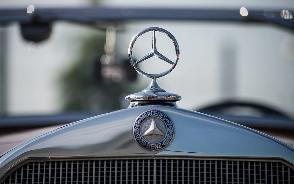
The Mercedes-Benz logo, a simple yet powerful symbol featuring a silver star enclosed within a circle, is globally recognized for representing luxury, innovation, and precision engineering. Since its inception, the brand has been synonymous with quality, with a reputation that stretches back over a century. The star itself symbolizes the brand’s commitment to reflecting Mercedes-Benz’s focus on creating vehicles that offer an unmatched combination of performance, comfort, and safety.
Just like Audi logo, Mercedes-Benz’s consistent use of its emblem across various models, marketing campaigns, and sponsorships has contributed significantly to its global recognition. The brand has not only focused on producing high-end vehicles but also on creating a powerful emotional connection with its customers. The logo is often associated with accomplishments, as it is seen in a variety of prestigious motorsport events, luxury lifestyle contexts, and cultural spheres.
In addition to its heritage and global presence, Mercedes-Benz’s emphasis on innovation has helped maintain the relevance of its logo. The brand continues to be at the forefront of new automotive technologies, including electric mobility, autonomous driving, and advanced safety features. As the company embraces future advancements, the logo remains a symbol of forward-thinking progress while still honoring the legacy of luxury and craftsmanship.
History of Mercedes Benz Logo
If you are a Benz lover, you need to know about the complete history of its logo. You need to know how this famous logo evolved over the years, taking different types of redesigns in different eras. Let’s take a quick look at the history of Mercedes Benz logo below.
Mercedes Benz Logo – 1902
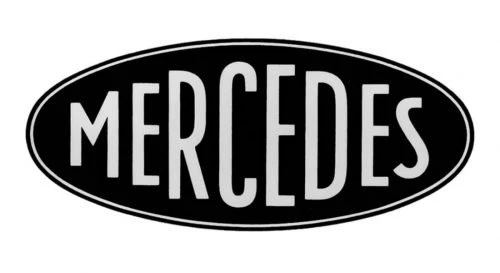
In 1902, Mercedes formally registered the name “Mercedes” as its official trademark. This significant step was taken to solidify the company’s presence in the burgeoning automotive industry. At this early stage, the logo did not include any imagery but focused solely on the wordmark. The design of the font was meticulously crafted to reflect the values of the brand.
The choice of the wordmark as the sole component of the logo emphasized clarity and sophistication. The typeface was sleek and modern for its time, exuding a sense of premium craftsmanship. Although the iconic three-pointed star symbol was not yet part of the brand, the minimalist yet impactful design of the original logo laid a strong foundation for future developments.
Mercedes Benz Logo – 1909

The 1909 Mercedes-Benz logo was a striking design that blended elegance with intricate detailing. Just like other European car brand logos, this emblem featured a traditional circular badge, which served as a timeless and recognizable shape in branding. The outer boundary of the circle was adorned with a bold double outline, creating a sense of depth and framing the logo with a commanding presence.
Inside the inner circle of the badge, the Mercedes wordmark was prominently displayed in a custom sans-serif font. The typeface was uniquely stylized, showcasing a sense of movement and energy that resonated with the forward-thinking ethos of the company. Rendered in black, the lettering stood in stark contrast against the white background of the inner circle, ensuring optimal visibility and sophistication.
Mercedes Benz Logo – 1916

In 1916, Mercedes-Benz introduced a redesigned logo that showcased an evolution in the brand’s visual identity while retaining its iconic three-point star. The primary element of the emblem remained the central three-pointed star, symbolizing the company’s dominance over land, sea, and air through its engineering expertise.
This enhanced logo became the definitive representation of the Mercedes-Benz brand for the next decade, reflecting both its innovative spirit and its commitment to excellence. The addition of the smaller stars and the prominent placement of the brand name emphasized unity, consistency, and prestige.
Mercedes Benz Logo – 1926
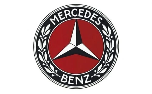
In 1926, Mercedes-Benz unveiled a distinctive new logo design that masterfully combined elegance and symbolism. At the heart of the emblem was the iconic three-pointed star, rendered in a refined red, black and white color scheme. This star, a long-standing representation of Mercedes-Benz’s dominance in transportation, was positioned against a deep burgundy-red background.
Encircling the star was a thick circular frame that enhanced the badge’s prominence and conveyed a sense of durability and completeness. Within this frame, the Mercedes-Benz wordmark was elegantly inscribed in white, ensuring clarity and reinforcing brand recognition. Alongside the wordmark, ornamental leaves adorned the frame, adding an element of finesse and heritage to the design.
Mercedes Benz Logo – 1933

In 1933, Mercedes-Benz underwent a redesign of its logo, introducing a more modern and refined look while maintaining its iconic elements. One of the most notable changes was the shift in the background color from burgundy to a light gray. This change gave the emblem a cleaner and more contemporary appearance, symbolizing the brand’s commitment to progress and innovation.
Another significant modification was the enhancement of the decorative leaves within the circular frame. These elements were redrawn with greater precision and enlarged slightly compared to the previous iteration. The refined detailing of the leaves added a sense of elegance and further emphasized the luxury associated with the Mercedes-Benz brand.
Mercedes Benz Logo – 1989

In 1989, Mercedes-Benz introduced a modernized version of its logo, elevating its visual appeal by transitioning to a three-dimensional design. This update brought the iconic three-pointed star to life with a sleek, polished look that added depth and realism. The color palette shifted to gradient shades of gray, enhancing the metallic texture and giving the badge a glossy, reflective finish.
Below the emblem, the wordmark was redesigned with greater prominence, featuring bold, enlarged serif lettering in black. This change emphasized the brand name and reinforced its visibility in various applications, from vehicle branding to marketing materials. The serif typeface added a touch of classic elegance, complementing the modern, metallic star above it.
Mercedes Benz Logo – 2011

In 2011, Mercedes-Benz introduced another refinement to its visual identity. The updated logo had a strong resemblance to the last logo, preserving the iconic three-dimensional metallic star as its centerpiece. However, the circular framing surrounding the star was given a bolder appearance with a thicker outline, creating a more pronounced and commanding presence.
Accompanying these updates, the wordmark underwent modifications that emphasized sophistication and clarity. The lettering featured thinner lines, lending the typeface a refined and contemporary look. The font, inspired by the Corporate A typeface family, exuded timeless elegance, perfectly complementing the emblem’s luxurious and forward-thinking character.
Frequently Asked Questions
| Why Mercedes Benz logo is popular in the world? The Mercedes-Benz logo is globally popular because it symbolizes luxury, innovation, and engineering excellence. Its iconic three-pointed star represents dominance over land, sea, and air, making it a timeless emblem of prestige and aspiration. |
| What does the 3 point star mean in Mercedes Benz logo? The three-pointed star in the Mercedes-Benz logo represents the brand’s ambition to achieve dominance in mobility across land, sea, and air. It symbolizes the company’s pioneering spirit and its commitment to engineering excellence in all domains of transportation. |
| What does AMG stand for? AMG stands for Aufrecht, Melcher, and Großaspach, the names of its founders and the birthplace of one founder. It represents Mercedes-Benz’s high-performance division, specializing in creating powerful, luxury vehicles. |
Final Words
That concludes our entire blog in which we have discussed the complete history of Mercedes Benz logo. It is one of the top car logos that has a very rich history in the world. Introduced in 1902, the Mercedes Benz logo has come a long way, making itself as a top symbol of elite cars in the world. From time to time, the logo saw many changes, yet the core branding concept of the company remained the same. That is how Mercedes preserved its branding identity, while bringing continuous innovations in its cars to stay ahead in the market.

Logopoppin
Logopoppin is a graphic design agency that specializes in logo designing, web development, video production and advanced branding services. We love to innovate businesses with new age technologies, allowing them to improve their visual reputation.


