Table of Content
Discover the Transformation of the Miami Dolphin Logo Through the Years
Of the thirty-two teams in the National Football League, the Miami Dolphins logo is one of the most iconic ones in the entire roster. It joined the AFC Eastern Division in the 1970s, and as of today is the oldest NFL regional franchise in its Southern group.
The team symbol is one that is easy to remember, with the design perfectly portraying its roots to the city of Miami, as well as the team mascot. Such iconic designs are only possible when the logo design services you hire are experts at incorporating a lot of details without the logo looking cluttered.
And that is the case with the current Dolphins logo. The symbol incorporates Miami’s symbol as a sunny, coastal city known for their beaches. Let’s discover how the logo for the NFL team came into its current form, from the old Dolphins logo to the modern iteration of the design.
Miami Dolphins Logo History and the Iconic Team It Represents
Miami Dolphins holds the distinction of being oldest sports team in the state of Florida, as well as the first NFL team from the Southeast USA. They also hold the record of being the only team to ever have a perfect regular season in the League’s history, as well as being the second franchise to win back-to-back NFL championships.
However, the team isn’t just known for their success. Rather, their failures are also quite well-known.
Two partners, actor Danny Thomas and attorney Joe Robbie founded the team in 1965. They played their first season in 1966, as part of the iconic American Football League (AFL). Under their first coach, Don Shula, the team went ahead and dominated several seasons both in the AFL as well as the NFL later.
The Miami Dolphins logo has remained largely consistent throughout the team’s history. The mix of coral and aqua is used to represent the coral reefs of Miami’s Biscayne Bay. The addition of a leaping dolphin rounds up the franchise’s mix of playful fierceness.
Miami Dolphins Logo Fonts
The logo fonts used for the Miami Dolphins logo wordmark features a dual-tone, sans serif font. It was custom designed for the team’s symbol, and its simple yet artistic style is perfect when accompanying the team logo.
The word Dolphins is colored blue, while the word MIAMI is written in orange, and the overall wordmark uses the team’s color palette quite effectively.
Miami Dolphins Logo Colors
The current color combinations features a mix of orange and teal. The orange represents the bright sunlit atmosphere of Miami, while the color teal is the shade the neighboring Atlantic Ocean is famous for. A darker blue, almost navy shade is also added to the palette, and is used to accent the design.
Evolution of the Miami Dolphins Logo Over the Years – A Timeline Overview
Sporting one of the most well-known NFL logos in the sport, the Miami Dolphins logo is one that perfectly represents its connection to sunny Miami. Let’s take a look at how the iconic Dolphins logo has evolved over the decades.
Original Miami Dolphins Logo (1966 – 1974)
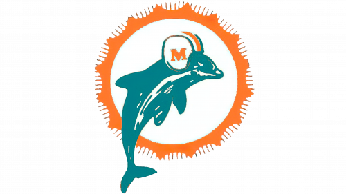
The first iteration of the Miami Dolphins logo was released for the team’s first season in 1966. It features a leaping dolphin, wearing a football helmet in front of a wavy orange circle meant to depict the bright Miami sun.
The image of the sun had a number of thin lines emerging from all around the outline, and were meant to depict the rays of the sun. The dolphin was colored in bright shades of turquoise color, and the shade of orange used was light and bright.
First Dolphins Logo Redesign 1974
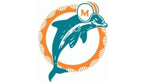
The first logo redesign was seen in 1974, nearly a decade later. The old Dolphins logo was refined slightly, and the image of the dolphin was increased in size. The helmet was now more distinct, and clearly featured the team’s monogram.
Even the lines of the blazing sun were refined, making the overall logo look quite attractive.
Second Miami Dolphins Logo Redesign (1989 – 1997)
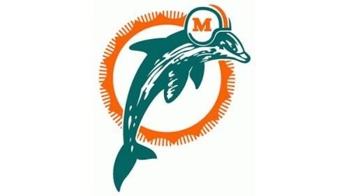
The 1989 redesign featured a few subtle changes. The shades of teal color and orange were both darkened a few levels, making them deeper and darker. The blue had overtones of green in it, and the font for the logomark was changed as well, using a bolder typeface now.
The New Iteration of the Old Dolphins Logo (1997 – 2013)
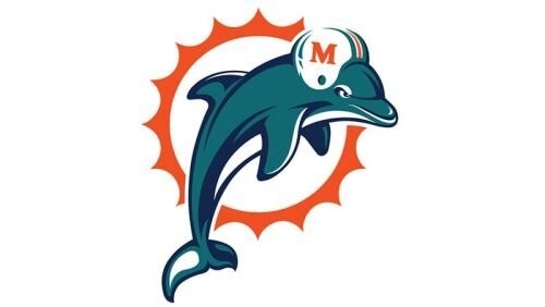
The 1997 redesign of the Dolphins logo bought with it some massive changes to the Miami Dolphins new logo. the design of the dolphin was quite different, and leaned more towards a cartoon-style animation then the previous iterations.
Similar to the design aesthetics of other NFL team symbols like the Chicago Bears logo, the lines of the dolphin as well as the sun were refined and smoothed out. The image was also accented better, adding a layer of depth which was missing before.
Moreover, in an effort to be a minimalist as was common in the late 1990s, the design of the sun removed all the thin lines meant to depict the sun rays.
Fourth Redesign of the Miami Dolphins Logo (2013 – 2021)
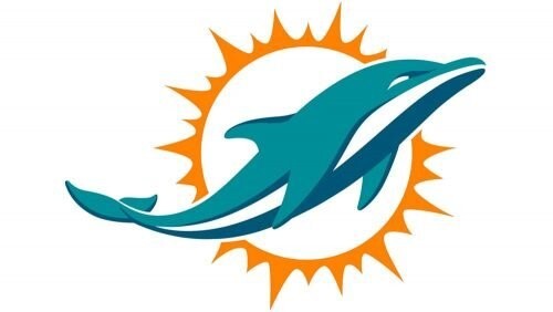
2013 saw the club being rebranded, and the old Dolphins logo saw another drastic change. Now, the Miami Dolphins logo featured a leaping dolphin, yet the design was made less cartoon-like. The contours and the lines of the image were cleaned up even more, and the image of the sun and the dolphin were given additional design details to make them stand out.
Also, gone was the helmet on top of the dolphin’s head. Moreover, a few of the sun’s rays were elongated and made sharper, making the design less symmetric, yet somehow more realistic.
Miami Dolphins New Logo (2021 – Present)
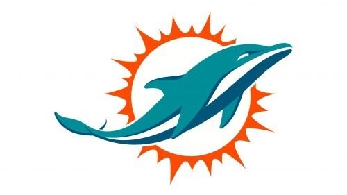
In 2018, the color palette for the 2013 redesign was revamped. And within that, the only shade to change its was the orange. The new color scheme featured a darker hue from shades of orange color, and was meant to make the logo look sharper, deeper, and stronger. That makes the logo design pop out even mora than before.
Miami Dolphins Logo History and Evolution of the Wordmark
Over the years, the accompanying wordmark for the Miami Dolphins logo has also been revamped several times with the changing aesthetic. Let’s take a look at the evolution of these wordmark logos through the years.
Old Dolphins Logo Wordmark (1980 – 1997)

The initial Miami Dolphins logo wordmark was released in 1980, and featured a curvy design spelling the team’s name and mimicking flowing water. The color was a simple aquamarine the same as the team’s primary logo at the time. the design of the text was made to mimic three dimensional characters, adding depth to the logo.
Miami Dolphins Logo Wordmark Redesign (1997 – 2009)
The new design featured cleaner lines compared to the old Dolphins logo wordmark, with the addition of the color orange into the wordmark. The new logo featured the name of the team in a slightly thinner version of the original design, with the shadows depicted in orange. The area below the name featured the word Miami in small, blue letter, and the right side of the design featured the outline of a blazing sun.
Second Dolphins Logo Wordmark Redesign (2009 – 2013)
2009 saw a minimalistic redesign to the old Dolphins logo wordmark. Now the accents were subtle, and the image of the sun, as well as the name of their home city was removed from the logo. However, nothing else was modified in the design.
The Old Dolphins Logo Wordmark (2013 – 2016)

Next, the version of the wordmark used from 2013 to 2016 featured a simple design with sans serif fonts that featured the name of the team in white and orange, over an aquamarine background. This simple design pairs well with the current design aesthetic of the primary Miami Dolphins logo.
The New Miami Dolphins Logo (2016 – Present)

The Miami Dolphins revealed a new version of their wordmark that streamlined the design from the previous one to make it more pleasing, as well more legible. The color scheme is similar to the old one with the exception of the team name, which was now colored in shades of aquamarine color. Moreover the design now features greater accent outlines for better readability.
Miami Dolphins Logo History for Various Anniversaries
Let’s take a look at a few of the commemorative Miami Dolphins logos we have seen over the years. From the old Dolphins logo from the 25th Anniversary in 1990, to the 40th Anniversary Dolphins logo from 2005, let’s dive in and explore them.
1990 Anniversary Dolphins Logo
The 25th anniversary Dolphins logo features a simple aqua and silver color palette, with an orange outline. It celebrated the team’s 25 years playing the sport.
1997 Anniversary Miami Dolphins Logo

The 1997 commemorative logo represented the 25 years of the Miami Dolphins logo history and team spent as part of the National Football League. This came a few years after their introduction to the world of professional football, which they began as part of the AFL.
2002 Anniversary Logo for the Miami Dolphins
2002’s commemorative Miami Dolphins logo featured a simple aqua and orange color palette. the design was in the form of a shield, with the team’s primary logo featured in the middle of the image. This was incidentally, also the perfect season for which they still hold a record.
2005 Anniversary Miami Dolphins Logo
Celebrating 40 years in the sport in 2005, the team released a new shield design of the Miami Dolphins logo using its iconic color scheme of that time. The green tinged blue color filled the entire design, while the logo was outlined in thin bands of white and orange.
Old Dolphins Logo Vs. Miami Dolphins’ New Logo – Was the Redesign Worth it?
The new and old Dolphins logos represented the team’s aesthetic perfectly. As the imagery and even the color scheme has remained quite similar in the nearly 7 decades of playing the sports, we cannot say that one design was better than the other.
However, the team’s decision to revamp the logo, similar to the 49ers logo, as design trends changed has been a great decision as far as the franchise’s branding goes. That is why we are of the opinion that redesigning the logo was a great decision.
Frequently Asked Questions
| 1- When did Miami Dolphins change their logo? They changed their primary logo in 1974 the first time. Over the years, their logo has changed multiple times. |
| 2- Why did the Miami Dolphins change their logo? They modified their logo to cater to the changing design trends over the decades. |
Conclusion
Now that you know the evolution of the Miami Dolphins logo, what do you think? Was it a good decision to change their brand symbol over the years?
If you want a great logo designed for your sports team, we can help you do that. Our designers are experts at creating iconic designs that perfectly portray your team’s ideals.

Logopoppin
Logopoppin is a graphic design agency that specializes in logo designing, web development, video production and advanced branding services. We love to innovate businesses with new age technologies, allowing them to improve their visual reputation.

