Table of Content
Learn How Miami Heat Logo Became a Popular Basketball Symbol
Miami Heat is one of those names that doesn’t need any introduction. It is a team that has dominated the NBA circuit from the start of 2000s, showcasing real prowess and supremacy in the court. That is the reason why Miami Heat logo has become extensively popular among the fans. The message evident from the design of this logo is quite clear. Created by professional logo design services, it refers to bring fire to the court by deploying aggressive and bold tactics. This concept also fits well with Heat’s identity, as the club has always emphasized on daring gameplay.
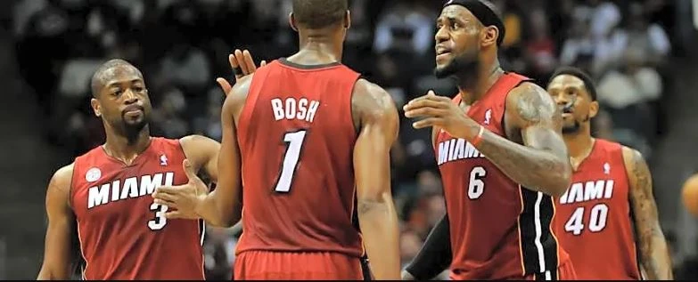
Talking about the achievement of Miami Heat, it is indeed a highly successful team with 3 major championship titles. The team plays in the Eastern Conference of the NBA that is already packed with many competitive names. Over the years, Heat has produced many stars that have lit up the NBA circuit with thrilling performances. It includes many notable names such as Tim Hardaway, Jimmy Butler and more others.
If you want to know about the complete history of Miami Heat logo, read this article in detail. It will let you know how the iconic symbol of this team evolved and became popular in the US. Let’s start from the basics understanding the prominence of Miami Heat in the NBA circuit.
Miami Heat – A Strong Force Over the Years

The Miami Heat has remained a strong force in the NBA through a combination of shrewd front office leadership, a strong organizational culture, and consistent talent development. Since its establishment in 1988, the franchise has been guided by visionary leadership, particularly under team president Pat Riley. Riley’s ability to attract marquee talent helped the Heat quickly transition into championship contenders. His experience and influence have provided the franchise with long-term strategic direction, allowing it to stay competitive even through transitional periods.
A defining characteristic of the Heat’s sustained success is its well-known “Heat Culture”. Head coach embodies this culture and has earned widespread respect for his ability to adapt and succeed with varying rosters. This culture fosters a winning mindset that extends beyond just star players to the entire team, including role players and undrafted talent. As a result, the Heat often outperform expectations, especially in high-pressure playoff situations.
Meanwhile, the Heat’s emphasis on player development and scouting has helped them stay relevant even without top draft picks. The franchise has consistently identified and nurtured undervalued talent. Their ability to mold these players into key contributors is a testament to their development system. By combining elite coaching, front-office acumen, and a deeply ingrained culture of excellence, the Miami Heat has maintained its status as a formidable force in the NBA over the years.
History of Miami Heat Logo
The history of Miami Heat logo is not that diverse, as the team has not changed its emblem rapidly like other NBA logos. Still, there are some modifications made in the style and color scheme of the logo. If you want to know all about Heat’s logo, take a look at the information given below.
Miami Heat Logo: 1988

The Miami Heat’s original logo, unveiled in 1988 during the team’s inaugural season, established a bold and energetic identity that reflected the franchise’s name and character. Central to the design was a basketball depicted in shades of gradient orange, stylized to resemble a flaming ball of fire. This creative choice gave the logo a dynamic, almost motion-filled appearance, symbolizing both the heat of Miami and the fast-paced intensity of basketball. The use of fiery elements immediately set the team apart visually from other franchises at the time.
Above the flaming basketball, a solid black ring was illustrated, giving the impression that the ball was being thrust through a hoop in the midst of being set ablaze. This dramatic image conveyed a sense of power and momentum, emphasizing the action-packed nature of the sport. The contrasting black ring served as a strong visual anchor that balanced the brightness of the flame and added depth to the logo. The effect was both striking and memorable, giving the new team an instantly recognizable emblem.
Beneath this imagery, the team’s name was displayed in an elegant, bold NBA fonts. The choice of typography further communicated the team’s bold entrance into the league and added a modern, stylish finish to the overall logo. Altogether, the original Miami Heat logo combined symbolism, color, and typography to present a powerful and distinctive visual identity that laid the foundation for the team’s brand for years to come.
Miami Heat Logo: 1999 – Today

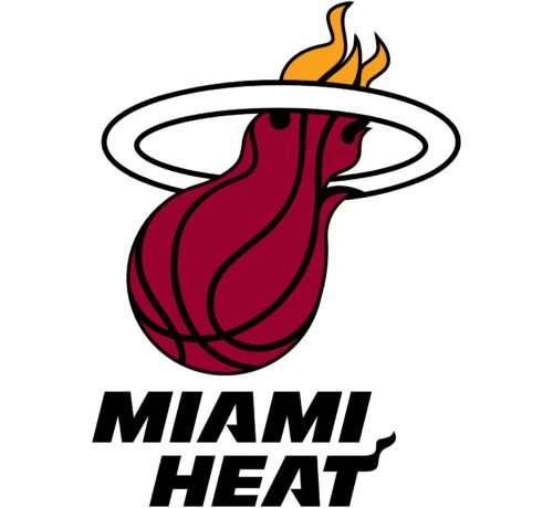
In 1999, the Miami Heat introduced the only official redesign of their logo. The update preserved the essential visual elements that fans had come to associate with the team, most notably the flaming basketball passing through a hoop. This decision reflected the franchise’s desire to maintain continuity in its brand identity while also adapting to the evolving aesthetics of modern sports design. The core composition remained intact, ensuring the logo would still be instantly recognizable.
One of the most noticeable changes in the redesign was the transformation of the basketball flame. The curves of the flame were reworked to appear more fluid and stylized, giving the image a sleeker and more contemporary feel. These enhancements added a greater sense of motion and intensity, making the flame appear more dynamic and lifelike. The stylization emphasized the idea of controlled energy and precision, aligning with the team’s competitive spirit and disciplined performance on the court.
Another significant update was related to the color combination of the logo. This change gave the emblem a more mature and powerful visual presence. The darker hues added depth and contrast, making the design stand out more prominently across a variety of backgrounds, from merchandise to digital platforms. By refining its color and form, the 1999 redesign helped the Miami Heat logo evolve with the times while preserving the fierce, fiery essence that had defined the team’s image from the beginning.
Frequently Asked Questions
| Why Miami Heat is popular in the US? Miami Heat is popular in the U.S. due to its championship success, iconic players and a strong, hardworking team culture. The franchise’s exciting playstyle and loyal fanbase also contribute to its national appeal. |
| How many titles Miami Heat has won? The Miami Heat has won three NBA championships: in 2006, 2012, and 2013. These titles solidified the team’s reputation as one of the league’s premier franchises. |
| What is the color of Miami Heat logo? The Miami Heat logo features a fiery basketball in red, orange, and yellow tones. The accompanying text is typically displayed in black, white, or red, depending on the background. |
Final Words
That concludes our complete blog in which we have discussed how the Miami Heat logo became a strong force in the NBA circuit. It is one of those emblems that is known to every basketball follower in the US. Over the years, the logo has built a strong reputation in the market, which is why the branding of team has become quite popular. This is also a key reason why the logo didn’t experienced much changes during all these years. It has certainly built a strong identity, which basically compelled the club to keep its core design intact and unchanged.

Logopoppin
Logopoppin is a graphic design agency that specializes in logo designing, web development, video production and advanced branding services. We love to innovate businesses with new age technologies, allowing them to improve their visual reputation.


