Table of Content
A Brief Look into the MLB Logo and All Baseball Team Logos in the Major League
When it comes to baseball, the name of MLB always stands tall in the world. As one of the biggest and most successful sports leagues in the world, it has an estimated worth of more than US$50 billion. Moreover, it is the oldest of the American Big-Four sports leagues, outdating even the NFL. Today, the MLB logo represents one of the highest paid sports association in the world.
Baseball has a long and rich history in the United States. Known as “America’s favorite pastime”, there were baseball leagues as early as the end of the 19th century. Today, despite football eclipsing baseball in terms of viewership and even revenue, baseball still holds a special place in the hearts of the people.
If you love visiting the ballpark with the sun at your back, a hotdog and a plastic cup of cold beer in your hand, you might have wondered how the top baseball team logos and names came to be. So, let’s dive in and take a look at the various symbols used by MLB’s teams, and discover how the use of professional logo design services helped them achieve that level of attraction.
A Look at the MLB Logo and the League it Represents
The history of Major League Baseball (MLB) is a long one, but it is a great read. The League that we know today has evolved drastically since its inception. And despite the ups and downs it has experienced in its nearly a century and a half tenure, the MLB is still going strong. In fact, its long period of operation is testament to why baseball is known as “America’s favorite pastime”.
The baseball teams associated with MLB have seen many modifications throughout their lives, from logos to their uniforms, and more. the various baseball team logos we see used by the teams today are a result of a constant improvement that these franchises perform on their branding elements. But do you know when and how the Major League Baseball started out?
Let’s dive into the history of the league through the different ages.
The Founding of Major League Baseball – The Highest Ranked Baseball League in the US
The League’s formation goes back to the late 19th century, into the 1860s. It was a turbulent time when America was facing a massive civil war and new soldiers were getting continuously recruited in the army. Some of these new soldiers who came from the north’s urban areas, brought a specific New York-popular game with them to the Union army. Thus, the sport came to into the establishment’s notice.
From there, the sport got more fame among the army, and eventually, at the national level. And after the war, when these Union soldiers went back home, they took the knowledge and excitement for the game with them. After forming an official governing body called the National Association of Baseball Players (NABBP), the game started to expand in different regions of the United States. People began to show more interest in this sport once it steadily came down near their regions.
The NABBP remained in operation for about twelve years before disbanding. In 1869, the first glimpse of the MLB was seen when the Cincinnati Red Stockings was established as a professional baseball club. Back at that time, most club members were playing as amateurs which is why the founding of Red Stockings as a professional club was a big deal.
Meanwhile in 1876, the National League of Professional Baseball Clubs (later known as National League) was established. The first game of the NL is often considered as the beginning of MLB, as it later allowed more clubs to join the league.
The Dead-Ball Era and the Decline in Professional Baseball’s Popularity
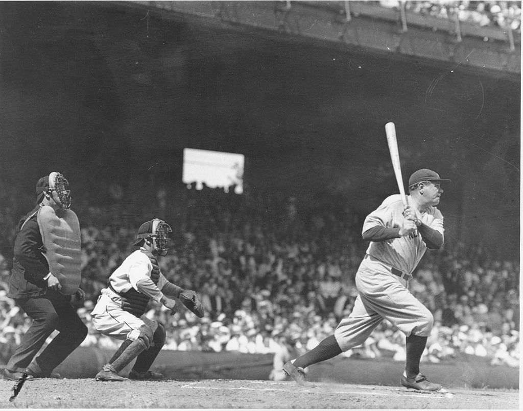
Moving on to the start of the 20th century, the game of baseball suddenly started to lose attention. The reason was very clear. It was basically the time when the games in baseball were low-scoring. Most of the time, they were dominated by the pitchers, hence the audience already knew the results. Although some matches went the other way, but the majority among them followed the same practice.
This particular era was therefore called the Dead-ball Era. It was rightly named after seeing the lack of creativity or unorthodox style of play in the matches. This term also fits best for the style of ball used during that time. Unlike the modern Australian wool yarn, the baseball used American stuff which is why its quality was not that good enough.
The usage of these poor balls often affected the style of play. Despite having the full arm power, the shots were not good enough to travel long distances. Also, these balls were kept in the play until they became fully damaged. There are a lot of reasons why the balls were not frequently changed, in which pricing was one of the biggest factors.
Meanwhile, the use of spitballs was also very common during that time. According to today’s baseball rules and regulations, spitball is totally prohibited. It is basically a practice that allows players to change the state of balls by using any external substance. It affects the performance of the ball, causing it to move in an atypical manner.
In simple words, all of these things contributed to making the style of play poor during that era. It was starting to get the label of a boring game after these tactics, as people were getting frustrated after seeing the same type of matches.
End of the First World War and the Revival of Baseball in the United States
Once the rules of the game started to change in the 1920s, the style of play also became better. This allowed the baseball sports to grow once again in America. Especially after the events of W, people started to come back towards their favorite national game that allowed MLB to grow rapidly World War II with leaps and bounds.
It was also the time when other professional franchises were entering into the competition of MLB. This precisely gave a huge boost to the reputation of the league, allowing it to gain more attention. The followership of the league also increased due to this very reason. It gave prominence to the name of baseball in America, enabling it to stand in the line of other popular sports.
Meanwhile, another thing that enhanced the popularity of MLB during that time was the appearance of the New York Yankees into the highly reputable World Series. The team precisely did well after appearing in 11 World Series and winning 8 out of them. It gave prominence to the baseball circuit of America, letting everyone know about its other gems playing in the country.
This perfectly set up the coming years of glory for MLB in the world. All the franchises doubled up their branding efforts to gain more attention in the market. Meanwhile, the mega rise of sports culture in America also played its part in the popularity of MLB. The youngsters specifically became crazy about baseball which eventually started its great followership trend in the United States.
The MLB Leagues and the Division of Teams Among Them
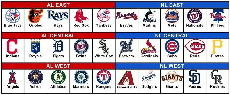
The division of teams in Major League Baseball (MLB) is done on the basis of two different separate leagues i.e. National League (NL) and American League (AL). As of 2024, the total number of teams that play in these two leagues are 30. This means that both the National League and the American League consists of 15 teams each, further divided into three divisions; East, Central, and West.
The National League was formed in 1876, while the American League was introduced in 1901. Up until the end of the 20th century, both of these leagues operated as separate entities in the baseball circuit while still signing the National Agreement.
But, with the start of 2000s, they were officially merged into a single league led by the Commissioner of Major League Baseball. Since then, both of them are part of MLB, offering a thrilling level of gameplay to the baseball crazy American audience.
Let’s look into these leagues with more details below.
National League
The National League was founded on February 2, 1876 to replace the outgoing National Association of Professional Baseball Players (NAPBBP). It is also called one of the oldest extant professional team sports leagues in the world. That is why it has got a very crucial historical value as compared to the other US tournaments. The prestige and status of the National League is comparable to none, giving it an elusive presence in the market.
Due to having elite level teams in the competition, the National League is also called the “Senior Circuit” in the MLB. The high market value and status of players involved in the teams from the NL perfectly justifies this tag. Many people often refer to the National League by this name, precisely because they know its connection with the high profile baseball players.
Speaking about the divisions in the National League, the teams are divided into three divisions based on their geographical regions, with each division having five teams each. A team can belong to either the East, West, or Central division. The ratio of five teams per division allows for a balanced competition between each league before moving towards the World Series.
Meanwhile, due to adopting conventional yet strong rules, NL is also often called the “traditional” or “pure” league. For instance, the league did not embrace the designated hitter rule to make the gameplay interesting for everyone. In contrast, the American League (AL) has approved it long ago to bring some changes in their style.
Besides playing the group and intra-league games, the teams of NL also play some matches with their AL counterparts. This makes the competition interesting, attracting a wider range of fans across the US.
American League
The American League is the second half of the MLB. It was founded in 1901 to accommodate some of the amateur baseball teams in the US that were not able to compete in the National League. That is why the American League was often referred to as the “Junior Circuit”.
Talking about the structure, the seasonal champion of AL plays against its counterpart in the NL for the World Series title. This brings a very interesting clash for the fans who wait eagerly to see which league has the upper hand. This particular match attracts a lot of audience, as well as a investment from the advertisers and sponsors.
The categorization of teams in AL is done similarly to the groups in NL. The teams are divided into three divisions; East, West, and Central. Each of them have five teams perfectly placed according to their gameplay balance. Their stunning group clashes are worth watching, as they always provide close matches on the ground.
To date, the New York Yankees have remained the most successful baseball franchise in the American League. Over the years, they have won 40 AL titles, establishing their pure dominance in the field. In not only the AL, but the New York Yankees have also shown their prominence in the World Series. Since 1903, they have won around 27 major World Series titles. This displays their stunning legacy and shows why they are termed as the most successful AL franchise.
The Baseball Team Logos and Names from the National League East
The National League East consists of five teams from a total of fifteen in the League. And as most of the National League teams have better stats overall in the sport, it is often said that the teams involved in the National League (NL) are more consistent and better in performance. The famous tag of “Seniors Circuit” is therefore derived for them, as they are more competitive as compared to American League (AL) teams.
Let’s take a brief look at the teams that make up NL’s East division to find out their achievements and historical value in detail.
Atlanta Braves
Atlanta Braves is a renowned professional baseball team of MLB. It was established in 1871 after the proper formation of the National Association of Professional Baseball Players (NAPBBP). This gives them an elusive title of one of the oldest franchises operative in the MLB. They have provided a platform to many inspiring Atlanta players in the field of baseball which eventually made careers of many.
The team is placed in the east division of Major League Baseball, grouping up with some other known franchises. Historically, they have remained an important part of this group. The players associated with Atlanta Braves are always rated among the top professionals. That is what makes this franchise a very special outfit to watch, as they play collectively and smartly to outclass others.
The Braves are also termed the only MLB side that has won World Series titles in three different home cities. Indeed this very elusive record makes the prominence of the Braves even better among others.
Talking about the branding, Atlanta Braves have always chosen to represent themselves creatively. Just like different NFL logos, the current emblem of the team is a perfect example of that. It looks quite stylish as well as bold in looks, offering a stunning franchise representation. Although the Atlanta Braves have sported a variety of baseball team logo over the years, their core theme and identity has remained the same. Currently, it consists of a beautiful typography that perfectly gives the whole MLB logo an alluring look.
Miami Marlins
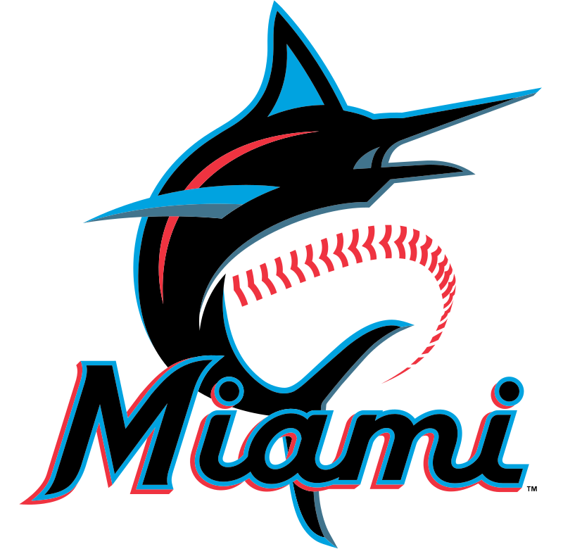
Miami Marlins is a reputed name in the competitive American sports circuit of Baseball. As the name suggests, the franchise is based in Miami and their home ground is Loan Depot Park. The operations of the franchise started in 1993, when it was first formed under the name of Florida Marlins. This name was attached with the franchise for a few years, until they decided to change it in 2012.
Looking at the history of this franchise, you will get a mixed feeling about their performance. They have not won consecutively in the tournaments, but have always shown their stunning glimpses of extravagant baseball talent. Going by the big accolades, the Miami Marlins have just won two World Series in 1997 and 2003. Both of these titles were followed by a little bit of uncertain periods in which the franchise was going through a dire bad patch.
Talking about branding, the franchise has used different types of logos and uniforms from time to time. They have smartly followed the trends to bring changes in their style. Especially after getting renamed as Miami Marlins in 2012, the team’s outfit and branding practices took a stunning turn.
The franchise introduced a completely new color combination, having orange, black and blue as their mainstays. This really gave their baseball team logos a new look, refreshing the color theme of the franchise. Recently, they have also updated this theme by introducing orange and silver with Caliente red, blue and slate gray. Their home and away uniforms are also a bit different, offering a smart sense of creativity in the design.
New York Mets
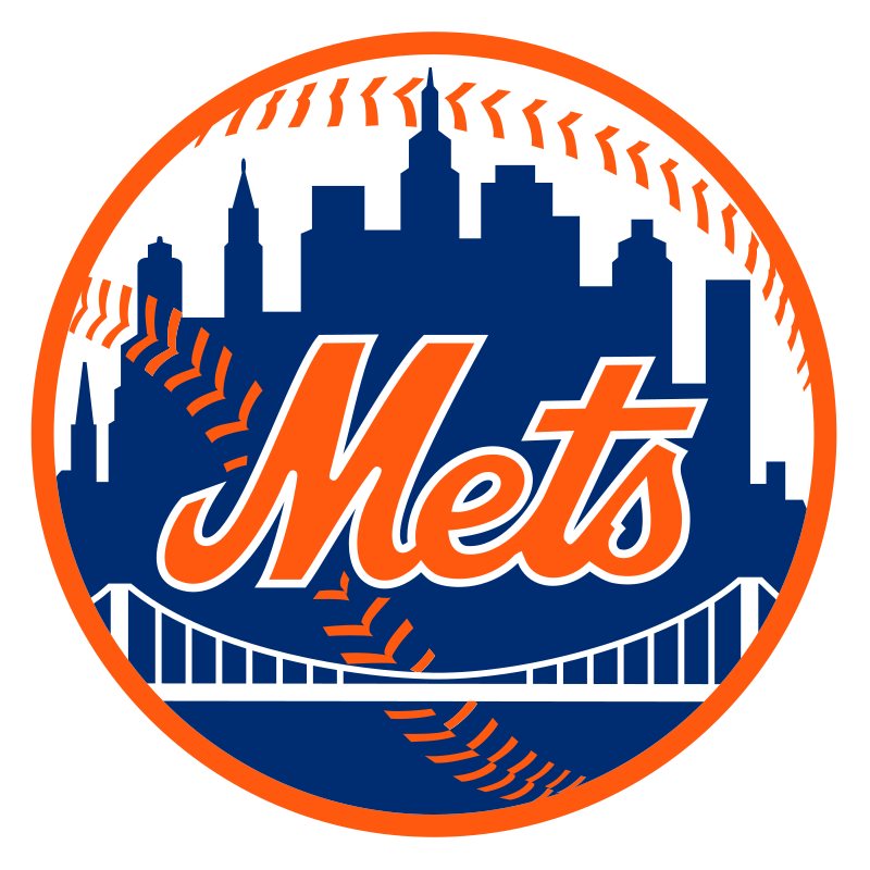
New York Mets is one of the more renowned baseball team logos and names in the circuit of American professional baseball. They compete in the MLB from the East division having Phillies, Marlins, Braves and Nationals in the group. This makes their group highly competitive and one to watch for in every MLB season. As a baseball fan, you can never dislike the gameplay or tactics of the Mets. They have always remained pretty smart in strategizing the game according to the situation and requirements.
They are also one of those two teams that are listed in the MLB playing from New York. Besides them, the famous New York Yankees from the American League (AL) are the other NY based teams in the league.
So, the New Yorkers who precisely follow the National League, support the New York Mets in every season. Their relevance with the great NY city gives them a strong supporter base. This provides them a huge motivation to do better in the league and perfectly make a name for their franchise.
Talking about achievements, the miraculous win of the Mets in 1969 over the Baltimore Orioles is always worth remembering. This was a very nervy and incredible match that gave them their first World Series title. It can be definitely said that this win gave them a prominence in the field of Baseball. They utilized it to perfection to grow more and win the second World Series title in 1986. Other than that, the Mets have also won five National League Pennants, in which their recent achievement came in 2015.
Philadelphia Phillies
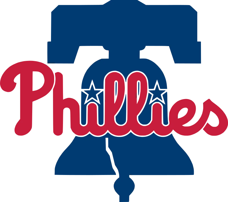
Philadelphia Phillies are also listed among the oldest sports franchises in America. The franchise was formed in 1883 after the establishment of the National Association of Professional Baseball Players (NAPBBP). It was the time when there were only a few professional sports clubs operating in the circuit. The Phillies became one of them when it joined the forces with Braves, Chicago Cubs and more others.
Since the inception, the franchise has remained a prominent name in the circuit of American baseball. It was first established with the name of Philadelphia Quakers that was later changed to Phillies in 1883. At first, people didn’t get the idea of it because they were more comfortable with Quakers. However, once the team started to win competitions, it automatically came into the limelight. This gave their new baseball team logo a prominence in the market, allowing them to gain attention from the people.
The major achievement of the team came in 1915 when it comprehensively won the first pennant with their stunning batting prowess. They finished the long season with a cumulative record of 90-62, outclassing all other teams in the tournament. This gave them a great motivation to continue the momentum in the second season of the National League. Though they dominated most part of the tournament, but just fell short in the finals which eventually restricted them to grab the second consecutive pennant.
Speaking about current times, the Philadelphia Phillies enjoyed the illustrious golden era between 2006 and 2012. It conquered various titles during these years, establishing its name as a top MLB franchise. The team also won the National League east division title in 2007, taking its name further on top of the charts.
Washington Nationals
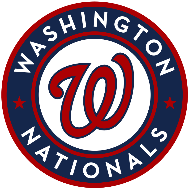
Washington Nationals are also a popular MLB franchise based in the heart of Washington, D.C. They belong from the east division and are known because of their aggressive gameplay. The team have long followed this style of game play to become unique among others. Though they found a lot of hard time while playing with this style, but it eventually helped them to build a profound name for themselves.
The early years of the team weren’t that good enough as it should be. The team was founded in 1969 with a different set of name i.e. Montreal Expos. It was based on a four team expansion plan that later also failed in the process. The team was then purchased by MLB and was relocated to Washington where it got the new name.
The reason behind picking Nationals was to bring a flare of patriotism in the team. It allowed the fans to support and rally behind them in the games, giving their confidence a great boost to achieve better results. Starting from 2010, the team showed great signs of improvement. They secured their first playoffs and division title in 2012. This followed up with better performances, as the team comprehensively took the titles of National League East in 2014, 2016 and 2017.
Later in 2019, the Nationals again showcased their resilience. They advanced to the World Series where they defeated the Houston Astros in seven games to claim their first championship title. This precisely shows the rapid rate of improvement in the Washington Nationals, that too in all sorts of departments.
Their logo is one of the more interesting red logos in the MLB. The curling shape of the logo makes it one of the very few baseball team logos that can work with a modern or vintage aesthetic.
Baseball Team Logos and Names from National League Central
The National League’s Central division also consists of five teams, hailing from areas such as Chicago and Pittsburgh. Let’s take a look at some amazing baseball team logos and histories of the franchises that make up the NL’s Central division.
Chicago Cubs
The Chicago Cubs is one of the oldest American baseball franchises known in the world. They were also the first team alongside Cincinnati Red Stockings to be founded in the 1870s. Before their formation, baseball was an amateur sport and there were no professional teams present in the market. Chicago Cubs ensured to build a presence of professional level baseball teams in America. That is what gives them a great historical value and an iconic name among others.
At the start, the team was not founded with the name of Chicago Cubs. Instead, it was first known as White Stockings. In 1890, the team adopted a new name of Chicago Colts to give their branding a new touch. During this period, they were also known as “Anson’s Colts”, referring to the vast influence of Captain Anson on the team.
From 1902, the club transitioned into the new era, changing its name to the Chicago Cubs. It was literally the start of something extraordinary as the team started to sweep titles across different championships. Because of their spectacular record, the team of Cubs during that time is said to be legendary. Their winning streak is still regarded the best in the history of Cubs, allowing them to leave a major legacy.
Speaking about today, the franchise has also won the National League Championship in 2016. Besides that, they have also won the World Series in the same year, establishing their dominance in the American circuit. Apart from getting on-field praise, the team is also popular due to its other activities including modernistic branding, which includes one of the more geometrically symmetrical baseball team logos on the current MLB roster.
Cincinnati Reds
When it comes to list down teams that have got the oldest roots in the field of professional American baseball, Cincinnati Reds will always come on top of the charts. It was founded way back in 1869 with the name of Cincinnati Red Stockings. This was basically the time when professional level baseball in America was emerging steadily. The Reds along with Cubs and Braves, precisely founded the roots of this emergence.
The club was also one of the first members of the National League (NL) when it was newly formed in 1876. However, due to some non-ethical circumstances, the club was expelled from the League in 1880. Serving the penalty and expulsion period, the club came back into the NL in 1890 when other professional baseball teams were also emerging in the circuit.
Starting from 1910, the club came back to its winning ways when it precisely won multiple titles in America. Their major achievement came in 1919 when the team comprehensively won the World Series by defeating the Chicago White Sox in the finals. This gave the Reds a new era of dominance. They flawlessly showed great prominence in the field by regularly sweeping different major titles.
Today, the team is still leading the MLB circuit, which is why it has got a vast followership in America. The branding of this historical club is also done wisely to keep this fan base interacted. Their iconic ‘Reds’ is a fine example of that, showcasing their great historical identity in the MLB circuit.
One of the cool baseball team logos on this list, the logo has a striking similarity to the previous Chicago Bears logo of the NFL with its wishbone-C shape. However, as the Bears have a different logo now, that doesn’t matter.
Milwaukee Brewers
Milwaukee Brewers is a famous MLB franchise based in the city of Milwaukee, Wisconsin. They are part of the central division in the National League, grouped with other big names like St. Louis Cardinals, Pittsburgh Pirates, Chicago Cubs and Cincinnati Reds. Due to their strong association with the city’s brewing industry, they are given the name Milwaukee Brewers.
Unlike other MLB franchises, they do not have a long history dating back to hundred years. Instead, the club was founded in 1969 with the name of Seattle Pilots. After just one season in the American League, the team was relocated to Milwaukee. This precisely made their way to represent the city as its official franchise and later named as Milwaukee Brewers.
In 1998, the Brewers switched to the National League. This made them only one of those two elusive teams in America that have successfully switched their leagues. The other one is the Houston Astros which has also done the same thing after playing in the NL for 51 seasons.
When it comes to branding, Milwaukee Brewers is indeed very active in this domain. In 2019, the franchise published a unique “Glove Story” comprising a series of videos. The primary reason behind this was to promote the new branding of the team, as well as showcase its culture to the audience. This series got incredible attention from the fans and they appreciated all the work done behind it.
The centerpiece of this new branding theme was indeed their famous MLB logo, which is our opinion is one of the best baseball team logos currently used in the League. It was redesigned with a stunning concept of “ball-in-glove” illustrated logo that was really very spectacular. The theme used in it was not much changed, except for replacing a few old color shades with the new ones.
Pittsburgh Pirates

Pittsburgh Pirates have long remained a dominant name in the field of professional American baseball. This team enjoys the reputation of a historical MLB club, as it was founded way back in 1881. Earlier, it was formed as a part of the American Association having the name of Pittsburgh Allegheny. After seeing its tremendous rise, the club was officially integrated into the National League in 1887.
The club remained in the east division from 1969 to 1993. It conquered many titles and tournaments during the period, establishing a perfect dominance in the ease circuit. Notably the pirates have won five World Series titles and National League Pennants. These accolades precisely show the true worth of this franchise and why people enthusiastically follow them.
Currently, the Pittsburgh Pirates are in the central division. Their rivalry with Cincinnati Reds brings the mouthpiece clash of the group. Supporters and fans of both the teams really enjoy their matchups, as they are equally balanced teams. Besides Reds, the Pirates also have a long rivalry with Phillies, but that matchup often happens due to the change in divisions.
The official uniform and famous MLB logo of Pirates has changed quite a lot over the years. Sporting one of the simplest baseball team logos, this was done precisely to evolve with the trends and keep the identity of the franchise fresh. Currently, their monogram logo design just represents “P” designed with a creative typography. It is very evident on their shirts as well as their caps. The team often changes its style and colors for the merch, but most of it remains the same for the official events.
St. Louis Cardinals
Hailing from St.Louis, this franchise is one of the best performing teams in the history of Major League Baseball. They have always ranked on top of the charts due to their astounding winning rate. Till to date, St. Louis Cardinals have won 11 World Series Championships which is termed most by any NL team. Alongside that, they have also won 19 National League Pennants and 14 division titles while playing from the East and Central division.
All of this precisely shows the sheer domination of St. Louis Cardinals in the circuit of professional American baseball. The players associated with this franchise are always rated best because of their stunning gameplay style. This gives them a wide followership not only in St. Louis, but across all the United States.
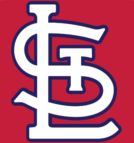
Talking about the rivalry, the Cardinals have always enjoyed their matchup with the Chicago Cubs. It is a historical rivalry that goes back to the early time of 1892. Since then, both of these teams have met quite regularly in the central division, offering a tremendous level of competition to each other. Most of the time, the Cardinals have come on top of this matchup. Their incredible skills and knowledge of the game have allowed them to get an upper hand on the Cubs, comprehensively with big scores.
Both of their baseball team logos, including the cap insignia, sport interesting designs that are a treat to look at. Overall, the team’s branding has a great aesthetic to it.
The Baseball Team Logos and Names from National League West
Just like East and Central, the National Leagues’ West division too has five of the MLB’s top teams on its roster. Let’s dive in and take a look at these cool baseball team logos and see what makes them so amazing.
Arizona Diamondbacks
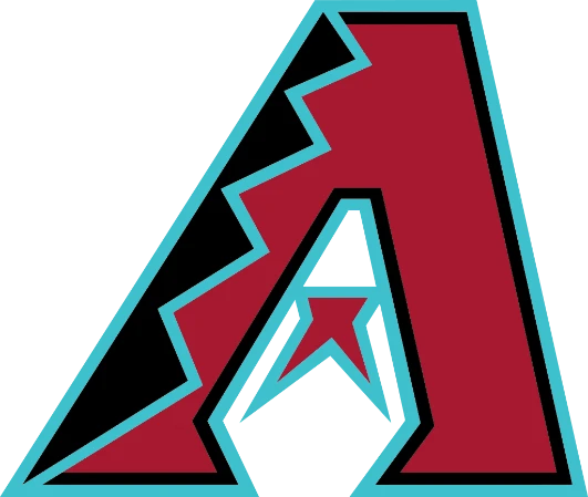
The Arizona Diamondbacks are placed in the west division of the National League. They are mostly called as D-Backs as it is one of their famous tags recognized by the fans. The franchise was established in 1998 as an expansion team. At the start, they didn’t get much support because of being new in the circuit. But once they got onto the winning ways, their followership steadily started to increase, giving the team a good recognition in the market.
The baseball franchise first got the limelight in 2001 when it surprisingly defeated the mighty New York Yankees in the World Series Championship. It was the time when Yankees were invincible and beating them was a big deal for any team. The D-backs perfectly spurred surprise by beating them in the finals, announcing their strong arrival in the baseball circuit.
Just like different NHL logos, the team sports one of the top baseball team logos done in an attractive style. The italicized “A” on their emblem looks very unique, allowing them to showcase a bold team identity. Similarly, the combination of standard gray and white uniforms gives them a decent presence. It is simple yet classy, giving their field presentation a neat look.
Colorado Rockies
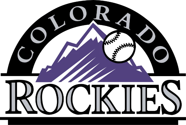
Based in Denver, Colorado Rockies is a professional baseball team playing in the west division of the National League. They began as an expansion team in 1993, in which they were allotted the Mile High Stadium to play their home games. The team quickly expanded its followership by winning games in a long streak. This gave their name a stunning prominence that eventually allowed them to grow more in the field.
In 2007, the club showcased its true potential to the baseball circuit. It gained the first National League pennant after winning 14 straight games in the tournament. It helped them to secure a Wild Card position that perfectly illustrated their high class game. This achievement proved to be their stepping stone for the coming future triumphs. Not only fan following, but they gained a spectacular reputation in the market of being the fastest growing expansion team in NL.
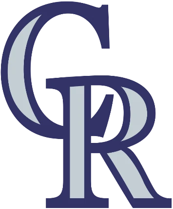
Besides the on field game, the team also pays high attention to its branding identity. Their creative “CR” vintage logo design is a perfect example of that. It is smartly crafted in an overlapped style, enhancing the creativity of the overall emblem. The color combination used in their famous MLB logo looks adequately similar to their uniform colors. It looks quite good and decent, perfectly representing their team aesthetic via one of the most understated baseball team logos.
Los Angeles Dodgers
The Los Angeles Dodgers have always remained on the forefront of Major League Baseball. Their great history in this sport is the one reason why they are heavily popular among the fans. They are currently placed in the west division of the National League, teaming up with D-backs, Rookies, Giants and Padres. This makes the overall group quite competitive in which Dodgers play a major role to outclass others.
Established in 1883 in the city of Brooklyn, the team was one of those few franchises that became part of the NL in 1890. They were first formed with the name of Brooklyn Bridegrooms which was later changed to Dodgers in 1932. They became highly popular in the circuit and developed a highly competitive rivalry with the New York Yankees in the mid-1950s. This was indeed an iconic clash and was highly popular with the name of the Dodgers-Yankees battle.
Today, the Dodgers are ranked among the top MLB franchises in America. They enjoy a large fan base not only because of on-field performance but also because of their creative branding practices. As per Forbes, the current total franchise value of Dodgers is estimated around $3.57 billion. This is certainly quite huge, providing a perfect example of their stunning value in the circuit.
Coming to their logo, it might be true that the interlinked letters of their cap insignia is more popular than any of the baseball team logos they have released over time, even more than their soaring ball symbol.
San Diego Padres
Founded in 1969, San Diego Padres gained popularity in the American baseball circuit right after its formation. They club became immensely famous in 1984 when it won the first National League pennant. After that, they didn’t get any major victory until 1998 when the team again won the prestigious NL pennant. This title reinstated their motivation and they came back to winning ways after its achievement.
The San Diego Padres is one of those two MLB teams that have originated from California state. The other one is Los Angeles Angels which is placed in the west division of American League (AL). This makes a very friendly rivalry between both of these teams whenever they meet in the inter-league matches. Fans enjoy this amazing clash by supporting their desired teams, perfectly by wearing the given merch.

The MLB logo of the franchise has changed quite a lot in the last few years. I was first introduced with the full name in brown color. The main idea of this logo remained the same despite having few changes until in 2015 when the emblem got completely changed. It consists of only two letters i.e. “SD” designed with overlapping. It looks decent as well as highly creative rightly as per the latest logo design trends.
San Francisco Giants
The birth history and origins of the San Francisco Giants is quite different as compared to other teams. It was founded in 1883 with the name of New York Gothams. This tag didn’t go well with the franchise and they decided to change it later. The team was then named the New York Giants which perfectly suited their overall theme.
After moving to San Francisco in 1958, the team was given the tag of San Francisco Giants. This marked the beginning of a fine era for them in which they started to claim different major titles. Their recent achievements came in the 2010s when they successfully won three World Series Championships in 2010, 2012 and 2014.
The franchise used these achievements to solidify their marketing value. Just like the famous NBA logos of top teams, people also recognize their logo as a symbol of domination in MLB. The team and their baseball team logos are highly rated by the fans, as well as by the adversaries they regularly face during the tournament.
All Baseball Team Logos from the American League East
Just like the National League’s East division, the American League’s East division too consists of five amazing major league baseball teams. Let’s dive in, explore these baseball team logos, and discover the secret to their success.
Baltimore Orioles
Baltimore Orioles was established in 1901 as one of the American League’s eight charter teams. It was first named as Milwaukee Brewers because of its formation in Milwaukee, Wisconsin. After moving to St. Louis in 1902, they were renamed as St. Louis Browns. The team kept this name for a very long time until they were purchased by a syndicate of leading Baltimore business.
This led the team to adopt the new name of Baltimore Orioles and enter into a new era of professional baseball. According to the stats and history records, the team found immense success from 1966 to 1983.
During this time, they appeared in 11 World Series games and successfully won three of them. This era literally saw the clear domination of the Baltimore Orioles, allowing them to establish a strong reputation.
Today, the franchise is still competing in the circuit with the similar stronghold. Though they haven’t won any major titles recently, but are precisely counted among the best contenders in the east division.
The Boston Red Sox don’t need any kind of introduction in the field of professional American baseball. It is highly regarded as one of the best teams ever to play the MLB league. They have won nine World Series titles successfully. The last one came in 2018 when they defeated the Los Angeles Dodgers in five games. This title reinforced their domination in the American baseball circuit, allowing them to get a strong repute.
Starting from 1901 when the team was established, they have remained a formidable force in the American baseball circuit. They won their first World Series title in 1903 and then four other tournaments by 1918.
This shows that the Boston Red Sox continued to be the force since its inception. Today, they are still competing in the MLB with the same motivation and fire. Their World Series win in 2018 reestablished this fact that they are still one of the best in the competition.
The team is historically recognized by its iconic red sox logo, one of the most visibly striking baseball team logos on the MLB roster. This has remained a top source of their branding activities, as fans prefer to buy their merch specially sox having the same design.
Meanwhile, their cap insignia is obviously different from their MLB logo. It uses a bold B letter designed with the official color combination of red and blue. The team often uses this insignia on their merchandising products, as people also like to wear t-shirts, caps designed with them.
New York Yankees have been termed the most successful team in the history of Major League Baseball. They are known because of their astounding records and strong gameplay style in the MLB. The Yanks are currently placed in the east division of the American League. Due to their spectacular lineup, they are considered the most powerful team in this division. Though they have got strong challengers in the group as well, but it doesn’t count much when they start to outclass everyone in the line.
Till to date, the New York Yankees have won more than 19 American League East division titles. This is indeed quite a big number as it shows their pure winning consistency in the game. Many people often term them as the most successful professional sports club in all of the United States.
Their countless titles and solid market value perfectly justifies this fact. It provides the team an amazing reputation in the industry, enhancing their overall brand value.
From youngsters to adults, everyone is a fan of Yankees gameplay. Their MLB logo is itself considered to be an emblem of leadership, one that is ranked above any other baseball team logos and names. Every season, people bet on their name to claim the title. It perfectly shows their prominence in the baseball circuit that is simply unmatched.
Tampa Bay Rays is a renowned baseball team based in the city of St. Petersburg, Florida. It was established in 1998 as an expansion franchise. The team took part in the 1998 MLB season, but didn’t get any major achievements. They team came in the limelight in 2008 when they posted their first winning season. It marked a new era for them, allowing the franchise to grow and expand its followership in the market.
Currently, the team is placed in the east division of the American League. Their rivalry with the Yankees and Red Sox is quite famous in this division. Both of these teams consist of high quality players which is why their game with Tampa Bay Rays is termed worth watching.
The MLB logo of Tampa Bay Rays is quite simple yet very astounding in looks, similar to some of the lettermark baseball team logos we have seen above. It has not changed much in the last few years, except for a few modifications in the color. Their MLB logo consists of a combination of blue and white colors, designed perfectly as per the franchise’s core theme.
Toronto Blue Jays is the only team hailing from Canada in the American League. They are based in the city of Toronto and were established in 1977. The team is renowned because of their Canadian roots and unique name.
The name Blue Jays refers to the bird of the same name, while the maple leaf shown in their MLB logo is the official representation of their flag. It could be said that the Blue Jay’s MLB logo is designed quite creatively keeping the core Canadian identity in mind.
After having initial troubles in their starting years, Toronto Blue Jays came to the winning path in 1983 with their first season win. Two years after that, they became the division champions and established their strong footprint in the market. This was the time when their popularity crossed the border and people in Canada started following them.
Since then, the team has won different AL titles, in which the notable ones came in the 1990s. They also won the World Series in 1992 and 1993 which precisely enforced their prominence in the MLB.
Cool Baseball Team Logos and Names from the American League Central
The American League’s Central division also consists of five teams, hailing from areas like Chicago, Detroit, and Milwaukee. And due to the rival nature of the National and American Leagues, you may see that some cities have a team from each league, fostering a healthy rivalry between baseball fans. Let’s take a look at these cool baseball team logos and see what they are made of.
Chicago White Sox
Chicago White Sox is a professional baseball team placed in the central division of American League (AL). They are based in Chicago and play their home games at Guaranteed Rate Field. They are the second MLB team that is based in Chicago, the other one is the historic Chicago Cubs placed in the central division of the National League (NL).
Just like the Cubs, the Chicago White Sox franchise was also found in the early 1900s. They were first named as White Stockings, but later changed to White Sox in 1904. Their popularity increased in the circuit when they won the World Series Championship in 1906. Their unique style of defensive gameplay during that season is still remembered and termed with the famous phrase of “the Hitless Wonders”.
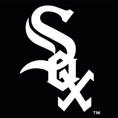
The team has sported a variety of baseball team logos over the years. They first came up with a traditional logo of white sox, but later changed it to a unique emblem. Today, their MLB logo is designed with a creative typography, illustrating the bold club identity with perfection.
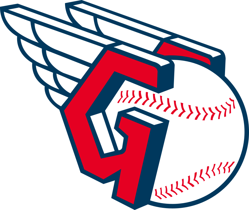
Cleveland Guardians is also one of those MLB teams that was founded way back in 1894. Their formation came with an entire different name i.e. Grand Rapid Rustlers. It was a minor league team in the Western league having no major followership. The team moved to Cleveland in 1900 and was renamed to Cleveland Lake Shores.
The team was again renamed to Cleveland Indians in 1914 after its owner forced the club to pick a new name. Since then, it participated in all the MLB seasons with the same name, until recently in 2021 when it was again changed to Cleveland Guardians. This has been done recently, hence not many people are still aware of this change.
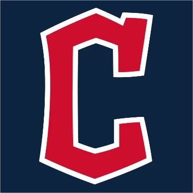
Their MLB logo has also changed after this huge transition. It is creatively designed with a special “C” lettermark. The core color theme of the franchise is however still the same. It has remained the same as the previous baseball team logos used by the franchise.

Founded as a member of the Western League in 1894, Detroit Tigers was one of the first AL teams that were formed as charter franchises. They attained the major league status in 1901 when the club started to compete with the bigger professional teams. After getting in the major league, the Detroit Tigers won four World Series titles that precisely reinforced their reputation in the baseball circuit.
The team has also won more than 11 AL pennants in which the most recent came in 2012. Besides that, they have also won four consecutive AL central division titles starting from 2011 to 2014. This shows their strong record as a team in the highly competitive circuit of MLB. They have perfectly utilized these achievements to boost their team branding, so that it can get maximum audience attention.
The MLB logo of Detroit Tigers have been continuously modified since the club’s formation in 1894. Currently, their MLB logo consists of a “D” lettermark having dark blue color gradient. The team prefers to use this logo on their jerseys as well as merchandising products, including t-shirts, caps and more others.
Placed in the central division of American League (AL), Kansas City Royals is a popular team in Major League Baseball. They are based in the city of Kansas and play their home games at Kauffman Stadium. They relocated to this stadium in 1973 after playing in Municipal Stadium for 5 years. The team enjoys a lot of supporters in this stadium, which is why it is regarded as their strong central fort.
Before 1976, the team didn’t have many accolades in their credits list. But, it changed quickly when the team decided to give a swift rejig to its playing lineup in 1976. After that, their golden period started and they won different major titles one after another.
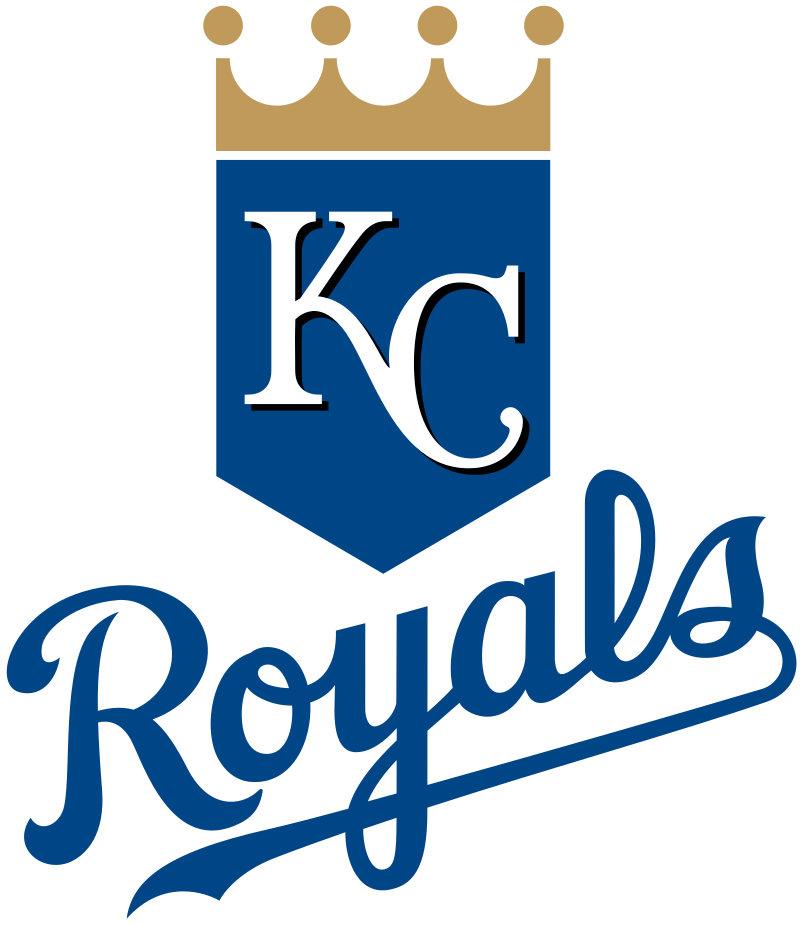
Besides the on-field game, the franchise has also shown heavy attention on its branding. Their MLB logo is a fine example of that. It is artistically designed keeping the core franchise name and theme in the mind. The crown design and blue/white color combination gives it an astounding look, making its overall illustration highly stylish.
The Minnesota Twins compete in the American League from the central division. The team name is quite unique from others because it is chosen to represent two cities. Minnesota and St. Paul are the two adjoining cities that are represented by this franchise. Though the team was founded way back in 1901 in Washington, but it was later relocated to Minnesota naming the Minnesota Twins.
Till to date, the team has won three major World Series titles and six AL pennants. They have also won 8 central division titles which is termed second best to Royals. This record shows the great value of the Minnesota Twins in the American baseball competition. They have always remained a fan favorite franchise, rightly because of these amazing records.
The design of their MLB logo also looks very subtle and neat. It has been created with a combination of blue, white and red color. This theme has remained consistent over the years, as it represents their core branding identity.
Baseball Team Logos from the American League West
The American League’s West division consists of the last five teams in the league, hailing from areas like Texas, LA, and Seattle. Let’s take a look at these baseball team logos and names to and see what makes them so great.
Houston Astros
The Houston Astros have played largely in the National League (NL) since its inception. However, in 2013, the franchise was moved to the west division of the American League (AL). They are based in the city of Houston and play their home games at Minute Maid Park. They have earlier played 51 seasons in NL in which they have secured 7 division titles in total.
After moving to the American League, the franchise continued on its winning ways. Till to date, it has clinched four AL division titles in which the last one was recently won in 2021. This illustrates the true potential of the club and their consistency in winning major titles.
The MLB logo of the franchise looks very artistic. It is created keeping the core identity of the team in mind. The combination of blue and orange color has always remained the core preference of Astros, which is why their usage in the team logos and merch has also been consistent.
Los Angeles Angels is termed to be the first MLB team to originate from the state of California. They are currently positioned in the west division of the American league, grouped with Athletics, Mariners, Astros and Rangers. Their rivalry with the team of Texas has become a stunning clash of the group. Both of these teams are high class and always offer tough competition to each other in the matches.
The franchise was founded in 1961 in the city of Los Angeles. First, it was known as the California Angels which later changed to Anaheim Angels in 1997. After keeping this tag for many years, the team was finally renamed to Los Angeles Angles in 2015. They won their first World Series title in 2002 by beating the San Francisco Giants in the finals.
Talking about their MLB logo, the team has always used the iconic A lettermark as their team emblem. It offers a decent yet bold look of the franchise, enhancing its reputation to the next level. The color combination used for this MLB logo is red and white, as it defines the main brand theme of the LA Angels.
Oakland Athletics was also founded in 1901 as a charter franchise of the American League. Their first name was Philadelphia Athletics as they were initially based in Philadelphia. During that period, the team won three World Series titles consecutively in three years. This gave their name a huge prominence in the market and people started to follow them instantly.
In 1955, the team moved to Kansas City which gave them a new name of Kansas City Athletics. The team played twelve consecutive seasons of MLB with this name, until in 1968 when they finally moved to Oakland and changed the name to Oakland Athletics.
Speaking about the performance, the Athletics have always remained a dominant force in the circuit of professional American baseball. They have won more than 15 major titles, in which 9 are the World Series titles. This precisely showcases the reason behind their huge supporters and fan following. Their MLB logo is ranked among the best team emblems that have played the game and won major titles over the years.
The Seattle Mariners was formed in 1977 as an expansion franchise. The specific “Mariners” tag relates to the city’s famous marine culture. This relevance is also precisely evident with their logo and uniforms color selection. The MLB logo of Seattle Mariners consists of a navy blue color inspired from the same shade used by the US Marines.
The team didn’t find any major success until they defeated the mighty New York Yankees in the division championship final in 1995. This can be termed as their first feather in the cap, allowing them to grow rapidly as a top team.
They haven’t won any major championship title till to date, but their strong gameplay style is the core reason why fans love watching them. They are currently placed in the west division where the group is comparatively very tough. All the franchises field star studded teams, making each match in the group interesting to watch.
The Texas Rangers have always been termed as a highly competitive MLB team. They started as an expansion team awarded to Washington D.C. in 1961. Their track record in the MLB circuit doesn’t contain any major World Series accolades. However, they have successfully won two AL pennants in the consecutive 2010 and 2011 seasons.
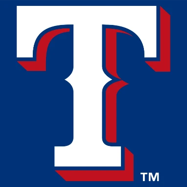
The franchise specifically pays heavy attention to its branding elements. That is the reason why their MLB logo is designed quite spectacularly. The bold color meaning of this logo demonstrates their solid team identity.
Though it has seen many transformations in the last few years, but the color theme used in it has always remained the same. Their new MLB logo was introduced in 2003 and since then it has not seen much changes except for a few special events modifications.
Final Words
That concludes our article where we discuss all baseball team logos and names. The iconic MLB logo has always remained a powerful emblem in the field of American sports. It represents the game loved by millions of Americans no matter which city or state they belong from.
From youngsters to adults, everyone is quite passionate about their favorite MLB teams. Their historic value and association with the cities makes them even more connected to fans. That is the reason why this league is super popular in America. Its growth over the years has been unprecedented, rightly due to getting unending engagement and love from the baseball fans.
Frequently Asked Questions
| 1. Why is the MLB logo famous in the American baseball circuit? Major League Baseball has remained a dominant tournament in the field of American sports. Its MLB logo is quite famous among the people as they know it’s true historical value in the US. |
| 2. Which is the most famous team logo in MLB? There are many teams famous in MLB due to their branding and gameplay style. However, some of the most notable team logos among them include New York Yankees, Boston Red Sox, Atlanta Braves and more others. |
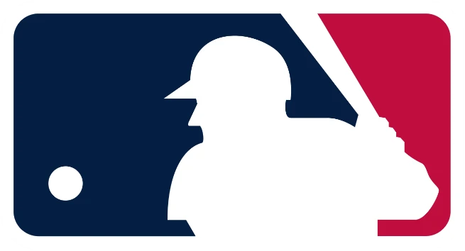
| 3. Who is the guy designed in a silhouette in the MLB logo? The famous MLB logo includes a silhouette of a baseball batter. It is considered that this design is inspired from the image of MLB Hall of Famer Harmon Killebrew. |
| 4. When was the new MLB logo created? The new MLB logo was introduced in 1968. It was designed by Jerry Dior on the request of MLB league owners to celebrate the centennial anniversary of professional baseball in America. |
| 5. What is the color combination used on the MLB logo? The MLB logo uses a creative color combination of red, blue and white. The silhouette has been designed with the white color perfectly with a concept of negative spacing. |
Final Words
That concludes our article where we discuss all baseball team logos and names. The iconic MLB logo has always remained a powerful emblem in the field of American sports. It represents the game loved by millions of Americans no matter which city or state they belong from.
From youngsters to adults, everyone is quite passionate about their favorite MLB teams. Their historic value and association with the cities makes them even more connected to fans. That is the reason why this league is super popular in America. Its growth over the years has been unprecedented, rightly due to getting unending engagement and love from the baseball fans.

Logopoppin
Logopoppin is a graphic design agency that specializes in logo designing, web development, video production and advanced branding services. We love to innovate businesses with new age technologies, allowing them to improve their visual reputation.


