Table of Content
Know About the Popular MLS Team Logos & Their History
The popularity of Major League Soccer (MLS) is rising day by day with the addition of new global football stars. The introduction of Lionel Messi in the MLS have already done wonders for the league. Earlier, many people didn’t knew much about MLS, because it is not a Europe-based football league. But, with the addition of global icons, people from around the globe have started following different MLS teams. Due to this, the popularity of MLS team logos have also risen, making them a strong known entity among the likes of other popular football clubs.
Created by professional logo design services, the MLS team logos exhibit a sheer class of perfection. Recently, the logo of Inter Miami became highly popular in the sports circuit due to arrival of Lionel Messi in the club. Since then, football enthusiasts have shown interest in other MLS teams that are also competing in the league. This has not only increased the followership of the teams, but also the overall viewership of the MLS league in the world.
If you do not know much about the MLS teams and their enthralling logos, read this blog in detail. It will list down some of the best MLS team logos that are currently popular among the fans. So, if you want to explore more about them, let’s first take a look at the history of MLS below.
A Short History of Major League Soccer (MLS)
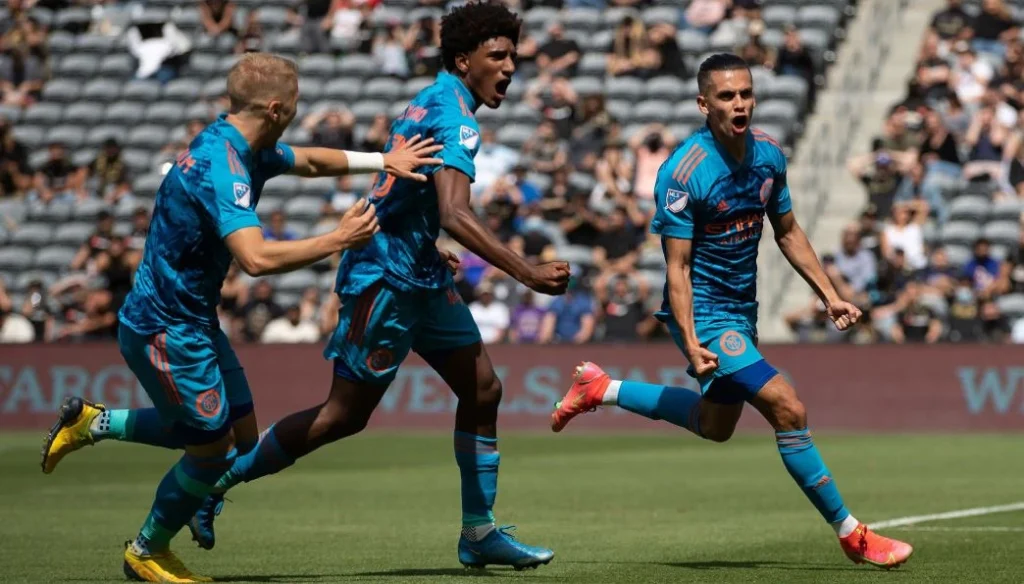
Major League Soccer (MLS) was founded in 1993 as part of the United States’ successful bid to host the 1994 FIFA World Cup. The league began play in 1996 with 10 teams, aiming to establish a professional soccer league that could thrive in a country with limited soccer tradition. Early years were challenging, as the league struggled with low attendance and financial instability. However, the league survived through a series of strategic decisions, including a salary cap system and single-entity ownership model, which helped control costs.
In the 2000s, MLS began to grow both on and off the field. The league expanded by adding new teams, including the introduction of franchises in cities with strong soccer fanbases such as Seattle, Portland, and Vancouver. The 2000s also saw the arrival of international stars like Landon Donovan, David Beckham, and Thierry Henry, helping to raise the league’s profile. Beckham’s arrival in 2007, in particular, marked a significant turning point, as his signing brought increased media attention and investment in MLS.
By the 2010s, MLS was firmly established as a competitive league in North America. The league expanded further, with teams like Atlanta United and LAFC becoming major contenders and achieving high attendance and fan engagement. The increasing presence of designated players, a system that allows teams to sign high-profile international stars outside of the salary cap, continued to raise the league’s visibility. Today, MLS is a rapidly growing league, with 29 teams and a growing television and international audience, setting the stage for its continued development and potential global influence.
Most Popular MLS Team Logos
There are many teams competing in the MLS league, representing different states and cities across the US. Some of these teams are highly popular among the fans, such as Inter Miami, Portland Timbers and more others. If you do not know much about their official logos, take a look at the list given below.
Inter Miami CF
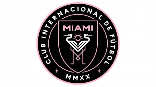
Inter Miami CF, based in Fort Lauderdale, Florida, joined Major League Soccer in 2018 as the league’s newest expansion team. From the outset, the club made waves with its bold ambitions and strong ownership group, led by former soccer star David Beckham. However, it wasn’t until 2023 that the team reached new heights of international attention when the legendary Argentine forward Lionel Messi confirmed his decision to join the club, a move that significantly boosted the team’s global profile.
The club’s emblem features two birds arranged back to back, which, at first glance, resemble flamingos. However, a closer look reveals that the birds depicted in the logo are actually white herons. This design choice reflects the natural beauty and wildlife of the area, as well as the club’s connection to the local environment. The illustrated logo and the symbolism behind it serve as an important part of the team’s identity, connecting both to the region’s wildlife and its vibrant soccer culture.
New York City FC
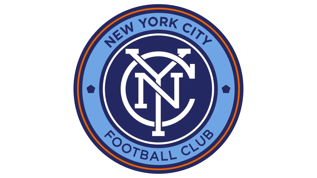
New York City FC made its debut in Major League Soccer in 2015. The club’s arrival brought a second major soccer franchise to the city, joining the New York Red Bulls, and ignited a natural rivalry that further energized the region’s soccer scene. Backed by the City Football Group, which also owns English powerhouse Manchester City, and the New York Yankees, NYCFC quickly established itself as a competitive force in the league, attracting international players and a passionate fanbase.
From its inception, New York City FC has embraced a visual identity that reflects the energy and sophistication of its home city. The team’s consistent color palette featuring sky blue, navy, and orange pays homage to both the city’s skyline and its sports tradition, while the club’s branding exudes a sense of modern elegance. The current emblem features the city’s initials, “NYC,” artfully intertwined in a sleek monogram, symbolizing unity and the interconnected nature of New York’s five boroughs.
Atlanta United FC
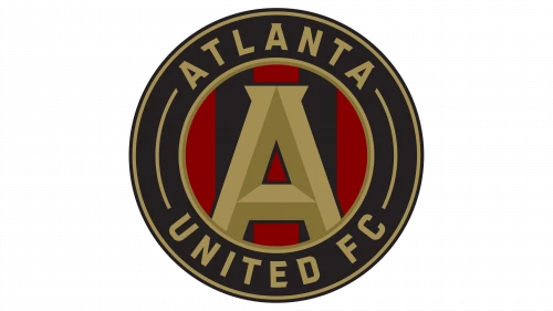
Atlanta United FC was founded in 2014 and officially began competing as an expansion team in Major League Soccer during the 2017 season. The club’s introduction to the league marked a new era for soccer in the southeastern United States, where professional soccer had previously struggled to gain a foothold. However, Atlanta United quickly defied expectations by building a passionate fanbase and achieving remarkable success on and off the field.
The team’s visual identity was unveiled in 2015, well before their competitive debut. The Atlanta United badge draws inspiration from the city’s official seal, taking the shape of a circle to symbolize unity, strength, and inclusivity. At the center of the logo is a prominent, stylized “A,” representing both the city of Atlanta and the club itself. The badge features a sleek color palette of black, red, and gold, reflecting resilience, pride, and excellence. Just like Real Madrid logo, this carefully crafted emblem not only highlights the club’s connection to its hometown but also serves as a powerful symbol of Atlanta United’s identity and ambition.
LAFC
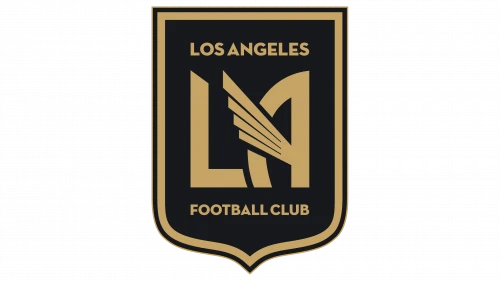
Los Angeles FC (LAFC) was founded in 2014 and officially entered Major League Soccer as an expansion team in 2018. From the outset, LAFC set out to redefine the soccer experience in Los Angeles. The team quickly became a major force in MLS, thanks to its exciting style of play, and star-studded ownership group. Playing home matches at the state-of-the-art BMO Stadium, LAFC has created an electric game-day atmosphere, drawing in supporters from all corners of the diverse city.
LAFC’s visual identity is a key part of its distinctive appeal, setting the club apart from other MLS teams. The team’s emblem pays homage to Los Angeles’ history and culture, blending modern aesthetics with classic Art Deco influences, a style famously associated with the city’s architectural heritage. The shield-shaped badge draws inspiration from the city’s official seal, symbolizing strength and tradition while serving as a nod to Los Angeles’ rich cultural tapestry.
Portland Timbers
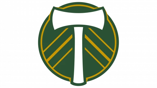
The Portland Timbers, founded in 2009, officially joined Major League Soccer in 2011 as an expansion team. With roots tracing back to the original Timbers team of the 1970s, the club’s entry into MLS was met with great enthusiasm, particularly from the passionate and dedicated fanbase known as the “Timbers Army.” This group has helped create one of the most vibrant and unique atmospheres in American soccer at Providence Park, the team’s home stadium.
The team’s logo, though relatively simple in design, carries significant meaning and effectively reflects Portland’s identity and culture. The badge is dominated by the color green, symbolizing the lush forests of Oregon and the city’s reputation for natural beauty. At the center of the logo is a white double-headed axe, a nod to Portland’s historic timber industry. Meanwhile, the golden stripes form a circular border around the axe, adding a sense of balance and tradition to the design while highlighting the team’s ambition and excellence.
Frequently Asked Questions
| What is Major League Soccer (MLS)? Major League Soccer (MLS) is the top professional soccer league in the United States. Established in 1993, MLS has grown into a competitive league known for its international players, expanding fanbase, and growing influence on global soccer. |
| Why MLS is becoming popular in the US sports circuit? MLS is becoming popular in the US due to its increasing international star power, expanding teams, and modern stadiums. Additionally, soccer’s growing youth participation and a diverse fanbase have fueled the sport’s rise in mainstream American culture. |
| Why Inter Miami CF logo has become famous recently? The Inter Miami CF logo has recently gained fame due to the arrival of Lionel Messi in 2023. The crest’s elegant design, featuring two herons and vibrant symbolism, now represents a team associated with one of soccer’s greatest icons. |
Final Words
That concludes our entire article in which we have discussed different MLS team logos that are popular in the market. These emblems have created a special place in the hearts of true MLS fans. They represent the identities of the teams that are followed by thousands in the United States. And just like other sports logos, these emblems are created with stunning perfection, which is why they look professional and impeccable from every angle.

Logopoppin
Logopoppin is a graphic design agency that specializes in logo designing, web development, video production and advanced branding services. We love to innovate businesses with new age technologies, allowing them to improve their visual reputation.

