Table of Content
Understanding the Basics of Monogram Logo Design
Sometimes, businesses need more than just a logo. They need an illustration that can tell their brand story, perfectly in a strong manner. This requires to be creative as well as straightforward in the design, allowing everyone to understand the meaning easily. Monogram logo design provide that demonstration, showcasing not only the brand image, as well as its true business meaning.
Unlike the conventional ones, the monogram logos are created with a different mindset. They are built with a combination of lettermarks and shapes, giving the brand a completely unified look. There are some other principles as well involved in the designing of these logos. It includes selecting the right font size, color and other similar stuff.
Being a designer, you should have a sound knowledge between the designing of conventional and monogram logos. Many businesses prefer to hire agencies offering professional logo design services to create these logos. It looks classy and unique, offering a complete subtle image of their business.
If you are also looking to design a monogram logo, but don’t have knowledge how to do it, read this blog in detail. It has defined some useful tips to help you understand the requirements of these logos and how they should be designed perfectly.
Let’s first start from the essentials, understanding what basically is a monogram logo.
What is a Monogram Logo?
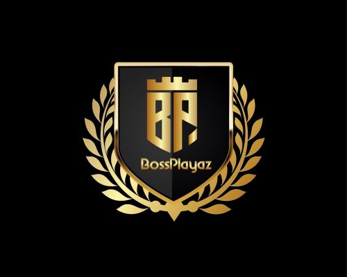
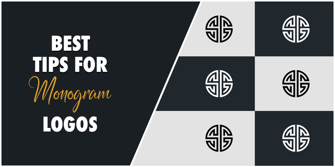
Monogram logos are generally known as the lettermarks. They primarily consist of typography, and sometimes a short brand symbol. The letters used on a monogram logo range from two to three worlds. Generally, they represent the initials of the name, allowing the company to get identified easily.
The history of monogram logos goes back to ancient Greece. It was first used during that time to identify currencies belonging to different city states. This way, it became associated with the city governments, giving people a great marker of legitimacy.
Unlike other logos, monograms only use one single color tone. This gives the whole logo a simple yet unified touch. You must have seen multiple examples of monogram logos using a singular color tone, such as H&M, Gucci, Louis Vuitton and more others. All of these logos are made using just one shade, giving a perfect bold look.
Monogram logos are thought of as the symbol of luxury and elite styling. That is the reason why they are preferred more by the top brands. It exhibits a great quality of class, if designed properly with the right theme.
Types of Monogram Logos
Before moving into the design tips, let us first understand the different types of monogram logos. It will give you a brief idea how to pick the right style and design perfectly according to the required needs.
Traditional Monogram Logos
Just as the name suggests, traditional monogram logos are created in a simple style. They are demonstrated by using simple initials written next to each other. These traditional monogram logos are also designed using just one color. The H&M logo is certainly a fine example of that, showcasing a simple yet stunning logo design.
Many fashion brand logos are created with this straightforward approach. It allows people to easily recognize the brand name without going into any hassles. For instance, the Balenciaga logo is a perfect illustration of a monogram logo. It doesn’t use any additional symbols like other fashion brands. Instead, it just uses a straightforward typography representing a clear name of the company.
Intertwined

Another important type of monogram logos is the usage of the intertwining style. It is a very unique practice to design brand name initials around each other. This not only makes the whole logo attractive, but also gives a stunning representation to the brand logo.
The famous Louis Vuitton logo is a great example of Intertwined monogram logo design. It has very creatively used the “LV” initials in an intertwined style. It often looks like an abstract symbol, demonstrating an iconic emblem of the popular fashion brand.
Just like the traditional logo, the Intertwined style also uses a single color tone. It makes sure to make the typography and symbol look unified, so that people can easily relate with their style.
Reflected Style
As the name suggests, it is a type of monogram logo that shows reflection. It consists of the brand initials written in front of each other in an inverted style. This perfectly exhibits a mirror like style that looks very engaging and attractive to the people.
Many modern companies like to use this monogram logo design over other styles. Some of the known names like Chanel, Gucci and more others are a perfect example of that. Their brand initials are designed very creatively in a reflected style. It makes them look highly luxurious, as well as classy as compared to general logos.
Tips to Create a Great Monogram Logo Design
Being a designer, you must need to know different types of logo designing techniques. The monogram logo design is one of them, as it provides great opportunities to get clients.
The practices required for monogram logo design are quite different from others. If you do not have much idea about them, take a look at the tips given below. It will help you understand some basic principles of designing a monogram logo, rightly as per the latest trends.
Start with a Concept
Before starting to create any monogram logo design, you need to first come up with a proper concept. It will help you to pick the right elements needed in the design, such as fonts, colors, etc. The representation of brand themes is also important in these logos, so that people can find good relevance in them.
As a designer, you will need to conceptualize a design that can offer a solid identity of the business. To do this, you need to think creatively as how to design a logo that can get the attention of the people.
If you are facing difficulties in finding a concept for monogram logos, try to get assistance from Google. It will give you tons of ideas and design inspirations for these logos. You can always customize and edit them as per your own requirements, but just make sure to use the right design that fits best according to the brand theme.
Find the Best Typeface
The second part that is highly important in designing monogram logos is the selection of a right typeface. This is very crucial because it represents your brand name in the logo. People will generally get an idea about the business by looking at its name, and it depends totally on using the right typeface style.
There are plenty of free sites available on the internet where you can find different types of typefaces. From sans serif to masculine fonts, you can find multiple types of letterings according to the given requirements.
The selection of these fonts also depends on the niche of your business. For instance, if you are designing a logo for a food center, then you will like to go for catchy vintage fonts. Similarly, for fashion brands, you will prefer cursive fonts because of their fabulous style. All of this basically depends on your business background, and how you want to portray its name in the market.
Pick the Best Colors
After picking the typeface, you need to select a color that can represent your brand identity. It is a very important step because it showcases the theme of your company.
For example, if you are creating a monogram logo design for a school, then it should be in blue or green color. Both of these shades are commonly used for creating school logos as they offer better relativity with the educational institutions.
Similarly, for fashion, you could pick red, orange or any other strong color combination. It will depend on your brand representation choice, as well as what suits most with it. If you are getting confused in picking the right color, take a look at the logos of other competitors. It will let you pick the right color, perfectly by knowing about the trends and latest practices being used.
Play with Logo Shapes
We all know that logo designing is all about playing with different creative shapes. It helps to bring uniqueness in the logos, allowing people to differentiate them among others easily. For monogram logos, you need to bring an added value of creativity in the design. This can be done when you’ll play with different types of shapes. From closed circles to hexagonal shapes, try to come up with stuff that can make your logos unique and stunning among others in the market.
Choosing an abstract design for monogram logos isn’t a bad option at all. You can customize it according to your requirements or how you want to portray the brand identity. Meanwhile, just make sure that the logo shapes are not too complicated and can be understood by the people easily.
Where You Should Use Monogram Logos?
It is also important to know which type of businesses require monogram logos. Not all the companies or organizations use these logos. Here are some specific cases where you should use monogram logo design.
Monogram Logo for School
Monogram logos are primarily considered for educational institutions like schools. You must have seen many elementary and secondary schools using monogram logos. That is because it suits their identity, providing a great strong look.
Monogram Logo for Wedding Planners
Wedding planners also use monogram logos to showcase a creative brand style. They mostly design logos that can offer a luxurious look, precisely by using catchy colors. As a designer, you need to be very innovative to design monogram logos for wedding planners. It requires a creative approach that can showcase the true meaning of a company while being stylish in overall looks.
Frequently Asked Questions
| 1. What is a monogram logo design? Monogram logos primarily consist of lettermarks. They are different from other logos because they use a single color tone and an abstract structure to represent any company identity. |
| 2. How to design a monogram logo? To design a catchy monogram logo, you need to consider various points. From colors to typography, you need to pick everything precisely that can relate properly with your brand’s theme. |
| 3. What are the best tips for designing a monogram logo for a school? The monogram logo for a school should be designed by choosing the right shape and colors. Both of these things are important for monogram designing, hence they should be picked very carefully. |
| 4. Which is the best monogram logo font recommended in the market? There aren’t any specific font classes recommended for monogram logos. You always need to pick those fonts that can relate directly with the design and showcase a bold company identity. |
| 5. Can I use multiple colors in monogram logos? Ideally, it is not recommended to use multiple colors in monogram logos. They should always be designed with a single color tone, as it helps to bring a uniformity in the design. |
Conclusion
That concludes our whole blog in which we have discussed about monogram logo design in detail. These logos are created for a specific purpose which is why they are only used by the top level organizations. This article has precisely covered everything you need to know about monogram logo design. From types to best practices, we have listed everything in detail, allowing you to understand its core knowledge perfectly.
Meanwhile, if you are looking for a company that can design monogram logos flawlessly, get in touch with us today. We will assist you to design spectacular monogram logos, rightly as per the custom requirements.

Logopoppin
Logopoppin is a graphic design agency that specializes in logo designing, web development, video production and advanced branding services. We love to innovate businesses with new age technologies, allowing them to improve their visual reputation.

