
Table of Content
Discover What Meaning the Iconic Monster Logo Incorporates Within Its Design
The energy drink market is a vibrant and highly competitive arena, where exciting branding plays a pivotal role in capturing the attention of a target demographic looking for a boost of edgy, cool energy. Among the many contenders, Monster Energy has carved out a distinctive and formidable presence, largely thanks to its instantly recognizable and somewhat enigmatic Monster logo.
The logo’s impact evolution, from its initial launch to its modern day rendition, reflects the brand’s growth and its consistent commitment to a strong and impactful visual identity. Understanding the origins and symbolism embedded within the Monster logo provides valuable insights into the power of effective branding and its crucial role in building a successful global brand.
In this article, we will dive into the fascinating history of the Monster Energy logo, tracing its origins, exploring its design elements, and deciphering the symbolism it conveys. We will explore the creative process behind its inception, analyze the significance of its font and color scheme, and ultimately understand how this “eerie mark” has become one of the most iconic and enduring symbols in the highly competitive energy drink industry.
By exploring the story behind the Monster logo, we can gain a deeper appreciation for the strategic thinking and artistic execution of the logo design agency behind it, learning to replicate that for truly memorable and impactful brand identities. Let’s begin.
Monster Logo – A Brief Overview of the Monster Energy Brand and Logo
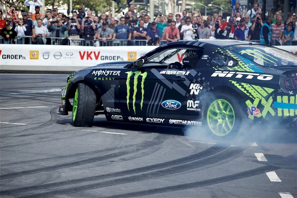
Monster Energy is a global energy drink brand known for its high caffeine content and association with extreme sports, music, and gaming communities. Launched in April 2002 by Hansen Natural Company (now Monster Beverage Corporation), the brand quickly gained popularity, challenging established players in the energy drink market. Its aggressive marketing strategies, sponsoring of numerous athletes and events within its target demographics, and, most notably, its distinctive logo have been key to its rapid growth and widespread recognition.
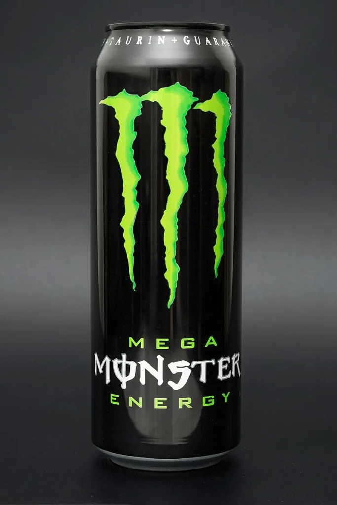
A stylized, neon green “M” formed by three claw-like slashes against a stark black background characterizes the Monster logo. This visual mark is instantly recognizable and has become deeply ingrained in popular culture. The logo is typically displayed prominently on Monster Energy cans and merchandise, serving as a powerful visual cue for the brand.
While the core design has remained consistent since its inception, subtle variations and adaptations have been used across different product lines and marketing materials. The simplicity and boldness of the logo contribute to its memorability and its ability to stand out in a visually cluttered marketplace of food logos. Its somewhat abstract nature also allows for a degree of interpretation, contributing to its mystique and appeal.
The Origin of the Monster Logo – One of the Most Iconic Energy Drink Symbol
The creation of the Monster Energy logo was a crucial step in establishing the brand’s identity and differentiating it from competitors. The design process involved a deliberate effort to create a symbol that was both visually striking and evocative of the brand’s core attributes: energy, power, and a sense of the extreme, as witnessed by their collaboration with X-Games. While the exact details of the initial brainstorming and design iterations might be proprietary, the final outcome clearly reflects a strategic approach to visual branding.
Industry sources and branding analyses suggest that the “claw mark” design was intended to symbolize the unleashing of a powerful, almost monstrous energy. The three slashes are often interpreted as the tearing or ripping open of something, suggesting the release of intense power and invigoration that the drink promises to deliver.
The choice of a stylized “M” shape cleverly integrates the brand’s initial letter into the powerful visual mark, enhancing brand recall and association, one of the most essential branding elements. The simplicity of the design, with its clean lines and lack of intricate details, ensures that it is easily recognizable and reproducible across various media, from large-scale event banners to small product labels. The impact of the logo was immediate and significant, contributing to the rapid rise of the Monster Energy brand within a highly competitive market.
What Does the Monster Energy Logo Represent?
The Monster Energy logo represents a carefully curated set of brand attributes and aspirations, resonating deeply with its target audience. Its design elements, including the font and color scheme, further contribute to the overall message and impact of the brand.
The iconic “M” claw mark, rendered in stark, aggressive lines, has become synonymous with the brand’s high-octane image and rebellious spirit. This seemingly simple yet powerful symbol has a rich history and a carefully considered design that contributes significantly to Monster’s global appeal and market dominance.
The Monster logo is more than just a visual identifier; it’s a carefully crafted emblem that embodies the brand’s core values and target audience. Its sharp, jagged edges and bold presence evoke a sense of raw energy and untamed power, aligning perfectly with the extreme sports and counter-culture communities that Monster has strategically aligned itself with.
Monster Logo Font
The font used for the “Monster Energy” wordmark, typically positioned alongside or below the claw mark, is a custom-designed typeface that complements the logo’s aggressive and energetic aesthetic. It features bold, sans-serif lettering with sharp, angular cuts and slightly distressed edges. This font choice reinforces the brand’s edgy and unconventional image, further differentiating it from more traditional or corporate-looking brands.
The sharp angles and bold weight of the font convey a sense of power and intensity, mirroring the visual impact of the claw mark. The subtle distressing adds a touch of rawness and rebellion, aligning with the extreme sports and counter-culture communities that Monster targets. The spacing and kerning of the letters are carefully considered to ensure legibility and visual balance. While the claw mark is the primary identifier, the accompanying logo fonts plays a crucial role in reinforcing the brand name and its overall visual identity. The consistency in the use of this specific typeface across various marketing materials further strengthens brand recognition and recall.
Monster Logo Color Scheme
The primary color scheme of the Monster Energy logo is a striking combination of neon green against a black background. This color pairing is deliberate and carries significant symbolic weight, contributing to the brand’s overall impact and appeal.
The neon green color is highly vibrant and attention-grabbing, immediately conveying a sense of energy, excitement, and invigoration. Green is often associated with energy and vitality, and the neon variation amplifies this effect, suggesting an almost electric level of power. This choice directly aligns with the core promise of an energy drink – to provide a significant boost of energy and alertness. The black background provides a stark contrast, making the neon green claw mark stand out even more prominently and enhancing its visual impact.
Black often symbolizes power, intensity, and a sense of mystery, further reinforcing the brand’s edgy and somewhat rebellious image. The high contrast between the two-toned color combinations also contributes to the logo’s excellent visibility across various platforms and lighting conditions, ensuring that it remains instantly recognizable. This iconic color scheme has become so strongly associated with Monster Energy that it serves as a powerful visual shortcut for consumers.
FAQs
| What do the three lines on the Monster Energy logo mean? The three lines are meant to represent claw marks, connecting to the name of the brand. |
| What was Monster Energy originally called? The brand was originally known as Hansen’s, which sold juice products back in 1935. It was in 2012 that the company rebranded as Monster Energy. |
| Who owns Monster Energy brand? The company is owned by South African businessman Rodney Sacks and his family. |
Conclusion
The Monster logo is a testament to the power of effective and strategic branding. From its mysterious origins and the deliberate design of its claw mark to the carefully chosen font and the impactful neon green and black color scheme, every element of the logo contributes to the brand’s powerful and recognizable identity.
The “eerie mark” has successfully captured the essence of the energy drink’s promise and resonated deeply with its target audience, playing a significant role in Monster Energy’s rise to become a global powerhouse in the competitive beverage market. The history of the Monster Energy logo serves as a valuable case study for understanding how a well-crafted visual identity can become an enduring and iconic symbol of a brand’s success and cultural impact.
Logopoppin
Logopoppin is a graphic design agency that specializes in logo designing, web development, video production and advanced branding services. We love to innovate businesses with new age technologies, allowing them to improve their visual reputation.
