

Table of Content
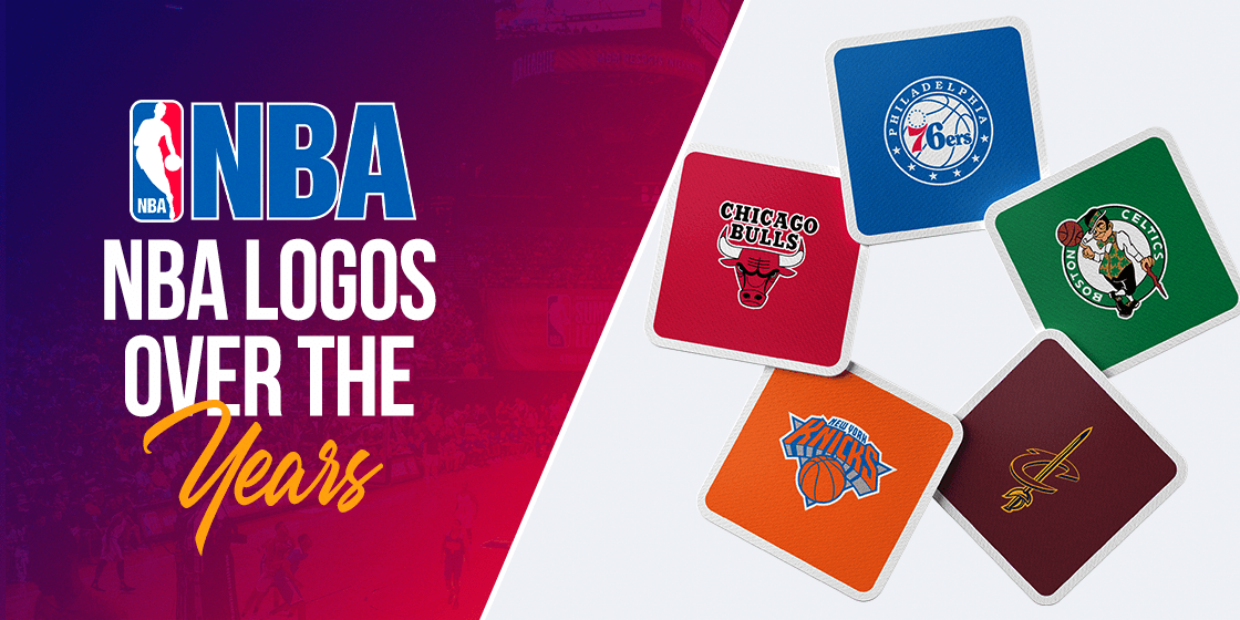
Discover How the Various NBA Logos Have Evolved Over the Years
NBA, or the National Basketball Association, is the highest level of pro-basketball in the United States of America. Barring Olympic tournaments, this is the pinnacle of Basketball in the US. Since its rise to fame, NBA has joined the MLB and the NFL as the trifecta of the most influential pro sports in the country.
Over the years, the sport and the National Basketball Association has acquired a rich history full of stories about achievement and success. NBA logos from all teams in the Association have become iconic in their own rights. And since 1969, the NBA itself has been sporting the now iconic symbol – the silhouette of a basketball player over a red and blue background.
So if you want to know how logo design services create such iconic symbols then let us begin by diving into the interesting history of the sport, the teams, and the NBA itself.
Inception of the National Basketball Association into a Major League Entity
In June of 1946, a few businessmen who owned Ice Hockey rings in Northeastern and Midwest, as well as Canada, decided to start the Basketball Association of America. The first game played under the BAA was on the 1st November,1946, in Toronto, Canada. The Toronto Huskies hosted the New York Knickerbockers at the Maple Leaf Gardens, and the game is considered as the first official game for the league that would become the NBA.
It was not the first attempt at establishing a professional basketball league, however. Previous associations like the American Basketball Association (ABA) or the National Basketball League (NBL) had attempted to legitimize the sport as well. Nevertheless, NBA tried to distinguish itself from them by aiming to play exclusively in larger venues from the major cities.
During the early years since its inception, the quality of play was quite similar to the ABA, the NBL, as well as independent clubs like the famed Harlem Globetrotters. However, four team from the NBL moved over to the BAA, cementing it as the better choice as a basketball association. And in 1949, the remaining teams from the NBL also merged with the BAA.
In order to honor the legacy of the NBL, the Association decided to rename itself the National Basketball Association. However, they retained the BAA managing body for the new Association, as well as established the BAA as their own, conveying that they considered the action as a team expansion rather than a merger.
In the nearly eight decades since its inception the NBA has grown from eleven teams to the current thirty teams playing for the association. Twenty-nine teams hail from the United States, while one team is from Canada. The NBA’s roots with the early teams of the NHL is also why we see many of their team symbols inspired by the design aesthetics of the NHL logos. This is even more apparant when you look at the team logos from the NFL or the MLB, who have a very distinct design style.
In 2005, the Association introduced a new structure for the teams. The franchises were divided equally into two conferences of fifteen teams each. Each conference contained three divisions, with five teams each.
The Eastern Conference of the NBA
The eastern conference was founded before the 2004-2005 season, when the Charlotte Hornets joined the Association as their 30th franchise. With the new team joining the eastern conference, the New Orleans Pelicans were moved to the western conference in order to balance the two.
The eastern conference contains three divisions – Atlantic, Central, and Southeast.
The Atlantic division is made of:
- Boston Celtics
- Brooklyn Nets
- New York Knicks
- Philadelphia 76ers
- Toronto Raptors
The Central division consists of:
- Chicago Bulls
- Cleveland Cavaliers
- Detroit Pistons
- Indiana Pacers
- Milwaukee Bucks
And the Southeast division includes:
- Atlanta Hawks
- Charlotte Hornets
- Miami Heat
- Orlando Magic
- Washington Wizards
The conference’s most recent championship winner is the Milwaukee Bucks, who won the NBA Finals for the 2020-21 season. The most championship wins however, goes to the Boston Celtics, who are tied with the LA Lakers with seventeen wins each since the inception of the Association.
Western Conference – The Second Half of the NBA
![]()
The other half of the NBA, the western conference also consists of fifteen teams. When the Association adopted the new divisional structure in 2004-05, the New Orleans Pelicans moved over to this conference. The purpose was to round out the number of teams in both eastern and western conferences, which were skewed when the Charlotte Hornets joined the NBA as its 30th franchise.
The conference is divided into three sections – Northwest, Pacific, and the Southwest. The teams in this conference sport some of the most iconic NBA logos in the association, such as the Golden State Warriors or the San Antonio Spurs.
The Northwest division is made up of:
- Denver Nuggets
- Minnesota Timberwolves
- Oklahoma City Thunder
- Portland Trail Blazers
- Utah Jazz
The Pacific division consists of:
- Golden State Warriors
- Los Angeles Clippers
- Los Angeles Lakers
- Phoenix Suns
- Sacramento Kings
The Southwest division includes:
- Dallas Mavericks
- Houston Rockets
- Memphis Grizzlies
- New Orleans Pelicans
- San Antonio Spurs
The Denver Nuggets are the most recent NBA champions from the western conference, winning the NBA Finals for the 2022-2023 season, with the Lakers having the most championship wins of the conference. That ties them up with their biggest rival on the eastern conference, the Boston Celtics, with 17 wins each.
Transformation of the NBA Logo and the Inspiration Behind It
The original NBA logo is quite iconic. The design incorporates the profile of a dribbling basketball player using white space, over a blue and red background. The logo was designed by Alan Siegel in 1969, taking inspiration from another of his project; the MLB logo.
The player used for the profile looks like a photo of the famed LA Lakers player Jerry “Mr. Clutch” West. The NBA has never confirmed that is the case, as they are reluctant to associate any individual with their brand iconography. However, the image looks uncannily like a photo of West taken by Wen Roberts.
The logo was revealed in 1971, representing the Association since then, albeit with some slight changes to the design over the last seventy-five years.
The Design of the NBA Logo and the History Behind its Inception
The purpose of the NBA logo was to create a unified brand identity for the Association, similar to what the MLB and NFL logos enjoyed. The iconic red, white, and blue color scheme of the design establishes it as an all-American basketball association.
That is why the NBA management has shied away from acknowledging what any sharp-eyed fan might see. According to them, they want it to become a unified symbol for basketball fans from a variety of ethnic and social backgrounds. Moreover, they have also shied away from any Christmas or Halloween marketing ideas to revamp their logo for the season, as they want to be portrayed as an entity free of religious or cultural bias for the players and the fans.
They want their logo to be a focus of their identity as a sports association. And by acknowledging the player whose profile was chosen for the logo would only end up driving the attention to that individual player rather than to the sport as whole.
75th Anniversary NBA Logo – Designing the Diamond
The Association released a new NBA logo commemorating the seventy-five years they have spent playing the sport. Instead of the oblong rectangle with rounded edges, the background is now in the shape of a diamond. The color theme remains the same however, with the addition of the number “75” in the design to the right of the logoman.
The Legacy of the NBA Logo – What Has It Stood For Through the Years
The legacy of the NBA logo is quite good. The logo has remained essentially unchanged for five decades so far. That means that it has been successful in overcoming the misconceptions of the society and bringing everyone together in the love for the sport.
In 2020, after the premature death of NBA superstar Kobe Bryant in a helicopter crash, an online petition was started. The petitioner argued that to honor the late basketball star’s passing, and to show their support for the family, the NBA should change its logo to incorporate Kobe’s likeness.
Around the time of his first death anniversary, the petition had garnered over three million signatures, including endorsements from former and current NBA players. However, the National Basketball Association has been adamant that they do not want to change the logo to associate it with an individual, no matter how important the player might be. They argue that the purpose behind the silhouette is to ensure that the logo encompasses all of its players, and that associating with a specific player would undermine its intended impact.
And they are right, from a branding perspective. If we look at the scenario from a business, branding, or even an impartial perspective, redesigning a logo could open up a Pandora’s Box for the business in question. And the NBA is a global business, with billions of dollars’ worth of merchandising and sponsorship deals around the world.
It has taken a lot of time, effort, and sheer luck for the NBA logo to become such an iconic symbol. Changing it now could spell disaster for the Association.
Fonts Used in the NBA Logo Wordmark
When we talk about the various NBA logos sported over the years, you will find that the symbol is always accompanied by a small, yet impactful wordmark. In the case of the NBA, the wordmark spells just that – NBA.
It helps those who have no basis about the association and its teams quickly relate the NBA team logos and names with the entity without any issues. And it is this capability that is necessary for an association as large as the NBA or the NFL, NHL, or MLB.
In the case of the NBA logo above, the logo fonts used are a medium, sans serif font that is placed at the lower left of the design. The positioning and the style of the wordmark make it easy to see and understand, as the stark white of the font contrasts well with the blue background to stand out visually. The font is a modified form of Helvetica or Neue Haas Grotesk, and is named the NBA Pacers.
NBA Logos Representing the Teams from the Eastern Conference
The official NBA team logos are iconic in their own rights, and have represented their teams for a long time. The official NBA logos are iconic in their own rights, and have represented their teams for a long time. A team logo can serve to highlight the city, a specific feature, or even the team name itself using clever imagery, like the famous 49ers logo from the NFL. The NBA basketball team logos listed below are in order of what we believe to be the ideal rankings according to their symbol’s attractiveness and effectiveness.
Let’s have a look.
Chicago Bulls
This franchise’s logo has one thing that other sports logos lack in the NBA – it has retained the same logo throughout its tenure in the Association. Introduced in 1966, the design featured the image of an angry red bull, with blood on the tips of its horns. Over the image, the name of the franchise “Chicago Bulls” was displayed in dark, blocky capital letters.
Many teams in the sport have changed their logos over time, with the rebranding of NBA logos considered a normal part of team evolution. Some changed them for the sake of upgrading with the times, while other NBA logos were revamped due to a change in their name or a move to a new city. Some changed them for the sake of upgrading with the times, while other NBA team logos were revamped due to a change in their name or a move to a new city.
The Bulls however, created the perfect logo in the first place, cementing its place as one of the historical NBA logos. Taking inspiration from the famed Chicago Stockyards, one of the most profitable businesses the city has enjoyed, the logo was designed by Dean Wessel.
The team has been graced by many Hall-of-famers including Michael Jordan, who lead the team to six NBA championship wins. Moreover, the mascot, Benny the Bull, has been a mainstay attraction for the team since the 1969 season, and is known for its outrageous antics.
Toronto Raptors
The Toronto Raptors are the only Canadian team on the National Basketball Association roster, since the Vancouver Grizzlies moved to Memphis during the COVID-19 pandemic crisis in Canada.
Joining the NBA in 1995, the Raptors and the Grizzlies were bought on as expansion teams for the Association. The franchise has gone through three NBA logos in the nearly three decades of playing the sport.
The first symbol they released in 1995 sported a red velociraptor dribbling a silver basketball. The raptor wore a game jersey with the letter “R” on its front. The word RAPTORS was written in silver, and curled at the top of a black semi-circle behind the image. the entire image was on a purple background, which had the wordmark TORONTO written on it.
In 2008, the logo was redesigned. Now the purple color of the image was changed to a vibrant red. That design was used until 2015, when the logo was changed completely. Now the symbol sported a silver basketball with three rips in it, as if made by sharp raptor claws. The image is encircled by a black outline, with the word TORONTO written in white at the top, and RAPTORS written at the bottom. The black circle surrounding the image is accentuated using red trim.
Philadelphia 76ers
Originally hailing from the city of Syracuse, the team was called the Syracuse Nationals. Their first logo was a map of the USA in light blue, with the stylized wordmark spelling NATIONALS in cursive vintage fonts done in white.
The image was formed in the dimensions of a circle, and the background was colored in red and white stripes mimicking the US flag. Moreover, blue and red stars encircled the logo. Released in 1946, the logo was soon updated, with the US map now in white, and the logo fonts and the stars now in blue. and the typography and the stars now in blue.
The team moved to Philadelphia in 1963, and changed its name to the Philadelphia 76ers. One of the few teams to change their NBA logos due to a move to another city, the new 76ers symbol was designed.
This logo sported a blue circle with the number “76” in the middle of it. The numbers were enlarged, and the number “7” was colored red, while the “6” was made blue. In 1977, the team modified this design, by minimizing the logo and centering it within a white basketball with blue seams.
1997 saw the logo being modified again. Now the word “76ERS” were written in gold, with black and red trim. A grey star surrounds the number “7”, shooting a gold basketball mimicking a shooting star.
From 2009 to 2014, the 1977 logo was reused, but now featured a red box accented with gray trim. Below that was a blue rectangle with the word PHILADEPLHIA written in white. In 2015, the logo was redesigned with the 1977 logo now encircled in blue, with the name of the city in white at the top, and five white colored stars at the bottom.
This makes it one of the most relatable of the National Basketball Association logos, as the clean imagery of a basketball only adds to the overall meaning of the design.
Atlanta Hawks
Starting out as the Buffalo Bisons in 1946, the Hawks are one of the few teams to sport a number of different NBA logos by city, as the franchise has moved around a lot. Renaming themselves the Hawks once they moved to Milwaukee, the team stayed with the city from 1951-55. After a 13-year stint as the St. Louis Hawks, the franchise moved to Atlanta in 1968.
Using the same illustrative logo as their St. Louis years, the team modified it a little bit to differentiate the design. The logo now featured a hawk wearing a white team jersey and kneepads, with the name of the team spelled out in black letters at the bottom of the image.
In 1972, the logo was redesigned. The new symbol now looked like a reverse Pacman, with the mouth pointed towards the left instead of right. The shape of the figure’s mouth was modified to look like the profile of a hawk, and the name of the team was written in red at the bottom of the logo. However, this design looked less like a logo for a professional sports team, and looked like it belonged with a group of collegiate basketball logos.
1996 saw another redesign. Now the logo featured an airborne hawk with a basketball clutched in its talons. The franchise name was spelled at the top of the image. In 2008, the yellow colored border was changed to a deep navy blue.
The current logo for the Atlanta Hawks is the same one used in 1972. However, the words Atlanta Hawks Basketball Club are written in a white font over a bold red circle. That circle is then encircled by a thin white and another red line to finish off the logo.
Miami Heat
Miami Heat’s first logo was introduced in 1988, and featured a flaming basketball going through a dark hoop. The stylized wordmark “MIAMI HEAT” was written at the bottom of the logo design, with the letter T sporting a small flame emanating from it.
Considering the changing graphic design trends, the first redesign was initiated in 1999, which updated and enhanced the initial concept of the logo the flaming ball from the original design was now colored red, with the tail end of the flame being a bright orange. The basketball hoop swapped the color palette from black to white, making it more prominent.
Finally, the wordmark remained the same in base design. However, the shade of the color used for the letters was darkened a few levels, in order to provide a sharp contrast, to the now brighter imagery of the logo.
Boston Celtics
The first logo for the team was released in 1947, and featured a white shamrock on a green background in the shape of a circle. The name of the team, CELTICS, was written in white at the top of the logo.
In 1951, the redesign added a crowned leprechaun dressed in white, holding a walking cane and jumping about. The 1969 modification made the leprechaun wear an Irish hat colored green, and holding a cane in one hand while balancing a basketball on the other hand’s finger. The background was now a red-brown basketball, with the name of the franchise spelled out in white.
From 1977-1996, the color green was made more prominent. The leprechaun was now green, and the image was encircled in a green ring. The name of the team was displayed in bright white around the image.
The final, and current iteration of the logo, has modified the skin color of the leprechaun. The character’s walking stick and the basketball are now colored brown, the vest he wears and the stripe on the hat are now gold. The encircling ring is now a deeper green, with a thick black outline featuring the name of the team in bold white letters.
Overall, the Boston Celtics have been known to release some of the most unique NBA logos ever seen, capitalizing on the area’s Irish heritage. Moreover, it is also one of the very few NBA team logos with mascots featuring in the team’s logo.
Milwaukee Bucks
The team has sported four NBA logos so far, since their inception in 1968. The first iteration featured a buck wearing a green sweater sporting a white letter “B”. The cartoon spun a golden ball in one hand, and sat on the black wordmark displaying the words MILWAUKEE BUCKS.
A new design was introduced in 1993, which now showed a feral looking buck colored green, and sporting purple eyes. The image was transposed over a purple triangle, with the name of the team’s city written in silver over the image. However, this was one of the weirdest professional basketball logos, and was changed after a few years. Moreover, it is also one of the very few NBA team logos with mascots featuring in the team’s logo.
2006 saw the purple background becoming red, and the font for the team name becoming sharper. In 2015, the logo was modified drastically, with the imagery made more intimidating with white eyes, ears, and nose. The chest of the buck was made in the shape of an uppercase M, standing for Milwaukee.
The wordmark is done using a bold white font, curving around the chest of the buck, and rounding out the whole design.
Washington Wizards
The team began as the Chicago Packers in 1961, featuring a bull inside a brown ball for their logo. The team has moved around a lot during the years they played in the Association, and have designed and sported a number of NBA logos in that time. However, we will focus on the NBA basketball league logos they have used since naming themselves the Washington Wizards.
Now, the first logo for the now renamed team was released in 1997. It showed a wizard done in blue balancing a basketball on a fingertip of one hand, and a star in the other hand. The chest of the character bore a large letter “W”. The design also featured a crescent moon in the shape of a basketball, with the wordmark with the team’s name at the bottom of the logo in blue font.
The 2007 redesign changed the color combination of the crescent and the ball to a light gold. Then, the logo sported a red, white, and blue color scheme in accordance with the new team colors. Moreover, the font for the wordmark was now a sleeker and modern option.
The version of the logo used today was introduced in 2014. It now features a red and white ball, with a small Washington monument at the bottom of the image the top of the monument shows a silver star, and the entire basketball in encircled by a red, white, and blue ring. The name of the team is written in white, with the name of the city on the red section of the circle, and the team name on the blue section.
New York Knicks
Originally named the Knickerbockers, the original logo featured a guy named “Father Knickerbocker” dribbling a basketball, and colored in blue, orange, and white. Then, in 1964, the logo was redesigned to display the wordmark for the team’s name, featuring one of the few NBA logos with names of the franchise as a central element of the logo design.
1979 saw the team modify the logo. The wordmark was written in red, and displayed over a white background over a blue trim. Moreover, the basketball was now colored orange with black seams. In 1983, another modification made the ball even darker, and the name of the team was now written in bright orange instead of red.
Then, in 1989, the logo’s color scheme was revamped again. Now, the wordmark of the team name was colored a darker orange, and the football was shaded in a similar color, but with blue seams to match the outline of the font.
In 1995, the team added the name of their city on top of the team wordmark, written in a blue the same color as the basketball seams.
Finally, the current version of the logo was introduced in 2011. The dark shadow beneath the “KNICKS” wordmark was swapped for a lighter gray, the blue was darkened several shades, and the shades of orange were lightened to complement it.
Brooklyn Nets
Starting out as the New Jersey Americans in 1967, the team logo had a shield covered in the red, white, and blue of the US flag. The middle of the design sported a similarly colored basketball, and the words “N.J. Americans” written across the top of the logo. six white stars, three on each side of the shield, rounded off the design.
Moving to New York the next year, to the Long Island borough, the team renamed themselves the “New York Nets”. Swapping out the US shield for a different design, the new logo featured a giant “NY” written in red, the word “nets” displayed in a cursive blue font below it, and a dark profile of a basketball player.
Finally, from being one of the few NBA logos with colors representing the US, the new Nets team settled for a shield logo that featured a simple white on black color scheme. The new design now featured the name NETS written in white font over a black shield, with a small basketball with the letter B below it inside the shield. Finally, the wordmark for Brooklyn is written in black below the shield, making for a great contrast.
Indiana Pacers
The pacers first introduced their logo in 1967. The design featured a white gloved hand holding a yellow basketball, and the entire design was included within a large uppercase “P” colored blue.
1976 saw the logo’s first redesign, where the color of the ball was changed to a shade more golden than yellow. Moreover, the blue color in the design was lightened a few shades to complement the new ball color. The symbol was also accompanied by the team’s wordmark depicting the franchise name, which was displayed to the right of the logomark.
In 1990, the color scheme and design was tweaked again. This variant saw the addition of a gray outline around the letter “P”, and the shade of the basketball was colored a shade of golden brighter than before.
Finally, 2017 saw the introduction of the design that is still a part of NBA logos today. It features the iconic lettermark of the previous designs, surrounded by a gold ring over a white background. The team’s name is written curved within the golden ring, and surrounds the entire image.
Cleveland Cavaliers
The Cavaliers inaugurated their first team logo in 1970, featuring a swashbuckler designed in red. The name of the team was written at the top, while the bottom of the logo featured the city name. The entire wordmark was curved around the circular logo design, rounding off the design nicely.
1984 saw the team’s first logo redesign. The new design featured a stylized wordmark spelling “CAVS”, with the letter “V” made to look like a basketball net. A red ball was added over it, depicting a basket being scored.
In 1995, the team again changed their logo. It now featured an orange basketball outlined in black, going into a white net. The entire image was over a black background, with the wordmark written in baby blue appearing at the bottom of the design.
The team produced yet another entry for the NBA logos list in 2004. It featured a red basketball, with the wordmark of the team’s name written in white over it. A gold sword went through the bottom of the ball, reaching the middle of the letter “C” in “Cavaliers”. The color of the sword was lightened in 2011, when they decided to lighten the outline of the logo too.
The team’s symbol today is in the form of a shield logo. The outline is made using a wine and golden color, with the franchise’s wordmark written in white at the top of the shield.
Charlotte Hornets
The first Hornets team was inaugurated in 1988 as an expansion team, featuring a logo with a hornet dribbling a basketball. The design was in teal, with a team’s name at the top and the bottom of the symbol, in a lighter shade of the logo.
Yet another team with multiple NBA logos to their name, the franchise released another logo in 2004, when they renamed themselves the “Bobcats”. The design depicted a dark orange bobcat roaring, with the team name written as a wordmark on top of it. The color of the bobcat was lightened in 2008, becoming a lighter orange.
In 2012, the logo was redesigned, with the bobcat now in gray. The word “Bobcats” was written in white and “Charlotte” was written in orange and was now inside the main logo.
Changing their name back to the “Hornets” in 2014, the team also introduced a new logo. It featured a fierce hornet with white eyes, which are tilted down for a scary vibe. The wings and antennae are raised in to make it seem ready for a fight, and a basketball is incorporated within the body of the hornet. The team’s name is written in white, and displayed across the logo.
Detroit Pistons
As another team who has gone through multiple names and NBA logos, the Detroit Pistons were originally called the Ft. Wayne Zollner Pistons. Their logo depicted a character made out of cans, preparing to set a layup. Sometime later it was redesigned, with the character now being in gray instead of red, with the lettermark “Z” on its chest as it dribbled a basketball.
Renamed the Detroit Pistons in 1957, the logo was a stylized wordmark. The name of the team was outlined in orange, below which were the words “Basketball Club” in solid orange. Underneath it were the words “National Basketball Assn” written in blue, and a ring of the same color encircled the whole design.
In 1971, the “National Basketball Assn” was removed from the logo. 1975 saw another redesign, with the name of the team and the word “NBA” in solid orange, with a black outline for the basketball.
A new logo was introduced in 1979, which followed a red and white color scheme. The team name appeared in the center of the basketball outline done in red, and the entire design was encircled in blue.
Redesigned again in 1996, the logo now featured a horse running, with its burning mane flowing behind it with the team’s name over it. Both of the letters “S” in “Pistons” were designed to look like exhaust pipes, a nod to Detroit being the hub of automobile manufacture in USA. Behind the horse was a red basketball enclosed with teal ring featuring the name of the city in white at the bottom.
2001 saw the color scheme changed to red and navy blue. In 2005, the team changed their logo to a red ball with white outline, and the team name in white with a blue outline. White and blue rings encircled the entire symbol.
Orlando Magic
The first logo for the team was introduced in 1989, featuring the wordmark “Magic” in bright blue with a silver star for the letter “A”, and the word “Orlando” to the right of it, also with a star for “A”. A blue basketball and a few silvers tars trailed the design, mimicking the tail of a shooting star.
After nearly 11 seasons with the same logo, the team redesigned it in 2000. The new logo made the “Orlando” smaller, and the word “Magic” larger. Moreover, they also swapped the letter “I” in “Magic” for a silver star, just like the letter “A”. The basketball was moved to the bottom, accented with silver, and the streaks behind it were now black to help the silver stars stand out better.
The logo used today is the third iteration of the symbol, and was introduced in 2010. Eschewing the original design, the new logo uses a special font for the word “Magic”. Atop that is the name of the city in black, with the addition of the basketball-as-shooting-star imagery from 2001 added to it, albeit in a smaller size.
The Orlando Magic is one of the few teams in the Association with comparatively fewer NBA logos to its name throughout the years.
The NBA Team Logos from the Western Conference of the Association
Just like the Eastern Conference teams, the Western Conference too consists of franchises with iconic NBA logos and team history. And just like the LA Rams logo from the NFL, these logos serve to portray a sense of history and legacy into their team symbols. Listed below are the teams included in this Conference, in order of their logo’s attractiveness.
Let’s take a look.
Los Angeles Lakers
Originally called the Minneapolis Lakers, the team only came to be associated with Los Angeles after it moved to the city in 1960. the name of the franchise was inspired by the ten thousand lakes in the state of Minnesota , and has sported various types of logos throughout the years.
The first logo for the team featured their home state in white, with a gold star depicting the position of Minneapolis on the map. The wordmark spelled “MPLS”, the initials for the city, and was placed in the middle of a golden basketball. The word “LAKERS” was written at the top and the bottom of the symbol, with a star flanking each side of the city’s wordmark.
Moving to LA in 1960, the newly renamed Los Angeles Lakers introduced a new logo. The design portrayed a gold basketball, with the team name in purple. Lines streak out from the wordmark “LAKERS”, and the name of the city was placed at the top of the logo. in 1976 the design was tweaked slightly, with the ball using a brighter yellow color and rotated slightly, and the wordmark lightened a few shades too.
The current team symbol is arguably one of the most iconic NBA logos of all time, with many basketball greats sporting it, as well as being one of the most popular NBA team logos on jerseys. Released in 2001, the design was changed slightly. The colors used were tweaked, with the ball becoming a darker gold, the purple getting deeper, and the black outline of the basketball being darker too.
Portland Trail Blazers
The team’s first logo was introduced in 1970, and featured a trailblazing track with a black top and red bottom. The name of the team was in a mix of black and red font, with “Portland” written in black, “Trail” in red, and “Blazers” in black.
However, in 1990 the symbol was redesigned. The trailblazing track was now smaller, and the colors were inverted from top to the bottom. The name of the team, “BLAZERS”, is to the right of the image in a solid black with red accents.
In 2002, a couple of tweaks were made to the logo. The top of the trailblazer track was now changed to bright white instead of light gray. The center of the image was now black, and the font of the wordmark “BLAZERS” was swapped for some suitable futuristic fonts.
Trail Blazers’ logo saw yet another redesign in 2003, with the word “BLAZERS” now in white, and the name of the city at the top if the image. In 2004, the design was changed again, with the addition of the word “TRAIL” just above “BLAZERS” in the team wordmark.
Finally, the version of the team logo used today was introduced in 2017, with a new and animated trail logo, with a white bottom and a red top. The word “PORTLAND” is in a deep black, and uses a truly edgy and modern typeface.
Phoenix Suns
The Suns introduced their first team symbol in 1968, the first one of their iconic NBA logos. It depicted a burning orange basketball, with flames coming off of it, over am orange background. At the top of the logo, the wordmark spelling “Phoenix” was at the top of the logo, while the word “Suns” was at the bottom, both colored purple.
The first drastic modification was introduced in 1992, with the orange basketball now portraying the sun shooting into the sky over a purple background. Its 2000 alteration tweaked the design even more. Now the sun was a brighter yellow, and looked better animated. The purple background was now surrounded by gray accents.
The name of the team was now written in white color with gray trim.
Finally, the current version of the logo was released in 2013. It portrays a basketball as the sun with a tail like a shooting star. The entire image is over a black background, and the wordmark uses a modern font.
San Antonio Spurs
The team originally known as Dallas Chaparrals released their first logo in 1967, which featured a blue bird dribbling a ball with the ABA logo. Becoming the Texas Chaparrals in 1970, the team modified their logo to match their new home.
The redesigned logo featured the bird dribbling the ball inside an outline of the state of Texas. the gray background was outlined in black. Moreover, the wordmark featuring the team name “CHAPARRALS” was written in red and placed below the bird.
Renaming themselves the San Antonio Spurs in 1976, the franchise made a new logo to honor this change. Spur’s team symbol had the wordmark of the team “SPURS” in big bold characters. And, the letter “U” in the name was designed to mimic a spur worn by horse riders, and the addition of the words “SAN ANTONIO” over the original wordmark rounded it up.
The logo saw another redesign in 1989. The color of the “SAN ANTONIO” wordmark was now white, and the logo also swapped the background for a trio of streaks – pink in the middle, teal on top and yellow at the bottom.
A 2002 redesign saw the letter “U” completely replaced with a stylized spur, and the name of the city written in white over a black stripe. Finally, the logo came in to its current form in 2017. The words “SAN ANTONIO” were written in bold, with the wordmark “SPURS” increased in size and using a cleaner, more modern font. Moreover, an intricate spur was used in place of the letter “U” in the name.
Golden State Warriors
Golden State Warriors, originally called the Philadelphia Warriors, introduced their first of many NBA logos in 1946. It featured a native American dribbling a basketball, with the name of the team written in bright yellow cursive script.
Moving to San Francisco in 1962, the team renamed themselves the “San Francisco Warriors”. Its logo featured a white and blue colored native headdress surrounded by a yellow ring with blue accents. The name of the franchise is designed in bright blue, with the letter “I” in “Warriors” replaced with an arrow. The background is white with blue trim, encircled in yellow.
The last version of the San Francisco Warriors was used from 1969-71, and featured the iconic Golden Gate Bridge colored blue, on a yellow background encircled in blue. Renaming themselves the Golden State Warriors in 1971, their first logo featured an outline of California in blue. A blue star marked the Bay Area on the design over a yellow background.
The number 14 was added to the right of the Californian outline, designed in a dark blue. The wordmark displaying the team name curved around the entire logo. Its 1972 modification featured the words “Warriors” and “Basketball” in blue, the former at the top and the latter at the bottom of the logo.
The franchise introduced a new logo in 1997, which now featured a masked blue man – the team mascot Thunder. The character held a lightning bolt attached to the letter “W” in “Warriors”. The background is a basketball with numerous lines and borders.
2010 saw the introduction of a new NBA logo for the team, and the one currently used by them. It features the new Bay Bridge colored yellow, over a blue background. The design is encircled with alternating bands of yellow and blue. Finally, the wordmark portraying the team name is curved around the top and bottom of the design.
Denver Nuggets
Originally called the Denver Rockets, the team introduced their first team logo in 1967. It featured a red-colored basketball with the word “ROCKETS” written on it in black, and encased by a rectangle of the same color. the basketball was surrounded by a white ring, which featured the team name, and the words “RINGSBY SYSTEM” at the top and bottom respectively.
1971 saw the team redesigning the symbol, which now featured a purple and yellow rocket dribbling a ball within a purple colored ring on the Rocky Mountains. The wordmark for the team was included within the design as well.
Renaming themselves the Denver Nuggets in 1974, their new team logo featured a red-bearded miner, holding a pickaxe in one hand, and a basketball in the other. The team name curved around the character, written in a blue color. in 1976, the word “Denver” was changed to a red color, and the word “Nuggets” was colored blue.
In 1981, the logo featured a rainbow colored semicircle, with different cities in different colors, except for the Rocky Mountains, which were colored white. Redesigning the logo again in 1993, it featured the dark blue mountains of the Rocky’s, with a ribbon with the team’s home city written on it stretched across the peak. “Nuggets” was written at the bottom of the logo in a dark golden color.
2003 and 2008 saw minor tweaks made to the logo, mostly modifying the color scheme. The current iteration of the logo features a couple of crossed pickaxes, with a mountain emerging from the point those two meet.
A white and yellow basketball is placed at the bottom of the image, and a red ring encircles the logo. The wordmark for the team name curves around the outer edge of that ring colored white. The outskirts of the logo have yellow and red accents, as well as a couple of unique stars on each side of the symbol, and the overall design makes it perfect for an addition to the list of top sporting monogram logos.
Memphis Grizzlies
Originally called the Vancouver Grizzlies from their inception till 2001, they were one of the few Canadian teams in the NBA. Another franchise to change their NBA logos due to moving to a new city, their redesigns have kept the same general sense of the imagery.
The original logo featured a scary grizzly bear holding a red colored ball in its hand. Above the bear’s head was the word “GRIZZLIES” in teal, and it was displayed below a red “Vancouver”. Moving to Memphis in 2001, the team swapped out the Vancouver for Memphis in their logo at the time.
A 2004 redesign saw a touched up grizzly, with differently colored blue accents. A darker shade could be seen on the right side of the image, with menacing yellow eyes. Even the wordmark used three different shade of blue, with the word “MEMPHIS” using two shades in its design, and the word “Grizzlies” using a lighter shade than the rest.
Today, the logo being used features a larger version of the grizzly imagery with a gray outline. This wordmark logo shows the word “Memphis” in two shades of dark blue, and the word “Grizzlies” being straight in orientation instead of curving like previous iterations.
Utah Jazz
Starting out as the New Orleans Jazz in 1974, it featured a purple colored “JAZZ” wordmark, with the letter “J” being replaced with a musical note. At the end of the image were a tri-colored basketball, in purple, yellow, and green.
Renaming itself the Utah Jazz in 1979, the team featured the same logo, except for the name of the city written in purple. They released their first bespoke team logo in 1996, and it had some controversial designs. Gone was the musical note. Each character was colored in two different colors, with the top halves being light blue and the bottom being purple.
The bottom of the logo featured a half basketball in purple, surrounded by a copper colored ring enclosing the complete design. 2004-2010 saw only minor changes to the logo, mostly tweaking the color shades. In 2010, the team replaced the light blue with white with yellow accents.
2016 saw the arrival of the current logo for the team. It is an homage to the original logo, with a music note in place of the letter “J”, colored yellow, green, and navy blue. The rest of the wordmark in colored navy blue, with green accents outside “JAZZ”.
Today, the team uses just the symbol of the letter J with the musical note design, colored black. The rest of the wordmark has been removed from the logo, making for a simpler design.
Sacramento Kings
Originally called the Rochester Royals, the team has moved around a few cities and have sported a number of NBA logos before finally settling in Sacramento.
The first Sacramento Kings logo was a slightly modified version of the team’s Kansas City logo, and was released in 1985. It featured a red crown, with its color faded and featuring the word “SACRAMENTO” instead of “KANSAS CITY”.
A 1994 redesign of the logo saw the design change quite drastically. The new color scheme was purple, white, and gray. The symbol used a gray colored crown, with purple and gray lancers crossed. The wordmark with the team name was written in white, over a purple background stripe.
The word “KINGS” was enlarged and placed at the bottom of the logo, above the image of a purple basketball. Finally, in 2016, the current version of the logo was released. It also takes inspiration from the final Kansas City logo, albeit in a gray and purple color scheme. The crown is purple, with the name of the city in white.
Below that, the word “KINGS” is written in a bold and purple colored script, and the half basketball is colored gray with white seams, that merges well with the rest of the design.
Los Angeles Clippers
Originally called the Buffalo Braves, the team moved to Los Angeles in 1984. Their first logo for the team featured the same design they used in San Diego, but replacing the words with “Los Angeles”. Moreover, the basketball with red seams and blue letters on it was shaded a little darker.
2010 saw another redesign, which modified the bold shades of red and blue in the design, darkening both by several levels. However, the design was kept the same. The current logo joined the ranks of iconic NBA logos in 2015, featuring a white basketball with the words “LAC” on them.
The letters “LA” were colored red, while the letter “C” was wrapped around it. Red and blue curved lines surround the black and bold wordmark “CLIPPERS” from the top and the bottom. One of the more popular teams in the NBA, the Clippers often feature in popular NBA team logos wallpapers or other merchandise, highlighting that this is a major franchise, and one to look out for.
Houston Rockets
The first logo for the team featured a basketball player in a red jersey, which featured a yellow letter “H” and a jetpack spitting out fire. The end of the design featured the wordmark “HOUSTON ROCKETS”. The character also spins a yellow NBA basketball on its finger.
The second iteration of the team’s many NBA logos came in 1972. It featured a light orange ball with white outlines and a black font writing the word “ROCKETS” on it. A thick red ring, with the word “HOUSTON” on top of it in white, surrounded the logo.
1995 saw another drastic redesign for the logo. It now featured an entirely new color scheme, with the ball now colored red, and the letters over it written in gray. A rocket flew around the basketball, rounding off the new design.
The modern logo for the team features a red-oriented color scheme. Released in 2003, the design features a wordmark portraying “HOUSTON ROCKETS” in red, and the letter “R” designed to look like a rocket taking off. This is one of the most popular NBA team logos on hats and bandanas around the Texas region, as the team has a far-reaching fan base.
New Orleans Pelicans
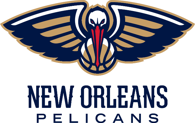
The team came into being after the Charlotte Hornets moved to New Orleans in 2002. The new logo featured the new city’s wordmark at the top of the logo, with a hornet dribbling a ball colored light yellow. The stripes on the hornet, and the eyes were colored a dark blue, with the city’s name stretched across it in white and yellow.
The team’s previous NBA logo wordmark was displayed below it in red letters, and the name of the city was written at the top in white. A red Fleur de Lis also made an appearance at the top of the logo. However, at the end of the 2023 season, the New Orleans Pelicans changed their logo again.
This time, the pelican is more prominently displayed, flying above with the basketball clutched in its bill, hiding its body except for the head and the wings. Underneath it is a new wordmark for the city name, which has gone for thinner typography, albeit one that is still ornate in design with little serifs. The new color scheme for the wordmark is a dark navy blue, a prominent departure from the previous red.
Minnesota Timberwolves
The first true logo for the Timberwolves was released in 1996, with the addition of a black-and-silver wolf standing menacingly between the trees. The wordmark “TIMBERWOLVES” appeared in a large and rough typeface at the bottom, with the word “MINNESOTA” just above the team wordmark.
2008 saw slight changes made to the design, which added white accents to the wolf, lightened the shades of green of the trees, and simplified the font and white color for the wordmark.
Finally, the current version of the logo was released in 2017, and portrays a navy blue and light gray wolf with green eyes howling at the moon. The background is a medium blue basketball with a green start at its top. A gray ring encircles the image, with the team’s name “MINNESOTA TIMBERWOLVES” curving over the ring in simple white font.
Another gray ring encircles the entire logo, rounding off the image.
Dallas Mavericks
Introducing their new logo in 1994, the team added the name of their city to the design. Now the words “DALLAS MAVERICKS” appeared in solid blue within the design, with no outline; green or otherwise.
2002 saw the team go in a different creative direction, and introduce a new logo. The new symbol used a shield for inspiration, with the head of a stallion with its mane flowing about in a way that mimicked the outline of a basketball. Below the image, was the wordmark “MAVERICKS”, with the bottom edge of the shield sported a white star.
The current Mavericks logo underwent slight color iterations as the shield is a darker gray and the shade of blue next to the stallion appears darker. Featuring the horse prominently in its design, it gives a vibe quite similar to the Denver Broncos logo from the NFL, albeit with the blue coloring preferred by the Dallas-based Cowboys.
Oklahoma City Thunder
Originally called the Seattle Sonics, Oklahoma City Thunder is another team which has gone by many names and sported many different NBA logos over the years. In fact, considering the fact that the team was renamed in 2008 to represent their new city, they have only introduced the one logo so far.
Released in 2008 when the Seattle Sonics moved to Oklahoma, the logo is in the form of a shield. The initials for the team, “OKC” are spread across it, with the partial image of a basketball behind the text. A couple of streaks colored orange and blue round off the design, with the word “THUNDER” curving over the top of the logo in navy blue font.
NBA Logo and Team Symbols in 2024 – What Do They Say About the NBA?
Within the last few years, with many teams and associations around the world being accused of cultural appropriation and social injustices, the logo designers for NBA teams of today have been free of these due to their choice of opting for a more neutral mascot.
And especially with so many players on the teams being people of color, and many of them following actions of peaceful protest, this has helped the NBA logos keep themselves free of any conflict, this has helped the NBA team logos keep themselves free of any conflict, such as the one that plagued the NFL Washington Commanders logo and name.
Best NBA Logos of All Time – Which of NBA Team Logos Have Left Their Mark?
Now, unlike a few of these NBA logos like the Chicago bulls or the Golden State Warriors, which are truly majestic, the choice of favorites among these symbols is a matter of personal taste. However, many teams use a NBA logo that does not represent them effectively, and as such fail in their tasks to make themselves and the team they represent, truly iconic.
I our opinion though, some of the best NBA logo design currently featured on the roster include:
- Los Angeles Lakers
- Houston Rockets
- Minnesota Timberwolves
- Dallas Mavericks
- Chicago Bulls
- Atlanta Hawks
- Boston Celtics
- New York Knicks
- Charlotte Hornets
- Golden State Warriors
Can You Recognize These Popular NBA Logos Without Their Team Names?
Now that you have studied the history of the NBA logo and the variety of NBA team logos on the roster today, which ones would you recognize them without their names as clues?
Creating a strong logo for a sports team that represents the brand and lasts a long time can be a difficult endeavor, and one that can be a constant process of trial and error. However, armed with the right inspiration, and the knowledge needed to ensure that the resultant logos are a success, you will be able to streamline the process easily.
If you want to know how to create a logo like the ones above for your neighborhood basketball team or club, then Logo Poppin can help you. Our expert designers are highly skilled in creating the perfect symbols for a variety of sports and athletic activities.
People Also Ask (FAQs)
| What is the oldest NBA logo? The old NBA logo was introduced in 1950s. It had a circular shape designed with an idea of basketball. The typefaces kept changing in the logos introduced during the 1950s which is what seen as a minimal modification. |
| What is illustrated in the logo of Phoenix Suns? The logo of Phoenix Suns showcases a Basketball lit up with a star shape design. It looks quite simple, yet offers a very bold presentation of the NBA franchise. |
| What is the color combination of Detroit Pistons logos? The color combination of Detroit Piston logo is blue and red. It looks quite aesthetic, as the whole design has been made flawlessly using a simplistic circular art. It has similarities with the shape of basketball, showcasing a decent relevance with the theme of NBA. |
| What are the best NBA logos in 2024? The best NBA logos include Chicago Bulls, Cavaliers, and the Golden State Warriors. |
| What happened to the old NBA team logos? As per the norm, many of the old NBA logos failed to keep up with the times, and as such required the franchises to keep updating them from time to time. |
| What is the most popular NBA logo? The most popular NBA logo is the one for the Lakers, as they feature some of the best players and teams in the association. |
| How many NBA teams have logos? Currently all 30 of the teams in the NBA have logos. |
| How often do NBA teams change their logos? It is rare that a team changes its logo quickly in the NBA. They either do it to update their logo according to the changing aesthetics of people, or to highlight their move to a new city. |
| What are the most iconic NBA logos? Some of the most iconic NBA logos include: • Lakers • Clippers • Spurs • Rockets |
| How many colors are in the NBA logo? The NBA logo uses a three-color palette, featuring red, blue, and white. |
| What NBA teams have the most creative logos? Some of the teams in the NBA with most creative logos include: • Cavaliers • Hornets • Grizzlies • Wizards |
| Did Jerry West get paid for the NBA logo? No, Jerry West has never been paid for the use of his image in the design of the NBA logo. And the biggest reason for that is because the NBA hasn’t officially accepted that the logo design represents him. According to the designer Siegel, NBA “wants to institutionalize the logo, rather than individualize it”. |
Latest news you want to know!
Subscribe for cutting-edge design inspiration at Logo Poppin! Elevate your brand with updates on logos, branding, web design, and video animation.
Note that by clicking “subscribe,” users may agree to our privacy policy and consent to Logo Poppin to use your contact data for newsletter purposes.
Logopoppin
Logopoppin is a graphic design agency that specializes in logo designing, web development, video production and advanced branding services. We love to innovate businesses with new age technologies, allowing them to improve their visual reputation.

