Table of Content
Understanding Different Types of Negative Space Logo Ideas in Detail
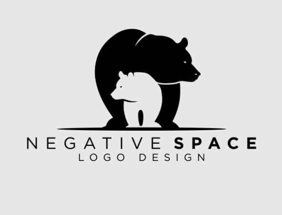
The art of logo designing has changed quite a lot in the last few years. It has become more advanced, allowing designers to bring in more creativity in the emblem. The practices to design a logo have also changed seeing all these new trends. Today, designers are opting out from using conventional design, as it is quickly getting outdated in the market. They are now focusing more on working with new strategies that can add a refreshing touch of creativity in the logos. The negative space logo design is therefore gaining a lot of popularity in the market, as it is introducing a new craft to use white space in the design.
It should be noted that the art of using white spaces in an artwork is not a new thing. However, its usage in logos certainly appears to be revolutionary stuff. Therefore, instead of calling it a white space, the design industry has termed it as negative spacing. It utilizes the same process of leaving the space in such a manner that it could portray some sort of image or picture. This basically depends on the logo design agency or freelance designers how they want to portray any figure using the negative space. It could either be a short or big illustration depending on the needs of visual creativity.
In this article, we will take a detailed look into the art of using negative spaces in the logos. Let’s first understand its concept, so that you can get a good knowledge about its need and usage in the logos.
What is a Negative Space?

Some people often remain confused in understanding the concept of negative space. Most of them are tricked by the name of this technique, which is indeed very puzzling.
Making the point clear, negative space is basically the blank space that is left untouched on the design. This means that a particular area in the design has been left with a complete mark of whiteness or any other suitable color. But, there is a huge art of creativity in it which certainly defines the caliber of the designer.
The untouched spaces are basically smartly left to portray any specific type of figure in the design. Now, this type of illustration using a white space requires a serious level of design expertise. It can’t be done by just splashing colors and randomly leaving a whitespace. Instead, it requires a prior structure in mind, defining how you will use different color combinations in particular areas to make the untouched white spaces look like a figure in the design.
Most of the designers are not well versed in using negative spaces. It is therefore recommended to look at various examples given on the web to learn this art perfectly. It lets them understand the rules of leaving the white spaces, so that the overall design can portray some sort of image using it.
The Concept of Using Negative Space in a Logo
As defined above, designers are always looking to work with different types of techniques to create brand emblems. This has led them to use negative space in the logos, as it offers a unique level of creativity in the design. Not just the logos, but negative spaces are also used in other forms of artwork. It includes banners, flyers, posters and more others.
Basically, it depends on the designer how he wants to portray an image or figure using negative space in the design. The instinctive level of creativity matters a lot in this regard. It means that using negative spaces in the design largely depends on your own mind and skills. If you have got the ability to illustrate any image within an image, negative spacing could prove to be the perfect option for you.
How to Use Negative Space in the Logos

To use negative space in a logo, you need to think creatively as well as smartly. It is not a conventional type of designing, because it requires you to demonstrate a figure within the logo in a hidden manner.
If you don’t have much knowledge about negative space logo designing, here are some tips that will help you to learn its art. Let’s take a look at them below.
Think About Your Figure
As stated above, negative space logo designing requires you to take a different approach. It is not that kind of design in which you have to just think about the basic layout. Instead, you have to think more in a detailed way to finalize that figure which will be hidden inside the whitespaces. This will further require to create a plan how the whole process will go, including that of designing the negative space.
A lot of times, designers do not think about this fact. They try to create the main design first without looking into the negative space required in it. This eventually brings difficulty for them when they are asked to add negative space in the finalized design. It is certainly very difficult to do that, because changing a completed design will require everything to get modified.
So, if you want to avoid this type of situation, always think preemptively about the negative space required in the logo. This will help you to stay away from those complexities that could arise later in the designing process.
Pick the Colors for Each Section

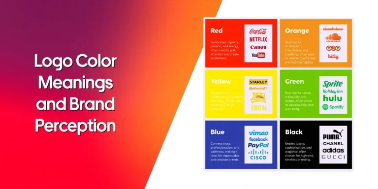
The color selection for a negative space logo is quite vital for the designers. Keep this in mind that these logos are made using more than one color. Hence, you need to keep the balance between them while selecting from the cluster of colors. Picking a perfect contrast that can differentiate between the main design and negative spacing would certainly do the job for you.
If you are confused in selecting the right color combination for a negative space logo, try to consult with any experienced logo designer near you. This will help you to come up with the right options, one that will suit perfectly in your logo.
These types of suggestions also allow you to learn some good tips from the professional designers. It will enhance your knowledge about graphic designing, enabling you to make better color selection decisions on your own.
Create the Logo According to the Latest Standards
Once you have selected the right color, it’s now time to start the logo designing in detail. This will be a lengthy process, as it will require your dedicated attention in the process. Any little mistake can prove to be a detrimental thing in the later stage of designing. Hence, it is recommended to give your complete attention while designing a negative space logo, so that the chances of mistakes can be reduced.
Meanwhile, also keep in mind to consider the trends while designing a negative space logo. It plays a big role in making any design live up to the mark of modern standards. If you will try to ignore the trends, your logo design might end up just like trash. Therefore, always try to look at the trends, so that you can come up with a great design.
Famous Negative Space Logos Examples
While designing a negative space logo, you must also need to know about its types. It allows you to know which type of design you would be pursuing, considering the design requirements of the clients. Here are some of the important types of logos you should know about.
Wordmark Logos

Negative spacing is commonly used in the wordmark logos. Many companies have created their logos using this unique technique. It brings a great flare of distinctiveness in the design, allowing people to take immediate interest in the logos.
Generally, the wordmark logos consist of only two types of colors. The first one is used for the wordmark, while the second one helps in the designing of a negative space. The selection of these colors depends on your branding elements. Hence, it is always advised to pick them precisely, so that your logo can portray the perfect brand image.
Intra-design Logos

The layout of the intra-design logo is quite complicated, but does offer a very delicate appeal. Its design is also a bit difficult from the conventional wordmark logos, because it includes a figure within a figure. This indicates that intra-design logos can only be created by an experienced designer who has got good knowledge about complex logo designing.
Unlike other logos, intra-design logos can take a bit more time to complete. That is because these logos are harder to design as compared to the normal logos. As a designer, you need to take care about various types of intrinsic details while working on these logos. These little things offer a great impact on the design, hence it is recommended to address them smartly while creating a logo.
Letterform Logos

Besides the normal wordmark emblems, negative spacing is also separately used in the letterform logos. We know that many companies just like to use their brand initials in their logo. It can be further optimized by using negative spaces, precisely with a touch of creativity.
If you are struggling to grasp this idea how a negative space could be used inside a letterform, take a look at the different examples given on the web. It will help you to learn its precise technique, allowing you to design them with complete perfection.
Frequently Asked Questions
| 1. What is a negative space logo? A negative space logo is a unique type of designing that portrays a figure within the whitespaces. This is precisely done to add a bit of creativity in the design to make it look attractive. |
| 2. How are negative space logos different from others? Unlike other conventional emblems, a negative space logo illustrates a figure within the design. It could include anything depending on the requirements of a company such as geometric shapes, abstract art and more others. |
| 3. How to design a negative space logo? To design a negative space logo, you need to first pick the colors and style wisely. This will help you to plan everything in advance as per the requirements. It will simplify your understanding as well as also help you to get the whole process done easily. |
| 4. What type of colors should be used in a negative space logo? A negative space logo can be designed using different types of colors. There are no particular limitations or restrictions for it. However, just make sure to use those colors that relate directly with your theme, so that branding can be done easily. |
| 5. What can I learn about negative space logo designing? The best way to learn about negative space designing is by looking at the different examples given on the internet. You can find plenty of stock logos on sites like Freepik, Shutterstock and others to know more about negative space designing. |
Conclusion
That concludes our entire article in which we have discussed some useful tips to design a negative space logo. It is indeed a very creative type of logo that looks very catchy to the eye. The designing of these logos also requires a good amount of skills and dedication. A budding designer with limited knowledge cannot design a negative space logo. It could only be handled by an experienced designer or an agency that has got the knowledge about color selection and styling as per the latest standards.
So, if you are looking for an agency that can help you to design a negative space logo perfectly, contact us today. We are quite well versed in designing these kinds of logos, rightly as per the given branding requirements.

Logopoppin
Logopoppin is a graphic design agency that specializes in logo designing, web development, video production and advanced branding services. We love to innovate businesses with new age technologies, allowing them to improve their visual reputation.


