
Table of Content
Discover How the Netflix Logo Transformed From Its Initial Design to Modern Iteration
In the digital age we are in today, where entertainment is delivered on-demand and consumed across a multitude of devices, Netflix stands as a towering figure, a pioneer that fundamentally reshaped the way we access and enjoy movies and television shows. Its journey from a humble DVD rental service to a global streaming behemoth is a testament to innovation, adaptability, and strategic branding.
At the heart of this transformation lies the Netflix logo, a visual symbol that has evolved alongside the company, reflecting its growth and changing identity. From its initial, somewhat utilitarian design to the sleek, minimalist icon we recognize today, the Netflix logo’s history is a fascinating narrative that mirrors the evolution of the streaming media industry itself.
In this article, we will explore the captivating history of the Netflix brand logo, tracing its origins and analyzing its evolution through various stages. We will explore the company’s journey from its early days as a DVD rental service to its current status as a streaming giant, examining how these transformations influenced the logo’s design.
We will also analyze the symbolism embedded within the logo, the meaning behind its font, color scheme, and overall aesthetic, and discover how a professional logo design agency can be the difference between success and failure. By understanding the evolution of the Netflix logo, we can gain valuable insights into the power of effective branding and its crucial role in building a successful global brand.
History of Netflix – From Physical Entertainment Media to Streaming Pioneer
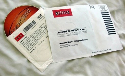
Netflix began its journey in 1997 as a DVD rental service, offering customers the convenience of renting movies and television shows online and receiving them through the mail. This innovative approach disrupted the traditional brick-and-mortar video rental market, offering a more convenient and cost-effective alternative. The company’s initial business model focused on a subscription-based service, eliminating late fees and offering a vast library of titles.
The pivotal moment in Netflix’s history arrived in 2007 with the launch of its streaming service. This marked a significant shift from physical media to digital content delivery, transforming Netflix into a pioneer in the burgeoning streaming industry. The ability to stream movies and TV shows instantly over the internet revolutionized the way people consumed entertainment, offering unprecedented convenience and accessibility.
As broadband internet access became more widespread, Netflix’s streaming service experienced exponential growth, solidifying its position as a leading player in the digital entertainment market. This transition also necessitated a shift in the company’s brand image, moving from a service focused on physical rentals to a cutting-edge technology provider.
Evolution of the Netflix Logo Over the Years
The Netflix logo has undergone several transformations, each reflecting the company’s evolving identity and strategic direction. These changes have been marked by a gradual simplification and a shift towards a more modern and globally adaptable design, exploring various types of logos before settling on the current one.
The logo’s transition from a detailed wordmark to a simplified “N” icon signifies a move towards a more universally recognizable and adaptable symbol, essential for a global brand operating across diverse platforms and cultures. This simplification also mirrors the streamlining of the user experience that Netflix has consistently strived for, emphasizing ease of access and immediate gratification.
Let’s check them out in detail.
First Netflix Logo (1997-2000)
The inaugural Netflix logo was a product of its time, reflecting the late 1990s aesthetic. It was a relatively complex wordmark, featuring the company name “NET FLIX ” in a bold, uppercase, serif font. The “NET FLIX” portion was rendered in a black, while the reel design was in purple that darkened to black. This initial design was functional and straightforward, primarily serving to identify the company as an online DVD rental service.
- Functionality Over Aesthetics: The primary objective of this logo was to clearly communicate the brand name and its online presence. The inclusion of the reel was essential during the early internet era, emphasizing the company’s digital nature. The dark color, while not as vibrant as later iterations, still conveyed a sense of energy and excitement.
- Early Internet Aesthetic: The font choice and overall design were typical of early internet companies, prioritizing clarity and readability over visual sophistication. This logo served its purpose in establishing the brand’s identity during its initial phase, but it lacked the visual impact and memorability that would characterize later designs. The logo was primarily used on the company’s website and early marketing materials, reflecting its nascent stage in the entertainment industry.
Post-Y2K Netflix Logo (2000-2001)
As Netflix entered the new millennium, it underwent a significant logo redesign. The reel design was dropped, and the “NET FLIX” wordmark was made more modern. The purple color was replaced with a bright yellow flanking the logo, and the design used some quite futuristic fonts, giving it a more polished and contemporary look.
- Refinement and Modernization: This redesign signaled Netflix’s growing confidence and its move towards a more refined brand image. The removal of “.com” reflected the increasing familiarity of consumers with online services, making it unnecessary to explicitly state the company’s online presence. The brighter red color added a touch of vibrancy and energy, aligning with the brand’s evolving image as a dynamic and innovative company.
- Transitional Phase: This logo represented a transitional phase, bridging the gap between the company’s early days as a niche online service and its growing ambitions as a major player in the entertainment industry. The subtle changes in font and color reflected a gradual shift towards a more modern and sophisticated brand identity. This logo was used during a period of significant growth for Netflix, as it expanded its customer base and solidified its position in the DVD rental market.
The Netflix Logo That Popularized the Brand (2001-2014)
This era saw the most significant evolution of the Netflix logo. The wordmark became more stylized, with a distinct drop shadow effect that added depth and dimension and the red color back. The font was also refined, giving it a more rounded and approachable appearance. This logo became synonymous with the Netflix brand during its rapid growth and transition to a streaming service.
- Visual Depth and Approachability: The drop shadow effect added a sense of depth and visual interest, making the logo more eye-catching and memorable. The rounded font softened the logo’s appearance, making it more approachable and user-friendly. This design reflected Netflix’s growing focus on providing a seamless and enjoyable user experience.
- Brand Recognition and Growth: This logo played a crucial role in establishing Netflix as a household name. It was prominently displayed on the company’s website, DVD mailers, and early streaming interfaces. This logo’s longevity helped create a strong association between the design and the brand itself. As Netflix transitioned to streaming, this logo helped maintain brand recognition during a period of significant change.
Current Netflix Logo (2014-Now)
In 2014, Netflix introduced its current logo, one of the most popular additions to red logos, a simplified “N” icon. This minimalist design reflects the brand’s evolution into a global streaming giant, operating across diverse platforms and cultures. The “N” icon is easily recognizable and adaptable, making it ideal for use in the digital age.
- Minimalism and Adaptability: The “N” icon represents a move towards a more modern and streamlined brand identity. This minimalist design is highly adaptable, allowing it to be used effectively across various platforms and devices, from app icons to large-scale advertising campaigns. The simplicity of the design ensures that it is easily recognizable, even at small sizes, which is crucial for mobile devices and digital interfaces.
- Global Brand Identity: This logo reflects Netflix’s global reach and its ambition to become a truly international brand. The “N” icon transcends language and cultural barriers, making it universally recognizable. This design choice aligns with Netflix’s strategy of expanding its content library and reaching audiences around the world. The logo is also used in conjunction with the full wordmark in many cases, offering versatility in application, and ensuring brand recognition is maintained.
Understanding the Netflix Logo – What Does It Represent?
The Netflix logo, despite its apparent simplicity, carries a wealth of symbolic meaning, reflecting the brand’s core values and its commitment to delivering seamless entertainment experiences.
Simplicity and Accessibility
The logo’s minimalist design reflects Netflix’s focus on ease of use and accessibility. The clean lines and straightforward typography convey a sense of simplicity, making the brand approachable and user-friendly. This aligns with Netflix’s goal of providing a seamless and intuitive streaming experience.
Modernity and Innovation
The logo’s sleek and contemporary aesthetic reflects Netflix’s position as a cutting-edge technology company. The use of a bold, sans-serif font conveys a sense of modernity and innovation, highlighting the brand’s commitment to pushing the boundaries of entertainment technology. The logo’s evolution towards a simplified “N” icon further reinforces this image of modernity and adaptability.
Global Reach and Adaptability
The logo’s adaptability across various platforms and cultures is crucial for a global brand like Netflix. The simplified “N” icon is easily recognizable and reproducible, making it suitable for use in a wide range of contexts, from app icons to large-scale advertising campaigns. This adaptability is essential for maintaining brand consistency and recognition in a diverse and rapidly evolving digital landscape.
Entertainment and Engagement
The red color of the Netflix logo is often associated with excitement, passion, and energy. This color choice reflects the brand’s commitment to delivering engaging and entertaining content. Red also has a strong visual impact, making the logo stand out and capture attention.
The Modern Design of the Netflix Logo – Understanding the Transitional Form of the Iconic Symbol

The modern design of the Netflix logo represents a significant evolution from its initial wordmark. This transition reflects the brand’s growth and its shift towards a more streamlined and universally recognizable symbol.
From Wordmark to “N” Icon
Initially, the Netflix logo consisted of a wordmark featuring the company’s name in a bold, sans-serif font. Over time, the brand transitioned to a simplified “N” icon, which has become the primary visual identifier for Netflix. This transition reflects a move towards a more minimalist and adaptable design, suitable for use in the digital age. The “N” icon is easily recognizable and reproducible, making it ideal for use across various platforms and devices.
Color and Typography
The iconic red color of the Netflix logo has remained consistent throughout its evolution, reinforcing brand recognition and association. The logo fonts used for the wordmark and the “N” icon has also been carefully selected to convey a sense of modernity and simplicity. The bold, sans-serif typeface is clean and legible, ensuring that the logo is easily readable and recognizable, even at small sizes.
Transitional Forms
During the transition from the wordmark to the “N” icon, Netflix experimented with various transitional forms, including a stylized “Net” and other variations of the “N.” These transitional forms helped to gradually introduce the new icon and build brand recognition. The final “N” icon represents the culmination of this evolution, reflecting the brand’s commitment to simplicity, modernity, and global reach.
Adaptability in Digital Contexts
The simplified “N” logo works exceptionally well in the digital landscape. It functions well as a small app icon, within social media, and on large displays. The design is optimized for digital screens, ensuring clarity and impact across various resolutions and devices.
FAQs
| What is the Netflix strapline? The Natflix strapline reads “See What’s Next,” a catchy phrase that has stuck with Netflix patrons propensity for binging. |
| Why was Netflix named Netflix? The company felt that the future of movie rentals was through the internet, thus combining the words “internet” and “flicks,” a common word for movies, together to form Netflix. |
| Why did Netflix become famous? As more and more people are looking for entertainment on demand, Netflix emerged as a tool that disrupted local cable TV dynamic to give people the entertainment they wanted, when they wanted it. |
Conclusion
The evolution of the Netflix logo is a compelling narrative that mirrors the company’s transformative journey from a DVD rental service to a global streaming giant. Each iteration of the logo reflects the brand’s strategic shifts, its commitment to innovation, and its focus on delivering seamless entertainment experiences. The modern “N” icon stands as a testament to the power of minimalist design and its ability to create a universally recognizable and adaptable brand symbol. By understanding the history and symbolism of the Netflix logo, we can gain valuable insights into the crucial role of branding in building a successful global brand.
Logopoppin
Logopoppin is a graphic design agency that specializes in logo designing, web development, video production and advanced branding services. We love to innovate businesses with new age technologies, allowing them to improve their visual reputation.
