
Table of Content
Discover the Origins of the Saints Logo, and the Various Shapes It Took Over the Years
The National Football League, or the NFL, is made up of thirty-two different teams that hail from different states and cities across the United States. For each of those teams, or franchises, there is a specific name and symbol that they are known by among the fans.
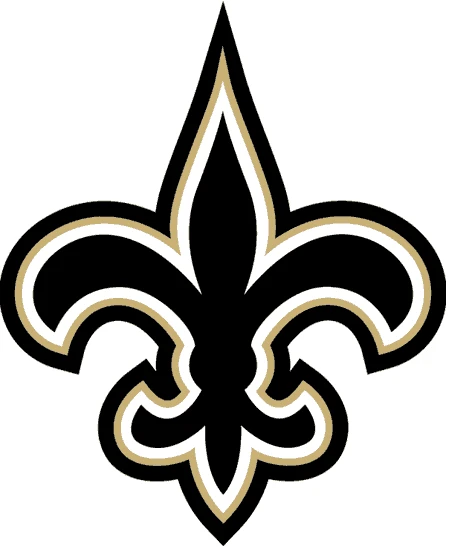
For the New Orleans Saints logo, that symbol is the fleur-de-lis. This French-origin symbol is also known as the sigil for the old French Royal Family, meaning that it has a rich history. And considering that the region around Louisiana and New Orleans has a rich French-influenced creole and Cajun heritage, it is natural that a French-inspired symbol would be used by a local team.
However, if we consider teams like the Arizona Cardinals or Carolina Panthers, how did this specific symbol make it onto the New Orleans team logo? How has it evolved over the years to match its fan base’s aesthetic? And what cultural impact has the use of this symbol had over the locals, considering that the French were colonists in the area that is home to the Saints team?
These questions and more will be answered in this article. Read on and discover the strong impact of a culturally deep-rooted symbol on a brand. We will also see how a professional logo design company can leverage that symbol to extract its maximum visual and emotional potential.
A Brief History of the New Orleans Saints and the Origins of Their Logo
New Orleans and the area around the Mississippi area has strong French connections, with a little Spanish influence. By the time the Americans took possession of the area from the French in 1803, the area had assimilated French customs and language into local customs as well.
From the language to the food, especially among the lower classes of people such as African freedmen and slaves, the local language had incorporated much from the French language. Even today, in areas around the Louisiana Bayou, you will find many areas that are French-influenced.
This influence is similar to how the area around New England in the USA is influenced by Irish culture, due to the early immigrations of pioneers to that area. And when it comes to cultural influence, symbology is a major part of that.
The French Royal Family who controlled and established the city of New Orleans had the fleur-de-lis as part of heraldic symbol. As such, the symbol held a special importance in all French colonies and constituencies.
Today, the symbol can be found all around New Orleans, from examples of architecture, to being incorporated into the logos for businesses in the area. And when the NFL offered the city a franchise, it was believed that there was no better symbol to represent the local people and the area than the fleur-de-lis.
Since its inception, the team has one league championship win and one conference win, both in 2009. For most of their history, they have been plagued by a weak defense, which at its worse was considered one of the worst the league had ever seen. And it is primarily due to a strong defense under coach Sean Payton, that they have achieved seven of their nine division wins.
The Saints Mascot
When we talk about logos, especially for sporting teams like the New Orleans Saints, there is often a special connection between the brand logo and the mascot. And that is especially true for brands with animals or other such characters as part of their logo design.
Now, the question for teams and brands that have no visible connection to a mascot-like imagery, is how to incorporate the identity of a mascot within their branding? Well, let’s take a look at the mascots – yes, plural – for the New Orleans Saints, and see how they have done it.
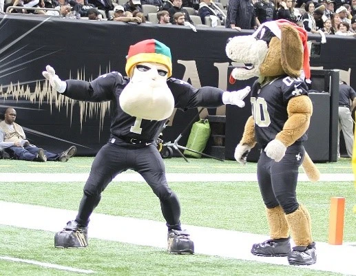
The first mascot for the team is Gumbo the Dog. He is modeled after a Saint Bernard dog, who wears a Saints jersey with the number 00, with black pants and shoes. The reason for its name and imagery is quite interesting.
As the Orleans Parish, which contains New Orleans, borders the area, the Saint Bernard imagery was chosen as a way to connect with their neighbors. As for the name, Gumbo is a popular Cajun dish, and one that is loved by all in New Orleans, old or young. The result was an exciting mascot for the team.
The second mascot for the team is called Sir Saint. Now this mascot is a little non-traditional. Instead of some kind of animal imagery, the mascot features a Caucasian man with a big chin, who wears the Saints uniform and helmet. Alongside Gumbo, this mascot too serves to represent their team successfully.
Since the inception of the team mascots, the franchise has used them in different ways. For Sir Saint, they have used the imagery of the mascot alongside the 1967-1984 brand logo. As for Gumbo, the mascot was originally an actual Saint Bernard dog that roamed the sidelines during a match, and bucked up the players’ morale.
Evolution of the New Orleans Saints Logo Over the Years
Logo designs for many sports logos are often inspired by the history or any point of significance of the team’s home city. If we take a look at the Denver Broncos logo, the image of a racing bronco perfectly represents the area’s historical significance in the Wild West era.
Let’s take a look at the New Orleans Saints logo to see how the team’s symbol relates to the name or history of its host city, as well as its evolution over time.
1967 – 1999
The first iteration of the logo for the New Orleans Saints was developed in 1967, when the team was first formed as part of the NFL’s expansion. The symbol used was the French fleur-de-lis, which is a symbol used by the French royal family who founded and ruled New Orleans for a long time.
The design of the fleur-de-lis, also known as the flower of lily, is an important heraldic symbol that has been used by many different aristocratic families through the ages. The most recent example was as the French royal coat of arms, which was used regularly from the high middle ages until the late 18th century and then sporadically throughout the 19th century.
When it came time to choosing a symbol for the team, there was no better symbol than the fleur-de-lis that represented the area’s French history. The resultant logo featured clean design colored black. The main body of the logo was black. The design also features a thin, white pinstripe before the edges of the design, which makes it look as if the outline is made with a pair of alternating white and black lines. And this design was good enough that it lasted for more than three decades, until the turn of the 20th century, showing the power of simple symbology in various types of logos.
2000 – 2001
In 2000, the logo featured a revamp to its design. The logo was made bolder, with thicker, more visible lines which improved the logo’s visibility at greater distances. The new design now featured a dark golden fleur-de-lis inside that had a slightly thicker black outline than the previous iteration.
The white and black outer borders were also made thicker, which made the design stand out better visually. However, the logo, while good enough, failed to make as significant an impact as the team had hoped for, with a bolder look and darker color combinations. And it was only two years later that the teams.
2002 – 2011
In 2002, the logo was again redesigned. This time, the internal golden color was made several shades lighter, which provided a much needed contrast to its black and white outline. The lighter color emphasized the internal outline, as well as the two outer outlines.
Now matching the team’s light gold kit, the logo was a signature image that was used for more than a decade by the franchise.
2012 – 2016
In 2012, after the previous logo’s long run of 11 years, the team decided to rebrand the New Orleans Saints symbol again. This time, they tweaked the inner gold color for a lighter, more heavily contrasting shade of gold that made it look as it the design was bathed in moonlight.
The lighter gold shade was designed to make give the logo a more regal look, and bringing it closer to the heraldic symbol that inspired the design. This high contrast shade resulted in the golden color being mistaken for gray in some scenarios, and was a great example of a monogram logo design.
2017 – Today
In 2017, five years after the release of the last New Orleans logo, the franchise revamped the logo design for the team again. While identical to the previous logo design in many aspects, the inner gold shade was darkened by one level to make it more visibly golden.
Similarly, the design was made a little larger for better visibility, which meant that the logo could be seen and recognized at greater distances. And since 2017, this is the logo that the New Orleans Saints have been wearing on their jerseys.
One interesting thing to note about all of these logo iterations is that while the logo has been tweaked from time to time, the base design of the logo is the same as that chosen at the team’s initiation. That shows that when your brand has the right logo symbols and design, you only need to tweak it rarely from time to time.
The New Orleans Saints Logo Wordmark
When it comes to sports team logos, there are often two different logotypes that are used. One is the primary that features that main symbol of the team, while the other is the team wordmark. Now, some teams may use their wordmark as their primary logo, as in the case of the Washington Commanders logo.
The New Orleans Saints wordmark is an interesting design. The design uses a serif font that has a varying stroke width style often found it many baroque or gothic typefaces from the Middle Ages. The color of the wordmark is a simple black, which contrasts well with the light gold of the fleur-de-lis.
The interesting style of the letters is such that it successfully blends the elegance of the baroque style, while combining it with the smooth strokes of modern typefaces. And the letters, when accompanied by the fleur-de-lis of the primary logo, result in a regal-looking design that hints at a rich and interesting history.
The Cultural Significance of the Fleur-de-lis in America – Why is it So Controversial?
In recent years, there have been increasing calls for critique and removal of insensitive symbology from sporting leagues across the US, such as from the MLB or NFL logos. After the George Floyd killing in 2020, and the subsequent drive that saw the renaming of the Washington Redskins to the Washington Commanders, many sporting companies are looking to explain why their logos are not insensitive.
When it comes to the fleur-de-lis, many social activists argue that it is a symbol commonly associated with that area’s slavery history. Now the act of slavery here started under the rule of the French, and continued under the Spanish, and finally the Americans.
The franchise however argues that the French and their influence in New Orleans, both good and bad, is part of the city’s identity. And by adopting that symbol, the team is aiming to own up to its identity, and bring to light its aspects so that people can learn and talk about it.
Unlike the overtly racist connotations of the Redskins symbol and name, or the blatant appropriation of cultural imagery in NHL’s Chicago Blackhawks, the case of the New Orleans Saints logo is different. Their imagery, while somewhat provocative to the families of former slaves from New Orleans, also heralds the rich cultural history of assimilation between Creole and French culture in the region.
Coming back to its cultural significance, there is no denying that the French had a massive role in the cultural and ethnic renaissance of the region. From the language, to the food, the ethnic diversity, and more, the French left a lot more than just their symbol in the New Orleans area.
And even today, the symbol can be found all over the region, not just in New Orleans but all over the Bayou. So if that is the case, then the question is, if not the fleur-de-lis, then what else? What other symbol could encompass the entirety of the New Orleans area, its culture, history, and the people?
That is the cultural significance of the fleur-de-lis in the New Orleans Saints logo.
FAQs
| What does the New Orleans Saints logo stand for? The fleur-de-lis, or the lily flower, is the symbol of the City of New Orleans, as well as the French Royal Family that founded the city. |
| What is the spiritual meaning of the fleur-de-lis symbol? It is a symbol that is historically used to represent the traits of purity, which is often why it is used for heraldic symbols such as that for the French Royal Family. |
| What is the connection between the fleur-de-lis and slavery? Under French rule, the colonies enslaved by them were often treated harshly. In those times, a slave that was considered insubordinate, or caught stealing food or running away, was branded with a fleur-de-lis as a reminder of their actions. |
| What does the New Orleans Saints wordmark represent? It represents the rich cultural history of the city, as well as the royal connection to the French royal family, through its typeface. |
Conclusion
To sum it up, the New Orleans Saints logo, both the symbol and the wordmark, have a rich historical and cultural significance behind them. Whether it is the idea behind the use of the fleur-de-lis, or the use of the baroque-style font for the wordmark, the fact is that it is undeniably one of the best logos in the entire NFL.
Many of the logos that we now see in the league fail to capture the essence of their host cities. Or they fail to connect with their fans at a subliminal level. However, in the case of the Saints, very few NFL teams have captured that essence as perfectly.
And while the team may not have been as successful as some of its brethren in the NFL, the steadfast support of its fans despite that shows the strength of connection they have built with their audience.
Latest news you want to know!
Subscribe for cutting-edge design inspiration at Logo Poppin! Elevate your brand with updates on logos, branding, web design, and video animation.
Note that by clicking “subscribe,” users may agree to our privacy policy and consent to Logo Poppin to use your contact data for newsletter purposes.
Logopoppin
Logopoppin is a graphic design agency that specializes in logo designing, web development, video production and advanced branding services. We love to innovate businesses with new age technologies, allowing them to improve their visual reputation.

