
Table of Content
How the Logo for One of NFL’s First Five Teams Transformed itself Over the Years
In the NFL currently, there are both teams who have been a part of the professional football for decades now, and those who joined the League just a couple of decades grow. When we talk about the New York Giants, they are one of the oldest teams in the league, playing for almost a century now.
However they are now the only team out of five still playing who joined the NFL in 1925. With a logo representing the team, they have managed to win eight NFL championships. Yet if you take a look at the New York Giant logo, you will agree that there is nothing about it that screams style or attraction.
Yet there are a large number of fans that follow it.
We understand that sometimes, the simpler logo designs are all the more attractive, as in the case of the New Orleans Saints logo. However, from a conventional design standpoint, the New York Giants symbol is one that is extremely simple, to the point of being boring and unattractive.
So the question here is, with such a plain-looking design, how has the Giants logo managed to rally such a large fan following behind it? What is it about their logo that make people like them so much? And how can a professional logo design company incorporate that same essence when creating simplistic brand logos? Let’s find out.
History of the Giants – A Franchise Built to Last
The New York Giants, also referred to as simply “The Giants”, are a professional football team that is based out of the NY Metro area. They are one of the few teams who are still playing football professionally. Joining the NFL in 1925 along with five other teams, they were quite beneficial to the success of the League.
However, as time went on, many of those original teams started to fade. Some moved to other cities, while others slowly folded up operations and left for greener pastures. But the Giants, along with fellow senior NFL alumni Cardinals and Bears persevered and managed to establish themselves post-1930s.
The first few years of the New York Giants involvement in the NFL were quite interesting. The first game they played in the NFL was an away game against the All New Britain in Connecticut. The game was a shutout victory for the Giants, in front of a 10,000 strong crowd. And they kept up this string of success to finish their first season with a respectable 8 – 4 record.
It was in their third season when the team finished with a great score of 11 – 1 – 1, that the Giants were awarded their first title due to the best score in the NFL. However, the very next year in 1928, the team suffered an embarrassingly bad season.
The team owner at that time, Tim Mara, had his eye on the Detroit Wolverines’ star quarterback Benny Friedman. But rather than just try to get him for his team, he bought the entire team, and merged it with his Giants squad to form a great team.
By 1930, many people in high places still believed that football didn’t have what it took to be a professional sport, despite the success of the NFL for a few years now. To change their minds, the New York Giants decided to play the Notre Dame All Stars to raise money for the New York homeless. The coach for the All Stars, who also didn’t believe in the quality of professional football, told his championship winning team to score early, and then defend hard to make the match a shutout.
However, when it came time to play, the All Stars had no idea what hit them. It was a decidedly one-way contest, with the Giants scoring three touchdowns while keeping the All Stars from scoring successfully. After the match, Rockne exclaimed that the Giants were the greatest football machine he had ever seen, and that he was glad that none of his players got hurt playing against them. This match, besides raising $100,000 for the homeless cause, also established the legitimacy of professional football.
Fast forward to 1947, and in the 16 years between the Giants playing against Notre Dame and this year, the Giants had qualified for the NFL championship eight times, winning twice. This brought their tally of NFL championship wins up to three, with a hall of famer coach, and multiple hall of famers on the squad.
During this time, the team was ranked as the best defensive team in the NFL, and set records that still stand. Their record of conceding only 7.5 points per game still stands to this day; showing how amazingly strong was the Giants defense of that era. In fact, during the 1944 NFL season, they shut out five of their ten opponents, a feat almost unheard of. Moreover, they also have the prestige of playing in the only game in the NFL history that resulted in a scoreless tie, against the Detroit Lions in 1943.
Up until the AFL – NFL merger, the Giants won the NFL championship only once more, in 1956, under the coaching of NFL legend Vince Lombardi and with a team and staff full of future hall of famers. And it wasn’t until the late 70s that the team started to regain its form again. The 1986 season is considered one of the best scores the Giants ever managed since the NFL started the 16-game season. With a season record of 14 – 2, the team slowly won their way to their first Super Bowl, where the team led by MVP Simms, who scored a record 88% completion percentage, won the championship 39 – 20.
This was their first championship win since 1956, ending a big drought for a team as great the New York Giants. Since then, the team has won three more Super Bowls, and have the third highest number of NFL Championship wins at eight, and the highest number of championship appearances at 19. Their championship tally is third only to the Green Bay Packers with 13 championship wins, and the Chicago Bears with nine wins.
An Overview of the New York Giants Logo and Its Significance
If we take a look at the New York Giants logo, what do you see at first glance? What do you believe it represents at first glance? Well, for many, these kinds of design are usually found in MLB logos, where wordmarks are more prominent than symbols. Moreover, there is an antiquated feel to the design of the logo, showing that the logo represents a brand with a long and rich history.
And that is exactly what the franchise wants to portray. As in the case of the 49ers logo, the logo represents the rich legacy of the team, showing that it succeeded and persevered when many others failed, and made their mark in pro football.
When we compare it to some of the more modern designs used by some of the other teams, we see that the Giants logo tends to stand out. But it isn’t necessarily a bad thing. That makes it distinct and more memorable. For a sport where branding is important and selling merchandise a part of business, being memorable can make for a successful business.
Evolution of the New York Giants Logo And Its Transformation Over the Years
Now that we have had a look at the history and inception of the NFL franchise, and taken a look at the New York Giants logo, we need to take a look at its transformation and evolution over the years. While it may seem that the antiquated design of the primary logo was created in the franchise’s early days, the fact is that it wasn’t until the 1960 season when this style was first introduced.
And it wasn’t until 1945 that the team even had a displayable logo. The first widely known logo for the team was introduced in 1945, and had a unique, sports patch-like design. Since then, the design has continued to evolve and change with the fans’ aesthetic, until we reach the present day.
The question however is, that how does a plain, vintage-style logo such as that used by the New York Giants, have the power to compete against symbols like the Philadelphia Eagles logo? Event the newly revamped logo for the Washington Commanders look modern despite being a plain lettermark. But the logo design for New York Giants hasn’t been changed to adopt a new aesthetic of the other logos.
Therefore, let’s take a look at the evolution of the team logo, and see what makes it so special in the eyes of the fans.
1945 – 1949
The first New York Giants logo was revealed in1945, and featured a unique design. The shape of the logo was oval, with an orange background that makes the rest of the design pop. The bottom of the logo features a rough New York skyline, showing rough outlines of the city’s skyscrapers. In the middle of the logo, standing over the timeline, is a giant football player wearing the New York Giants jersey, with his arm back that held a football he was about to throw. The player had one foot outside the design, with the overall design a play on their name, and an homage to their home city.
Although by that time, the team had already been playing in the NFL for twenty seasons, there hadn’t been a proper team logo until then. Even when the team played against the Notre Dame All Stars, they didn’t have a symbol representing their team. This was one of the reasons why many people didn’t think too much of pro football in the early days.
However, before that time, there were too few teams to justify creating NFL logos. That is because these professional football teams were often quite well known in their areas, and required little branding to draw a crowd. What they needed however, was good gameplay that drew in the crowds and sold tickets.
And for a team that had started achieving success quite early in their career, this wasn’t a difficult task.
1950 – 1955
Five years later, in 1950, World War II had ended and many of the players who had enlisted or were drafted had returned home. During the war, especially once the United States started actively participating after Pearl Harbor, many teams found themselves short of good players. And both the fans and the teams were avidly anticipating the return of those men for the sport to start again in earnest.
Now, many players from various NFL teams had died during the war, including the Giants offensive tackle Al Blozis. However, many others returned, with a large majority of them opting to return to playing football.
To celebrate that, the team came up with a new logo to celebrate this new era in the sport. The new design used the same idea as the previous one, but streamlined it for better aesthetics. The logo was now a circular emblem, which was colored red, and had a pair of thin outlines colored white and red. Around the upper curve of the emblem was the name of the team, with the bottom of the design featuring the New York skyline.
A giant football player wearing the team’s uniform, and with a football ready to throw in hand, straddled the skyline behind the Empire State Building, The overall design this time was cleaner, and more visible, something which addressed the needs of a more modern, post-war era. This change in design approach was also witnessed with other team symbols of that era, including the Green Bay Packers logo.
1956 – 1960
A few years later the team decided to revamp the logo again to keep up with the rising changes in design aesthetic. With the sport gaining massive popularity in the post-war era, the teams were now scrambling to establish and improve their brand identities.
The new logo featured a similar concept as the two versions before it, but improved for modern logo design rules. Instead of an overfilled design like the ones used previously, the team decided to remove the wordmark encircling the top of the logo.
The football player, while still a giant, now showed just the top half of the body, posed in the style of preparing to throw a football. However, instead of the New York skyline, the logo now featured the outside of the Yankee Stadium, another New York landmark. The color scheme used for the logo was blue, which is a common theme found in many team symbols including the Detroit Lions logo.
1961 – 1974
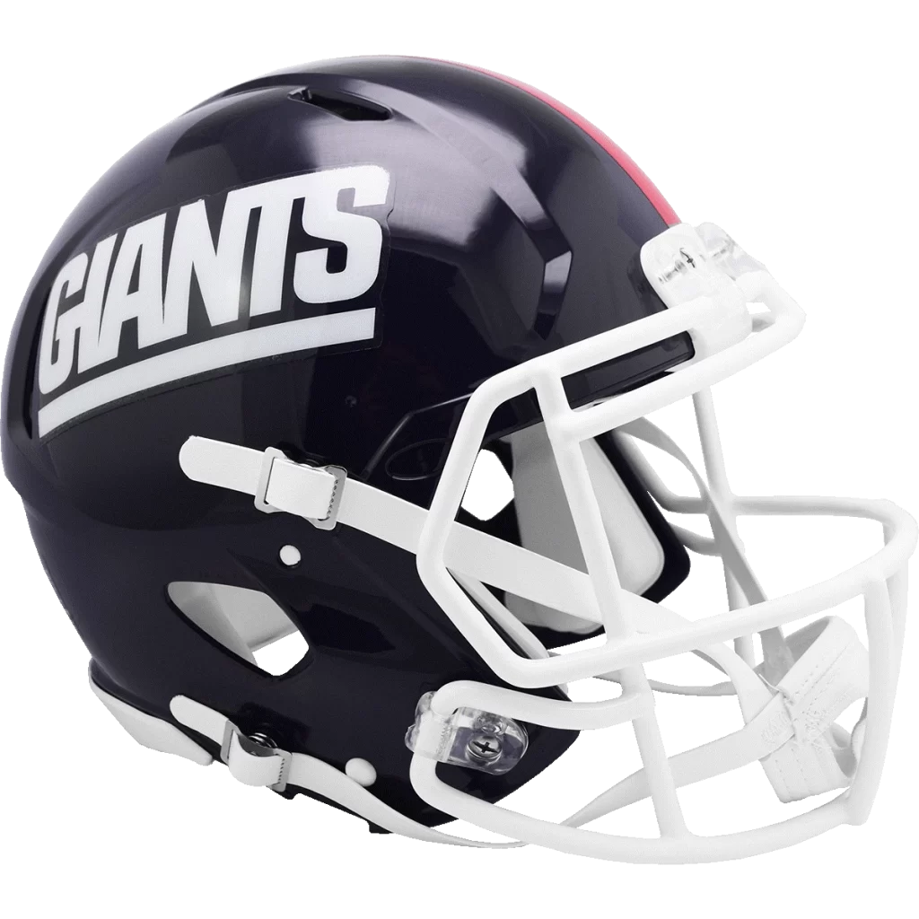
1961 was the year when the New York Giants logo we know today debuted for the first time. Written in all lowercase letters, the lettermark logo had just featured the initials of the city, with the letter “y” having its long tail folded left horizontally, to form an underline under the letter “n”. The design was simple, clean, and highly visible, as is common in minimalist logo design.
This drive for minimalism was slowly getting to some of the teams in the NFL by the start of the 1960s. Franchises were trying to simplify and improve their designs that had previously been too complicated for widespread use as logos. And as teams were now focusing on wider branding for merchandising and other business purposes, this design aspect was utilized.
And the New York Giants were not the only ones. The original Dallas Cowboys logo, released during the same era, features a solid, five-point star as its symbol. And that was it. Nothing else adorned the primary logo for the team, keeping it simple and memorable.
1975
In 1975, the logo for the New York Giants was reworked again. Instead of solid letters spelling the team’s city’s initials, the design now featured the letters written using a set of two lines that formed the letters as negative space between them.
This time, the lettermark was written using one uppercase, and one lowercase letter, with the letter “N” written in uppercase, and the letter “y” written in lowercase. The color was still the same blue as before, but the design was now something similar to the Chicago Bears logo of today. Overall, this was not a great iteration of the logo, as it was used for just one year.
1976 – 1999
For 1976, the team went to using the wordmark as the primary New York Giants logo. The new logo differed from the general wordmark in that the logo had a thin red outline covering each letter, and even the underline.
The design was of the logo was nothing special, and exceedingly plain, even more so than the LA Rams logo used during the mid to late 80s. The color scheme, while good to look at, didn’t pop as instantly as some of the other NFL team symbols from that era.
However, despite that, the logo was used for more than two decades by the team quite successfully.
2000 – Present
The final iteration of the New York Giants logo, and the one still used today, was revealed in the year 2000. It combined the design of the logo from 1961, and combined it with the design aesthetic of the logo from 1976.
Combined, the new logo became a good brand symbol again, with the stylized lettermark no longer serving just as a lettermark, but a brand symbol as well. This design aesthetic was also used by the Washington Commanders logo, who had to quickly revamp their decades-long identity post-2020 due to allegations and pressure about their logo’s racial insensitivity.
FAQs
| Why did the Giants change their logo in 1976? They did so because at the end of the 1975 season, the team moved to New Jersey, therefore they couldn’t call themselves the New York Giants. So they decided to use the team name instead, rather than the city. |
| Why are the New York Giants called that? They ae called the Giants because their home city is full of giant sky scrapers, which at one time were the tallest freestanding structures in the world. |
Conclusion
To sum it up, the New York Giants logo is an interesting study in the design of professional sports logos. Their use of a lettermark and a wordmark when the rest of the League were using mascots and symbols, shows how going against the flow can be beneficial, if you manage to do it well.
As in the case of the Denver Broncos logo, when the team decided to use a combination mark from the mid-70s to 90s, doubling down and standing by your idea can be difficult. However, if you have done your research, then seeing it through is the best way forward.
Latest news you want to know!
Subscribe for cutting-edge design inspiration at Logo Poppin! Elevate your brand with updates on logos, branding, web design, and video animation.
Note that by clicking “subscribe,” users may agree to our privacy policy and consent to Logo Poppin to use your contact data for newsletter purposes.
Logopoppin
Logopoppin is a graphic design agency that specializes in logo designing, web development, video production and advanced branding services. We love to innovate businesses with new age technologies, allowing them to improve their visual reputation.

