

Table of Content
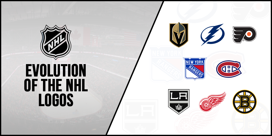
Evolution of the Top NHL Team Logos and the History behind Their Design
Organizations around the world rely on unique symbols and designs to represent their brand identity. That is especially true for many sports and athletic organizations, as they rely on their logos to establish a strong brand presence. And if we take a look at any NBA or NHL logos, we discover that every team has a symbol that brings to mind that specific franchise.
And while we agree that some franchises are better at it than others, no can deny that each of these sports logos is iconic in its own rights. Every one of these symbols used by various athletic teams, from the NFL’s Cardinals, to the MLB’s Yankees, perfectly represents their brand and its values to their consumers.
Coming back to the NHL, let’s discover the NHL team logos used by the League and its franchises, and find out what makes each of these symbols so iconic.
History of the National Hockey League and its First NHL Logo
The NHL, or National Hockey League, is one of the biggest professional sports associations around the world. It comes in fifth behind the NFL, MLB, NBA, and the English Premier League in terms of wealth and revenue. This speaks to its popularity among the masses.
The NHL is considered as the premier ice hockey league in the world, with players willing to sign with an NHL franchise hailing from countries as far as Finland. One of the four major sports leagues in the United States and Canada, it consists of 32 teams, with twenty-five hailing from the US, and seven from Canada.
The history of the League’s inception is quite interesting. The National Hockey League was formed in late November, 1917. Its preceding organization, called the National Hockey Association had just been disbanded, and its members were looking for a replacement to take over.
The owners and managers of the original teams in the NHA met in the Windsor Hotel in Montreal, and came up with the NHL in order to compete for the coveted Stanley Cup. The Stanley Cup was an interleague tournament that saw different ice hockey leagues compete for the ultimate prize.
However, by the year 1926, several mergers and disbands left the NHL the only league competing for the trophy. Initially, the NHL consisted of just four teams, all based in Canada, hence the word National. In 1924, NHL expanded to the USA, with the Boston Bruins being the first North American team to join the League.
Till 1967, the League consisted of just six teams, nicknamed The Original Six. That year, they decided to add some more teams, and doubled in size with six new expansion teams. By 1974, NHL had added six more for a grand total of eighteen franchises, and was up to twenty-one teams by 1979.
The 1999-2000 season of the NHL saw thirty teams playing as part of the NHL, with the thirty-first team added in 2017 and the thirty-second team joining in 2021. Since its inception, the Montreal Canadiens have been the most successful NHL franchise of all time, with twenty-five League titles to their names.
While the NHL only has teams from the US and Canada, it recruits promising talent from all around the world. Players from countries like Finland, Sweden, China, and many others have played for various franchises of the NHL, making for a more diverse player lineup than the ones found during the Original Six era. This is why you see that the NHL logos use a diverse mix of design ideas and concept for their franchise’s symbol, due to the rich and diverse player base.
The Women in NHL
Over the years, the National Hockey League has seen many important firsts, largely due to strong women who made it their goal to break the glass ceiling and reach heights never dreamed of before.
1952-55 saw the Detroit Red Wings enjoying the presidency of Marguerite Norris. As the first female NHL executive, she broke new ground, made even more official by being the first female to have her name engraved on to the Stanley Cup.

In 1992, Manon Rhéaume became the first woman to play in any north American professional sports league. Signing up with the Tampa Bay Lightning, she played multiple pre-season exhibition games, and spent a further five years playing in various junior professional leagues, as well as part of the Canadian national women’s team up until her retirement from pro hockey in 1997.
The 2019 NHL All-star skills tournament saw USA’s Kendall Coyne Schofield participate in the fastest skater competition instead of an injured Nathan Mackinnon. This saw her become the first woman to be officially a part of the NHL All-star skills tournament.
Fellow American Brianna Decker displayed a tremendous premier passer skill, which was three seconds faster than the ultimate winner Leon Draisaitl, but was ultimately not counted due to her not being a part of the competition.
This is just the tip of the impact women have had on the NHL and the sport of ice hockey in general.
Evolution of the NHL Logo Design – A Look at the NHL Logo History
As the brand identifier for one of the world’s most successful professional sports league, the NHL logo is simple and memorable, and speaks to the design aesthetic of the logo design services hired for the job. The first version of the logo was introduced in 1917, which used a shield design with short and soft peaks. Using a black, yellow and white color palette, the logo featured the League’s initials written in a transverse pattern.
This logo concept has been used throughout the 104-year history of the NHL, with the design modified only twice during the years. Today, the NHL symbol still features a shield-like design, with the initials written is a transverse pattern on it, albeit modified to look modern.
Moreover, many individual NHL logos have incorporated its gray, black and white color scheme into their designs, as a way of unifying the design aesthetics of the league.
NHL Logo Colors
The NHL team logos have used a few different color combinations through the years. The first variant used a black-yellow-white color scheme. The second variant, introduced in 1946, simplified the palette to a simple black-dull orange color scheme. Finally, the logo variant used today is colored in a simple black-dim metallic silver.
This change in color palette over the years was a means of signifying the different eras of the sport, as well as a way to connect with the changing sensibilities of their viewers over the years.
NHL Logo Design Fonts
The initial logo fonts used by the NFL logo had a simple, strong sans serif typeface, written in uppercase and denoting a straightforward and secure mindset of the league at the time. Today however, the logo’s font is strong serif typeface, and brings a sense of dynamism and modernism to the sport and the league itself, differentiating itself from the NHL of the past while still paying homage to its century long legacy.
NHL Team Logos – A Look at the Hockey Team Logos in the League
Currently, there are a total of thirty-two teams in the National Hockey League, with the thirty-second team joining the League for the 2020-2021 season. The teams are divided into two conferences, east and west, with each conference consisting of sixteen teams each.
Each conference is further divided into two divisions, each made up of eight teams. This structure is quite similar to the one followed in the NFL, and allows for a more exciting and fierce match structure.
Each team is identified by a unique logo, with some using stylized version of their initials while others opt for more elaborate logo symbols, paying homage to their name or to their home city in their NHL logos.
Let’s begin and discover the NHL logos for the teams that make up the Western Conference of the National Hockey League.
Western Conference NHL Logo
The Western Conference of the NHL is one of two conferences in the NHL, and consists of sixteen teams divided into two groups of eight teams each. Formed in 1974, it was originally called the Clarence Campbell Conference. It was inaugurated when the NHL decided to split its teams into two different conferences with two divisions each.
Initially, despite consisting of the westernmost teams in the NHL, neither the conference nor the divisions were segregated or named accordingly. That is why in 1981, they were realigned to better fit their geography. Moreover, the name too was changed to reflect the geo-positioning of the two conferences and their divisions.
The reasoning behind dividing the teams into conferences was to help non-hockey fans understand the divisions better, as they were similar to how the NFL, NBA, and the MLB teams were distributed.
Since the formation of the western and eastern NHL conferences, only once has this system been ignored. During the 2020-2021 season, the COVID-19 pandemic forced the league to come up with a solution that did not clash with the pandemic restrictions of either country. With both countries trying to restrict the flow of the disease, moving players back and forth across the border was dangerous. That is why, teams were divided into three regions for the season.
The most recent Stanley Cup champions from the western conference are the Vegas Golden Knights who won the 2022-2023 Stanley Cup, with the Chicago Blackhawks having the most League wins of the conference at six. Their logo is one of the simplest NHL logos, with a shield design with the Conference’s wordmark displayed upon it.
Eastern Conference NHL Logo
Like the Western Conference in the NHL, the Eastern Conference was formed with teams from the east of USA. Initially, the eastern conference was called the Prince of Wales Conference. Named after the Prince of Wales in 1925. However, it was renamed in 1974 when the NHL realigned its teams for better geographical grouping.
This conference is the home to the Montreal Canadiens, arguably the most successful franchise in the entire National Hockey League. The team predates the formation of the NHL itself, the only team still playing who can lay claim to this massive feat.
The most recent Stanley Cup champions from the eastern conference are the Tampa Bay Lightning who won the 2020-2021 Championship, with the Montreal Canadiens having the most championship wins of the entire NHL with twenty-four titles to their name.
And just like the Western Conference, the Eastern Conference too has one of the plainest NHL logos in the entire League roster.
The Stanley Cup – A Look at the NHL’s Counterpart to the Super Bowl Trophy
The Stanley Cup is the ultimate championship trophy for the National Hockey League. Each season, team within each division of a conference play together for the chance to play in the playoffs. Finally, the winning team from each conference plays for the right to be that year’s NHL champion, and claim the ultimate prize.
Originally, the trophy was an intra-club competition played between the top teams of various ice hockey clubs is Canada. However, a few years after the formation of the NHL, the majority of these independent clubs and leagues were assimilated within the NHL itself, or disbanded.
This left the National Hockey League the only association left to compete for the championship, and they adopted it as their official season trophy.
Over the years, especially during the era of the Original Six, the trophy was competed for by only a few teams, with limited new talent. But since the expansion of the NHL, many new teams have won the tournament, and the trophy.
Currently, the Stanley Cup winners for the 2022-2023 season are the Vegas Golden Knights of the Western Conference, who won the title by defeating the Florida Panthers, retaining the championship title with the Western Conference for a second year in a row.
Western Conference’s Central Division NHL Logos
The Western Conference of the National Hockey League consists of two divisions; Central, and Pacific. Each division is made up of eight teams each, with the League’s newest team, the Seattle Krakens, a part of the Pacific division.
Let’s take a look at the teams that make up the Central division, and the NHL logos that represent them.
Arizona Coyotes NHL Logo
Originally called the Winnipeg Jets, the team was founded in December 1971, as part of the World Hockey Association. After the association disbanded in 1979, the team was one of the four franchises who were granted permission to be a part of the NHL.
In 1996, the team moved to Phoenix, Arizona and renamed themselves the Phoenix Coyotes. In 2014, the team reevaluated their name and decided to change it to Arizona Coyotes. In the few decades they have spent playing for the league, the team is famous for their unstable history.
From 2009 to 2013, the team was under the direct supervision of the NHL, as previous owner Jerry Moyes had declared bankruptcy. They are also the oldest team who has never played in the Stanley Cup Finals, a feat that no other franchise in the League can claim.
Their logo is a howling coyote, an animal commonly found in the Arizona prairie. The color palette consists of Sedona red, white, desert sand, and black. A similar color scheme can be seen in the MLB’s Arizona Diamondback logo. It is one of the few NHL logos that feature animals as their emblem logos.
Chicago Blackhawks NHL Logo
The Chicago Blackhawks, known as the Black Hawks till 1986, are one of the Original Six teams in the NHL. The franchise is based in the Chicago area, and have claimed six Stanley Cup titles since their inception.
Originally, the team was owned by Frederic McLaughlin, who took a hands-on approach to managing the team and helped them win two Stanley Cups, in 1934 and 1938 respectively. However, after McLaughlin’s death, the team passed into the hands of the Norris family.
The family also owned and operated the Detroit Red Wings, and the Blackhawks soon found themselves taking a backseat to them. Once the family patriarch died however, the team’s new owner took an active interest in the team and soon saw the Blackhawks win another Stanley Cup in 1961.
By 2007, the team had lost the majority of their fan base when the ownership came to Rocky Wirtz. But Wirtz turned out to be exactly what the team needed, and won the Stanley Cup thrice under him in 2010, 2013, and 2015.
The team’s symbol is one of the more controversial NHL logos, featuring a caricature of a native Indian man, designed by the McLaughlin’s wife. And although the logo has been modified since its inception, the rising tide of racial and social sensitivity has prompted many people to speak out against the team’s use of a racial mascot.
The team claims that they are honoring a famous native American figure named Black Hawk, of the Illinois Sac and Fox nation. And unlike the Washington Commanders logo and name, previously the Redskins, the Blackhawks are not willing to change their name or logo. However, many Native American organizations and even Black Hawk’s descendants have urged the team to change their name and logo, to a more neutral mascot like many other NHL logos
Colorado Avalanche NHL Symbol
Based out of Denver, Colorado, the team was formed in 1972 and was originally named the Quebec Nordiques. Initially, they were a part of the World Hockey League, but joined the NHL in 1979 after the NHL-WHA merger.
The franchise moved to Denver in 1995, after the team was sold to the COMSAT Entertainment group. In their first season as a transfer team, they won the Stanley Cup after defeating the Florida Panthers. This made them the first relocated team in NHL history to win a championship. Incidentally, the Washington Commanders of the NFL is the only other professional sports team to have replicated this feat in the USA.
The team has won 3 Stanley Cups in its career. The first championship win was in 1996, the next in 2001, and 2022 being their latest Stanley Cup championship win. Moreover, that made them the only NHL team currently active to have won all appearances in the Stanley Cup Finals. The team logo is a simple uppercase A colored a deep burgundy, with snow falling around it in the style of an avalanche, and a hockey puck at its lower end.
Dallas Stars NHL Symbol
Founded in 1967, the team was originally called the Minnesota North Stars. They joined the NFL by merging with the Cleveland Barons just before the 1978 NHL season. And in 1994, the team moved to Dallas and made it their home.
So far, the team has won a single Stanley Cup championship, winning the 1999 by defeating the Buffalo Sabres. However, the team has played the Stanley Cup final five times, in 1981, 1991, 1999, 2000, and 2020 respectively.
Just like the Avalanches and many other franchises, Dallas uses one of the most common types of logos called a combination logo. The Dallas Stars logo is simply the visualization of the team name, with an uppercase D overlaid over a large star. The color theme is a simple green, black, and white with gray accents making this one of the plainest NHL logos with great visual aesthetics.
Minnesota Wild NHL Logo
The Minnesota Wild team was formed in 1997, but joined the NHL in 2001. They were the first NHL franchise awarded to the city, after the Minnesota North Stars had moved to Dallas in the early 1990s. Moreover, as one of the newer teams on the grid, the Wilds have yet to reach the Stanley Cups final so far.
Although the team showed surprising progress in just their second year on the league, by advancing to the Stanley Cup playoffs, the franchise has been plagued with many issues in the off-season. This has prevented them from reaching the second round of playing almost every year, bar two incidents, since 2003.
Their symbol is one of the most unique NHL logos of all time, and depicts a simple imagery of the woods, with a full moon against the backdrop of the tree line and a stream flowing by. Moreover, the shape of the design’s outline is in the form of a wild animal’s profile, a nod to the team’s name. the color palette consists of green, red, and dark yellow accented by white.
Nashville Predators NHL Logo
The Predators are based out of Nashville, Tennessee. They were founded in 1998 after Craig Leipold was granted an expansion franchise. The team has so far been unable to win a Stanley Cup championship, reaching the finals of the competition in 2017 for the first time.
Over the years, the team has never been outstanding in terms of the NHL rankings, with only one conference title and one president’s trophy to their name. The franchise symbol however, is one of the more pleasing NHL logos currently on the League roster.
The design features a snarling saber-toothed tiger, colored in orange, navy, and white. The design depicts ferocity and a predator instinct, which pairs well with the team’s name. And its isn’t just these ferocious animal symbols that go well in logos either. A great example is that of the Batman or Spiderman logo, both designs that depict different, yet still awe-inspiring responses among viewers.
St. Louis Blues NHL Symbol
The St. Louis Blues are a NHL team founded in 1967, as part of the NHL expansion that year. The team has one Stanley Cup to their name, won in 2019 by defeating the Boston Bruins. Moreover, it is the only team outside of the Original Six with the highest amount of Stanley Cup playoffs appearance.
Their first three season in the sport saw the team struggle quite badly in the off-season, with the team losing in the Stanley Cup finals for three years in a row. However, forty-nine years after their last Stanley Cup finals appearance, the team reached and won the trophy. This made them the last team from the NHL expansion of 1967 to win the Stanley Cup.
Their logo features a musical note with wings. The design is unique, and pays homage to the origin of the team’s name. The color palette is a simple dark blue, with yellow and white accents outlining the design. And according to widely held logo color meanings, the blue color palette makes for a design that exudes trust and power within the entity, both necessary for a major sporting team’s logo.
Winnipeg Jets NHL Symbol
The Winnipeg Jets were initially introduced as the Atlanta Thrashers, who became part of the NHL in 1997. However, the first game they played was in the 2000 NHL season. After the ownership of the franchise passed to a new entity, the team was moved to Winnipeg in 2011, becoming the first NHL franchise to relocate in nearly a decade and a half.
A comparatively newer team on the roster, the franchise has no conference titles, division championships, or tournament trophies to their name. However, a number of players from various years have been inducted into the NHL Hall of Fame over the years.
The team logo consists of a fighter jet superimposed over a red maple leaf, surrounded by a ring made to look like a magnetic compass. The color scheme is a simple light and dark blue for the outer ring, with the maple leaf colored a dark red and the jet a mix of light and dark gray. The Jets feature one of the few NHl logos with both subtle and obvious design elements incorporated within it.
Western Conference’s Pacific Division NHL Logos
The Pacific division is the second group of teams in the NHL’s Western Conference. Similar to its counterparts in the Eastern Conference, as well as the Western Conference’s Central division, the Pacific division is made up of eight NHL franchises.
Let’s take a look at the teams that make up the Pacific division, and the NHL logos that represent them.
Anaheim Ducks NHL Logo
The inception of the team is one of the more interesting stories, as is the story of how their logo became one of the most iconic NHL logos of all time. the franchise was founded in 1993 by the Walt Disney corporation, as a means of promoting their movie The Mighty Ducks. Originally called The Mighty Ducks of Anaheim, the franchise was renamed after the Disney corporation sold it to Henry and Susan Samueli in 2005.
The team has claimed one Stanley Cup victory, winning the 2007 Stanley Cup Finals against the Ottawa Senators. Moreover, the team has won two conference championships, in 2003 and 2007 respectively. The franchise also dominated their division for five straight years, from 2013 to 2017.
The logo for the team comprises of the image of a duck’s flipper, and is colored in a mix of navy and light brown, with white and orange accents. The design is one of the more minimalist logos in the league, and is one of the easiest team logos to remember.
Calgary Flames NHL Logo
The team has a rich history in the sport of ice hockey, and the NHL itself. The Calgary Flames are the third professional ice hockey team to play for Calgary, with the Tigers playing from 1921 to 1927, and the Cowboys playing from 1975 to 1977.
Finally, the Flames came into being, but were initially named the Alberta Flames in 1972. Relocating to Calgary in 1980, the team renamed itself accordingly. Moreover, as it one of two NHL franchises to live in close proximity of the Alberta area, with the other being the Edmonton Oilers, there is an intense rivalry between the two teams.
The team’s logo is simply the visual representation of their name, with a giant flaming letter C representing the franchise in the NHL with one of the most obvious initial logos. The design is simple, clean, and colored using a rudimentary red and yellow color scheme.
Edmonton Oilers NHL Symbol
One of the strongest and fiercest rivals of the Calgary Flames, the team was founded in 1971. Originally, it was a part of the WHA, and played the 1972 season as one of the twelve founder teams of the association.
They joined the NHL in 1979, as part of the NHL-WHA merger. And after joining the League, the team went on to win the Stanley Cup five times, in 1984, 1985, 1987, 1988, and 1990 respectively. That ties them with the Pittsburgh Penguins for the most Stanley Cup wins by any franchise since the NHL-WHA merger.
The logo for the team is designed to look the like the franchise name spelled out using flowing oil, with the bottom of each letter elongated to look like an oil smear. The top of the circle logo design also features the shape of an oil droplet, which further adds to the essence and reference to the team’s name in the logo.
Los Angeles Kings NHL Symbol
The LA Kings was founded in 1967, as part of the NHL expansion plan that year. The team is well-known for a series of impressive gameplay during the 1970s and the 1980s, which was often overshadowed by their spotty performance in the playoffs.
This meant that the team was hard pressed to make it to the Stanley Cup Finals, which was made possible only through the efforts of the Hall of Famer Wayne Gretzky when an all-star lineup spearheaded by him managed to reach the Finals in 1993 for the first time in team history.
So far the team has two Stanley Cup titles to their names, by winning the 2012 and 2014 seasons. The team logo features a shield-like design, with the top featuring the franchise city’s initials, and the bottom featuring the image of an ornate crown, a reference to the team’s name. At its essence, the brand symbol is quintessentially in the classic Los Angeles logo design style, with a mix of old-school and modern elements.
San Jose Sharks NHL Logo
The Sharks became a part of the NHL in 1991, becoming the first NHL team from the San Francisco Tri State area since the California Golden Seals. As a comparatively newer franchise, the team has only managed to reach the Stanley Cup Finals once, in 2016. However, they lost to rivals Pittsburgh Penguins.
The team has also won the President’s trophy once in 2009, as well as winning the division title six times since the 1993 season.
The team’s logo features a ferocious shark biting a hockey stick in half. The color palette used is a mix of sea green and blue, accented using navy for the shadows. The hockey stick is colored a medium brown, with dark accents using black. Overall, it’s one of the many cool logos that people expect to see teams sporting in the major league sports of the United States.
Seattle Kraken NHL Logo
Seattle Krakens is the newest franchise to join the National Hockey League, which began play as the League’s thirty-second team for the 2021-2022 season. The franchise is the first hockey team from the Seattle area since the Seattle Totems of the Western Hockey League played their final game in 1975.
As the newest team on the NHL roster, the franchise currently has no wins to their name, whether it’s a conference championship, a division trophy, or a President’s trophy.
Their franchise symbol may look like one of the more generic logos; however, it is one of the most unique NHL logos you might see displayed. The design features a stylized shape in the form of the letter S. The texture and fine details on the design however, make it look like a curving tentacle of a giant sea monster – aka the mythical kraken. The color scheme is a mix of three different shades of blue, with the top inner edge having a splash of bright red.
Vancouver Canucks NHL Symbol
The Vancouver Canucks was one of two franchises who joined the NHL in 1970, alongside the Buffalo Sabres. While the team has advanced to the Stanley Cup Finals thrice, they have lost every time, against the NY Islanders in 1982, the NY Rangers in 1994, and the Boston Bruins in 2011 respectively.
This history of losses has made them one of the two oldest teams who have never won a Stanley Cup championship trophy. Coincidentally, the second team to never win a Stanley Cup is no other than the Sabres themselves.
The logo features a killer whale emerging out of the top of a breaking wave. The angles and design of the logo is meant to be aggressive and mean, and the color scheme used is dark, mixing various shades of blue ranging from pale blue, to a dark navy.
Vegas Golden Knights NHL Symbol
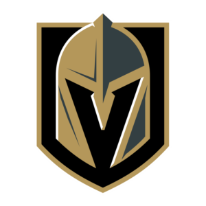
The Golden Knights are a pro hockey team from Las Vegas, and was introduced in 2017 as an expansion team. This makes them the first major profession sports team to represent the city of Vegas. Surprisingly, the franchise has been quite successful, qualifying for the Stanley Cup Playoffs every year since they started playing in the NHL.
Moreover, they even reached the Stanley Cup Finals in their inaugural season, an extremely rare feat. Unfortunately, they faced a strong team in the form of Washington Capitals, and lost the tournament. However, their thirteen-game winning streak is the highest for any team in the NHL for their inaugural season. And despite their age, they made their mark and cemented their place among the greats by winning the 2023 Stanley Cup, adding their symbol to the list of NHL logos associated with the trophy.
Eastern Conference’s Atlantic Division NHL Logos
The Eastern Conference of the National Hockey League consists of two divisions; Atlantic, and Metropolitan. Each division is made up of eight teams each, for a total of sixteen teams to a conference.
Let’s take a look at the teams that make up the Atlantic division, and the NHL logos that represent them.
Boston Bruins NHL Logo
The Boston Bruins has been playing the sport of ice hockey since 1924, making them the third-oldest franchise in NHL existence which is still active and playing. As a member of the Original Six, the team is the oldest NHL franchise in the United States, and has won six Stanley Cup trophies in their career.
The team is tied for fourth highest number of Stanley Cup wins with the Chicago Blackhawks. This comes after the Bruins saw success in 1929, 1939, 1941, 1970, 1972, and 2011 respectively. They have also won the President’s trophy thrice, and the division title an impressive twenty-six times.
The logo for the team features a large uppercase B placed over a wooden wagon wheel. The color scheme is a two-tone yellow and black, making the logo unique among sporting monogram logos.
Buffalo Sabres NHL Logo
The Buffalo Sabres were established in 1970, alongside the Vancouver Canucks. They were part of the League’s expansion for that era. Coincidentally, both teams hold the record for being the oldest teams who have not won a Stanley Cup in their career.
But that is not the only record the Sabres lay claim to. The team also has the longest Playoff drought of any team in the NHL, at ten seasons. However, that is not to say that the team has never had a good season. The Sabres have managed to reach the Stanley Cup Finals twice in their career, but lost it to the Flyers in 1975, and the Stars in 1999.
The logo consists of the image of an American bison, atop a pair of crossed sabres over a blue background, and surrounded by a ring of bright orange.
Detroit Red Wings NHL Symbol
The Detroit Red Wings are, arguably, the best NHL franchise in the United States. They have the largest number of Stanley Cup wins of any American Hockey team, as well as the third highest number of wins in the entire National Hockey League.
The only two teams ahead of the Red Wings in Stanley Cup wins are Montreal Canadiens at twenty-four wins, and Toronto Maple Leafs at thirteen wins. A member of the Original Six, the franchise is one of the most successful teams in NHL history.
Their logo features a car wheel with spread wings on either side. This logo design pays homage to Detroit’s history as the world’s leading car manufacturers of its time, and was often called Motor City or Motown. The color palette is a simple red and white, with clean and distinct lines, making it one of the few red logos that are passionate without being too loud.
Florida Panthers NHL Symbol
The Panthers joined the NHL in 1993 as an expansion team. And was considered as the most successful expansion team of its time, until the Vegas Golden Knights broke their streak in 2018. Panthers have only made it once to the Stanley Cup Finals, in 1996.
However, they lost, and since then have found it hard to maintain a stable season.
The team logo is quite versatile in design, being as much at home in a group of fantasy NBA logos, as it is in the NHL. The design features an image of a panther, over a navy background with a red bar at the top displaying the city’s name.
Montreal Canadiens NHL Logo
The Montreal Canadiens is the most successful franchise in the NHL’s history. They have achieved twenty-four Stanley Cup victories to their names, with the second team not even close to their win record.
The franchise is one of the Original Six, and since the formation of the NHL in the early 1900s, the team held the record for most wins of any major professional sports leagues, until the New York Yankees won their 25th World series title in 1999.
The Canadiens logo on the other hand, could easily be confused as belonging to a set of college logos. The design is simple, with the team’s initials displayed prominently within the symbol. The color palette is a red with a blue outline, with white used to accentuate the negative spaces.
Ottawa Senators NHL Logo
The Ottawa Senators today are the second team to use that name in the National Hockey League. The first Senators franchise was a highly successful team, winning eleven Stanley Cups from 1917 to 1934. The current team of Ottawa Senators was founded in 1992, and went on to have a mildly successful career.
While there are many unique symbols in the NHL, the Senators logo is one of the most distinct NHL logos amongst the entire League. The design features a caricature of a Roman senator in ornate battle helmet, accented by a red plume and cape. The armor itself is colored a soft bronze, outlined and accented with black.
Tampa Bay Lightning NHL Symbol
Tampa Bay Lightning is one of the more successful midfield team in the National Hockey League. Introduced during the 1992 season, the team has managed to win three Stanley Cup titles, in 2004, 2020, and 2021 respectively.
The team is also known for more than that. The Lightning is the first team to sign a female player to its roster, when it contracted Manon Rhéaume for a few exhibition games. Moreover, the head coach for the team has also made his name as the oldest running active head coach for any team in the NHL.
Their team symbol is one of the simpler NHL logos out there. Paying an homage to their name, the design features a blue lightning bolt emblazoned through the middle of an oval. The simple design uses a unicolor scheme, choosing a dark blue as its shade of choice.
Toronto Maple Leafs NHL Symbol
The Toronto maple Leafs are arguably, the second best team on the NHL roster. They are the second highest winner of the Stanley Cup, with thirteen wins to their name. a member of the Original Six, the team has been wildly successful in its career.
Their primary rivalries include the Boston Bruins, the Detroit Red Wings, the Ottawa Senators, and the Montreal Canadiens.
Eastern Conference’s Metropolitan Division NHL Logos
The second division of the Eastern Conference of the National Hockey League is called the Metropolitan.
Let’s take a look at the teams that make up the Metropolitan division, and the NHL logos that represent them.
Carolina Hurricanes NHL Logo
The Carolina Hurricanes originally came into being as the New England Whalers, a franchise of the World Hockey League. An instant success, the Whalers won the division title the first three years in the association, and went on to win the inaugural Avco World trophy for the 1972-73 season.
The team joined the NHL in 1979, when the WHA merged with the NHL, and renamed themselves the Hartford Whalers. However, when the team moved to North Carolina in 1997, they again changed their name to the Carolina Hurricanes. Moreover, with their 2006 Stanley Cup win, they won the first and only major sports championship trophy for the state of North Carolina.
Their logo is one of the simpler NHL logos, and is a swirling vortex of red and black, as a depiction of their name. Hurricanes are a common occurrence in North Carolina, which is why this is also a subtle nod to their home state.
Columbus Blue Jackets NHL Logo
They joined the NHL in 2000, as an expansion team. Their initial years were a struggle, with the team failing to win thirty games in a season their first five seasons. However, 2009 saw them qualify for the Stanley Cup playoffs for the first time.
Sporting one of the better-looking NHL logos, the design and the name of the team too, has roots in Ohio’s Civil War history. It shows a star with a union flag covering it, with a red, white, and blue color palette accented with gray and white.
New Jersey Devils NHL Symbol
The New Jersey Devils was originally founded as the Kansas City Scouts in 1974. After moving to Denver, and then finally to New Jersey, the team renamed themselves the New Jersey Devils. Their first decade and a half of playing the sport were highly unsuccessful, with them never finishing higher than fifth out of six teams in their division.
After 1987, when their ownership was changed, the team turned around and became a vast success. From 1988 to 2012, the team failed to make the playoffs only thrice. They also won the Stanley Cup three times out of five, in 1995, 2000, and 2003 respectively.
Their symbol is one of the most iconic and intuitive NHL logos in the entire league. The design looks like a lounging devil, the shape mimicking the profile of the letters N and J joined together. The color theme is bright red with a bold black outline.
New York Islanders NHL Symbol
The New York Islanders were founded in 1972, as part of the NHL’s ploy to keep a rival team from the WHA from using the new Nassau Veterans Memorial Coliseum. The franchise is one of three NHL teams in the New York metropolitan area, with the New York Rangers and the New Jersey Devils.
Their logo is a simple round emblem, with a blue background and an orange map of New York, overlaid with the team’s wordmark curving around the top and bottom edges of the logo. the design also includes a hockey stick and puck, symbolizing the sport the team plays.
This logo is one of the simplest NHL logos of all time, something they share with the other New York NHL team.
New York Rangers NHL Logo
The New York Rangers are the second team to hail from the Big Apple, along with the New York Islanders. However, they are the older of the two, as the Rangers are one of the Original Six. They were the first American NHL team to win the Stanley Cup, achieving that feat in 1928.
Their logo is a simple shield design, with the wordmark of the team written on it in blocky, uppercase letters. The color theme is a simple red, white, and blue, using a very geometric design for the team’s symbol.
Philadelphia Flyers NHL Logo
The Philadelphia Flyers became a part of the NHL in 1967, as one of the new expansion teams in the League. They have the honor of being the first team to win the Stanley Cup who was not a part of the Original Six.
Their all-time points percentage is third best in the entire NHL at 57.5, behind the Golden Knights and the Canadiens. They also have the second highest number of playoff appearances at forty playoffs, behind the St. Louis Blues.
One of the most popular NHL logos around today, the design featuring a stylized P with flairs at the end made to look like wings. The color palette is a simple black, white, and orange, making this design simple yet unique.
Pittsburgh Penguins NHL Symbol
The Pittsburgh Penguins was another team that was founded as part of the 1967 NHL expansion plan. In all their years of playing, the team has reached the Stanley Cup finals six times, and has won five of them.
This makes the team one of the two highest Stanley Cup winners outside of the Original Six, along with the Edmonton Oilers. Their logo is a cartoon penguin with skates and gloves, wielding a jockey stick over the ice. The color scheme is black, white, and orange, with the orange used for the image’s triangular background.
Washington Capitals NHL Symbol
The Washington Capitals were founded in 1974, as an expansion team. They struggled the first eight years of their career, rarely winning any of the games they played. However, in 1982, the team’s fortunes turned around due to a group of new, strong players.
The team has won one Stanley Cup final, for the 2017-2018 season, defeating the Vegas Golden Knights for the win. Their logo is a simple wordmark-based design, with the letter T of the wordmark elongated to look like a hockey stick, and a red dash besides it depicting a puck. The color scheme is blue and red, depicting itself a true American NHL team.
NHL Playoffs 2024 – Which of These NHL Team Logos Feature With the Stanley Cup?
With the Colorado Avalanche breaking the Tampa Bay Lightning’s two-championship streak in 2022, and the Vegas Golden Knights winning in 2023, this year’s playoffs are highly anticipated by fans of the sport. And with the Western conference retaining the Stanley Cup for a second year in a row, will the Eastern Conference, with its highly dominant teams, be able turn the tide? Or will 2024 be another year of Western Conference’s dominance?
According to the current format, the top three teams from each division will make the playoffs, along with two wild card entries, for a grand total of eight teams from each conference. However, with the regular season still going on, the heat is on for all of the top contenders. Let’s see what this June brings us in terms of the next NHL champion.
Retrospect on the NHL Logos Evolution– From the Vintage Symbol to the New NHL Logo
Throughout the National Hockey League’s history, teams have modified their logos, while some have changed the design entirely. For many of the teams, the change was due to a move to another city, prompting the team to modify their logo entirely.
However, a few teams, and even the main NHL logo itself, was modified to conform with the modern design aesthetics.
Even today, some of the NHL logos look archaic, something which has caused problems in recent years, like the Chicago Blackhawks.
Why the Detroit Red Wings Never Needed a Change Unlike Other NHL Team Logos?
The logo for the Detroit Red Wings is one which has been slightly modified a few times through the years, mainly to get the design according to the modern design standards of different eras. However, the team has never needed to make any drastic changes to their logo, unlike various NFL logos that have been modified over the years.
That is because the original design of car wheel with wings was perfect for a team from Detroit, paying homage to the city’s history of vehicle manufacturing. As one of the few nearly perfect NHL logos of all time, it is no wonder that the logo has remained unchanged all these decades.
Frequently Asked Questions
| 1- What is the best NHL logo? The Detroit Red Wings have the best logo among the entire NHL, with the team sporting the same design, with minor touchups, since their inception in 1932. The logo features red wings emerging from the sides of a car’s tire, paying homage to Detroit’s legacy as the eponymous Motor City, once the global center of the automobile manufacturing industry. |
| 2- What hockey team has a B logo in? The Boston Bruins team sports an uppercase B on their logo, overlaid over the image of a spoked wheel. For the majority of their time in the NHL, the team has used various iterations of their logo, but with a similar theme of their initial over a spoked wheel. |
| 3- What is the NHL symbol? Introduced in the early 1900s, the well-known NHL logo now features a black, white, and silver-gray shield with the initials of the league upon it. However, its initial form featured a similar design but with an orange, black and brown color scheme. |
| 4- Can I use NHL logos? Many athletic corporations often take measures to protect their IPs like the MLB or NFL logos, and as such do not allow others to use their symbols. However, in case you need to use any of the NHL logos, you can do so only if by express permission of the team that the logo belongs to. |
| 5- Who has the oldest logo in the NHL? The Montreal Canadiens, one of the “Original Six”, are the NHL team with the oldest logo in the league. As one of the original six teams who inaugurated the NHL, they are also one of the oldest franchises still playing the sport. |
| 6- When did the NHL logo change? The logo for the National Hockey League changed in 2005, and looked very similar to the previous design. The basic shape was still in the form of a shield, but the color scheme was changed from black-brown to a black-white palette with grayish silver accents. |
| 7- What are NHL logos? NHL logos are the logos that represent the various franchises that are a part of the National Hockey League, as well as the logos that represent the League itself, and its two Conferences. |
| 8- How many NHL logos are there? There are thirty-two NHL team logos, two Conference logos, and one League logo. |
| 9- How do I find out which teams have NHL logos? As of 2023, all teams in the NHL have their own logo to represent the franchise. |
| 10- How can I create my own NHL logo? In order to create your own NHL logo for a fantasy league, you can use an online NHL logo generator, which will give you a NHL logo vector or a PNG file for your use. However, you need to ensure that your design, if you create one yourself, doesn’t infringe upon an existing team logo. |
| 11- What are the most popular NHL logos? The logos for the Tampa Bay Lightning and the Anaheim Ducks are some of the more popular NHL logos. However, popularity is subjective, as people from different regions tend to support their own teams, thus popularity varies wildly. |
| 12- What are the different types of NHL logos? There are different types of logos in the NHL that you can find today, with some teams going for a mascot-based design, while others looking for a shield-style, emblem, or even an initial-style logo for their team. |
| 13- What are the best NHL logo designs? The design for the Calgary Flames is one of the best designs for a sports team, being simple yet expressive at the same time, resulting in an iconic brand mark that people will remember for a long time. |
Conclusion
Now that you know the concept behind the inception of the various NHL logos, you understand the elements that need to be there for a successful logo that represents a sports team perfectly.
But knowing what goes into a good logo is one part of the equation. Learning how to design a logo is the next part, where you learn how to implement those necessary elements into a design that combines your brand identity and message into a visually appealing, cohesive whole.
Latest news you want to know!
Subscribe for cutting-edge design inspiration at Logo Poppin! Elevate your brand with updates on logos, branding, web design, and video animation.
Note that by clicking “subscribe,” users may agree to our privacy policy and consent to Logo Poppin to use your contact data for newsletter purposes.
Logopoppin
Logopoppin is a graphic design agency that specializes in logo designing, web development, video production and advanced branding services. We love to innovate businesses with new age technologies, allowing them to improve their visual reputation.

