
Table of Content
What Inspired the Nightwing Logo and Its Evolution as the First Robin’s New Identity
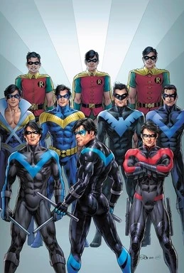
Nightwing is a name that fans of the DC universe are intimately familiar with. In their time within the DC continuity, Nightwing is often considered among the first sidekick-turned-full superheroes. And considering that he is one of the founding members of the Bat Family, as well as one of the earliest sidekicks for DC’s top superheroes, the rise of the Nightwing logo and persona is a small wonder.
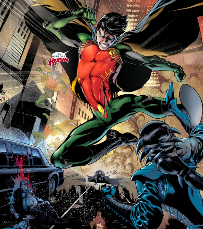
For the majority of comic runs, the name Nightwing is considered the superhero alias for Richard “Dick” Grayson. Originally starting out as Bruce Wayne’s ward after the tragic murder of his family, he soon became the caped crusader’s first sidekick. Taking on the moniker of Robin, the character played a huge part in popularizing the hero and sidekick trope in comic books.
But how did he go from Robin to Nightwing? What inspired the new superhero persona, and the accompanying symbol? And how has it evolved over the years to account for the changing dynamic between the character and their origins?
Let’s read on and discover the mystery behind the Nightwing symbol, and see if a professional logo design company could have done any better at encompassing his persona.
Who Is Nightwing?
Let’s start with understanding the origins of the superhero Nightwing. Dick Grayson belonged to a family of circus acrobats, called the Flying Graysons. One day, his entire family fell victim to a botched trick during a show, and died. It was later discovered that a mobster with a grudge against Dick’s father had killed them.
Bruce Wayne, the billionaire vigilante known as Batman, was present at the show. He saw the same hunger and drive in Dick as he had after the murder of his parents. And thus, Bruce adopted him as his ward.
Initially, Bruce tried to keep Dick away from his vigilante activities. But soon, he started training the child, turning him into his sidekick called the Robin. And although Dick looked up to Bruce, they had very different personalities. Dick was more compassionate and open, while Bruce was tight-lipped and kept things close to his chest.
Over the years, this difference in personalities, as well as a differing moral compass, resulted in Dick leaving the position of Robin. Bruce, believing Dick to be someone far better than himself, let him go. After leaving the mantle of Robin, Dick had no idea what to do. However, the Teen Titans, a team of young sidekicks formed by him, soon called him back to action.
Now here is where the origin differs. Some comic runs say that Dick took on the Nightwing moniker after Superman told him of a vigilante superhero on the planet Krypton, hundreds of years ago. The more popular theory however, is that he heard superman mention a mystical bird on Krypton, and decided that it suited him after years working as Robin.
Whatever origin you consider cannon, the fact is that Dick saw the Nightwing persona as his rebirth, an identity separate and out from under the Batman’s shadow. And as Nightwing, Dick has proven to be a far better leader and crime fighter than his mentor could ever be, something Bruce both knew and hoped for.
It is often said, and also proven in the Injustice comic run, that Batman considers Nightwing his son. In fact, the accidental death of Nightwing at the hands of Damian, Bruce’s son by Talia Al Ghul, resulted in a permanent falling out between him and Bruce.
Demystifying the Nightwing Symbology
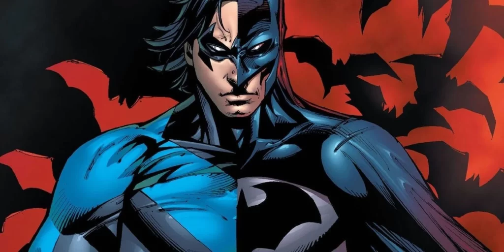
Now that we have looked at the Nightwing character, let’s talk about their symbol. We all know about Batman and his symbol, the spread-winged bat emblazoned across the hero’s chest. He uses that symbol to strike fear into the hearts of his foes, and that is why he has designed all of his equipment around that motif. On the other hand, the Superman logo is all about hope.
But what about Nightwing? Well, unlike Batman’s dark and subdued aesthetic, Nightwing went for a brighter, more reassuring blue. Honoring his bird-oriented motif, he went with a bright blue bird with wings spread across his chest.
The bright blue color gives the design a sense of hope and comfort to those who view it, a stark contrast to how Nightwing’s mentor operates. Moreover, the mystical origins of the Kryptonian Nightwing bird makes it the perfect symbol for the rebirth of the superhero, lending an air of mystery to the character.
However, over the years, Nightwing has rarely worn this symbol in its original form. Throughout different runs, the design has been made more sleek and simplified, similar to how the post-new 52 run has the design simplified yet extending all the way across the shoulders and around the back.
Nightwing Logo vs. Batman Logo – The Symbolic Duality of the Bat Family Pioneers
As one of the most trusted superheroes, second only to Superman, it is obvious that the Nightwing logo representing them would be one of the most important symbols in the DC universe. However, there is a stark difference between how Nightwing uses his symbol versus how his mentor uses the Batman logo.
Batman uses an animal that is known specifically for coming out at night. Similarly, the animal is also one of the most unfairly reviled and terrifying creatures, which has legends and myths attached to it across the world.
Therefore, obviously, Batman uses his symbolic animal to strike and aura of fear and mystery, as evidenced by his entire persona. However, the brighter, imagery that is more visible used by Nightwing, shows that he is the polar opposite.
Unlike Batman, he does not want to rule his opponents with fear. Instead, Nightwing instills a sense of swift and ever-present help, which combined with his other qualities, make him a far better and sustainable superhero than Batman could hope to be.
That is what DC always try to show, the duality. As with the unlikely friendship and work partnership between Batman and Superman, the mentor-mentee relationship between Batman and Nightwing shows a unique balance. And it also how the concept of light and dark interact, where there cannot be one without the other.
Evolution of the Nightwing Logo
Unlike many other superhero logos that modify their design and accompanying suits quite frequently, the Nightwing logo has remained, for the most part, the same as the original. However, there have been some minor changes, often due to different storylines that require a change in the character.
Let’s take a look at the different variations of the Nightwing symbol, and see how the symbol has evolved through different comic runs.
The Earliest Nightwing Logo Variant
We all know the first, or original Nightwing logo. Well, Nightwing’s logo, as well as his costume, for the most part, has not seen any drastic or major changes. That is why, the first iteration of the Nightwing logo saw the design of the bird changed to now form a T-like shape, with the trailing edges moving up the shoulders and moving down the arms.
The color palette was a visible blue over black, making the design highly visible and aesthetic, especially when the character was moving. This is usually seen in the earlier days of Nightwing’s career, soon after he left Batman.
New 52 Red Nightwing Logo
With the New 52 comic run, the design of many superhero and their symbols was changed. That was the case with the Nightwing logo as well. The base design of the bird was similar to the previous iteration, only the shape was now made thicker to look more similar to the core Nightwing symbol.
The color theme was also changed, moving from a blue on black to a red on black scheme. This color scheme has a more visceral visual impact, as Marvel also saw when they introduced the red on black Spiderman logo.
The design also now had a distinctly visible beak, lending credence to the name and persona of the superhero. And this style of the costume and the logo remained throughout the New 52 run. However, after Rebirth, the color scheme went back to the blue on white.
The Return of the Blue Nightwing Logo
After New 52, but for a very short time, Nightwing wore a very plain and visible form of his bird-like symbol. Using the original blue on black motif, the new design of the costume saw the superhero wearing a black costume with the bright blue Nightwing logo emblazoned across the chest.
However, while it was as close to the original design as possible, the fact of the matter is that this iteration was a little lackluster. The visual impact was quite underwhelming, and the overall design looked somewhat incomplete, somewhat like the Wonder Woman logo of the early 50s.
Restyled Nightwing Logo for Better Aesthetics
Soon, however, Nightwing went back to a more visually appealing logo and costume design. Drawing inspiration from the design before the New 52 run, the new Nightwing logo now featured a thinner, more delicate profile, with the wings now thinning while running around the shoulders and across the character’s back.
This overall look of the logo and its interaction with the costume makes the most visually appealing impact, as well as looks more like a bird with bright colored plumage hidden beneath dark feathers.
This is the costume and logo design that is being used nowadays for the character.
FAQs
| What bird is Nightwing’s symbol? Originally, Nightwing was a Kryptonian bird whose tales Superman told to Dick Grayson. However, Post-Crisis, many people consider the shape of the wings and the color scheme to be somewhat similar to a raven. |
| What mystical Kryptonian animal is the Nightwing bird tied to? The Kryptonian Nightwing bird is often bound to a partner, a mystical bird known as the Firebird. This relationship mimics the dynamic between Nightwing and Batman. |
| Why did New 52 Nightwing use red colored costume? The red color was a nod to his history as a robin, as well as his connection to the Bat Family at large, who use the color red in their costumes in one form or another. |
Conclusion
To sum it up, the Nightwing logo is one of the most recognizable superhero symbols in the DC Universe, arguably even more so than many of the more popular Justice League members. However, despite that, the Nightwing symbol is one that fans would more commonly associate with the Teen Titans than they would with the Justice League logo.
Nevertheless, according to canon, Nightwing is one of the most important superheroes in the DC continuity, maybe even more so than his mentor is. In fact, Bruce’s pride in Nightwing shows that he is aware of his limitations, and has succeeded in raising a hero who rose above the hurt and grief of his parents’ death to become a true protector of the people.
Latest news you want to know!
Subscribe for cutting-edge design inspiration at Logo Poppin! Elevate your brand with updates on logos, branding, web design, and video animation.
Note that by clicking “subscribe,” users may agree to our privacy policy and consent to Logo Poppin to use your contact data for newsletter purposes.
Logopoppin
Logopoppin is a graphic design agency that specializes in logo designing, web development, video production and advanced branding services. We love to innovate businesses with new age technologies, allowing them to improve their visual reputation.

