Table of Content
A Complete Logo History of the Famous Japanese Automobile Brand
The car manufacturing industry has seen the rise of numerous brands, but one name stands out as an undeniable leader—Nissan Motor Company. Founded in Japan, the Nissan logo has earned a stellar reputation both domestically and internationally, becoming one of the most recognized and trusted automobile manufacturers in the world. Its influence is not limited to its home country, as the brand has successfully expanded into numerous global markets, capturing the attention and loyalty of consumers from every corner of the world.
Nissan’s remarkable success can largely be attributed to the brand’s commitment to quality, innovation, and customer satisfaction. Whether it’s a compact car, a luxury vehicle, or a sturdy truck, Nissan has consistently delivered products that meet the unique needs and preferences of drivers. The brand is widely admired for offering a diverse lineup of cars, each designed to provide exceptional performance, reliability, and value. This ability to produce vehicles that cater to various markets is one of the reasons why Nissan is frequently ranked among the best automobile manufacturers globally.
Designed by professional logo design services, the Nissan logo has become synonymous with excellence in the automotive industry, and for good reason. Over the years, Nissan has built a reputation for understanding and anticipating the needs of its customers. The logo of the company has seen various redesigns since the inception of the brand. If you do not know about the history of iconic Nissan logos, read this article in detail.
Why Nissan Automobiles are Popular Worldwide?

Nissan automobiles have gained widespread popularity worldwide due to their reputation for high-quality craftsmanship and reliability. The brand has consistently delivered vehicles that offer excellent performance, durability, and value for money, which has helped it earn the trust of customers across diverse markets. Nissan’s global appeal stems from its ability to produce a wide range of vehicles, from compact sedans to SUVs and trucks, catering to a variety of consumer preferences.
Additionally, Nissan’s commitment to sustainability and forward-thinking technology has played a pivotal role in its global success. With a growing emphasis on eco-friendly solutions, Nissan has introduced electric vehicles like the Nissan Leaf, which has helped the company stand out in the green car movement. The brand’s consistent investment in research and development, as well as its focus on improving safety features, has also helped solidify its position in the competitive automotive industry.
History of Nissan Logo
Just like Ford logo, the history of Nissan emblem is quite diverse because it has been changed multiple times during the last few decades. A lot of people do not know about the stunning evolution of Nissan logo. If you are also one of them, take a look at the complete logo history below.
Nissan Logo – 1933
The Nissan logo has a rich history, with its first version introduced in 1933. The original design featured a simple yet powerful red circle, which held significant symbolism for the brand. The circle was intended to represent the rising sun, a powerful national symbol of Japan, reflecting the country’s sense of optimism, energy, and hope.
This initial logo was much more than just a visual mark; it was a representation of Nissan’s connection to its cultural heritage and its dedication to producing products that were both innovative and trustworthy. By incorporating elements that were closely tied to Japan’s identity, the logo conveyed a sense of pride and authenticity.
Nissan Logo – 1940
The first major redesign of the Nissan logo took place in 1940, marking a significant shift in the brand’s visual identity. The new emblem adopted a more streamlined and modern design, utilizing a simplified color scheme of red and white. This redesign was meant to reflect the evolving nature of the company as it grew and adapted to the changing automotive landscape.
This redesigned logo, with its concise color palette and distinct shapes, remained in use for a decade, serving as the symbol of Nissan during a pivotal time in its history. The red and white color scheme continued to evoke a sense of passion and energy, while also maintaining a sense of purity and simplicity.
Nissan Logo – 1950
In the early 1950s, Nissan underwent another logo redesign, this time opting for a more structured and bold look. The new emblem featured a rectangular shape, giving it a more defined and modern appearance compared to previous versions. Within this rectangle, the brand’s name was presented in all-caps lettering, a deliberate choice that conveyed strength, confidence, and reliability.
While the color palette of red and white remained unchanged, the redesign marked a noticeable shift in the font style. The new typeface was stronger and more prominent, with larger, bolder letters that enhanced the logo’s visibility and impact. This change was reflective of Nissan’s increasing ambition and its desire to stand out in the competitive automotive industry.
Nissan Logo – 1960
In the 1960s, Nissan introduced a refined and sophisticated update to its logo, incorporating cursive lettering that gave the brand a more elegant and stylish appearance. The use of cursive fonts created a sense of fluidity and motion, subtly reflecting the dynamic and forward-looking nature of the company as it embraced innovation and progress.
This redesign was an important step for Nissan as it sought to establish itself as a globally recognized brand. The combination of cursive lettering and sharp lines presented the company as both modern and sophisticated, appealing to a broader, more international audience.
Nissan Logo – 1967

In 1967, Nissan embarked on another logo redesign that represented a bold departure from its previous designs, this time experimenting with a completely new color palette. The company chose to incorporate a combination of cream and chocolate-brown, a decision that set the logo apart from the brighter red and white schemes of earlier versions.
The introduction of these new colors marked an important phase in Nissan’s branding, signaling a shift in the company’s identity as it sought to mature and appeal to a wider range of consumers. The cream and chocolate-brown tones provided a more understated, yet refined aesthetic, positioning the brand as one that was not only modern but also grounded in values of dependability and quality craftsmanship.
Nissan Logo – 1970
In 1970, Nissan once again reimagined its logo, opting for a significant shift in both color and typography. The new design featured a bold black and silver color palette, which gave the logo a sleek and modern appearance. The contrast between the deep black background and the metallic silver lettering created a sense of elegance and sophistication.
The lettering itself was rendered in an all-uppercase, typewriter-style font, which added a sense of structure and authority to the design. This choice of font conveyed strength and professionalism, aligning with Nissan’s ambition to position itself as a leader in the automotive industry.
Nissan Logo – 1978
In 1978, Nissan revisited its historical roots with a logo redesign that paid homage to its heritage. The new emblem, which is often referred to as the “new-old” logo, brought back familiar elements from the brand’s earlier designs. The logo featured an iconic symbol of the brand, reintroducing the classic circular motif that had been a central feature of Nissan’s identity since its inception.
The 1978 Nissan wordmark was placed within a rectangular frame. The choice of a rectangular shape around the logo helped to provide clarity and focus, ensuring that the brand’s name stood out with prominence and authority. This iteration of the logo reflected Nissan’s continued evolution, as the company sought to build on its established reputation while adapting to the changing automotive landscape.
Nissan Logo – 2001
In 2001, Nissan unveiled a refreshed version of its logo, building upon the design elements from its previous iteration but with a more modern and polished look. The new logo featured a sleeker, more streamlined aesthetic, with the emblem refined to appear sharper and more contemporary.
One of the most notable changes in the 2001 redesign was the shift to a silver color palette, replacing the previous monochromatic tones. This updated logo successfully conveyed a sense of refinement and quality, signaling to consumers that Nissan was a modern, high-end brand with a commitment to innovation and excellence in automotive design.
Nissan Logo – 2012
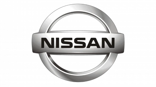
The 2012 redesign of the Nissan logo marked a significant evolution, bringing back the familiar circular shape that had been a defining element of the brand’s identity for many years. However, this time the circle was reimagined with a more modern twist. The new design featured a silver circle with a hollow center, giving it a more dynamic and refined appearance.
In addition to the updated circle, the 2012 logo also reintroduced a rectangular element. This time, the rectangle was placed in front of the hollowed circle and was also rendered in silver. Within the rectangle, the brand name “Nissan” was prominently displayed in bold, clear lettering. This redesign successfully reinforced Nissan’s commitment to innovation and its status as a leader.
Nissan Logo – 2020
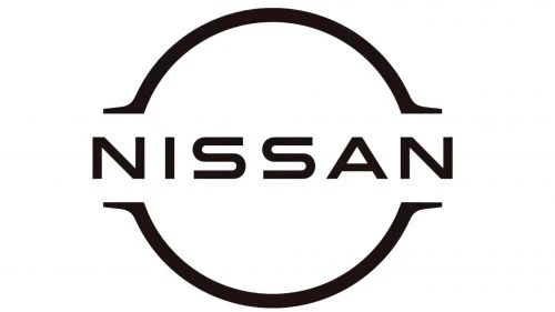
In 2020, Nissan unveiled a new logo that represented a significant departure from its previous designs,. The updated logo was executed in a flat, monochrome color scheme, a choice that contributed to its modern, refined aesthetic. By eliminating gradients and other embellishments, the design became cleaner and more streamlined.
The shape of the 2020 logo, while simplified, still echoed the iconic elements of Nissan’s past, maintaining the recognizable circular form that had long been a symbol of the brand. This bold, stylish reimagining of the Nissan emblem effectively captured the essence of the brand’s evolution, reflecting its continued commitment to innovation and forward-thinking design.
Frequently Asked Questions
| Why Nissan automobiles are popular in the world? Nissan cars are popular worldwide due to their reputation for reliability, innovation, and high-quality engineering. The brand offers a diverse range of vehicles that cater to various needs, ensuring broad appeal across global markets. |
| What does the Nissan logo mean? The Nissan logo represents the brand’s commitment to innovation and quality, with the circular emblem symbolizing unity and the rising sun. The bold, modern design reflects the company’s evolution as a global leader in the automotive industry. |
| What is the color of Nissan logo? The Nissan logo primarily features a silver or metallic hue, symbolizing sophistication and modernity. The emblem is often set against a simple, monochrome background to enhance its sleek, minimalist design. |
Final Words
That takes us to the end of this blog in which we have discussed the complete history of Nissan logo. It is a undoubtedly a famous Japanese car brand that has ruled the automobile industry since its inception. The logo of the brand is immensely popular in different parts of the world where people love durability and innovation in modern-age cars. This blog has therefore discussed the evolution of Nissan logo in detail, so that you can understand how its identity transformed in different eras as per the prevailing trends.

Logopoppin
Logopoppin is a graphic design agency that specializes in logo designing, web development, video production and advanced branding services. We love to innovate businesses with new age technologies, allowing them to improve their visual reputation.


