Table of Content
Discover Some Great Notary Website Ideas and Some Amazing Notary Website Examples
Notaries provide an essential service that allow people to ratify contracts and agreements by following the right, legal process. And while individual notaries do exist, most certified notaries who plan to make a living off of this service work for a notary business. And those businesses, need websites.
Now, like any other industry, there are many notary website ideas that are touted as a necessity for a successful website. However, a look at the industry shows that most notary businesses go for a simple business site that eschews most of these ideas, and are doing quite well. The top players, on the other hand, do have some tricks up their sleeves that allow their websites to offer a user experience far above that of these former sites.
So, what are these tricks and ideas that are successfully used by these top notary websites? And how can a professional web design services use them to improve your website’s UX?
Let’s dive in and discover the answer to these questions, and take a look at some carefully curated website design ideas for notary businesses.
What is a Notary Website?
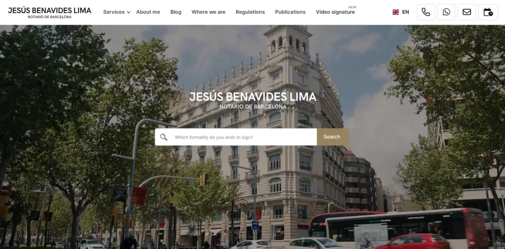
A notary website is a site that represents a notarization business, like the one above. Now, it could represent a single notary specializing in a specific kind of contracts, or a team of notaries covering a wide variety of services. In either case, the website would display, at the very least, a little information about the services they provide, their contact info, and details on how to schedule an appointment.
The reason notaries’ need a website is because that’s the easiest way for people to find them. Most of the time, when people need notary services, they look for them online. Now, if a notary doesn’t have a website online, it will be difficult for them to show up in the search results. This means that it will be difficult for them to find new business.
Moreover, having a business website today is a symbol of trust, as many consumers, especially the millennials and Gen-Z, consider it suspicious if a business doesn’t have an online presence. Therefore, in order to cater to the upcoming generation of consumers, notary businesses too need to create one for themselves.
Top 10 Notary Website Ideas to Uplift Your Notary Site’s UX
In the digital age of today, a notary’s website is more than a digital business card—it’s a gateway to building trust, credibility, and expanding the client base. Previously, there were various types of websites used by notaries, from simple informative sites, to comprehensive web apps with options to create profiles, book appointments, view history, and more.
A well-designed website is the foundation of your online presence, and therefore needs you to incorporate innovative elements to help you stand out in a competitive market.
But what are these innovative notary website ideas and elements?
We have carefully crafted this list of ten tried-and-true website ideas to transform your notary website into a useful branding tool for engagement and business growth.
Highlight Your Work Quality with Client Testimonials and Reviews
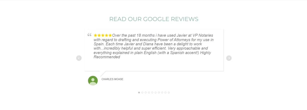
A business without any previous reviews or testimonials is one that is looked upon with mistrust, especially if it has been in business for quite some time. Your reviews serve as a way to establish and cement trust in your business and its services, which is an important factor in converting leads.
That is because authenticity and transparency speaks volumes. Therefore, integrating a dedicated section for client testimonials and reviews offers social proof of your proficiency and reliability, and is one of the basic web design principles taught to all web designers. Encourage satisfied clients to share their experiences, whether good or bad, highlighting the positive impact of your services on real people, as well as your ability to take criticism and learn from it.
Showcase Your Professional Portfolio to Establish Industry Expertise
Your notary website should, first and foremost, serve as a display of your notary expertise and accomplishments. Therefore, its important that you establish a section of your website to display your certifications, other relevant qualifications, and successful projects.
Now, you might wonder why just displaying a portfolio of finished projects won’t do the trick. Well, including details about your experience and areas of specialty helps potential clients understand your capabilities, thus building trust and credibility.
Add an Informative Blog/Article Section to Engage Readers
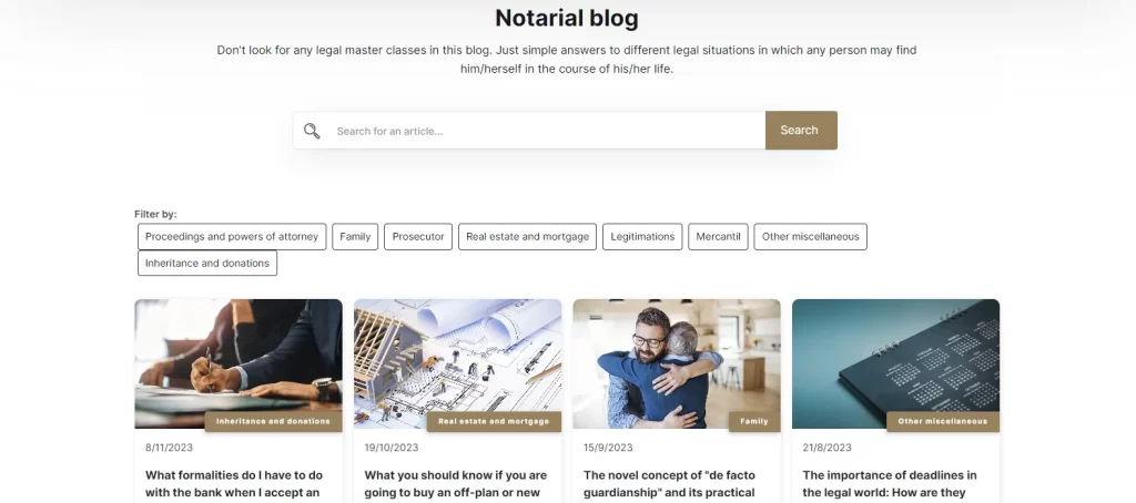
Now this is one section often ignored, even by some of the big players, despite the fact that this is one of the proven notary website ideas to boost user consumer engagement. An informative blog is a valuable digital asset for a notary business, helping to educate and engage visitors. That is why adding a blog section has been one of the leading web design trends for businesses for years now.
To make it relevant to your specific niche, explore topics relevant to your audience, such as the significance of real estate notarial services, unraveling legal jargon, or offering insights into crucial documentation processes. Not only does it help engage readers, a regularly updated and well-researched blog section positions you as an industry expert, keeping visitors coming back for valuable information.
Improve User Experience with a Mobile Responsive Design
A mobile-responsive website is no longer just an option—it’s a necessity. Most consumers today use their smartphones as the primary web-browsing device. That means that rather than offering a good visual interface on the desktop environment, businesses also need to ensure that their website looks and works great on mobile screens.
Therefore, you need to ensure your website functions seamlessly across various devices. Mobile optimization not only caters to user convenience but also positively impacts your website’s search engine rankings, enhancing its visibility and accessibility.
Boost Conversion with Easy-to-Find Appointment Scheduling

Most notary services require the physical presence of a notary. And considering the legal aspect, many customers looking for notary services prefer an appointment as the initial step towards a possible business relationship.
Therefore, you should streamline the process for potential clients by integrating a user-friendly appointment scheduling system directly into your website. If placed visibly and conveniently, this feature offers a lot of ease and flexibility, allowing clients to book appointments at their convenience, enhancing user experience and boosting client satisfaction.
Add Video Content to Catch Visitors’ Interest
While the norm for website content, especially for businesses, is text, there is something to be said by diversifying it for better user response. In today’s digital age, video offers a better response elicitation from consumers, especially when compared against text. That is because people today respond better to types of content where they have to spend less effort, which is why there is a call for accommodating video content in many of the modern web design guides.
Therefore, engage your audience through visually appealing and informative video content. Create videos that explain complex notarial processes, share client success stories, or offer tips on navigating legal documentation. Videos add a personal touch, effectively communicating information while fostering a stronger connection with your audience.
Guide User Actions with Intuitively Placed and Clear Calls-to-Action
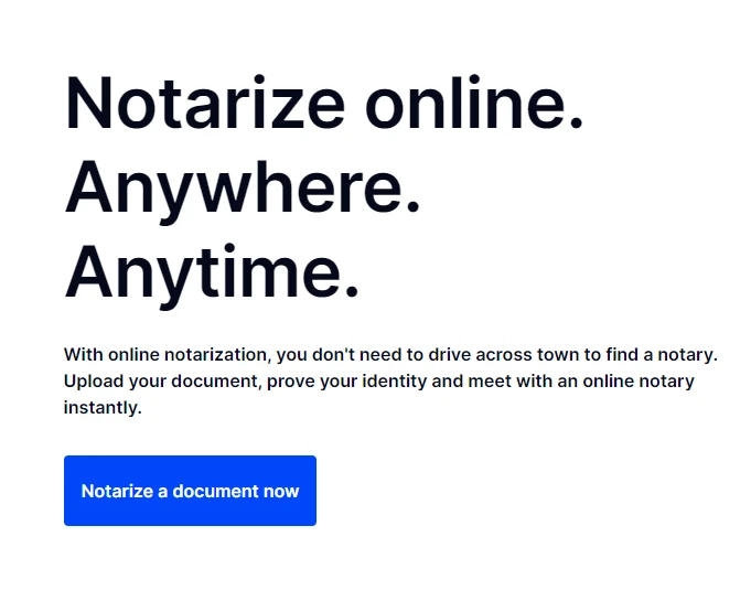
Calls-to-Action are a critical element for a business website, allowing the business to convert visitors and turn them into customers. However, adding CTAs to your website without any strategic planning will not only result in no conversion, but also a reduced site UX.
Strategic placement of clear and concise Call-to-Actions is pivotal. You can subtly guide visitors towards desired actions, whether it’s scheduling an appointment, requesting more information, or subscribing to newsletters. Well-designed CTAs streamline user navigation, prompting visitors to take the next step in their engagement with your services.
Ensure Your Brand Visuals are Appealing and Unified
Your website serves as a major element of your business’s brand. Not only does it help you connect and engage with your consumers, but it also serves as a medium to introduce consumers to your business, and convey your brand message to them.
However, consistency in branding and visual elements is key to leaving a lasting impression. Utilize cohesive branding elements, including color schemes, fonts, and imagery, to reinforce your professionalism and create a visually appealing website. Consistent branding across all elements of your site enhances recognition and trust among visitors. Moreover, it also helps your consumers connect with other brand channels, such as social media, more intuitively.
That is why it’s important that there is design collaboration between you and your web designers, to ensure that element is addressed properly.
Make it Easier for Users by Adding a FAQs Section
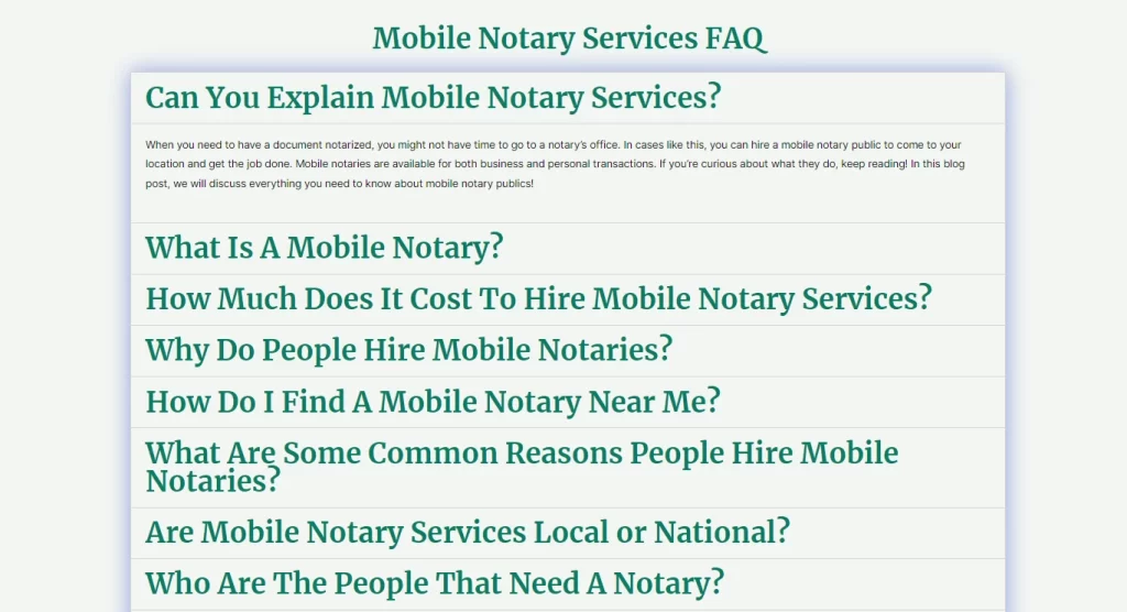
Considering that notary service is a specialty and often unknown niche for most consumers, its natural to assume that most visitors would have questions when they visit a notary. The same principle applies to your website too, where people might look for the answers to their questions to see if your business is the right one for them.
You can anticipate and address common queries through a comprehensive FAQ section on your website. Cover topics such as pricing structures, authentication processes, service areas, and legal obligations. This section acts as a knowledge base, simplifying information for potential clients and instilling confidence in your expertise, making it easier for them to trust you and your services.
Integrate Social Media Channels to Boost Social Engagement
While websites serve as a great source of disseminating information, social media is what helps your brand need the social engagement it needs to survive and grow. Social media channels allow your consumers to engage with you and other consumers, thus helping build a community.
So, leverage the power of social media by integrating social media links or feeds on your website. Engage with your audience across different platforms, share informative content, and foster a community around your notary services. It also offers a medium for direct interaction between the brand and consumers, further building trust and credibility.
5 Amazing Examples of Successful Notary Websites with Great UX
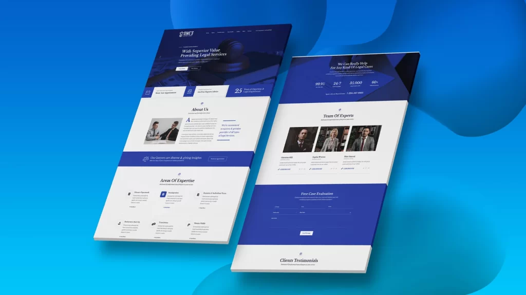
Now that we have seen the top ten notary website ideas that you need to incorporate in your website to help it succeed, you might be wondering how some of them look in action. However, you cannot go around visiting all the notary websites you can find to see which one has the answer to your question.
Don’t worry, we have done the legwork for you. We have compiled a list of five amazing notary websites, who have utilized some of the ideas discussed above to great success.
Let’s take a look at them, and see what they have to offer.
VP Notaries
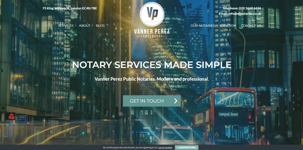
VP Notaries, also known as Vanner Perez Notaries, is a notarial firm in London, United Kingdom. Their website is designed to be modern aesthetically, with the design meant to instill a strong visual impact. Starting with their hero section, it portrays a sped up video of their busy street in London, which shows their positioning as a top service provider in their industry.
The header overlay over the video is translucent, with the CTA placed centered on the page to establish its visual impact on the visitors without any hindrance. The rest of the page’s design is clean and well structured, distributing the content in small chunks, thus making it easy to read and follow. Moreover, the intuitive navigation bar on top of the header makes it easy to find the information desired.
Peter H. Baker
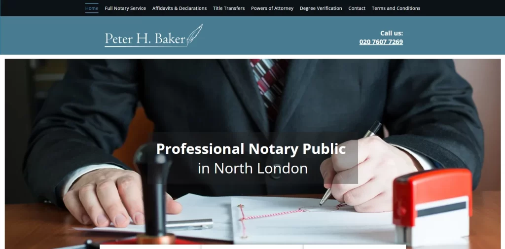
Like the previous notary option on our list, this one too is situated in London. However, while the previous notary business represented a team of notaries, the Peter H. Baker website represents a single, professional notary. The most obvious change is the tone of addressing, where this website showcases content that establishes the credentials of one single person – Peter H. Baker himself
The navigation bar at the top of the website is made to be sticky. That means that no matter where you are on the page, you will always find the navigation bar right there, without having to scroll all the way up. Overall, with its contact form at the bottom with a Google Maps integration with the office location, it’s a great design implementing some of the best notary website ideas.
Mobile Notary Zone
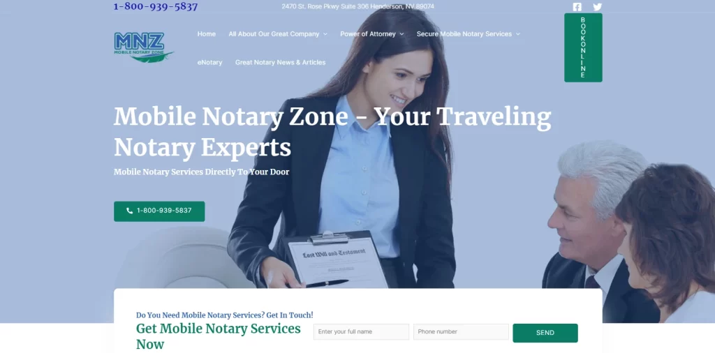
The design for Mobile Notary Zone may seem like anomaly to some, but not in a bad way. That is because they use a classic web design for business websites, but with a modern twist to give it that upscale and legacied feel.
Despite having sufficient graphics, the website may seem a tad content-heavy. However, none of that is fluff, with each piece of content serving to convey important information. The navigation bar at the top has traditional drop-down menus offering expanded options for each section. And while there is a CTA to schedule a call from the company just below the header section, the hero too clearly showcases the number one a button to initiate a call directly.
Notarize
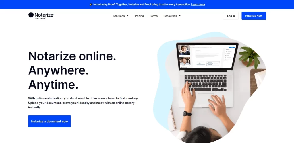
Notarize is another modern notary business, which allows people to get their documents notarized online, without the need to go out and find a notary for your documents. Their design is clean and well spaced, which makes it easy for people to follow along without being overwhelmed by too much content.
The top section of the page features a direct CTA, which is useful for visitors who want to get right down to business and get their documents notarized. However, for those still on the fence, the subsequent folds explain the notarial process of Notarize as well as the various notarial services provided by the company. Overall, the design is one of easy and accessible service provision.
Online Notary US
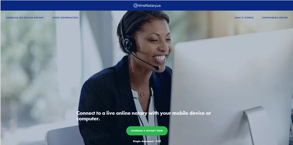
Online Notary US is another US-based notarial services provider that offers a great visual experience to boost its overall UX. The first thing that draws the eye is the parallax background effect of the hero, which displays a service provider on a call with a customer.
The next thing you will notice is that the text is pretty heavy on text. However, the addition of parallax effect makes that content seem well spaced, ensuring that the reader doesn’t find it too tedious to read the content. Finally, rather than go for a traditional footer, the website incorporates the contact form itself as the footer. This ends the page on a desired action for the user, signaling a strong and memorable stopping point for them.
Conclusion
To sum it up, there are a lot of ways you can boost your website’s UX. However, when it comes to business websites, its better to go for notary website ideas that are known to work well. That allows you to avoid integrating something controversial that could backfire and hurt your brand worth.
Therefore, if you are looking to start creating or revamping your own notary website, the list of ideas above are a great place to start from, boosting your UX through ideas proven to succeed.

Logopoppin
Logopoppin is a graphic design agency that specializes in logo designing, web development, video production and advanced branding services. We love to innovate businesses with new age technologies, allowing them to improve their visual reputation.


