Table of Content
What Makes NVIDIA Logo a Top Entity in the Tech Market?
The American tech industry is laden with many big names. Among the top five participants, NVIDIA holds a strong position with a gigantic stock market value. It is a computing infrastructure company that specializes in the manufacturing of graphic cards, microchips, and other high-performance components. The NVIDIA logo is therefore popular all over the world. In fact, the recent AI boom has made the company even more famous, as the chips created by NVIDIA have become a top preference of many AI companies.
Unlike other tech companies, the logo of NVIDIA is quite unique and unorthodox. It does not use any conventional wordmark or symbol. Instead, an abstract eye-like design is used to showcase the official identity of the company. Designed by professional logo design services, the emblem ensures to illustrate a distinctive brand identity of NVIDIA. It has not been changed since the first introduction in 1993, however little tweaks in the typography and color combination have been done a few years ago.
If you want to learn the complete history of the NVIDIA logo, read this blog in detail. It will let you know how this logo evolved and became a top symbol in the tech market in a very few time. Let’s start from the basics understanding why NVIDIA is hugely popular all over the world.
Popularity of NVIDIA in the Global Tech Market
NVIDIA is a global tech giant primarily known for its groundbreaking advancements in graphics processing units (GPUs). The company gained widespread popularity by revolutionizing gaming with its GeForce GPU series. Beyond gaming, NVIDIA’s GPUs became essential for creative professionals in video editing, 3D rendering, and animation. Its continuous innovation in hardware and software, such as ray tracing and DLSS (Deep Learning Super Sampling), has solidified its reputation as a leader in the visual computing space.
Beyond gaming, NVIDIA’s influence extends into artificial intelligence (AI) and high-performance computing. The company’s CUDA platform transformed its GPUs into powerful tools for AI research, making them a staple in scientific computing and autonomous systems. Today, industries like automotive rely on NVIDIA’s AI-driven technologies, including autonomous driving solutions through NVIDIA DRIVE and AI-powered robotics. This diversification beyond gaming has made NVIDIA an indispensable force in modern computing.
NVIDIA’s strategic expansion into cloud computing, enterprise AI, and the metaverse has further fueled its dominance in the tech industry. With innovations like the Omniverse platform for 3D collaboration and partnerships with major cloud providers, NVIDIA continues to shape the future of digital experiences. The company’s adaptability to emerging trends, strong research and development, and ability to deliver cutting-edge technology make it a key player in the global tech market, influencing everything from gaming to AI and beyond.
History of NVIDIA Logo
NVIDIA is one of those companies that has not made much modifications in its branding. Apart from few changes in the color scheme and wordmark, the large part of the illustrated logo has been kept same throughout the years. Let’s take a quick look at the history of NVIDIA logo below.
NVIDIA Logo – 1993
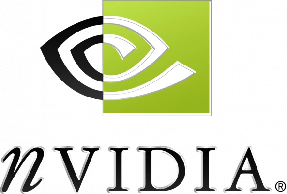
The NVIDIA logo made its debut in 1993, marking the beginning of the company’s visual identity. The original design was a representation of innovation and forward-thinking, aligning with the company’s mission to create cutting-edge technology. At the core of this logo was the iconic symbol of an all-seeing eye, which quickly became associated with NVIDIA’s ability to provide powerful products for the tech world. The design was simple yet effective, capturing the attention of the growing market for graphics hardware and software.
The all-seeing eye in the NVIDIA logo was more than just a design choice; it symbolized the company’s commitment to creating technology that could provide clarity and insight into the digital world. This motif was a nod to the idea of “visionary computing,” a fitting representation for a company focused on developing visual computing solutions, including graphics cards and GPUs. As NVIDIA grew and expanded its product range, this logo helped establish its identity as a leader in the field of graphics and computing technologies.
Just like many media company logos, the NVIDIA logo underwent several revisions, but the all-seeing eye remained a central aspect of its visual identity. The logo not only became synonymous with high-performance GPUs and gaming hardware but also signaled the company’s entry into other sectors like AI, autonomous driving, and cloud computing. This enduring symbol continues to represent NVIDIA’s innovative spirit and its role at the forefront of technological advancement.
NVIDIA Logo – 2006
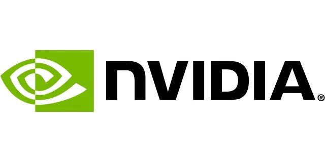
In 2006, NVIDIA decided to refresh its visual identity by redesigning both its symbol and wordmark. This rebranding marked a significant shift in the company’s approach to its public image, as it sought to further establish itself as a powerhouse in the tech industry. The redesigned logo aimed to reflect NVIDIA’s expanding influence beyond just graphics hardware. It signaled the broader ambitions of the company in other areas like high-performance computing, artificial intelligence, and mobile technologies.
The redesigned symbol in 2006 retained the recognizable shape of the all-seeing eye, but it was simplified and stylized for a more contemporary look. The eye was integrated into a more geometric and streamlined design, giving it a sharper aesthetic. This change helped to create a logo that was more adaptable across various platforms and products. The clean lines and modern feel of the new symbol reflected NVIDIA’s focus on innovation and its ability to evolve in a fast-changing tech landscape.
Alongside the revamped symbol, the wordmark also underwent changes. The new font used for the wordmark was more refined and professional. It matched the contemporary look of the redesigned symbol, contributing to a cohesive and unified brand identity. This shift in design helped NVIDIA communicate its expanded role in the tech industry, moving beyond just graphics cards and gaming into areas like AI research and data science. By refreshing its logo and wordmark, NVIDIA aimed to reinforce its position as a leading tech company ready to tackle the future.
Color of NVIDIA Logo
The current NVIDIA logo prominently features green, which serves as a powerful symbol of the company’s uniqueness and its commitment to growth. Green is often associated with vitality and forward momentum. As NVIDIA continues to lead the way in areas like artificial intelligence and high-performance computing, the green hue reflects its dynamic nature and commitment towards growth. This color reinforces NVIDIA’s position as an industry leader, constantly advancing and developing new solutions to meet the demands of the ever-changing tech landscape.
In contrast, the white in the logo embodies qualities such as elegance, perfection, and charm. White is often seen as a color of purity, which aligns with NVIDIA’s dedication to producing high-quality products. The use of white in the logo adds a sense of sophistication and balance, complementing the boldness of the green. Together, the green and white color combination conveys a sense of confidence, positioning the brand as one that is not only innovative but also precise in its approach. The interplay of these colors reflects NVIDIA’s ability to blend cutting-edge technology with a sense of grace and refinement.
Frequently Asked Questions
| What is NVIDIA? NVIDIA is a global technology company known for designing high-performance graphics processing units (GPUs). It is a leader in visual computing, driving innovation in fields like gaming, artificial intelligence, and deep learning. |
| What does NVIDIA RTX stand for? NVIDIA RTX stands for “Ray Tracing Texel eXtreme”, a brand of graphics cards designed to deliver real-time ray tracing. It represents the cutting-edge of visual computing, enhancing realism in gaming and professional applications. |
| What is the color of NVIDIA logo? The NVIDIA logo primarily features a vibrant green color, symbolizing growth, innovation, and uniqueness. It is complemented by white, which represents elegance, perfection, and sophistication. |
Final Words
That concludes our entire blog in which we have discussed the evolution of NVIDIA logo in detail. It is a symbol that has brought revolution in the industry of chip manufacturing and gaming. The graphic cards made by NVIDIA are highly popular in the world, primarily because of offering exceptional speed and performance. The logo of the brand is therefore a known entity in the tech circuit. Currently, the emergence of AI has again brought NVIDIA in a solid limelight, hence making its logo more famous all over the world.

Logopoppin
Logopoppin is a graphic design agency that specializes in logo designing, web development, video production and advanced branding services. We love to innovate businesses with new age technologies, allowing them to improve their visual reputation.


