

Table of Content
Discover How You Too Can Create The Perfect Painting Company Logo
The commercial and residential painting industry is a vast and expansive field that covers a variety of services including interior and exterior painting, as well as protective coatings and coverings. Now, as is common with many trades businesses, they underestimate the importance of a strong business logo to represent their brand.
This is especially true where the business is owned and people who belong to Gen X. More often than not, if they do go for a logo, they tend to make it a generic one just so they could print it on their business cards and vans. That is because they generally believe that the quality of work is more important than spending money on some fancy electrical or painting logos.
What they forget however is that the two things are intertwined, not separate. Your work ethic is what build brand value and loyalty, and gets people to promote your services in their circles. But the brand symbol is what lets the people, especially potential customers, associate that quality of work with your company.
So how can an independent painter or a commercial painting business develop an expressive logo for their services? What style or aesthetic of logo should they choose for their brand symbol? And why should they spend so many resources on building a custom logo when they could opt for an AI-generated one?
Let’s dive in to the article and find out the answers to these question.
Importance of Painting Logos for Trade Businesses like Commercial Painters
Trade businesses, especially small ones, often work within a specific locality, most often their own neighborhood. As such, they generally do not need a logo to advertise their services, as general word-out-mouth is enough for them to get enough business for them to handle.
However, when they want to grow their business, and take on larger, more lucrative contracts, that’s when the absence of a brand logo for their company suddenly presents a roadblock. In the larger business environment, carving yourself a niche among already established businesses requires a lot of branding efforts, foremost among them being the creation of a suitable brand logo.
Now, when it comes to painting logos, the concept is the same. A home painting business operating in a small town of 2-3000 people would easily get by without a logo, especially if the owners and workers are natives of that area. However, if they want to expand their business to a larger region, such as a collection of nearby towns as well, then having a suitable logo is the first step to take. And that too by a professional logo design services provider, not a generic online logo generator.
Moreover, it gives the people, both current and potential customers, something more memorable than your business name to remember and recognize you. Take for example, the UPS logo or Charmin’s logo affiliated with the bear mascot. In UPS’s case, people may not know or care about the company’s name. But with an iconic logo at the helm of its branding, people don’t need to remember its name anymore.
Similarly, despite P&G’s Charmin brand of toilet paper being one of the oldest in the business, people still refer to it as the “one with the bear on it”. And the bear is not even a part of the logo, just something that accompanies it to elaborate the logo’s message of softness and comfort. This shows that people find it easier to remember images than they do text.
Therefore, whether you have a trade business or some other type, a brand logo is important.
Ten Amazing Examples of Painting Logos from Commercial Painters and Businesses
Now that we have discussed the importance of creating your own painting logos, you might be convinced to develop one for your painting business. But a new question arises – what should it look like?
Understandably, for each industry, a few design elements are incorporated into logos to represent their belonging to that business industry. For example, a common theme in construction logos is the addition of elements like hard hats, hammers and pieces of wood, or other construction related equipment.
So what should a painting company logo look like? Let’s take a look at some successful designs that are already representing their companies in the market today, and discover the design secrets they hold.
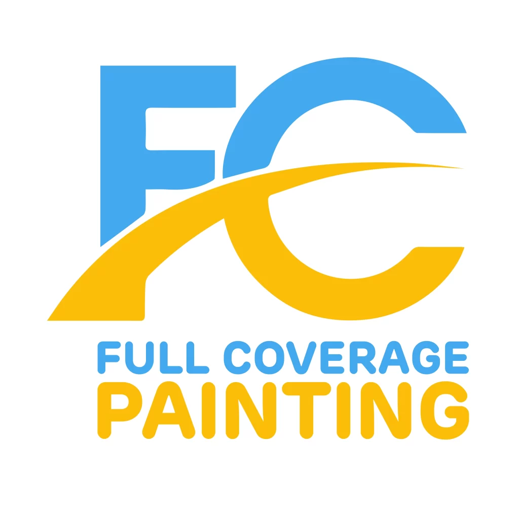
01 . Full Length Coating
The first painting company on our list is called Full Length Coating, or FLC. The business specializes in exterior painting and staining of commercial buildings and homes, interior painting and staining, and related services.
Considering that they are established in the San Diego County, a large metropolitan area in California, the business needed a strong and highly visible logo to establish themselves in the area. The logo they went with is simple, clear, and highly versatile. It can be used in a variety of different ways, including on business cards and stationary, on the sides of vans, and as monograms on company uniforms.
The design represents the company initials written in bold, blocky, and non-traditional font. A few additional design elements are added to the initials to make them look like a paint gun, like those used often in commercial painting and coating applications. The entire design is enclosed within a hand-drawn oval, mimicking the style of a continuous freehand swoop used by many circle logos.
02- Brad Stoner Painting
Brad Stoner Painting is one of the leading painting companies in the San Diego area. Established in 1986, the namesake of the company quickly grew his business from painting local apartments to painting complete homes and commercial buildings in the area.
Today, the company employs over 45 people that offer all kinds of interior and exterior painting services to their clients. Similar to the previous painting company on our list, Brad Stoner Painting needed a logo that could be used to represent their business in a commercially competitive area like San Diego County. However, rather than go for an abstract business name, this company decided to name itself after the owner, and created a logo that reflected it.
Considering that the company was established in the mid-1980s, this is a common thread among many small and single proprietor businesses from that era. However, by slowly establishing its base from small projects, and then moving onto larger contracts as their list of satisfied customers grew, the company managed to leverage even a simple logo like this one for maximum impact.
The logo for the company features a simple wordmark written in a simple serif font over three lines, which is one of the simplest types of logos. The letters are all in uppercase, and are colored black. The background is a rectangle with a blue gradient, which has a brush stroke going from left to right, and colored the same blue as the background but with a reverse gradient.
The overall look, while not as attractive or intuitive as some of the other entries on this list, is nevertheless quite successful. And if done properly, can even help a business today stand out and carve a niche in the market.
03- Onit Painting
Next up, we have a business with an interesting name. Onit Painting is a comparatively new business, established in 2015. Since then, it has amassed a great number of projects, both in the residential circles and the commercial ones.
The name of the business is a portmanteau of the words “On” and “It”. This makes a clever play on the phrase “On it”, which shows that someone gets right onto a task assigned. Headquartered in Indianapolis, and operating in both Indianapolis, IN and Nashville, TX, the company needed a logo that was suitable for the aesthetic sense of both the Texans as well as the people from Indiana.
They came up with a neutral design that would appeal to people of both areas, and more. The result was a simple design, whose impact was anything but that. Colored a medium-light shade of blue contrasted with dark gray, the logo was drawn in the style of a combination mark. The left side featured a set of outlines of building, with the smaller blue outline representing residential properties and the larger dark gray outline representing commercial properties.
The design was flanked on the right by the wordmark, which featured the same two-shade color combinations. The overall look is clean, sober, and somewhat corporate, perfect for representing a company that has established a presence in multiple regions.
04- Peek Brothers
Peek Brothers in another company that sports a somewhat classic style of painting logos. The logo fonts used here are a mix of three different styles. The main wordmark that spells “PEEK” is written in bold, blocky, serif font that is designed to be highly visible. Beneath it, in a typeface much thinner and smaller than the first part of the wordmark is the next word, spelling “BROTHERS”.
Both of these words are written in a black font, and are flanked on the left by a small graphic of a house’s front view, drawn in white over a red background. Underneath the aforementioned design, a thin red line separates words “FINE HOME PAINTING” from the main part of the logo.
As the company is situated in the San Diego County, as a few discussed above, we can see how different companies within the region have tried to separate themselves from the competition. Despite that, all different approaches have resulted in successful businesses. This shows that there is no one right way to making a logo for a business. All you need to do is find some way to connect with your target market, and come up with one of several ways to implement it into your company’s painting logo.
05- Torres Custom Painting
Next on our list is Torres Custom Painting. Their logo uses quite a straightforward base design, which is tweaked in several places to make the design stand out. This is one of the more interesting house painting logo design ideas, which makes use of common design elements; albeit tweaked slightly, to make something unique and memorable.
Now, the color scheme used is primarily black, with a dark maroon used as accent. The painting company logo uses a paintbrush within its design, which is one of the more obvious painting-related design elements. The design is also simple and clean enough to be used both as a monogram and in print, which fulfills the versatility tenet of a good logo.
06- Chism Bros Painting
Chism Bros Painting logo is a vastly different design compared to the ones we have discussed so far. The logo looks like it is designed predominantly for digital use. From the simple lettermark of the company initials, or the full length wordmark, the logo is hard to replicate in things like uniforms.
However, despite that, the company has been making good use of the brand logo, and have been serving the San Diego area since 1982. The founders are fourth-generation painters, meaning that their knowledge of the business, and understanding of what appeals to the target market is next to none. That is how they have been able to establish such a successful business.
The lesson to learn here is that if you know the business and the target consumers inside out, you can make even a simple logo design work wonders for you and your business.
07- Legacy Painting Company
Another example of classic-style painting logos, Legacy Painting Company is a great representation of elegance in unlikely places. People often associate trade businesses to be crude and uncultured, and Legacy Painting is breaking those stereotypes.
The design of the logo features a dark gold wordmark, written in a wide, san-serif font. The typeface features varying stroke widths, which lends additional appeal to the design, and the overall look is something that exudes delicately elegant vibes.
The entire wordmark is placed over an embossed image of a palm tree, which shows a slight silhouette behind the logo and brings the balance in design full circle. That may not be as apparent on medium like monograms and stickers, but for stationary and business cards, it would be a great addition to elevate the design.
08- PH.D Painters
PH.D Painters is an interesting business in itself, from its name to its logo. The idea behind it is that no matter what the project, the company would execute it with meticulous care expertise. While the name is easily explained, the logo is something of a conundrum.
Designed to look like a seal or monogram, the round shape of the design does not lend well to easy readability. However, that is offset by the addition of the paint roller in the middle of the logo. This central position of the painting tool instantly draws the eye, and makes the viewer concentrate on the design.
Overall, this is an important example of successful painting logos, despite the fact that its design seemingly goes against traditional logo design trends.
09- The Painting Company
The Painting Company is another firm that sports a straightforward painting company logo. the wordmark is large, with the core word of the wordmark easy to read due to its large size. Combined with the addition of a bright red paintbrush is a great way to boost the legibility of the logo when relying on design gimmicks like varying font sizes for different words of the wordmark.
The font used for the word “Painting” is elaborate and fancy, which can be hard to read if not used in a much larger size. However, the addition of the bright red brush, and the red paint stroke from it, draws the attention immediately to it.
10- Ladies on Ladders
Ladies on Ladder, the last entry on our list on inspirational painting logos, is a unique one. It is one of the simplest and plainest one on our list, with a few design elements added to enhance the impact of the logo.
On the left side of the logo, a paintbrush handle on its side is placed, with the handle facing left. Along the brush’s profile to the right, the wordmark is placed, with each word in a separate line. The first letter of each word is colored red, with the letter N in ON colored a light pink.
At the bottom, the letter A in LADDERS is replaced with a stepladder, with a small figure on it painting the pink N of the line above it. Overall, the design is one you would often associate with a small, new business. But despite that, the logo is a success.
FAQs
| Does my painting company need a custom logo? Yes, your business needs a custom logo to ensure people are able to remember and associate you with your market reputation and expertise. |
| What common elements are used in painting logos? Some of the most common elements in painting logos include paintbrushes, paint swatches, paint rollers etcetera. |
Conclusion
To sum it all up, the design of successful painting logos is dependent on many factors, including the aesthetics of the locals and the tone of the business itself. However, if you are on the fence about creating a custom painting company logo, don’t worry.
You can hire a professional logo designer or a branding company, who can set you up with the proper brand artifacts required to make your company present itself to the target market successfully.
Latest news you want to know!
Subscribe for cutting-edge design inspiration at Logo Poppin! Elevate your brand with updates on logos, branding, web design, and video animation.
Note that by clicking “subscribe,” users may agree to our privacy policy and consent to Logo Poppin to use your contact data for newsletter purposes.
Logopoppin
Logopoppin is a graphic design agency that specializes in logo designing, web development, video production and advanced branding services. We love to innovate businesses with new age technologies, allowing them to improve their visual reputation.

