
Table of Content
A Quick Look How to Famous New England Patriots Logo Evolved
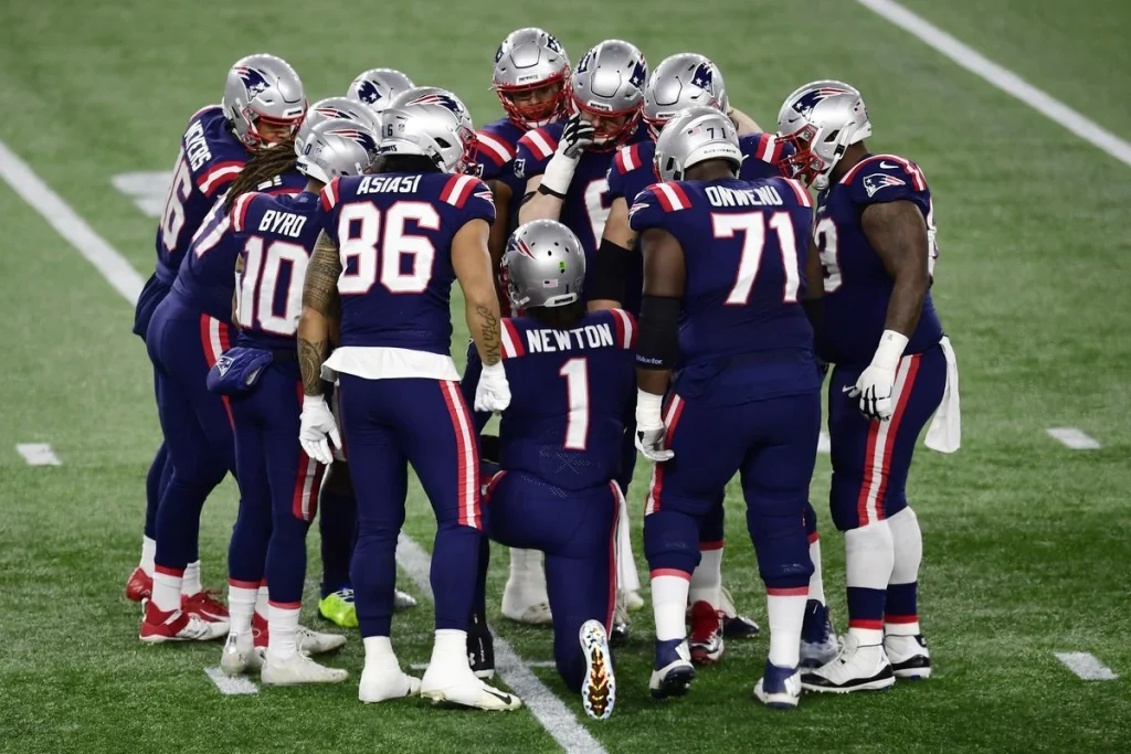
In the NFL history, very few teams have achieved a level of stardom like of New England Patriots. This is a team that has a rich legacy of glory in the tournament. Apart from winning titles, the team is also popular due to its creative branding. The Patriots logo is indeed a big part of team’s splendid branding identity. Created by professional logo design services, the emblem represents a team that is playing in the NFL circuit since 60s. This tells a lot about the longstanding presence of Patriots in the NFL that is already rounded up with many competitive teams.
As described by many experts, the logo represents a core identity of any sports franchise. Patriots have certainly understood this fact, which is why they’ve worked on their logo to make the branding noticeable for everyone. The team has changed its logo several times over the course of years, primarily to keep its branding fresh and updated. It is one of those practice that has worked well for many sports franchises, especially those that have a huge fan following in the market.
If you want to know about the complete history of Patriots logo, read this article in detail. It will let you know how this iconic logo evolved over the course of time, establishing a strong identity of the team in the NFL circuit.
The Rich Legacy of Patriots in NFL
The New England Patriots have carved out one of the most storied legacies in NFL history. Founded in 1960 as an original member of the American Football League, the team spent its early decades in relative obscurity. However, the hiring of head coach Bill Belichick in 2000 and the emergence of quarterback Tom Brady soon launched the Patriots into an unprecedented era of success. The team’s methodical approach, rooted in Belichick’s defensive genius and Brady’s precision under pressure, set a new standard for modern football.
Between 2001 and 2019, the Patriots became the NFL’s gold standard. They captured six Super Bowl titles and appearing in nine, while dominating the AFC East with 17 division titles in 19 seasons. Their dynasty was built not just on talent, but on adaptability, player development, and situational mastery. From thrilling comebacks to controversial moments, the Patriots consistently commanded attention and respect across the league, solidifying their identity as both revered and reviled giants of the sport.
Beyond the hardware and headlines, the Patriots’ legacy is also defined by their influence on how the game is played and managed. They revolutionized concepts such as the use of the slot receiver, the two-tight end offense, and situational game planning. Their emphasis on team-first culture and the “Do Your Job” mantra became a blueprint for other franchises seeking sustained success. Even as the post-Brady era unfolds, the Patriots’ two-decade reign remains a benchmark of organizational excellence in professional sports.
History of NFL Logo
Patriots have changed their logo many times, precisely to keep the brand identity updated as per the latest trends. If you don’t know much about the complete timeline of previous Patriots logo, take a look at the sequential evolution described below.
Patriots Logo: 1960
The original logo of the team now known as the New England Patriots was first unveiled in 1960, when the franchise was initially established under the name Boston Patriots. This marked the beginning of the team’s visual and cultural identity in the American Football League (AFL). The logo featured a revolutionary-themed figure, crouched in a ready stance as if preparing to snap a football. It reflected the team’s deep ties to New England’s historical roots, especially the American Revolution.
Just like Arizona Cardinals logo, the Patriots symbol was both a nod to the region’s heritage and a unique emblem that helped distinguish the team from other clubs. The choice of a patriot in colonial garb symbolized strength, resilience, and a proud local identity that resonated with fans in the Boston area. Over the years, the original 1960 emblem laid the groundwork for a legacy rooted in regional pride and historical symbolism.
Patriots Logo: 1961
The original logo of the Boston Patriots remained in use for just one season before team officials opted for a redesign in 1961. Although it served as the team’s initial visual identity, the first version was relatively simple and did not fully capture the spirit or character the franchise aimed to represent. As a new team in the American Football League, the Patriots sought a stronger and more distinctive image that would resonate with fans and reflect the cultural themes of the New England region.
In response to this desire for a more memorable and symbolic logo, the franchise commissioned a new design in 1961. This led to the creation of the now-iconic “Pat Patriot” logo, which depicted a revolutionary war minuteman crouched over a football. The historically inspired figure was quickly embraced by the fanbase and became an enduring symbol of the team for the next three decades. This change marked the beginning of the Patriots’ commitment to blending tradition with identity.
Patriots Logo: 1965
In 1965, the Boston Patriots made subtle yet meaningful refinements to their “Pat Patriot” logo to enhance its visual appeal. The contours of the minuteman figure were sharpened, giving the image a cleaner and more polished look. These adjustments helped to better capture the details of the character’s uniform and facial expression. The revisions were part of an ongoing effort to improve the team’s branding as professional football grew in popularity and visual presentation became increasingly important.
Along with the refined outlines, the color combination of the logo was also updated to include a new shade for the minuteman’s skin tone. This change contributed to a more vivid and humanized portrayal of Pat Patriot, helping him stand out more prominently on merchandise, uniforms, and promotional materials. These artistic enhancements reflected the franchise’s attention to detail and its commitment to evolving the team’s identity while staying true to its historical roots.
Patriots Logo: 1971
In 1971, the football team made a significant decision to change its name from the Boston Patriots to the New England Patriots. This move was intended to reflect a broader regional identity rather than being associated solely with the city of Boston. The new name was chosen to represent not just the team’s immediate locality, but the entire New England region, which includes six states in the northeastern United States.
Despite the shift in name, the team chose to retain its existing logo. This decision was made in order to maintain continuity with the team’s established brand and visual identity. By keeping the logo, the Patriots were able to preserve a sense of familiarity and tradition for long-time supporters, ensuring that the team’s heritage remained intact. The combination of a new name and an unchanged logo allowed the organization to evolve while still honoring its roots and the loyalty of its fanbase.
Patriots Logo: 1993 – Today
At the beginning of 1993, the New England Patriots made a notable change to their visual identity by introducing an entirely new logo design. This decision marked a departure from the team’s long-standing emblem that had been associated with the franchise for decades. The new logo was part of a broader effort to modernize the team’s image and present a more dynamic and contemporary look. The change reflected a desire to keep up with evolving design trends in professional sports.
The updated logo featured a sleek and stylized depiction of a patriot head. This modern emblem replaced the traditional colonial-style figure, which had become iconic but was seen by some as outdated. The rebranding aimed to energize the fan base and create a fresh identity that could resonate with a new generation of supporters while still paying homage to the team’s historical roots.
Frequently Asked Questions
| Why Patriots are popular in the US? The Patriots are popular in the U.S. due to their sustained success, including multiple Super Bowl wins. Their dominance in the 2000s and 2010s built a strong national following and media presence. |
| What was the original Patriots logo? The original Patriots logo, introduced in 1960, featured a Revolutionary War-style minuteman. Known as “Pat Patriot”, it symbolized the team’s historical roots and regional identity. |
| What is the color of Patriots logo? The current Patriots logo features a stylized patriot head in navy blue, red, silver, and white. These colors reflect strength, tradition, and a modern American identity. |
Final Words
That concludes our entire article in which we have discussed the complete timeline of Patriots logo. It is one of those NFL logos that is highly popular in the US. The emblem has been designed creatively to demonstrate the decades old to legacy of the team. The latest redesign of the logo indeed looks very simple, illustrating a clean identity of the club. This is the key reason why the logo has made a resounding identity in the circuit, making the team’s branding image highly solid.
Logopoppin
Logopoppin is a graphic design agency that specializes in logo designing, web development, video production and advanced branding services. We love to innovate businesses with new age technologies, allowing them to improve their visual reputation.
