Table of Content
Discover the Transformation of the PayPal Logo Over the Years Representing Its Platform
PayPal, a global online payments system that has gripped the world since the company’s inception, has revolutionized the way people send, receive, and manage money. Since its inception in 1999, PayPal has grown into a dominant force in the financial technology industry, serving millions of users worldwide. And the PayPal logo, a visual representation of its brand identity, has played a crucial role in its success.
Over the years, the PayPal logo has undergone several transformations, reflecting the company’s growth, evolution, and changing market dynamics. From its early days as a simple, text-based logo to its current incarnation, the PayPal logo has evolved to become a recognizable and trusted symbol of online payments.
Join us as we explore the history of the PayPal brand logo, tracing its journey from its inception in 1999 to the present day. By examining the key elements of each version and understanding the symbolism imbued within them by their logo design agency, we will gain insights into the brand’s enduring appeal.
Let’s begin.
History of PayPal – An Overview
PayPal was founded in 1999 as a merger of Confinity and X.com (then called Twitter). Initially focused on online auctions, PayPal quickly expanded its services to include peer-to-peer payments, online shopping, and international money transfers. The company’s innovative approach and user-friendly platform quickly gained popularity, and it soon became a leading player in the online payments industry, which was still in its infancy at that time.
In 2002, PayPal was acquired by eBay for $1.5 billion. The acquisition provided PayPal with a massive customer base and access to new markets, thus becoming a dominant player in the industry. Under eBay’s ownership, PayPal continued to grow and expand its services, solidifying its position as a dominant force in the online payments industry.
PayPal spun off from eBay in 2015, becoming an independent company. Since then, PayPal has continued to innovate and grow, expanding its services to include cryptocurrency payments, mobile payments, and point-of-sale solutions. And although its not technically one, the PayPal logo is considered one of the best bank logos known across the world.
Evolution of the PayPal Logo Over the Years
Just like many other brands you’ve seen around you, the PayPal logo has undergone many transformations over the years, reflecting the company’s growth, evolution, and changing market dynamics. From the convoluted design used in the initial days, to the modern and minimalist Here are some of the key iterations.
1999 PayPal Logo

The original PayPal logo was a simple, circle logo design featuring a pair of vertically mirrored “P”s to represent its full name. The font used sans serif, and the color was a dark navy blue. This early logo reflected the company’s focus on functionality and ease of use, rather than aesthetics. The minimalist design was intended to be straightforward and easy to remember.
2000 PayPal Logo

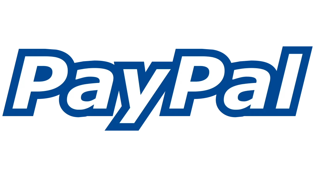
In 2000, PayPal introduced a new logo featuring its name in thick, sans serif letters spelling out its entire name. Broken into two words that were still read as one, the new PayPal logo wordmark showed the name “PayPal” in thick navy outlines against white letters. This design was intended to symbolize security, trust, and protection, reflecting the company’s commitment to safeguarding its users’ financial information. The four-sided shape also suggested stability and reliability.
2007 PayPal Logo

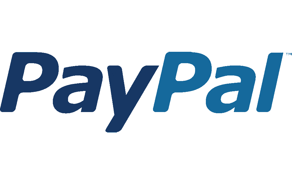
In 2007, PayPal introduced a new logo wordmark that featured a change in design as well as the color combinations used. The new design featured letters that were thinner than the older version, with distinct character spaces between them increasing legibility, and softer, rounded edges from the previous angular design. Moreover, rather than going for a solid-colored outline for white characters, the new design featured a duo of shades, with the first part of the wordmark colored in navy blue, and the other in a lighter blue.
The PayPal logo’s modern and approachable design reflected the company’s growing popularity and its expanding customer base. The use of a flat design was a trend in logo design at the time, and PayPal embraced this aesthetic to stay current and relevant.
2014 PayPal Logo

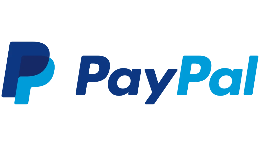
In 2014, a new PayPal logo was introduced a simplified design. Keeping with much of the previous design, there were some subtle changes such as the choice of the sans serif fonts used, the most prominent hint of this being the shape of the letter “a” in the wordmark.
Moreover, the logo now featured a logomark as well, inspired by the wordmark. The design featured the company initials overlapped and offset against each other, colored in the brand color palette. The simplified design and logomark was intended to be more versatile and adaptable, allowing PayPal to use the logo across a variety of platforms and channels. The new shape suggested the company’s flexibility and adaptability, while the sans-serif font added a modern and professional touch.
2022 PayPal Logo

In 2022, the PayPal logo was tweaked a bit to make it more aesthetically appealing, with an updated typography style and color palette. The navy blue was swapped for a vibrant royal blue that hits the gaze better, while the lighter blue was also replaced with more saturated shades of blue color. The font was subtly tweaked for the logomark, with the offset height of the top initial being increased to make the logo vertically longer and more visible.
The logo’s modern and dynamic design reflected the company’s commitment to innovation and its ongoing efforts to expand its services. The updated typography and color palette gave the logo a fresh and contemporary look, while still maintaining its recognizability.
PayPal Logo Design Reimagined – A New Brand Logo for 2024?

In 2024, PayPal announced plans to reimagine its brand identity, including a redesign of the PayPal logo, especially for USA. The company’s goal was to create a logo that better reflected its evolving business and its commitment to innovation and inclusion.
The new PayPal logo unveiled featured a bold, sans-serif typeface and a stylized “P” that incorporated elements of the company’s previous logos. However, while the previous designs had a little italic tilt to them, the new wordmark was straight, with the angular aesthetic of the 2000s logo. The logo’s color palette was also updated to a monochrome black to reflect a more modern and inclusive aesthetic.
The new monogram logo design was designed to be more versatile and adaptable to modern norms, allowing PayPal to use it across a variety of platforms and channels. It was also designed to be more inclusive, reflecting the company’s commitment to diversity and equity.
FAQs
| Does PayPal have a new logo? Yes, PayPal has revealed a new logo for its US operations in September 2024, which features a stark departure from the previous versions. Colored completely black with straight, sharply angled letters, the new logo features a modern minimalist aesthetic. |
| What is the PayPal color palette? Although the official color palette has ditched the old colors for a monochrome black color, you can still use their official color set. This includes white and black from the modern version, and the colors bright blue, deep blue, and medium blue from the older versions. |
Conclusion
The PayPal logo has undergone a remarkable transformation over the years, reflecting the company’s growth, evolution, and changing market dynamics. From its early days as a simple, text-based logo to its current incarnation, the PayPal logo has become a recognizable and trusted symbol of online payments.
The 2024 redesign of the PayPal logo marks a significant milestone in the company’s history. The new logo is designed to be more versatile, inclusive, and reflective of PayPal’s commitment to innovation and progress. As PayPal continues to expand its services and reach new markets, the logo will undoubtedly play a crucial role in shaping the company’s brand identity and future success

Logopoppin
Logopoppin is a graphic design agency that specializes in logo designing, web development, video production and advanced branding services. We love to innovate businesses with new age technologies, allowing them to improve their visual reputation.


