
Table of Content
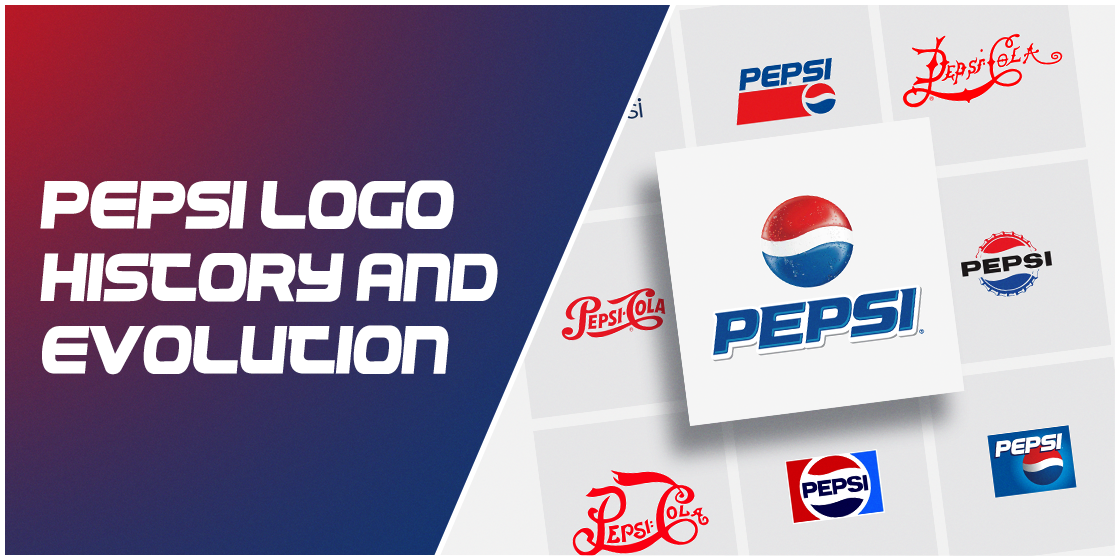
Take a Look at the Evolution of the Pepsi Logo Design Within the Past 100+ Years
For most brands, keeping a consistent logo design is what sustains their brand loyalty. That is because it allows people to easily recognize and memorize a logo that they trust and know well. However, if we look at the Pepsi logo history, we discover a surprising exception to the rule.
With experience spanning a century and more, the Pepsi company has modified its logo nearly a dozen times, most recently hiring the Arnell Group for their logo design services. And that doesn’t even count the minor variations like the one for Pepsi Max, Pepsi Crystal, or more variants.
Yet despite these changes, some more drastic than others, Pepsi has seen its consumer base grow, establishing itself as the leading cola drink in the market. And that is because it continues to deliver the same taste and experience as the one their fans have come to expect.
Let’s dive into how the Pepsi logo design has changed over the years, and learn how to design a logo that has managed to hold onto its brand recognition despite these changes.
The Late 19th Century, And Pepsi’s Entry into The Rising Cola Trend
The late 1800 were an interesting time in the Pepsi logo history. At that time, pharmacist entrepreneurs were looking to create tonics that would be a great pick-me-up for people after a long, hard day. It was the same movement that led to the formation of drinks like Coca-Cola and Dr. Pepper, two of the most popular worldwide cola drinks besides Pepsi.
Unlike Coca-Cola, which was invented as a way for morphine addicts to drop their habit, Pepsi and Dr. Pepper both had a history of being formulated as a tasty and fun digestive aid. Invented in 1893 by pharmacist Caleb Bradham, the drink was called Brad’s Drink when first introduced in its hometown of New Bern in North Carolina.
Named after its inventor, the cola was sold as a syrup which people could mix with soda water at home, for a fresh glass of the drink whenever they wanted. And slowly, the drink that would soon be known as Pepsi, started to gain way into the flavored cola drinks market.
Pepsi Logo History: Brad’s Drink, Pepsi’s Entry into The Tonic Medicine Industry (1893)
The first logo for the brand was an ornate wordmark that spelled the product’s name at the time – Brad’s Drink. The logo had a blue on white color palette, and the typeface used had a bold and elaborate design.
This aesthetic for ornate wordmarks is something we will see for a long time in Pepsi’s logo history, even after they changed the name and the color combinations to the iconic Pepsi logo design we all know and love.
The Old Pepsi Logo: Attempt at Creating a Familiar Wordmark as Pepsi-Cola (1898-1940)
As we mentioned earlier, Pepsi was a drink that was initially marketed as a tonic to help aid in digestion. That is why, when the company decided to give the product a proper name in 1898, they came up with Pepsi-Cola.
The choice of name might seem odd at first, but considering its major use was that as a digestive aid, the name was derived from the word dyspepsia, the clinical term for indigestion. And once the product had a proper name, it started to grow quite quickly.
Within a few short years, Bradham had seen his product grow so fast that in 1903, he trademarked the name Pepsi-Cola. And within just a year after that, had sold more than twenty thousand gallons of the syrup used to make Pepsi-Cola.
With a new name, a new logo was needed. And the company came up with a red, spiky wordmark logo. like the original log for the brand, the design was ornate. However, besides the eye-catching red color scheme, the serifs for the mid-height characters were made longer and sharper, while the trailing A had a long and curved tail that stretched up and out.
The 1905 Retouching of the Pepsi Logo Design
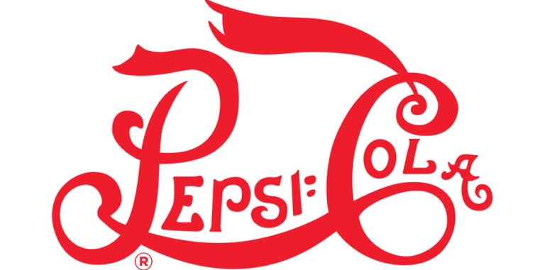
While the red wordmark for Pepsi-Cola would remain in use till the year 1940, the Pepsi logo design did see some changes in that time. The first retouching of the Pepsi logo would come in 1905, which say the letters of the logo made bolder. Moreover, the log now adopted a smooth, wavy kind of design, reminiscent of trailing banners and softer serifs and spikes.
The new design had better visibility, especially as the addition of a long trailing banner to the letter C of cola made the design somewhat more palatable, symmetrically. Overall, this design was different than the one before, but still managed to portray its inspiration from that design.
Fine Tuning the Pepsi Logo Design in 1906, and Its Similarity to Coca-Cola’s Logo
Despite the success of the new Pepsi logo design in 1905, the logo was tweaked again in 1906. This tweak was one of the most defining moments in the Pepsi logo history, as this is where we start to see the similarity with Coca-Cola’s wordmark logo.
This time, the designed condensed the logo a bit more, and made the first letters of both words in the name a bit bigger than the other characters. However, they retained the same overall design and color scheme for the logo. a few other things to note in the design included:
- The serifs were now spikier, again.
- The word Drink was added to the banner streaming from the letter C, which acted as a signifier of the product as something to imbibe, as well as acted as a call-to-action.
- Finally, the design now featured the word Pepsi on an incline, which gave the logo a better overall visual feel.
Taking the Pepsi Logo Design Down a Notch for a More Streamlined Look in 1940
Finally, the logo was tweaked again in 1940, after nearly three and a half decades of the previous logo design being deemed satisfactory for use. This new design was now closer in visuals to the Coca-Cola logo than ever before. Moreover, the streamlining of the design for a slimmer look, and the removal of the word Drink from the top of the wordmark made the design look elegant.
Moreover, the letters were made a little thinner, which game a less-cluttered feel to the Pepsi logo design.
Pepsi Bottle Cap Logo: The Third Major Redesign in Pepsi Logo History (1950)
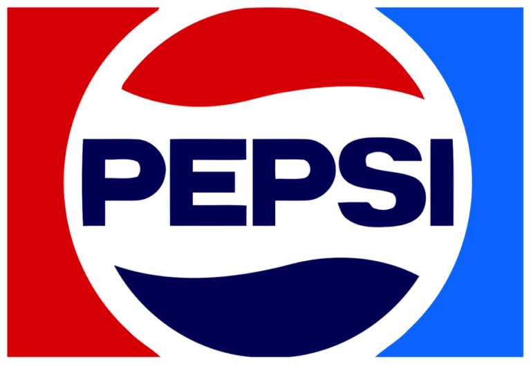
In 1950, nearly a decade after the last retouching of the logo, there was another major development in the Pepsi logo history. A new logo was unveiled in 1950, which featured the previous wordmark on a tilted, crimped metal bottle cap.
Additionally, the logo now also featured an all-new color scheme, which consisted of a tri-band look colored red, white, and blue.
Understanding the New Pepsi Logo Color Meaning: Why the red, white, and blue?
Now many people might be wondering about the significance of the new color scheme. And the answer to that is very simple. For one thing, the company wanted to look different to the Coca-Cola logo, and they did that with the bottle cap logo.
However, with World War II just ended a few years ago, there was a huge wave of patriotism in the country, which made the addition of a red, white, and blue color palette the natural option. And this is where Pepsi started to be associated with the color blue, which it is still known for today.
Dropping The Cola from Pepsi-Cola (1962)
In 1962, the Pepsi logo design was again given a makeover. It now lay flat instead of at angle, making the design more visible. Another major redesign was the change in the wordmark.
This was the first time that the company dropped the word Cola from its name, leaving behind the moniker we know well now. Moreover, unlike the previous wordmark which was placed in the middle of the center white bar of the bottle cap logo, now overflowed on both sides, in big block letters colored black instead of red.
Now the brand was called Pepsi, making it easier to grow it into a worldwide phenomenon marketed to the young and the hip. In the early 1960s, Pepsi was aggressively marketing itself as a drink for the youth, with the Pepsi Generation slogans rampant in that era.
And thus to position Coca-Cola as a drink for the people out of touch with the youth, Pepsi decided to change its wordmark drastically to differentiate from the red Coca-Cola wordmark.
The Rise of the Eponymous Pepsi Globe in Pepsi Logo History (1973)
1973 was the first time in Pepsi logo history where the company unveiled a version of the now famous Pepsi Globe. With the design industry moving towards the comparatively new concept of minimalism, the design was now changed somewhat slightly, with the ridges of the bottle cap disappearing, the wordmark tweaked, and the background colored.
Unlike the previous iteration of the Pepsi logo design, the new logo now featured the wordmark colored blue, and encompassed within the circular globe. Moreover, the canvas to the left and the right side of the globe were colored in red and a lighter blue shade respectively.
The First Pepsi Logo Design Facelift at the Height of the Cola Wars in 1980s

The mid to late 1980s were an exciting time for the consumers of cola products. Companies were in a serious battle to come out as the top contender, and the peoples’ choice for a cola soft drink. Coca-Cola had been established as a classic, a reputation they were unable to shake, despite trying hard.
Pepsi, on the other hand, had young and energetic mascots like Michael Jackson and Michael J. Fox. It was thus perceived as a drink made for the youth, for the people on the go. And instead of opting for a change of flavor like Coca-Cola did, they opted to revamp their logo.
The new logo lightened the shade of the colors used in the logo by a few degrees, and decided to unveil their own proprietary logo fonts to redesign their wordmark. The new typeface had less of a blocky design, and embodied a digital vibe that went well with the youthful persona of the brand.
The Big Break Up – Separating the Wordmark from the Pepsi Logo Design (1991)
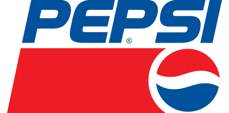
The 1991 Pepsi logo redesign was another big milestone in the Pepsi logo history. The new design now featured the same elements albeit with a few changes. The wordmark and the Pepsi Globe were now separate from each other, with the wordmark now stretched across the top of a bold red bar, which featured a small Pepsi Globe at the right end.
The font for the logo was made slightly italic, and the red bar was a callback to the red banner found in the earlier versions of the Pepsi logo design.
The White-On-Blue Motif of 1998 in Pepsi Logo History
In 1998 redesign was another major change to the logo, which now brought the iconic blue background to Pepsi logo design. the new logo now featured a blue background, with the wordmark in white, three-dimensional letters, and the Pepsi Globe at the back of the design.
This redesign is one of the most iconic in Pepsi logo history due to the fact that this was the one that bought forth the now iconic association between Pepsi and the color blue.
Giving The Pepsi Globe The 3-D Treatment (2003)
With the early 2000s bringing with it a rising trend in digital graphics, Pepsi opted to redesign its logo, specifically the Pepsi Globe, to give a three dimensional, wrapped in plastic look. The source of light was changed to compliment the new design, which gave the rest of the design a flatter look, while the light blue outline of the globe and the wordmark made them pop.
Moreover, the typeface was also tweaked, with small serifs added to the letters to give them a fresh, updated look. The letter also got some, light gray accents, made to look like shadows to give the letters a better depth of vision.
Giving The Pepsi Logo Design a Refreshing Chill in 2006
With a drive for innovation, Pepsi had long established itself the victor over its competitors. Yet it still worked hard to stand out and challenge itself for something new, something better.
That is why in 2006, Pepsi unveiled a new, rather Cool logo design. set over a jet black background, the new logo featured the 3D Pepsi Globe with condensation dripping down its surface, referencing a cold glass of Pepsi with water droplets running down it.
The wordmark stayed the same, albeit with a white outline to make it stand out from the dark background. Overall, this was one of the most iconic logos in Pepsi’s logo history.
Cementing Its Place as The World’s #1 Cola: The Culmination of a Long Pepsi Logo History (2008)
Finally, in 2009, the modern Pepsi logo design was unveiled to the public. PepsiCo decided that the time was right for a big rebranding, and hired design company Arnell Group, to spearhead their new logo. Allegedly, Pepsi payed the design company an amount over $1 million to create their new brand logo.
And the result, was the logo that we now see around us, on all Pepsi merchandise.
The new design featured a flat globe, with a dark blue outline around it for emphasis. The wordmark was a custom font called Pepsi Light, which was used to create the all-lowercase wordmark in a dark blue.
The globe was also tilted slightly, and the white band of the logo took up far less space than the blue or the red. However, the new design did not go over too well with the consumers, who called it uninspired and even lazy.
The New Pepsi Logo Design of 2014
Finally, in 2014, the company made a little tweak to the logo we see on Pepsi bottles today, where they removed the dark blue ring that encircled the Pepsi Globe. With the ring gone, the white band of the logo now connects to a white ring that encircles the globe today, making it stand out from the dark backgrounds.
Frequently Asked Questions
| 1- What was Pepsi’s original logo? Pepsi’s original logo was a wordmark, which spelled Brad’s Drink, and was colored blue. |
| 2- Why is Pepsi logo red, white, and blue? The red, white, and blue color palette is something the company used to capitalize on the patriotic feelings of the country after World War II. |
| 3- How many times has Pepsi changed its logo? Pepsi has changed their logo over 12 times, excluding the logo variants for different items like the Pepsi Max or Diet Pepsi. |
| 4- Is the Pepsi breathtaking document real? Yes, the document is real. However, how much it relates to the actual inspiration of the design is a matter of much debate. |
In the End
The Pepsi logo history paints an interesting tapestry of a brand that was willing to work hard and find its inner personality. From copying the style of Coca-Cola’s red wordmark, to creating a new logo and beating them as the world’s number one cola drink, Pepsi logo designs have been quite adept at making the brand stand out.
Want to create an iconic logo for your brand too? Logo Poppin can help you create unique and bespoke logos that would represent your brand perfectly, and help it stand apart from the competition.
Latest news you want to know!
Subscribe for cutting-edge design inspiration at Logo Poppin! Elevate your brand with updates on logos, branding, web design, and video animation.
Note that by clicking “subscribe,” users may agree to our privacy policy and consent to Logo Poppin to use your contact data for newsletter purposes.
Logopoppin
Logopoppin is a graphic design agency that specializes in logo designing, web development, video production and advanced branding services. We love to innovate businesses with new age technologies, allowing them to improve their visual reputation.

