Table of Content
Discover the Best Pharmaceutical Logos of Top Medicine Brands in the World
Ever since the advent of modern medicine, small neighborhood pharmacists and apothecaries have given way to large, multinational drug research and manufacturing companies. These businesses are represented by pharma logos, many of which we see around us every day.
Pharmaceutical companies play a major role in our lives today. From manufacturing infant formula and over-the-counter medicines, to researching and developing treatments and cures for various diseases, these companies provide value for us all.
Let’s discover some of the most popular pharmaceutical logos for companies and famous medicinal formulas and learn how their logo design services provider helped them achieve their fame.
Hallmarks of Great Pharma Logos – What Do They Represent?
Before we begin discussing various famous pharmaceutical brand symbols, let’s take a look at the design elements that set apart a good brand symbol, whether it is a small pharmaceutical company logo, or popular one. Every successful pharma logo needs to be attractive yet expressive, in order to catch the viewer’s eyes and convey its information.
For the most part, many pharma logos are quite simple in design, due to their drive to embody a more modern yet simpler design. The design elements common in successful pharma logos include:
Distinct Designs
The design of the pharmaceutical logos should be unique and recognizable, making it easy for consumers to identify them from the competition. Such designs are a great representation for the pharma companies, as the designs can be used on a variety of materials and mediums, while embodying a sense of sophistication and elegance. These designs are often accompanies by effective design trends and color theory too, for a stronger impact.
Minimalistic Iconography
The design of the pharma logos need to be simple and clean, with a minimalist approach when it comes to adding design elements like logo symbols and other graphics. Too much, and you risk confusing the viewer. And by using the right iconography, the designer can make big pharma logo look great with it looking too clustered.
Complimentary Color Palettes
The right color combinations can make or break a logo’s design. That is especially true for shades that we instinctually connect with various industries or businesses. Colors play an important part in conveying your brand message, with different shades and hues embodying different emotions that can be used to enhance the logo’s impact.
Suitable Fonts
Just like colors, logo fonts too play an important part in how successful the pharma company logos are. Different styles of fonts are designed for various purposes, with companies from different industries choosing the style of typography that suits their niche. Using the right font automatically sets the tone of your business when interacting with consumers.
Famous Pharma Logos Representing Historical Pharma Companies
Now, let us start and discuss a few of the popular pharmaceutical logos representing top pharmaceutical companies that have been working on producing medicinal treatments since the 19th century. Let’s begin.
Pfizer Logo

Pfizer is one of the oldest pharmaceutical companies in the world still working today. The company has been producing pharmaceuticals and medicinal chemicals since the mid-1800s, and is considered ones of the top research and development company in the world for medicines.
Even during the COVID-19 pandemic, Pfizer was one of the first companies to come up with an emergency vaccine to protect people against the deadly coronavirus. Their pharma logo saw a recent change in its design, after nearly seven decades of the company using the old one.
The new logo features a double helix, using a gradient of blue shades. The logo is meant to represent the company’s changed business model, “from commerce to science”.
Bayer Pharma Company Logo
Bayer is another pharmaceutical company that has been around since the mid-19th century. Originating in Germany, the company has been at the forefront of many scientific breakthroughs related to medicines and other chemicals such as pesticides.
With a long history, Bayer’s symbol is one of the few pharma logos that is easily recognizable, made easy by the fact that the company uses its wordmark logo. the current design features the name of the company horizontally and vertically, passing through a common center point.
Novo Nordisk Pharma Logo
Novo Nordisk is Denmark-based multinational pharma company that has been in operation for more than a century now. When we talk about its brand symbol, it is one of the most interesting pharmaceutical logos on this list. Rather than go for an abstract design as most old pharma companies do, their logo features the design of an Apis bull, which holds a sun disk between its horns. The design is in reference to the Egyptian god Apis, and while it may seem like an odd choice of symbol for a pharma company, you cannot help but agree that it is a highly memorable design.
Roche Pharma Company Logo
Roche is a Swiss pharma company that has been on operation since the late 19th century. Over the years, they have been at the forefront of some of the most important phases in human pharmaceutical history, cementing their place as a top-tier pharma company. Their symbol features one of the more interesting hexagonal pharma logos that contains a simple, sans-serif wordmark of the company name. With a bright blue color scheme, this is one big pharma logo that would be hard to miss.
Big Pharma Logos Representing the Most Popular Modern Pharmaceutical Firms
The majority of pharma logos we see around us today represent companies that are quite new to the business of pharmaceutical development. However, a few of them have made a name for themselves in the industry, with a wide variety of highly popular items available in the market.
Let’s take a look at some of these brands.
Sanofi
Sanofi pharmaceuticals is a producer of a wide variety of healthcare items besides medicines. Their pharma logo is one that can be seen on many items around us today, and is one of the more popular choices of pharma companies.
Their logo features an abstract “bird of hope”, surrounded by soft colors. The green represents the earth, the blue for water, white for air, and the red-brown for fire. It is also one of the few pharma logos that uses logo color meanings to enhance its design’s impact.
GlaxoSmithKline Logo
GSK, or GlaxoSmithKline, is a famous pharmaceutical and healthcare brand that produces a variety of items from soaps and toothpaste, to complex pharmaceutical formulas. Their brand symbol is one of the most iconic pharma logos, and many of us are familiar with it.
The design features a rounded triangle in the shape of the tablet, colored orange, and the company initials written in white over it. The simple yet elegant pharma logo is so easy to recognize, that even a passing glance of the design helps a viewer remember and recognize the brand.
Novartis Logo

Novartis Pharmaceuticals research and develop an expansive range of pharmaceuticals, including chemotherapy formulas for various cancers. Starting out in the mid-1990s, the company has quickly risen up and made its place competing with brands decades, or even a century older than themselves.
Their pharma logo uses an abstract logo design which some consider represents a mortar and pestle, an item still used to grind and mix chemicals for medicines. Others believe it to be a representation of a harp, relating it to the root of the company’s name. Overall, it is one of the most popular pharmaceutical logos today.
Janssen Logo

Janssen Pharmaceuticals are a research subsidiary of the Johnson & Johnson group, and have been tasked with researching and developing new and improved treatment formulas for a variety of disorders and diseases.
Their pharma logo is a simple blue abstract design, which makes the shape of a stylized letter J, but can also be considered as a rearing dolphin with its fin extended out. An elegant design, the logo finishes it off with a simple wordmark of the company name.
Famous Pharmaceutical Logos That Represent Iconic OTC Medicines Today
A few medicinal formulas, especially those available over the counter, have become so iconic, that their names have achieved a status of being considered the standard name for any such medicine.
For example, the Kleenex brand of tissues has become so popular, that it has become the standard term for any brand of tissue.
Let’s take a look at some of these popular pharmaceutical logos from brand-name medicines.
Vicks Pharma Logo
Vicks today has one of the most popular pharmaceutical logos, with the brand known especially for their sinus relief balm, called the Vicks Vapo-rub. Such is the popularity of the brand that the name of its product has become the colloquial term for all items serving the same purpose.
Moreover, the company also produces throat lozenges and other products aimed to treat nasal and bronchial issues, including coughs, colds, and blocked sinuses. Their pharma logo is a simple wordmark within a small triangular shield with rounded edges.
Strepsils

Strepsils is another popular throat lozenge meant to treat a sore throat. An easily available formula, they have become the standard term for any throat lozenge available today, with one of the most iconic pharma logos for a cough drop.
Their pharma logo is round, two-tone icon, with a curving middle line meant to mimic the letter S. The base tone of the logo is grey, and the secondary colors change according to the flavor of the lozenge itself.
Tums Logo
Tums is a popular brand of antacid tablets that has been used by people in the US for many years now. The medicine is so popular that even when getting a store brand or a generic brand of antacids, people usually just refer to them as Tums.
The logo for the tablets is an oval design, with the name of the medicine written in bold uppercase letters over it.
Tylenol Logo
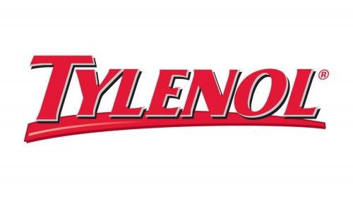
Tylenol is a brand of OTC pain killers popular in the United States. Now owned by Johnson and Johnson, the medicine has become a brand in itself today.
Its pharma logo is a simple wordmark, featuring a red colored, bold font with sharp edges and clean lines. Below the wordmark, there is a strike, which gives the logo a sense of depth.
Importance of Branding To Help Your Pharma Logos Succeed
Branding is essential in the pharma industry. That is because for the most part, many different companies, both new and old, are developing similar medicinal formulas, making for a highly competitive market. So how are they supposed to differentiate their offerings?
Two words – Pharmaceutical logos. These logos are the cornerstone of the pharma company’s branding strategy, and are useful to their success.
The benefits of branding include:
- Communicating the brand message effectively
- Creating better interactions with the clients
- Developing a loyal customer base
Frequently Asked Questions
| 1- Why do companies need their pharma brand logos? Companies need pharma logos to create a brand presence in the market, in order to compete with established pharma and chemical giants. |
| 2- Do pharma logos boost business? Yes, pharma logos do boost business for brands. |
| 3- What are common features for healthcare and pharma logos? Pharma logos often use images like the mortar and pestle, Bunsen burners, needles and syringes, and other iconography related to the medicine and healthcare industry. |
Conclusion
Now that you know what it takes to make great pharma logos, the next step is to take that knowledge and learn how to design a logo for one too.
Many designers often make the mistake of either playing it too safe with the logo, or go overboard with the design. This ends up muddling the intended message, and often results in a failed logo design. However, if you take inspiration from the pharmaceutical logos described above, you will be able to create a stunning pharma logo in no time.

Logopoppin
Logopoppin is a graphic design agency that specializes in logo designing, web development, video production and advanced branding services. We love to innovate businesses with new age technologies, allowing them to improve their visual reputation.


