
Table of Content
Discover the Transformation of the Old Eagles Logo to the Philadelphia Eagles New Logo
There are more than thirty teams and franchises currently playing in the National Football League, and many of them have logos and brand logos that are designed to reflect the team’s qualities or roots. However, there are only a few of those logos that inspire true regality, and one of them is the Philadelphia Eagles logo.
The Pennsylvania-based professional football team, the Philadelphia Eagles, was founded in 1933. The team is quite a successful and popular franchise in the NFL, winning 3 NFL championships before 1970 and the 2017 Super Bowl. The Eagles have a massive fan base in Philadelphia city and eastern Pennsylvania, with nearly nine decades of football under their belt.
However, other teams on the NFL too have a large and loyal fan base. So what is it about the Eagles logo design that make it such an attractive brand symbol, and rallying point?
Let’s dive in and discover the new Eagles logo design, and see how the idea behind the symbol, and its execution have both helped it gain such a following?
Inception of the Philadelphia Eagles Logo and the Eagles Logo History

The professional American football teams modified their logos several times to get the existing one. Its visual identity concept has been constant in the history of American football.
Formed in the early 1930s, the Philadelphia Eagles came to be when the Bell and Wray partnership bought the bankrupt Frankford Yellow Jackets, and relocated the franchise to the city of Philadelphia. Now, some people consider the Eagles to be the rebranded version of the Yellow Jackets. However, the franchise and the NFL itself consider it two different teams, as there was no team for Philadelphia for a season and a half, and no player from the Yellow Jackets played on the Eagles’ first roster.
When it came time to creating a logo for the franchise, Bell and Wray took inspiration from the NRA’s seal, using the imagery from Roosevelt’s New Deal association and made it into a design all of their own. The logo was built around the image of an eagle and a football, incorporating both the team’s brand identity as well as the sport they play.
Initially, the logo was colored in a gray-blue color. However, a few years later, the logo was modified and the new color palette featured a light, mossy-green color. And with the team using similar shades of green in their kits, the overall team colors were a pleasant mix of light green shades. From the perspective of professional logo design services, the execution of the branding project was a success.
Now that we know how the team and their first logo inspiration came to be, let’s take a look at the Philadelphia Eagles logo history and see how the design has evolved over the years and achieved the perfect form of today.
Evolution of the Eagles Logo – From the Old Eagles Logo to the Modern Eagles Symbol
As times change, brands need to modify their logos in order to cater to the changing aesthetics of the consumers. The hallmark of all great brands is that they manage to change or modify their logos without affecting the essence of their brand symbol. And in order to do that, many brand undertake graphic design projects with the help of experts to give their logos the desired changes.
Let’s take a look at the evolution of the Philadelphia Eagles logo through the decades.
The Original Philadelphia Eagles Logo 1933 – 1935
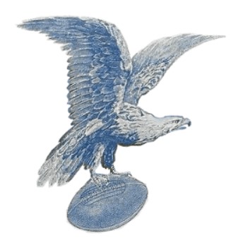
The original version of the Philadelphia Eagles logo was launched in 1933. The designer opted for a traditional approach and incorporated a lot of details into it. You can see the eagle holding a football in the design.
It looks realistic despite the choice of color. No doubt, the image of a bird flying with its wings spread looks elegant and powerful. The blue color also goes well with the logo design.
The Introduction of Green in the Eagles Logo 1936 – 1941
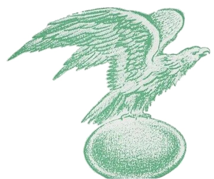
The fans saw a drastic change in the old Eagles logo between 1936 and 1941, when the franchise changed the color from blue to green. Moreover, the eagle’s contours were also redrawn.
If you look at the logo, you will see the bird is flying upright. Did you notice how the bird’s wings and neck are stretched as well? This variety featured the enlarged and rounded ball in comparison to the old Philadelphia Eagles logo.
The First Eagles Logo Change and the Arrival of The Aggressive Old Eagles logo 1942 – 1947
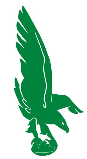
The logo went through a modification phase once again in 1942. This version was modernized with refined contours. The color was kept solid green with a few white details.
You can also see the bold eagle silhouette holding the ball, looking down while its wings were kept spread up to each side.
The Addition of White to Contrast the Green in the Eagles Logo 1948 – 1968
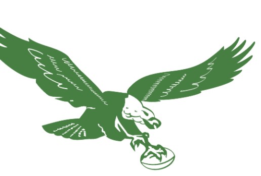
In 1948, the Eagles logo was redesigned and received more details and white accents. The football was kept white. Moreover, the bird’s contours looked more realistic in this emblem compared to other sports logos.
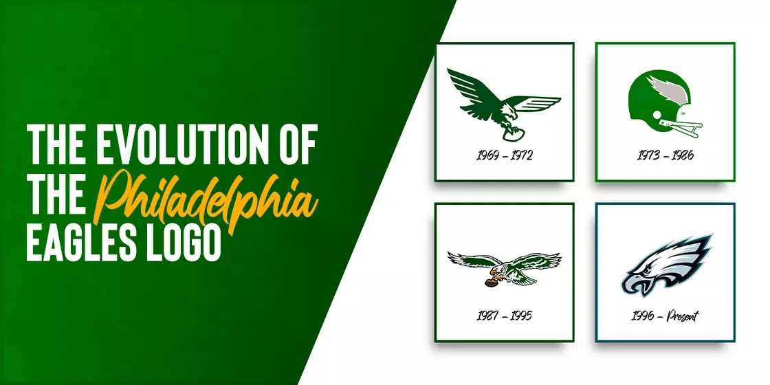
Simplification of the Eagles Symbol 1969 – 1972
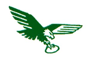
Most of the focus was kept on the contours when the franchise decided on an Eagles logo redesign in 1969. Despite the similar color combinations, the image started to look different from other versions of the Eagles logo.
Adopting a Helmet as the Eagles New Logo 1973 – 1986
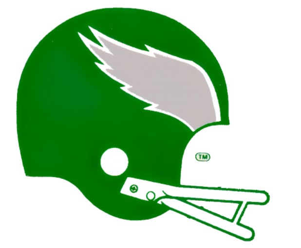
The Eagles symbol launched in 1973 was nothing like the franchise’s previous NFL logos. In fact, the old Eagles logo was redesigned from scratch.
The Philadelphia Eagles franchise opted for an image of a bold and green helmet. The details include a delicate gray wing on the side, which was outlined in white.
Return of the Eagles Symbol in the Next Philadelphia Eagles Logo 1987 – 1995
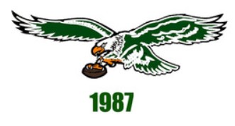
In the Eagles logo redesign of 1987, orange and brown colors were used for the bird and football beak. Apart from the new addition to the color palette, the Philly Eagles logo’s direction was also changed and kept to the left side.
The New Eagles Logo with the Eagles Hidden E 1996 – Present
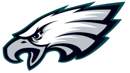
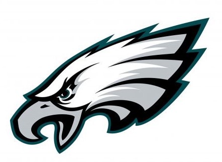
The old Philadelphia Eagles logo received a new style and color palette in 1996, converting it into the Eagles new logo that we are all familiar with today. The franchise still uses the newly introduced sleek and modern design, just like the Chicago Bears logo.
The new design of the Eagles logo features the eagle’s head facing the left side. The gradient white and gray, thick double outline in black and blue colors complete the bird’s head. The sharp and bold lines also make the bird look determined. Moreover, its design started the infamous debate of “Does the Eagles logo have an E in it”, a tinfoil hat theory that while highly plausible, hasn’t been confirmed by the franchise.
Elements of the Philadelphia Eagles Logo – Finding the Hidden Eagles Logo E
When we talk about visual art like logos and other branding designs, the elements of the logo help determine the success of the design. When we look at the logo for the Eagles, we see that over the years, the elements portrayed in the design change with the evolving design aesthetics.
Let’s take a look some of the essential elements of the Eagles logo.
Philadelphia Eagles Logo Font
The Philadelphia Eagles font styles incorporate a unique design with sharp ends in the letter “E” and “S,” which resemble the eagle’s claws. All letters in the typeface are kept uppercase. Recently, the company decided to update its wordmark for a more modern look. However, this new design faced a lot of backlash from the fans, with the people not liking the style of the new logo fonts.
Philadelphia Eagles Logo Colors
The Philadelphia Eagles color schemes include silver, white, green (Kelley green previously and a darker midnight green shade now) for several decades. Using elements of color theory, they have also used black as part of their color scheme, as a complementary color as well as a way to make the other shades pop. And in recent years, there has been talk about bringing the team’s primary shade of green, that is the Kelley Green, back into rotation with the other colors of their palette.
History of the Philadelphia Eagles and the Eagles Journey towards Becoming an NFL Icon
Now that we have seen how the Philadelphia Eagles logo design has evolved through the decades, let’s dive in and take a look at the history of the franchise and the team as well. With nearly a century of gameplay under its belt, the Philadelphia Eagles have seen championship success only four times, despite making the playoffs a number of times.
Let’s find out if its just bad luck or something more that has kept the franchise from becoming one of the most successful in the League.
Wray & Bell Buy a Bankrupt Franchise and Turn it Into the Philly Eagles (1931 – 1932)
With the Frankford Yellow Jackets declaring bankruptcy midway through the 1931 NFL season, the League decided to award the franchise to partners Wray and Bell. Looking to rebrand the team and move them to Philadelphia, the duo took inspiration from the symbol for FDR’s NRA, and named their team the Eagles.
However, despite their takeover, it wasn’t until the 1933 season that the franchise was able to field a team for the NFL. That is because it took the NFL nearly a year to find buyers for the bankrupt team, and it took the duo nearly the same amount of time to get up to speed and develop a team.
The Philadelphia Play Their First Season in the NFL (1933 – 1948)
In 1933, the Philadelphia Eagles, the now-defunct Cincinnati Reds, and Pittsburgh Steelers joined the NFL as new expansion teams. This meant that in the eyes of the league, the Eagles were not related to the Yellow Jackets in any manner, and were in fact a separate, new team.
With Wray as the team’s coach, the first few years of the team were not very successful. After the financial losses incurred in the first few years, the team was put up for auction in 1936. With Bart Bell being the only bidder, he was awarded the franchise. However, a salary dispute with Wray meant that he was let go, and Bell took charge as the new owner-coach for the Eagles.
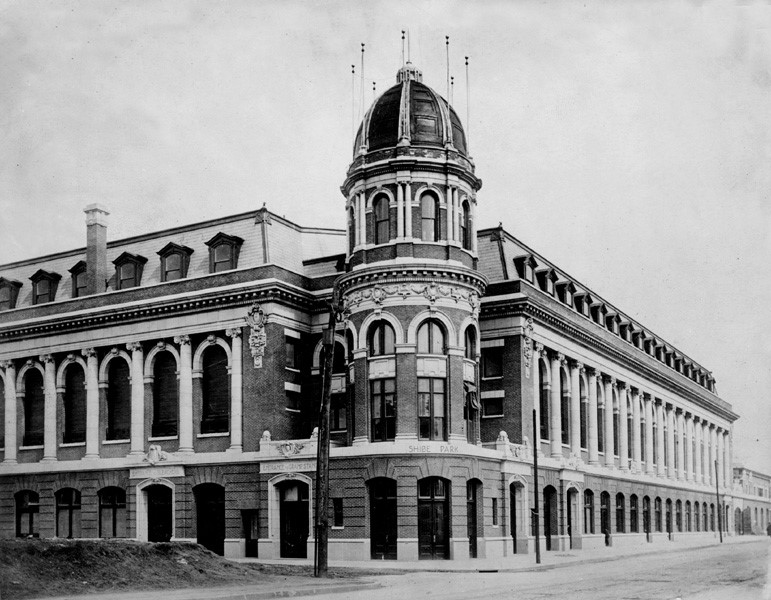
In 1940, the Eagles moved to Shibe Park as their home stadium after Alexis Thompson took over the Eagles in exchange for giving Bell and Art Rooney control of his Pittsburgh Steelers. Hiring “Greasy” Neal as the team’s head coach, the team continued its string of mediocre play until the 1943.
With the US heavily involved in World War 2, there was a severe manpower shortage for all major sports, including MLB, NHL, and the NFL. Therefore, in order to field a team to play the 1943 season, Eagles and the Steelers, both Pennsylvanian teams, decided to merge squads. This new team was called the “Steagles” by fans, and it was the first time that the team had a remotely positive score, with the season yielding a 5-4-1 record.
However, it was post WW2 that the team managed a winning season, with the 1945-46 seasons seeing the Eagles come in second. And it was 1947 that the team reached the championship game for the first time, losing a valiant fight to the Chicago Cardinals with 28-21 loss. Determined, the team made it to the championship final again the next year, beating the Cardinals 7-0 to win their first NFL championship.
The Happy Hundred (1949 – 1963)
Just after the team won their first championship, the franchise was sold to a syndicate of hundred investors for $3000 apiece, with noted Philadelphia businessperson James P. Clark at the helm. However, there was another big investor among the hundred, Leonard Tose, who would be involved with the team a lot more closely a few years down the road.
The syndicate, known as the “Happy Hundred” retained Greasy Neal as coach, which saw the team reach the NFL championship final once again in 1949, and win it, as back-to-back champions.
The Decline of the Two-Time NFL Championship Team Under Wolman (1964 – 1968)
With Greasy Neal retiring in 1950, the team lost much of the magic that had made them great for the better part of the previous decade. And although much of the championship winning team managed to retain their performance, along with the talented newcomers, the team lacked that winning spirit.
It wasn’t until 1958, a year after the team moved to Penn’s Franklin Field, that the franchise took steps to improve its form. Hiring Buck Shaw as head coach, and a talented Rams quarterback at the helm of the team, the team started regaining their championship-winning form. And it was just two years later that the Philadelphia Eagles won their third NFL Championship in 1960, handing Vince Lombardi his first and only championship game loss as the Packers coach.
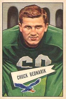
And that was one of the greatest NFL championships in the history of the team. With it being the year before star quarterback Van Brocklin, legendary tackler Bednarik, and Coach Shaw were to retire, all eyes were on the team to see what they would accomplish. It is said that this team had more determination than talent at that time. And that was the season where Bednarik executed “The Hit”, one of the hardest tackles in NFL history.
The next few years were bad, both for the team and the franchise as a whole. In 1964, the franchise was sold to Jerry Wolman, a Washington-based millionaire who outbid local investors to pay $5.5 million for the Eagles. However, he 60s were a terrible time for the team, with 1966 being the only season that the team managed a decent score.
Leonard Tose and the Era of Moving Forward (1969 – 1984)
With the team in crisis, Wolman sold the team to Leonard Tose, one of the original investors among the “Happy Hundred”, for an unprecedented record sum of $16 million. Changing the old guard at the top of the team, by replacing the coach and the general manager, Tose tried to steer the team back towards a winning streak.
However, despite adding new talent into the defensive side under GM Jim Murray’s guidance, as well as a revitalized offensive side, the team was barely a shadow of its former glory midway through the 70s. And it wasn’t until 1977 that the team started to see a glimmer of hope for a winning season.
1978 saw the Eagles making their way into the playoffs, and it was in 1980 that the team dominated the season. However, due to some major upsets for the Super Bowl XV, the team lost to the underdogs Oakland Raiders, despite a stronger team.
While the 1981 season showed great promise, the three years after that saw the team failing to make the playoffs. And with the team as well as its owner mired in problems, it was time for a change.
Norman Braman and the Stagnation of the Philadelphia Eagles (1985 – 1993)
In 1985, Tose sold the team to Norman Braman, in order to pay off his gambling debts. With Coach Buddy Ryan of Chicago Bears fame at the helm, the team was revitalized and became known for their toughness, both physical and mental.
However, despite visible improvements, the team failed to regain its championship winning form. With the team being widely considered one of the most talented squads in the NFL, the championship drought was frustrating for the fans and the Eagles alike. And despite playoff appearances in that time, Buddy Ryan was fired as the coach in 1991.
With new coach Rich Kotite leading the team, the Eagles tried to change their luck. However, a string of bad luck saw the team fail to make the playoffs, prompting the people to demand that something drastic needed to be done.
Jeffrey Lurie and the New Dawn for the Philadelphia Eagles (1994 – Present)
Based on the team’s performance, Braman decided that he needed to sell the franchise. And it was in 1994 that Norman Braman sold the franchise to Jeff Lurie for a sum of $185 million, who owns the team today.
Under his leadership, the franchise has grown and become more valuable, with Forbes valuing the team at $3.4 billion as of 2021. It is under his ownership that the team won their first Super Bowl, winning the championship in 2018, with backup QB Nick Foles leading the charge against Tom Brady’s Patriots. The championship decider was a game that broke many records, including the most combined yardage gained in a match.
What is the New Eagles logo Used Now, And Why Did the Eagles Change Their Logo?

The current logo design is a combination of a cartoon eagle featuring realistic strokes. It looks inspirational and rousing, just like the modern LA Rams logo. Over the years, the team has used many different Eagles logo design ideas incorporated within its design. However, the style of logo used today is designed for better visibility, as well as a League-wise focus on an animated logo design.
The eagle also symbolizes the spirit and ingenuity of the football team. The overall design of the logo is appealing with colors and logo symbols that match the team’s tenacity and rich history. The color palette is high contrast and easy on the eyes, with the white and blue of the design representing the team’s confidence and integrity.
Interesting Facts about Philadelphia Eagles
The Philadelphia Eagles has a rich history in the NFL, with nearly nine decades as a part of the League. In that time, there are a number of firsts that are attributed to the team and the people associated with it. Let’s take a look at some interesting Philadelphia Eagles factoids.
Defeated Vince Lombardi at a Championship Game
One of the biggest things that the Eagles are known for is defeating Vince Lombardi’s Green Bay Packers at the 1960 Championship game. That was truly remarkable, seeing as that was Lombardi’s one and only championship game loss in his entire NFL career.
Introduction of the NFL Draft
Organizing and conducting an annual NFL draft was Eagle owner Bell’s idea to ingrain a level of fairness in the NFL’s talent recruitment system. The team with the lowest score the previous year got first pick for the draft for the next season.
Eagles Played in the First-Ever Televised NFL Game
The was also one of the first teams to play an NFL game that was televised. In 1939, the Eagles lost to the Brooklyn Football Dodgers. NBC’s eight-men crew filmed the match. The game was telecasted on New York City’s affiliated networks. Around 500 New Yorkers watched the game aired for two hours and 33 minutes without any commercial interruptions.
Van Buren’s Multiple Thousand-yard Seasons
Philly icon Steve Van Buren ran for 1008 and 1146 yards in 1947 and 1949, respectively. He was the only Football Hall of Famer who belonged to Honduras. And along with Bednarik, was one of the key players in winning the 1948 and 1949 NFL championships.
President John F. Kennedy and His Brothers Once Wanted to Buy the Franchise
Did you know President John F. Kennedy and his brothers thought about purchasing the franchise?
As former senator Ted Kennedy said, “My brother Jack called me and said, ‘Are you in for a third if we can get [the Eagles] for $6 million? I’ve talked to Bobby, and he says he’ll go for it.’ I said, ‘Okay, I’ll go for a third.’”
The deal was not materialized as they ultimately came to conclusion that owning the franchise may not go well with JFK’s responsibilities as the US president.
Fifty Four Thousand Fans Watched the Game Despite a Blizzard
In 1968, 54,535 fans reached Philly’s Franklin Field despite the blizzard to watch the game. To boost the hype, the owners booked a Santa Claus impersonator to entertain the audience at halftime.
However, the hired impersonator never arrived. One of the attendees, Frank Olivo, wore a homemade Santa suit and performed in their stead. The angered fans hurled snowballs at him, which Olivo reportedly enjoyed.
When Fans Were Denied Celebrating Philly’s Win How They Wanted
Philadelphia city workers greased streetlight poles in 2017 after the team defeated Atlanta in the divisional round. The reason for greasing the streetlight poles was to prevent over-excited fans from celebrating on them.
Original Eagles Anthem Lyrics
You might recite the current Eagles anthem, “Fly, Eagles Fly.” But you might not know that the lyrics of the anthem have been changed over the years. The original anthem was “Fight, Eagles Fight,” written by Charles Borreli and Roger Courland in the 1950s.
People Also Ask (FAQs)
| What is the history of the Philadelphia Eagles logo? The logo was inspired by the NRA’s blue eagle seal, which incidentally also inspired the name of the new franchise when Wray and Bell bought it in 1933. |
| Who designed the Philadelphia Eagles logo? Co-founder of the franchise, Bert Bell, designed the original logo for the Philadelphia Eagles. |
| What are the colors of the Philadelphia Eagles logo? The colors used by the Philadelphia logo are midnight green (hex #004C54), silver (hex #A5ACAF), black (hex #000000), silver-white (hex #ACC0C6). |
| What are some alternative versions of the Philadelphia Eagles logo? Some of the alternative versions of the Philadelphia Eagles logo include the stylized wordmark, the combination mark which includes the wordmark and the symbol, and finally the spread eagle wings that the team uses on their helmets. |
| How can I find the official Philadelphia Eagles logo? The official logo for the team can be found on their website, which offers downloadable content based on the copyright and trademark law. However, you cannot use their logo for commercial purposes without the express documented permission of the franchise itself. |
| What is the significance of the Philadelphia Eagles logo? The Eagles logo has a symbolic attachment with the American sentiments. For one, there is the adoption of the bald eagle as the company’s mascot, featuring in their logo as well. Moreover, the design denotes strength, cunning, and the ability to be patient and calm in order to succeed. |
| How can I get the Philadelphia Eagles logo on merchandise? You can easily find items like Eagles logo wallpaper for desktop or walls, or Philadelphia Eagles logo vector artwork if you want to incorporate a modified version of the design into your own art. Merchandise like t-shirts, jerseys, and more can be found online as well as many sports-themed gift shops and sporting goods stores. |
| Why is the eagle in the logo facing the left side? Some people believe that the eagle’s head was kept to the left side on purpose to highlight the hidden letter “E.” |
| Where can we find the E in Eagles logo? Some people believe that in the new Eagles logo, the eagle’s head was designed to face the left on purpose, unlike other NFL team logos, in order for the eagle head’s profile to form an “E” at the neck. If you look at it carefully, you will see that the position of the white feathers on the eagle’s neck form the shape of an abstract, uppercase letter “E”. While not officially confirmed by the team, this is what you will discover when you search where is the E in the Eagles logo. |
| When did the Eagles change their logo last? The last time the Eagles logo was changed was in 1996, when the now iconic eagle’s head was released that started the hidden “E” in the Eagles logo debate. |
Summing it Up!
When it comes to taking inspiration to develop a unique yet compelling logo, you can observe the Philadelphia Eagles logo. The designers have done great work in designing the logo representing the determination and dedication of a football team.
Choosing the eagle is also the best idea to demonstrate the strength of the team. Moreover, the color palette goes well with the overall design of the logo. Observing these factors can allow you to incorporate elements in your logo that help showcase your brand message.
Developing a logo can be a challenging task. It needs brainstorming, research, and lots of creativity to design the innovative logo. At Logo Poppin, we are ready to take you onboard, discuss and develop the various types of logos you have been looking for.

Logopoppin
Logopoppin is a graphic design agency that specializes in logo designing, web development, video production and advanced branding services. We love to innovate businesses with new age technologies, allowing them to improve their visual reputation.


