Table of Content
Discover How the Following Photography Logos Represent Their Brand Perfectly
A well-designed logo is a great visual identifier for any company or brand. By that logic, individuals in business also require an identifier or symbol to help them stand out in a highly competitive market. Coming up with good photography logo ideas can help them build a brand that will set their photography business apart from the competition.
Many independent professionals, like photographers, tend to ignore the value a personalized logo offers. These professionals use their portraits as their brand’s identifier. They believe that the quality of their work will be memorable enough for people to associate it with their name.
But a personal portrait is not an ideal or versatile choice when it comes to a logo. Before you hire logo design services to create your brand logo, you need to know what makes your competition successful. The list of symbols we have compiled below will help you get inspired by several different logos used by photographers worldwide.
What Is A Photography Logo?
A photography logo is essentially a logo that represents a freelance professional photographer or a photography studio. Most photographers create a logo to mark the photos they take, used as watermarks as kind of an insurance against unauthorized usage of their intellectual property.
Moreover, it also allows them to associate an easier to remember design with their brand, which makes for a more memorable business. Professionals who cover events, like wedding photographers’ etcetera, find that a business card with their logo and contact information is a great way to network at these events, especially as they are the perfect places to display their talent to prospective customers.
Why Does Your Photography Studio Need A Logo?
Now, a photography business is just like any other business, meaning that they need a name and a brand symbol if they want to market or promote their brand. A brand symbol, or a logo, goes a long way towards making it simpler for people to remember a brand, as it allows them to associate an image with your entire brand.
Moreover, as visual creatures, humans find it easier to remember and recall images compared to any other medium.
Additionally, a logo also helps convey the tone and the brand message to prospective customers, and by tweaking the design accordingly, you can change the way your message is received and perceived. Some popular ways you can tweak the way your logo portrays your brand message, is by changing or modifying elements like:
- The logo fonts
- Your choice of imagery
- The color palette
Styles of Photography Logo Ideas and Brands Who Successfully Implemented Them
With many different design elements to choose from, you can choose from various types of logos to create your own photography logo. Many of the more famous photographers opt to use logos based on their names. While others, like wildlife or baby photographers, tend to go for a logomark or a combination logo.
Therefore, we can say that your photography niche does play a part in the style of logo you create for your photo studio. Some of the most popular of these styles include:
- Vintage style logos
- Minimalist photography logos
- Wordmark logos
- Modern photo studio logos
These and many other styles can be used as a base of inspiration for your own brand logo.
Vintage Photography Logo Ideas
Baku Photography
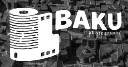
This logo for the Baku Photography company is quite simple yet very effective in portraying who it represents. The retro imagery in the logo is done quite efficiently, with the fonts used complementing the design quite well.
Designed by Mehman Mmammedov, a designer based in Baku in Azerbaijan, the logo is quite minimalist. The image shows a roll of an analog photo film, with the company’s name beside it in two different fonts. The fonts and the image go well together, elevating the logo’s impact.
Fidelity Vintage Photography
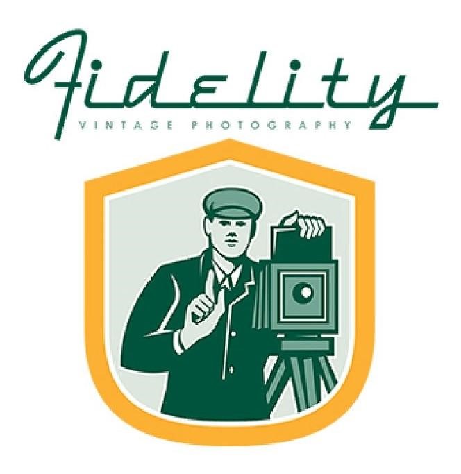
This logo for Fidelity Vintage Photography is an excellent example of a vintage-style logo. The company specializes in retro-style film photography, and the company logo portrays that quite efficiently.
Created by Patrimonio, a freelance vintage designer based in Auckland, New Zealand, this logo immediately portrays its purpose and aesthetic. The image shows an illustration of a photographer using an old bellows-style camera facing us. The entire image is bound within a shield crest on a plain white background.
Unique Conceptual Photography Logo Ideas
Some logos are created by using an abstract concept related to the logo’s theme. These designs use symbolism to create an air of mystery and create designs that connect seemingly unrelated imagery to the logo’s theme.
Abstract logos are almost always unique because the idea behind each design would always be different depending on who comes up with the concept. Having such a distinct symbol with a unique photography slogans would go a great way towards making your brand memorable and easily recognizable.
Listed below are two popular abstract photography logo ideas.
Juan Gestal Wedding Photography

Juan Gestal’s wedding photography logo is an excellent example of a unique conceptual logo. At first glance, people might be confused about the presence of a hot air balloon in a logo for a wedding photographer.
However, the decorations on the balloon look like it has been prepared for an event. Many high-end photographers use such props to give their images a unique edge.
Overall, while an unorthodox design, the logo stands out and makes the brand more memorable.
Haute Dog Fine Art Pet Photography
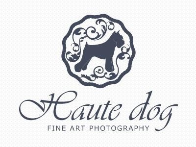
The logo for this photography studio is unique. The brand’s name is a play on words regarding its specific photographic needs, bringing a playful twist to its image.
The origins of the name are pretty interesting. As a couture pet photography agency, the name plays on the famous exclamatory phrase “Hot Dog!”. The word “Hot” was replaced with the similar-sounding French word “Haute”, which means high and is usually associated with fashion and art.
This clever wordplay shows the type of photography the company does very well. The resultant fashion photography logo featured the profile of a Schnauzer surrounded by decorative vines and enclosed in a wavy circle, with the name of the company in the flowing script below the image.
Photography Logo Ideas with Minimalist Design
Minimalism in logo design has become increasingly common nowadays. Many brands are opting for clean and straightforward logos over heavily stylized designs. Very much a modern design trend, this technique can be used to create exciting and highly recognizable designs.
The concept of minimalist logo has been proven to impact viewers significantly. That is because fewer details make it easy for viewers to remember all elements in a single glance. In comparison, traditional designs are much more detailed, making it harder to remember it all in one view.
Peter Ivancak Photography
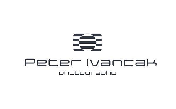
This logo for a photography agency is an excellent example of a minimalist design. Using just two geometric shapes throughout the plans, the designer created a logo that efficiently conveys its message through a unique concept.
The logo consists of a rectangle out of alternating gray and white bars. A big circle is superimposed in the middle of the shape, with the colors of the bars mirrored inside. This simple design forms a simple monochrome camera, a minimalist yet effective logo for the photography agency.
Carrie Chase Photography

The logo design for Carrie Chase Photography is simple, minimalist, and uniquely creative. Using the initials of the photographer’s name, the letters were combined to form the body and a professional camera lens.
Designed by a freelance logo creator, Pujiarts, the logo features the initials “CC” written in a way as to modify the entire shape into a camera profile.
The letters are written in a rectangular shape with rounded edges. The stroke of the first letter continues to create the top half of the next character. The second character has a small circle in the middle, depicting a camera lens. At the same time, a rounded line finishes the second letter’s shape.
Creative Illustrated Photography Logo Ideas
Not everyone prefers a simple wordmark or minimalist logo for their business. Similarly, for some photography businesses, a fun and creative logo illustration is what they desire. Some photography agencies might even need one to portray their specific niche or aesthetic.
Photography is a primarily visual medium. A photographer needs impactful photography logo ideas that speak for their brand to attract a consumer’s attention. A well-designed illustrated logo is of great need for businesses looking to stand out for their fun and light-hearted identity.
When creating an illustration for a logo, we need to be careful about the geometric shapes we use. According to a report by INSEAD researchers, the form of a logo can affect how a consumer perceives your brand.
Photo Laboratory
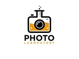
Photo Laboratory has a unique name for a photography studio. For the company, a well-designed logo complimenting such a name is crucial. The symbol for the agency is a creative design meant to portray the aesthetic of the agency’s name in a fun way.
The logo consists of a camera shape designed to look like a glass measuring cylinder from a lab. The tube is filled with a bubbly orange liquid, and the whole image is a play on the agency’s name.
Snapicus
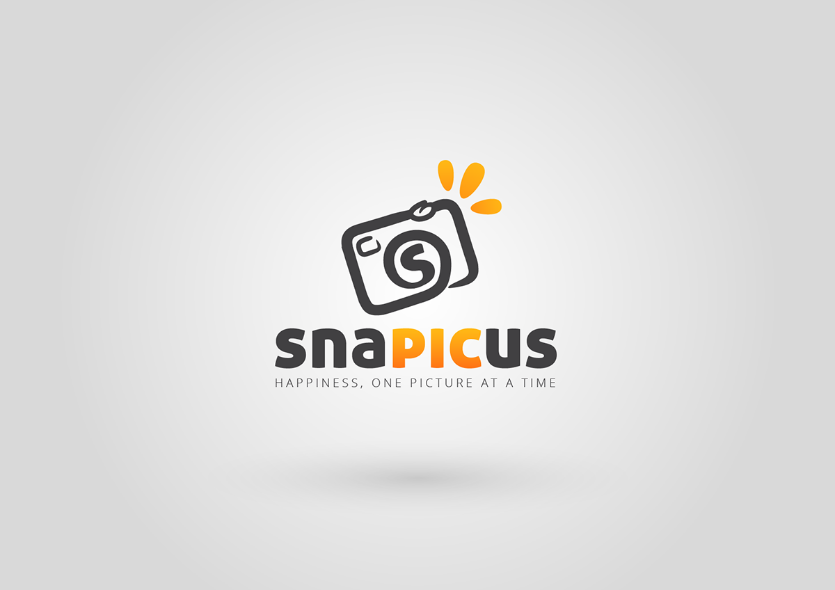
Another excellent example of a creative illustrated design, the Snapicus photography agency logo, is a fun identifier for the company. The studio believes that as photography is fun, then its identifier should be entertaining too.
The concept for the logo is based on the idea of the studio’s photographers “snapping a pic”. The design itself consists of a basic illustration of a camera drawn using a single stroke. The lens has the letter “S” written inside, illustrated from the same stroke as the rest of the camera body.
The entire image is designed in a dark gray color, accented by a bright orange coloring the character “PIC” in the name. All in all, it is a well-designed illustrated logo.
Wordmark Photography Logo Ideas
Wordmark logos are classic and are an excellent choice for any business. Some brands want to associate their brand image with their names rather than with an image. For companies like that, a well-designed wordmark logo is an answer.
In any art-related business, the artist’s name is the focus of the logo. For many, it is a personal brand that they are developing. For them, a stylized wordmark is a perfect choice to build a brand identity. Let’s look at a few stylized wordmark photography logo ideas.
Eliza Jane Photography
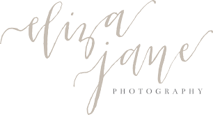
Wordmark logos do not always need to use a print-style font. Some wordmarks work great with script-style or handwritten fonts. Eliza Jane Photography studio uses the latter kind for her logo, representing a highly creative photography studio.
The design of the logo is based on the name of the studio’s owner, Eliza Jane. The name is written in a flowing cursive that exudes elegance and maturity. The design of the characters is somewhat asymmetric, making them look just slightly less perfect than a printed font.
For all intents and purposes, the logo is designed well enough to pass for her signature, rather than just a logo.
Christopher Allen Weddings

When it comes to wedding photography, people tend to think about cursive fonts combined with flowers. Christopher Allen breaks these stereotypes quite well. With a no-frills logo spearheading his company’s branding, he has achieved a lot of success.
The logo itself is a simple amalgamation of the photographer’s initials, signifying the name in a clean and crisp design. The font for the logo is a modern san-serif font, with clean lines and an assertive presence.
Although the logo for the designer is quite simple, the photographer has covered many high-profile weddings quite successfully, proving time and again that simplicity shows class.
Modern Photography Logo Ideas
The modern world of today brings with it some new design and creative trends. Trends like minimalism and monochromatic color combinations are a few changes that have made their impact in the logo industry.
For brands looking to stand out while keeping a modern aesthetic, incorporating unique design concepts is the way to go. That will show your clients that you are a modern creative brand.
The two symbols listed below are prime examples of modern photography logo ideas.
Priscila De Campos Fotografia
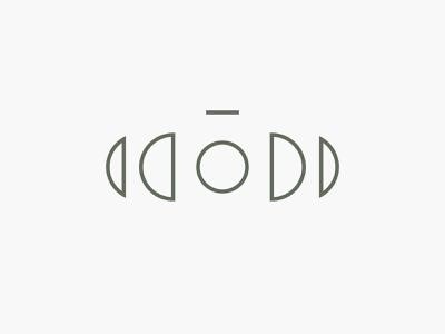
The logo for this transcendent photographer is based upon the phases of the moon. According to the photographer herself, the continuous lunar cycle inspires her about the concept of rebirth.
The logo features a camera lens in the middle of the image, which also stands for a full moon. The half domes on the left and right depict the moon’s various phases from crescent to full moon and back.
Interestingly, looking at the design indirectly shows the camera’s profile hidden creatively in this negative space logo.
Jakubeye Photography
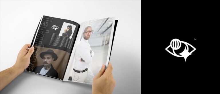
The term “artist’s eye” is a common phrase in the world of fine art. A similar phrase, called the “photographer’s eye”, is known in the design world.
Incorporating the imagery of this phrase into the design of a logo can be a creative and unique way to stand out. Jakubeye Photography has done just that. Combining the design of an eye with the lens of a camera as the pupil, the artist conveys that he is someone with an eye for great art.
The bottom of the lens is superimposed by a spark of light, depicting the camera flash’s lens flare and the spark of creativity, which is the hallmark of the agency.
What Makes a Photography Logo Great?
Art has always been known to be highly subjective. Photography, a kind of art, is highly personal too. The concept of an excellent logo for a brand can be different based on the one designing the logo. Therefore, a great logo speaks for you and your brand with confidence and surety, while still looking good on your photography websites and social media handles.
Knowing that your logo represents you well helps you become more confident and helps your brand succeed. Hiring a graphic designer who understands your business’s mood and aesthetic is very important to develop such effective photography logo ideas.
How to Elevate My Logo’s Impact?
Using the correct visual elements can help your logo elevate above its competition with ease. Using the right fonts in your logo will portray your brand’s values. Similarly, the right color palette will increase the logo’s impact by appealing to the consumer’s emotions.
Even the shapes we use can affect how great a logo looks. According to Professor Sunday Moulton, Ph.D., the asymmetry in the natural and organic shapes around us makes them attractive and unique. That inconsistency of angles and lines keeps our eyes on them, unlike symmetric geometric shapes.
An easy-to-remember and recall logo is one of the hallmarks of a great logo design. If your consumers can spot and identify your logo at a glance and understand its message, you can say that your brand has a great logo.
The Do’s and Don’ts of a Good Photography Logo
Before you start designing a logo for your photography business, you need to know what makes a great photography logo and what breaks it.
Hallmarks of Great Photography Logos
- Simplicity
If you look at some of the well-known brand logos, you will see that they all have something in common – a simple design. That is because simplicity has proven to be the best way to help people remember your brand and recognize it instantly.
- Versatility
A good photography logo should look good on a variety of canvas sizes without losing its quality. In the case of a colored logo, it should also look good in a monochromatic color scheme or a reverse color scheme. Something that might come in handy in applications like photography business cards.
- Highly Memorable
The design of the logo should be clean and distinct. That will help your logo become memorable and easier to recall.
- Timelessness
A well-designed professional photography logo should be able to represent your brand for a long time to come without needing a drastic upgrade. The trick is to go for the design practices and trends that will last rather than seasonal trends for your logo design.
What To Avoid For an Impactful Photography Brand Logo
- Complicated Design
A complicated design will make your logo look cluttered and unattractive. It will also make it hard to remember and recognize the logo by your consumers. A logo that is not easy to remember will hurt your brand identity.
- Unrelated Imagery
A logo is your brand’s visual identifier. As such, it needs to have imagery that is associated with your brand identity. Using imagery and artistic flairs that are not related to your brand will dilute the impact of your logo and hurt your brand identity.
- Use the Camera Extensively
Many photography logos use the camera as the focal image of their designs. As such, the imagery is so overused that it runs the risk of confusing your consumers about the brand’s actual identity. If you use a camera image in your logo, make sure that it enhances the effect of the logo, not dilutes it.
People Also Ask (FAQs)
| 1. How can I design a photography logo? To create a good logo for your photography business, you need to hire a logo designer. The designer will understand your business aesthetics, as well as what you expect from your logo. Next, he will create a few mockups for you to choose from, and finally, the designer will deliver the new logo for your brand. |
| 2. What makes a photography logo great? A great photography logo successfully conveys your photography studio’s message and aesthetics to the consumers. For that, the design needs to be clean and minimalist, and the fonts and colors used should be appealing and value-enhancing. |
| 3. How can I turn my photography logo into a watermark? To turn your logo into a watermark, the first step is to open your logo file and add a transparent layer. Once it’s done, you can change the transparency of the new version to create a watermark, which, when saved as a PNG file, can be used to watermark any image. |
| 4. How can I make my photography logo catchy? To make a catchy photography logo, the design needs to be clean. Each element needs to be distinct. The right color combination needs to be used, and all the parts need to complement and enhance each other. |
| 5. What color is best for a photography logo? Depending on your niche, your ideal color palette for a photography logo may change. However, the way you use your chosen color palette is more important for your logo’s success. |
| 6. Where should I put my photography logo? You can use it as a watermark on your online portfolio, or you can use it to mark your samples that you send to the client. Moreover, you can use it on customized photography gear, as well as on your business cards, stationary, and website. |
| 7. How can I make a photography logo? You can make your photography logos using a couple of methods:
|
Further Reading:
In The End
Your photography business’s logo is just one part of your brand. Nonetheless, a great logo can be a great foundation to build a solid brand identity and presence. More importantly, your perfect photography logo ideas should be memorable, easily identifiable, and they should portray your brand message successfully.
A logo like this will represent your brand for a long time and give you the confidence to help your brand succeed. If you want to know how to design a logo that is a creative and artistic representation of your photography business, Logo Poppin’s expert logo designers will create a logo that will embody your brand’s aesthetic and message.
Latest news you want to know!
Subscribe for cutting-edge design inspiration at Logo Poppin! Elevate your brand with updates on logos, branding, web design, and video animation.
Note that by clicking “subscribe,” users may agree to our privacy policy and consent to Logo Poppin to use your contact data for newsletter purposes.
Logopoppin
Logopoppin is a graphic design agency that specializes in logo designing, web development, video production and advanced branding services. We love to innovate businesses with new age technologies, allowing them to improve their visual reputation.