Table of Content
Discover What It Takes to Design a Podcast Logo That Attracts an Audience
More and more people are listening to podcast every day. Today, there are podcast that cater to nearly topic or activity, from science and technology podcasts, to shows that cater to conspiracy theories of every variety. And one of most popular defining characteristic of every show with a strong following, is a great podcast logo representing it.
According to Statista, podcast listeners will be in excess of a 160 million by 2023. And that figure could be even larger than expected, considering that there are many untapped markets and interests out there waiting for their own podcast. Just imagine! There is a podcast starring Brian Thompson, a comedian who plays the role of an investigative journalist convinced that McDonald’s used to serve pizza, and is determined to find out why they stopped doing it.
So, it’s fair to say that there is, or can be a podcast for anything on the face of this Earth. And if you too want to start a podcast on a topic that interests you, and need to come up with some amazing podcast logo ideas for your show, then read on.
What is a Podcast?

Before we get on with creating a logo for your podcast, we first need to understand what a podcast actually is. That will help us design a logo that fits your show better.
To put it simply, a podcast is a show published online, that consists of a spoken word, all-audio episodes focused on a specific topic. For example, the podcast mentioned earlier, called Whatever happened to pizza at McDonald’s? deals with the antics of an investigative journalists on a quest to unearth this conspiracy.
Similarly, the topic of your podcast could even be a personality. The Joe Rogan Experience is all about freedom of speech, and shows Joe Rogan interviewing a variety of guests ranging from business tycoons like Elon Musk, to politicians like Bernie Sanders. Unlike the podcast above, this one caters to an ideology rather than a specific topic. Therefore, when we talk about this kind of abstract podcast, it always better to hire professional logo design services who are more experienced in bringing the essence of your show into a small visual design.
To sum it up, a podcast can be about anything and everything.
Why Does a Podcast Need a Logo?
For starters, the reason you need a podcast logo for your show, is because that’s what podcast directories require in order to publish it. But in actuality, you need it for the same reason a business needs it – to build a brand. Podcasts, like TV shows and blog sites, are a medium of content. And as a content producer, you need to build it into a brand if you want your content to reach a large portion of your target audience.
But if your podcast doesn’t have a logo, how will your audience recognize it featured around them? Take for example, a popular TV show symbol like the Game of Thrones logo. Due to the massive success of the show, there is a huge fan following behind that logo. That design allowed people to center themselves and rally behind something they liked, by giving them something that represented the essence of the entire show.
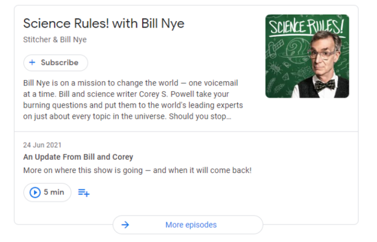
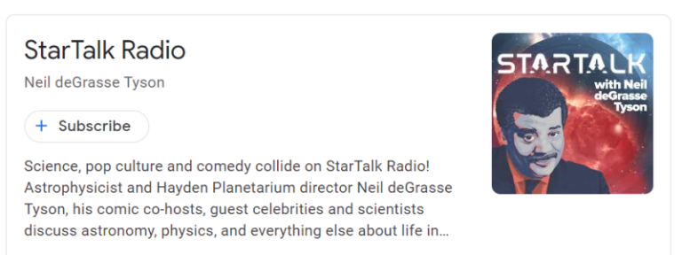
In some cases, it also allows you to separate the podcast from the presenter’s brand, and into a distinct brand of its own. That is an issue when the presenter themselves is someone famous, such as in the case of Bill Nye’s Science Rules! Or Neil deGrasse Tyson’s StarTalk. In both these cases, the presenters have established brands both as an individual, as well as with other forms of media. So a logo that represents their new podcasts as something both related yet distinct form their established brand, is a necessity.
Five Characteristics of a Great Podcast Logo
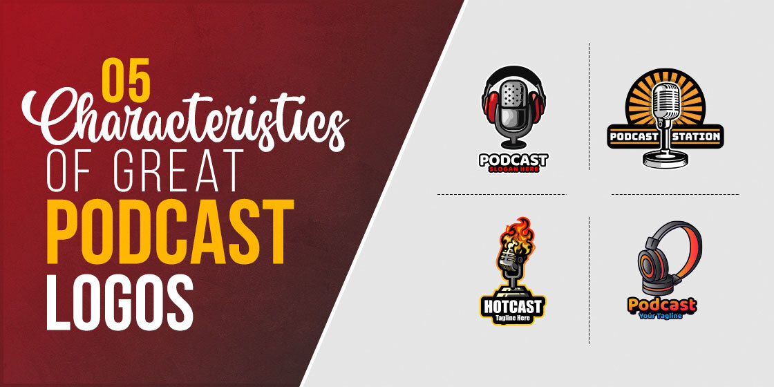
Now that you know why a podcast needs a logo, let’s take a look at the five most important characteristics that you need to know when searching for how to design a logo for your podcast. That is because creating “a logo” for your brand isn’t difficult. But creating “the logo”, one that represents the true aesthetic of your brand takes effort and a knowledge of the elements required to make the perfect brand icon.
There are five factors which ensure that your logo is going to be the perfect representation for your podcast. They are:
- The topic of your podcast
- The podcast’s brand identity
- The uniqueness of the logo
- The complexity of design
- The clarity of the design elements in your logo
Let’s take a look at how you can leverage each of these factors for an impactful podcast logo.
Showcases The Topic of Your Podcast
While it’s true that your content is what keeps the audience in its seats, your logo is what attracts them to your content in the first place. Consider your podcast logos as a snapshot of your show. The logo would tell the audience what the show is all about, allowing them to choose the show that suits their content needs, from a catalog of similar shows.
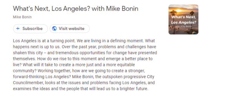
Take the podcast displayed above. It is a show hosted by city councilmember Mike Bonin, and talk about the different issues that plague those living in LA, and what can be done about those problems. Now a show with content that is all about Los Angeles, you would expect a logo that represents the topic in some way, right?
And that is exactly what Mike Bonin did. He designed a logo that showed a beautiful view of the famous Venice Beach in LA, perfectly portraying the primary topic of his podcast. Moreover, the design was also made better by the choice of the typography used, perfectly incorporating the Los Angeles logo design vibe.
Focuses on the Brand Itself
Podcasts are a great way to create multiple lines of connection and communication with your target audience. For example, an entertainment company or a content creator can create a podcast as a way of promoting their craft for their audience. A professional business, on the other hand, may host an industry expert on to their podcast, as a way of establishing their credentials in the industry.
To put it simply, a podcast can be used to do a lot of different ways depending on what you need it for. That is why some businesses create and publish more than one podcast, in order to target different segments of their audience.
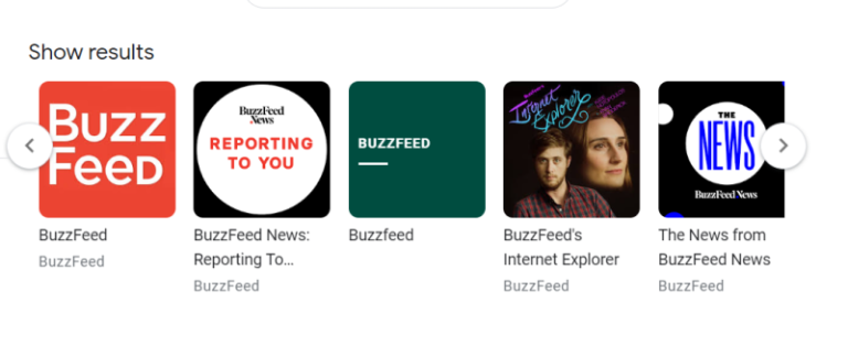
Take a look at the example above. BuzzFeed is a popular media house, that has offices in the US, UK, Japan, and more. As a large media house, they create content that targets different audience segments. For example, they have separate sections or podcasts for BuzzFeed News and BuzzFeed Entertainment.
This division of content into separate segments, unified under the parent brand of BuzzFeed, is how the media house manages to cater to so many audience segments simultaneously. And that branding strategy is how they do it without confusing or overwhelming their target audience by the sheer amount of content they produce.
Adds a Little Personal Flair to Jazz Up the Design
We humans are highly visual creatures. We all know that. Anything that doesn’t attract us visually needs to assault our other senses in a way that overcomes that lack of visual materials. Music appeals to the ears and the heart, and helps us visualize something that appeals to us. So how can podcast do it too?
Well, for one thing, podcasts need to be listened to before a person decides whether it’s good or not. So the difficult part, is to have them choose your podcast from the registry in the first place. One of the ways to do that is to give your logo a bit of a personal flair.
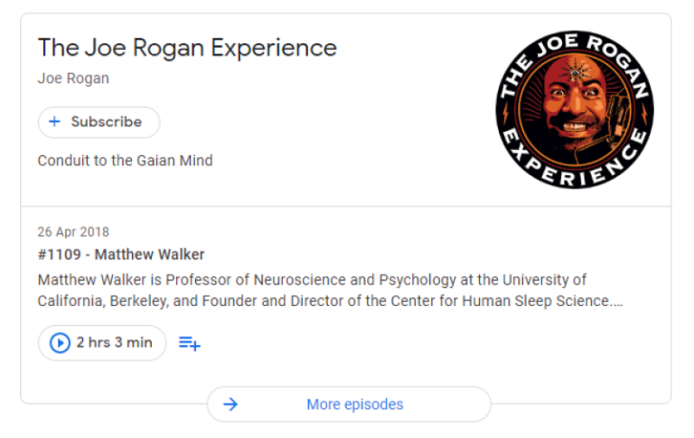
What that does is it uplifts your logo design, making it less aloof and sterile, and more in-tune with the audience. Take the logo for Joe Rogan’s podcast above. Considering that the show is all about Rogan and his guests getting high and talking about a variety of topics, both tinfoil theories and general topics, the logo for it is exactly what it needs to be. The image of a crazed man with an open third eye in the middle of the forehead is the perfect, lighthearted imagery for the show.
That’s what it means to give your logo a personal flair.
Keeps It Simple
Simplicity is key to creating a good logo that appeals to the senses without overwhelming the audience with too much information at the same time. Minimalism in design is something that has been incorporated into the logo design world as a whole, regardless of industry.
As the advent of data-driven strategies took vogue in the design and marketing world, professionals have been using the insights generated to find out what works best on their target audience. One of the most valuable insights gained, is that consumers today are constantly visually overwhelmed, which makes it hard for your logos to have a strong impact.
Today, from the billboards around us to the screens of our computers and mobile devices, we are constantly exposed to a myriad of logos and symbols. This constant inundation means that consumers are less likely to remember the small details from your logos. And too many of these fine details in your design are going to be ignored altogether. The solution – minimalist logos. Reducing the number of fine details in your design will result in your audience remembering your logo more easily.
Is Careful to Keep It Hi-Res & High Quality
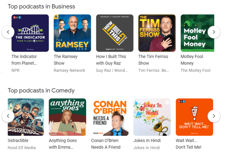
Obviously, unless the image you use for your logo is visible clearly, it won’t have the intended impact of attracting your audience to your brand. Clarity in your logos design is paramount if you want it to perform well. However, if you are using minimalist podcast logos, how is it possible that the details of your design aren’t clear?
Well, one reason for that, and an avoidable one at that, is the use of a low quality image for your logo. When designers create logos, they generate logo files of different sizes and quality, depending on what you need it for. The purpose of that is to ensure that you use the right format and size of your logo.
Using an image of a smaller resolution than required for your podcast symbol will result in a distorted image, which would not be clear about what it represents and would end up losing your audience’s interest. Take a look at the logos above. All of them have logos that are clear and visible at a glance.
That is what you should aim for when creating a logo representing your podcast’s topic.
Designing a Podcast Logo to Represent Your Show
Understanding what needs to go into making a great podcast logo is only half the battle. The next one is to come up with great podcast logo ideas, and then design the one you feel best represents your brand to use as your logo.
But how can you create your own logo? If you’ve never created a brand logo before, and don’t know how to start with the process, then don’t worry. The tips below will help you create an effective brand logo, or help you evaluate a designer’s handiwork if you decide to outsource your design project to a professional.
Finding the Right Color Schemes
First off, colors are an important part of any design, logo or otherwise. Choosing the right color combinations can uplift or boost a logo’s impact by magnitudes. But one thing to remember – choosing the right color schemes does not mean to choose a colorful palette of shades to choose from.
Sometimes, even a monochromatic logo can do wonders where a colorful one would have gotten lost. For example, for a serious corporate business, a corporate logo design full of bright, vibrant colors may be not accepted well, unlike the same logo colored in a subdued, yet distinctive monochrome.
Managing Your Design Layouts
Managing your design layouts is another important step in creating great brand logos. Aligning your elements, like segments of your iconography, your typography, and more, and make or break your logo’s impact. For example, you can create negative space logos using a few design elements.
But by simply rearranging those same elements, you can also create an abstract logo. It is all in the arrangement and layout of your design.
Choosing the Perfect Typography and Fonts
Choosing the right logo fonts is another way you can ensure your logo has a strong impact. A podcast logo that represents a show about retro games, yet uses typography that looks like your traditional corporate logo fonts, will end up losing its visual impact on the audience.
On the other hand, using a beautiful, retro font will boost the overall impact and the logo’s ability to present its message.
Selecting a Complementary Iconography
When creating a logo for your podcast, or any other brand, it’s important that you choose the right kind of iconography for it. We understand that there are a lot of different types of logos to choose from. But not all of them would be suitable for your brand aesthetic.
A legal firm that has an abstract logomark may not have the same impact as that of a combination or a wordmark. Choosing the right style of iconography for your brand logo can be critical to its success as a brand symbol.
People Also Ask (FAQs)
| 1. Do podcasts need a logo? Yes, they do. Practically every podcast directory requires some sort of artwork or a logo in order to publish that podcast. |
| 2. How do I get a logo for my podcast? There are a few ways you can get a logo designed for your podcast. – Use an online AI logo maker tool to create your logo – Hire a freelance designer to design a logo for your podcast – Hire a professional logo design agency to create your podcast logo |
| 3. How much does a podcast logo cost? In general, depending on what you need your podcast logo to do, it can cost as little as $5 if all you want to do is fulfill the directory’s requirements. But for those who actually want a suitable logo to represent their brand, then that kind of a logo can cost anywhere from a few hundred dollars always the way up to $6000 or more. |
| 4. Should I trademark my podcast? Yes, you should. If your podcast has a unique name, logo, or slogan, then you might be eligible for a US federal trademark protection, which can be claimed from the US Patents and Trademark office. |
| 5. Do I need a podcast cover art? Yes, you do. Just like a podcast logo, you need cover art for your podcast to be published on these registries. Today, the recommended size for a podcast cover art is 1400×1400 pixels minimum. |
Conclusion
To sum it up, creating suitable podcast logos is critical, if not required, if you want to publish it on a reputable podcast directory. Creating the perfect logo for your podcast will help your show attract the right audience, as well as help you build a powerful brand.
If you are starting a podcast, and want to know how to create and evaluate your own logo, then the tips above will be of a great help in guiding you into creating and adopting an impactful logo.

Logopoppin
Logopoppin is a graphic design agency that specializes in logo designing, web development, video production and advanced branding services. We love to innovate businesses with new age technologies, allowing them to improve their visual reputation.

