Table of Content
Discover the Top Poppins Font Combinations to Establish a Strong Typographic Impact
Typography, the art of displaying text in the best way possible, is a fundamental aspect of graphic design. Your choice of fonts can significantly impact the overall aesthetic and tone of a design project. In recent years, the Poppins font has gained immense popularity due to its versatility and modern appeal. And with it, we have seen a rise in people looking for the perfect Poppins font pairing choices for their graphics projects.
Now, the reason Poppins is so popular is because its clean lines, geometric structure, and neutral character make it a versatile choice for various design applications. Plus, its various styles available ensure that we can use Poppins font for nearly every situation, from body to headlines.
However, unless your design has just one small piece of text to show, you cannot make do with a single font. You need to pair it with other types of fonts to keep up the visual attraction, while ensuring that your text is going to be all visible and legible. But what fonts can you pair with Poppins?
Join us as we explore the subtle charm of Poppins and take a look at some compelling Poppins font combinations used by professional graphic design services for their typographic creations. Let’s begin.
Poppins Font Family – An Overview
Poppins, a geometric sans-serif typeface designed by Indian Type Foundry’s Jonny Pinhorn, has rapidly become a design staple. Its neutral character, exceptional legibility, and wide range of weights make it adaptable to diverse design projects. And the best part is that the font is available for personal and commercial use on Google Fonts, all for free.
Poppins excels in both print and digital media, offering a clean and professional appearance. The font family includes various styles, from thin to extra bold, providing designers with ample options to create harmonious and visually compelling typographic compositions.
Why Is Poppins Font Such a Popular Choice Nowadays?
Poppins’ popularity can be attributed to several key factors.
Firstly, its neutral and unobtrusive nature as one of the popular sans serif fonts allows it to complement a wide range of design styles, from minimalist to eclectic. Poppins’ popularity can be attributed to several key factors. Firstly, its neutral and unobtrusive nature as one of the popular sans serif fonts allows it to complement a wide range of design styles, from minimalist to eclectic.
Whether you’re designing a website or a sleek corporate presentation, its versatility shines through. Secondly, its exceptional legibility ensures readability across different mediums and sizes. Secondly, its exceptional legibility ensures readability across different mediums and sizes.
Thirdly, the availability of various weights and styles within the Poppins family provides designers with flexibility and control over their typographic compositions. Finally, its clean and modern aesthetic aligns with contemporary design trends, making it a sought-after choice for both print and digital projects.
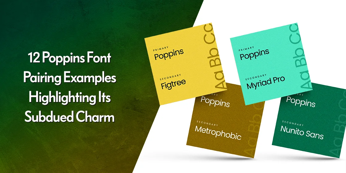
12 Amazing Poppins Font Pairing Examples for Great Typographic Visuals
Pairing fonts effectively is an art that requires careful consideration of factors such as contrast, harmony, and visual hierarchy. Poppins, with its understated elegance, offers numerous opportunities for successful pairings, even among the various Google fonts themselves. Here are twelve Poppins’ font pairing examples that complement its subdued charm.
Gravitas One + Poppins
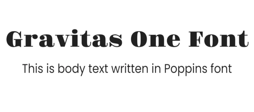
Gravitas One is a bold and geometric serif font from rounded fonts that creates a striking contrast with Poppins’ neutral character. The pairing works well for headlines and titles, adding a touch of drama and impact.
This pairing creates a strong interplay between the geometric simplicity of Poppins and the bold, rounded, and almost playful character of Gravitas One. The latter’s distinctive letterforms offer a counterpoint to Poppins’ neutrality, making it ideal for headlines and titles that demand attention.
Roboto Mono + Poppins
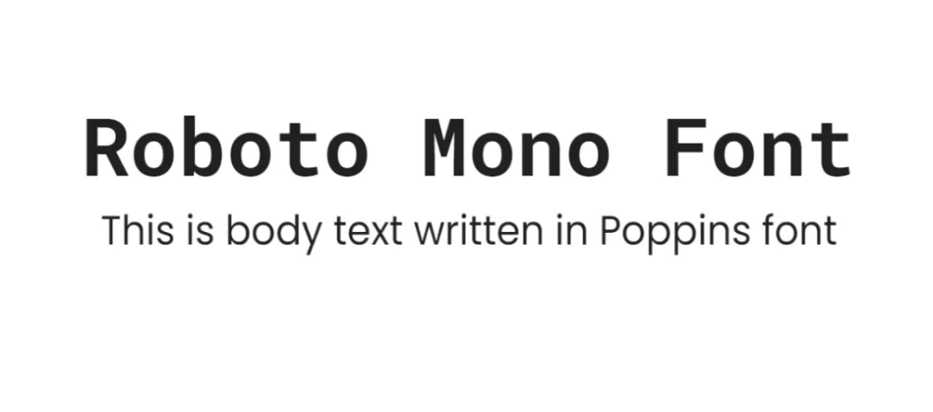
A clean and modern monospaced font, Roboto Mono complements Poppins’ geometric structure. This combination is ideal for technical documents, code snippets, and projects with a minimalist aesthetic.
Combining Poppins with Roboto Mono offers a contemporary and tech-inspired look. The contrast between the geometric sans serif of Poppins and the clean structure of Roboto Mono monospaced fonts creates a visually interesting balance, perfect for projects with a digital or futuristic feel.
Inconsolata + Poppins
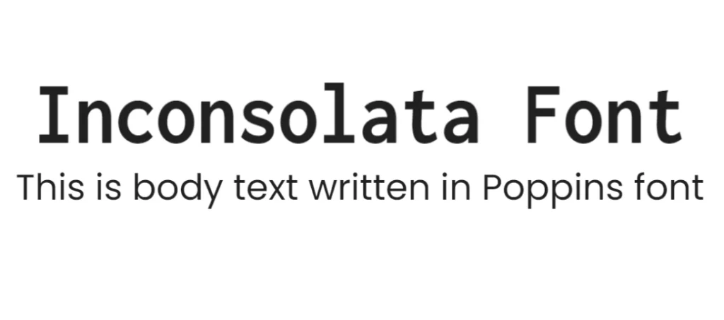
Another great option, Inconsolata offers a slightly warmer and more organic feel than Roboto Mono. The pairing with Poppins creates a balanced and harmonious composition of typography.
This Poppins font pairing blends the clean lines of Poppins with the distinctive, almost code-like character of Inconsolata. Both fonts share a geometric foundation, creating a harmonious yet contrasting composition that is particularly effective for tech-related or minimalist designs.
Source Serif 4 + Poppins
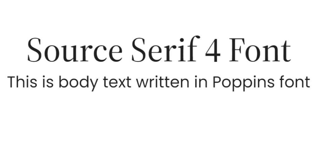
This classic serif font adds a touch of sophistication and elegance to Poppins’ modern character. The combination works well for editorial design, book covers, and projects that require a timeless feel, such as being counted among the best fonts for business card with a classic corporate look.
Pairing Poppins with Source Serif 4 creates a classic and elegant combination. The contrast between the geometric sans serif of Poppins and the traditional serif of Source Serif 4 provides a timeless and sophisticated look.
Ubuntu + Poppins
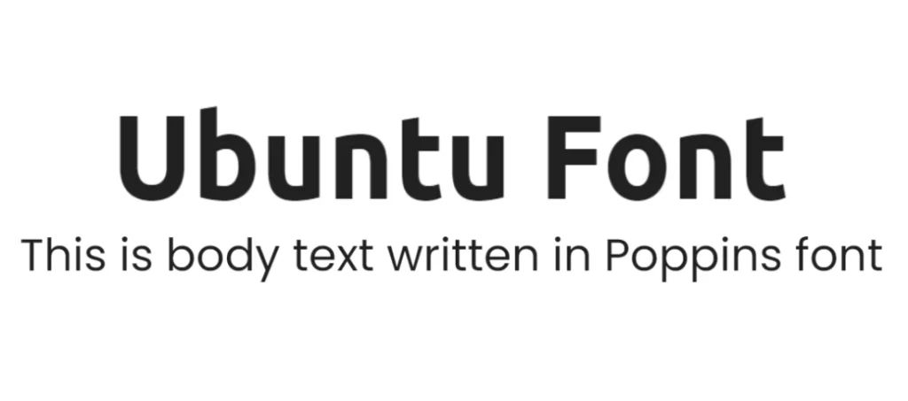
A humanist sans-serif font, Ubuntu shares some similarities with Poppins in terms of legibility and neutrality. The pairing creates a cohesive and harmonious look, suitable for various design applications.
This Poppins font pairing offers a harmonious and modern aesthetic, with Ubuntu lending a minimalist futuristic fonts vibe. Both fonts share a similar geometric structure and neutral character, creating a balanced design that works well for various applications, from websites to print materials.
Rubik + Poppins
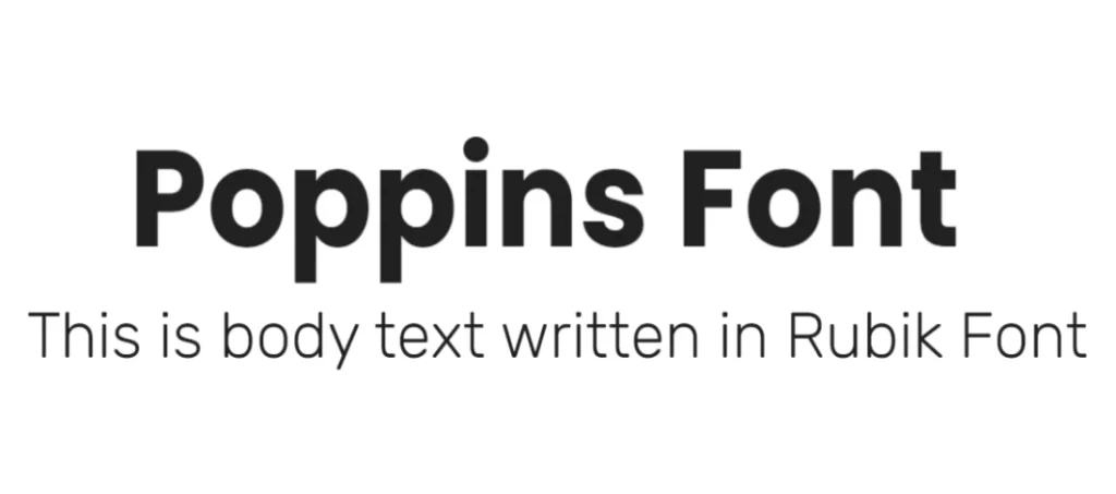
With its geometric shapes and rounded corners, Rubik offers a playful contrast to Poppins’ neutral character. The combination is ideal for branding, packaging, and projects targeting a younger audience.
Combining Poppins with Rubik results in a contemporary and energetic look. Both fonts are geometric sans serifs, but Rubik’s more expressive forms create a dynamic contrast to Poppins’ bold neutrality, making it suitable for youthful or energetic designs.
Alef + Poppins
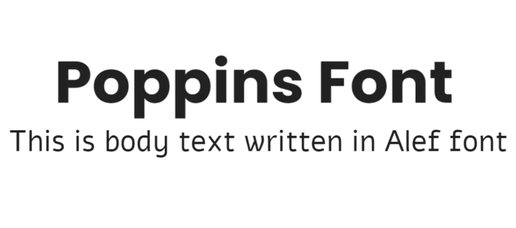
This sans-serif font with Hebrew origins brings a unique and contemporary feel to the pairing with Poppins. The combination works well for fashion, lifestyle, and cultural projects.
This Poppins font pairing brings together a modern sans serif with a Hebrew-inspired typeface. The contrast between the geometric structure of Poppins and the organic, flowing forms of Alef creates a unique and visually interesting combination, ideal for projects seeking a balance of modernity and cultural influence.
Playfair Display + Poppins
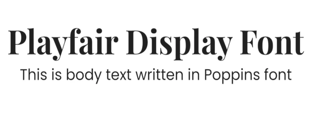
A classic serif font with elegant proportions, Playfair Display adds a touch of sophistication and luxury to Poppins. This pairing is the perfect option for understated invitation typography, wedding fonts, and high-end branding.
This pairing combines a modern sans-serif with a classic serif, offering a subtle yet elegant look. The contrast between the geometric simplicity of Poppins and the ornate details of Playfair Display creates a visually appealing hierarchy, perfect for editorial design and high-end branding.
Geologica + Poppins
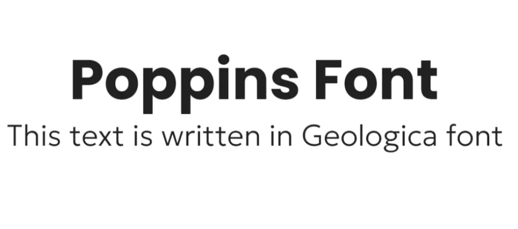
A geometric sans-serif font with a strong, architectural character, Geologica creates a bold and striking contrast with Poppins. The combination is ideal for headlines, posters, and projects that demand attention.
This Poppins font pairing creates a contemporary and futuristic aesthetic. Both fonts share a geometric foundation, but Geologica’s more experimental and angular forms provide a counterpoint to Poppins’ neutrality, making it suitable for tech-related or science-fiction inspired designs.
Tenor Sans + Poppins
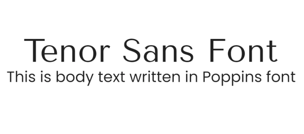
Another humanist sans-serif font with a warm and friendly appearance, Tenor Sans complements Poppins’ neutral character perfectly. The pairing works well for branding, packaging, and projects targeting a wider audience, suiting a number of different font trends aesthetic.
Combining Poppins with Tenor Sans offers a playful and energetic look. The contrast between the neutral character of Poppins and the expressive, almost handwritten forms of Tenor Sans creates a dynamic and eye-catching composition, ideal for children’s books or casual branding.
Anton + Poppins
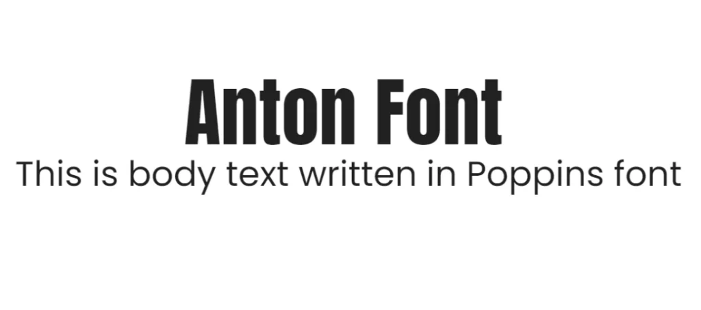
A bold and condensed sans-serif font, Anton creates a strong visual contrast with Poppins. This pairing is ideal for headlines, titles, and projects that require a powerful statement, due to its origins among print masculine fonts.
This pairing creates a strong contrast between the geometric simplicity of Poppins and the bold, condensed forms of Anton. The latter’s strong visual impact makes it perfect for headlines and titles, while Poppins provides a neutral base for supporting text.
Sofia Sans + Poppins
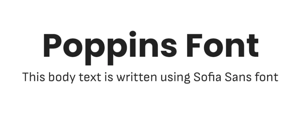
Another geometric sans-serif font, Sofia Sans offers a similar aesthetic to Poppins but with a slightly different character. The pairing creates a harmonious and cohesive look, suitable for various design applications.
This Poppins font combination offers a harmonious and modern aesthetic. Both fonts share a similar geometric structure, but Sofia Sans’ slightly warmer and softer forms create a subtle contrast to Poppins’ neutrality, making it suitable for a wide range of design projects.
Conclusion
Poppins has established itself as a versatile and popular font choice for designers. Its clean, modern aesthetic and excellent legibility make it a strong foundation for various design projects. By carefully selecting complementary fonts, as demonstrated in the Poppins font pairing examples above, designers can create visually compelling and impactful typographic compositions.
Experimentation with different font combinations is key to finding the perfect pairing for your specific design goals. Therefore, with this guide, you are well on your way to understand what kind of fonts will work well with Poppins, whether the fonts are from Google, Adobe fonts, or any other repository.
Latest news you want to know!
Subscribe for cutting-edge design inspiration at Logo Poppin! Elevate your brand with updates on logos, branding, web design, and video animation.
Note that by clicking “subscribe,” users may agree to our privacy policy and consent to Logo Poppin to use your contact data for newsletter purposes.
Logopoppin
Logopoppin is a graphic design agency that specializes in logo designing, web development, video production and advanced branding services. We love to innovate businesses with new age technologies, allowing them to improve their visual reputation.