
Table of Content
Take a Look at the Short History of Power BI Logo
Tracking business performance across various ventures is important for every company. It is a job that requires a specific tool, one that can give you complete insights about the existing campaigns. Power BI is a creative software that helps business administrators to track all the things from just one dashboard. The logo of Power BI is therefore known to everyone in the industry, as it represents a cutting-edge software that provides ease of data analysis. Coming out in 2011, the Power BI logo history is not that long, but still it has made a reputable name for itself in the data analytics market.
Today, business administrators from around the world use Power BI to measure the progress of targeted KPIs. Built by Microsoft, it is a software that helps you to perform data analysis and get correct real-time reports of the ongoing campaigns. Designed by professional logo design services, the Power BI logo is quite simple and clean, depicting a clear nature of the system. Since 2011, it has been changed multiple times to keep the branding identity of the software fresh. If you do not know much about those redesigns, read this article in detail to explore the complete history of Power BI logo till to date.
What is Power BI?
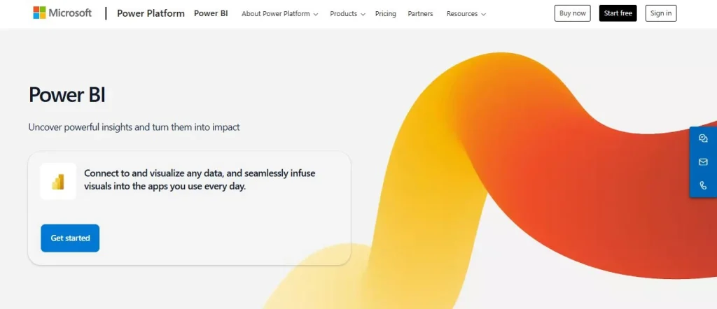
Power BI is a business analytics tool developed by Microsoft that enables users to visualize, analyze, and share data insights in an interactive and user-friendly way. It connects to a wide range of data sources, from simple Excel files to complex databases and cloud services, allowing users to create dynamic reports and dashboards. Power BI is designed to simplify data analysis, making it accessible for both technical professionals and non-technical users, empowering organizations to make data-driven decisions.
One of the key features of Power BI is its ability to deliver real-time insights through customizable dashboards and rich visualizations. Users can apply filters, drill down into granular details, and combine data from multiple sources into a unified view. Additionally, Power BI integrates seamlessly with other Microsoft products, such as Excel, Azure, and Teams, enhancing its value for businesses already using the Microsoft ecosystem. Its advanced analytics capabilities, powered by machine learning and artificial intelligence, enable predictive insights and automation.
Power BI offers flexibility to the business administrators through its suite of tools. Its scalability ensures that it can support small businesses and large enterprises alike. With robust security features, such as row-level security and compliance certifications, Power BI safeguards sensitive information while maintaining accessibility. This combination of ease of use, versatility, and security makes Power BI a leading solution in the world of data analytics.
Importance of Power BI for Businesses
Power BI is essential for businesses because it transforms raw data into actionable insights. By providing interactive dashboards and reports, Power BI allows organizations to monitor key performance indicators (KPIs) in real-time. This visibility helps businesses quickly identify trends, uncover opportunities, and address potential challenges. As a result, decision-makers can base their strategies on accurate, up-to-date data rather than assumptions or delayed information.
Another critical aspect of Power BI’s importance is its ability to integrate and unify data from various sources. Businesses often deal with fragmented data stored across different systems, which can hinder efficiency and insights. Power BI bridges this gap, allowing users to create a holistic view of their operations. This integration helps teams collaborate more effectively, align on goals, and streamline workflows by eliminating silos of information.
Finally, Power BI supports scalability and customization, making it suitable for businesses of all sizes. Small businesses can use it to gain competitive advantages through cost-effective data visualization, while large enterprises can leverage its advanced analytics and enterprise-grade security features. Additionally, its user-friendly interface enables non-technical users to perform complex analyses without relying on IT departments.
Power BI Logo History: Know the Complete Evolution
The history of Power BI logo is not that long because the software itself came out in the industry in 2011. Since then, there has been some changes in the logo to keep its identity interactive as per the latest trends. Let’s take a look at the complete Power BI logo history and all the redesigns in detail below.
Power BI Logo (2013-2016)
Until 2016, the Power BI logo featured a distinctive badge that represented its focus on analytics and data visualization. This badge consisted of five solid yellow elements arranged on a clean white background. The elements were carefully positioned to resemble an abstract analytical table, symbolizing the structured and organized nature of data analysis. These components were configured to form four vertical columns, a key visual metaphor for data organization and reporting.
The badge also included a unique diagonal framing with an open contour. This diagonal orientation suggested movement and progress, reinforcing Power BI’s identity as a forward-thinking tool for business intelligence. The open contour emphasized accessibility and flexibility, qualities central to Power BI’s mission of making data insights available to everyone. Together, these design elements created a minimalist logo that was both simple and conceptually rich, perfectly reflecting the platform’s purpose.
Power BI Logo (2016-2020)
The 2016 redesign of the Power BI logo introduced significant updates to its geometry, resulting in a cleaner and more modern look. One of the key changes was the reorientation of the frame, which was adjusted to sit straight rather than diagonally, giving the logo a more balanced and stable appearance. The frame retained its rounded corners, maintaining a sense of approachability and softness while reinforcing the brand’s commitment to user-friendly design.
Another notable change was the alteration of the column heights within the logo, which added visual interest and conveyed deeper meaning. The redesign introduced an alternating height pattern where the third column—the previously tied element—was now shorter than both the second and fourth columns. This variation in height symbolized flexibility and adaptability, reflecting Power BI’s ability to accommodate diverse data needs and visualizations.
Power BI Logo (2020-Today)
The current Power BI logo marks a complete departure from its original design, embracing a minimalistic and streamlined approach. Unlike the first illustrated logo, the updated version eliminates any visual elements that could be considered extraneous. The most notable change is the removal of the frame, which originally took the form of a display. By discarding this framing element, the designers simplified the logo significantly, allowing the focus to shift entirely to the core visual representation of data.
What remains from the earlier iterations is a stylized bar chart, reduced to its essence and now consisting of three bold, vertical elements. These bars are larger and more pronounced than before, emphasizing Power BI’s core function of data visualization. The three bars of varying heights represent the platform’s adaptability to different data scales and types, as well as its ability to distill complexity into easily understandable insights.
Color of Power BI Logo
The color palette of the Microsoft Power BI visual identity is carefully crafted to convey energy, professionalism, and confidence. It primarily features three distinct shades of yellow, creating a harmonious gradient effect that adds depth and vibrancy to the logo. These varying color combinations of yellow not only provide a visually appealing aesthetic but also symbolize the dynamic nature of data analysis and business intelligence.
In addition to the shades of yellow, the logo incorporates light gray gradients, primarily used for subtle shadowing and dimensional effects. These gray tones add a sense of sophistication and balance, ensuring the design maintains a professional and polished appearance. Together, the yellow and gray elements create a contrast that highlights the logo’s key components while reflecting expertise and reliability.
Frequently Asked Questions
| What is Power BI? Power BI is a Microsoft business analytics tool that enables users to visualize, analyze, and share data insights through interactive dashboards and reports. It connects to various data sources, empowering organizations to make data-driven decisions. |
| Why Power BI has become popular in the business world? Power BI has become popular in the business world due to its user-friendly interface and powerful data visualization capabilities. It empowers organizations to make informed decisions through real-time, interactive insights. |
| What are the benefits of using Power BI? Power BI provides dynamic data visualization, real-time insights, and integration with diverse data sources. Its scalability, ease of use, and advanced analytics capabilities make it ideal for businesses of all sizes. |
Final Words
That takes us to the end of this blog in which we have discussed the entire Power BI logo history in detail. It is a renowned logo in the industry of tech, as many businesses regularly use Power BI to perform real-time data analysis. Over the years, this logo has been changed multiple times, precisely to keep the overall branding fresh. This blog has discussed all those iterations in detail, so that you can understand how the famous Power BI logo evolved from time to time.
Logopoppin
Logopoppin is a graphic design agency that specializes in logo designing, web development, video production and advanced branding services. We love to innovate businesses with new age technologies, allowing them to improve their visual reputation.
