Table of Content
Discover How to Come Up With the Perfect Real Estate Logos for Your Realtor Business
Designing the perfect real estate logo is the first, and arguably the most important part of establishing your real estate brand. It basically represents the visual of your business, letting people know how to distinguish your brand from your competition.
This is one of the biggest reasons why top brands looks to their logo when establishing a unique identity in the industry. Whether it is a startup or an established venture, a creative and expressive logo always plays a vital role in letting a business letting the market know their values and offerings. And it does so while still being simple and memorable enough to portray their message at just a glance.
So what is it about these effective real estate logos that separates them from the mediocre and the average? And how can you use a professional logo design services to create some amazing real estate logo ideas for your brand?
Let’s take a look at the elements that define a strong brand logo, and take a look at some real-life logo designs to inspire your own.
What Elements Define a Good Real Estate Logo?
It is a known fact that brand logos not only represent the identity of their companies, but their values as well. In a people-centric industry such as real estate, where it’s the human connections that boost business, a good logo that connects with the consumers shows that your brand message in a creative manner that sets it apart from the competition.
To ensure that your logo portrays the right brand message, you need to oversee the entire design process carefully. That is because there are a number of factors that can ensure the creation of a unique logo.
But what are these factors? And how do they ensure the creation of a unique and effective real estate logo? Let’s find out, shall we?
Simplicity in Design
One of the best things that you can do for your logo’s success is to make it simple in design. The biggest reason for that is that it becomes easier to recognize a simple logo among others in the market. A simple design also helps the logo be versatile in use, which makes it easy for the brand to get exposure across multiple mediums, including real estate yard signs.
Memorability of the Logo
As we mentioned earlier, one of the biggest reasons simplicity in designing your real estate logos is so popular is because simple designs are easier to remember and recall. It doesn’t matter how unique your logo be, if people cannot remember the details that make it so great. High memorability allows your business to get effective recognition every time, which is the basis for nearly all real estate marketing ideas.
Longevity of the Design
A logo that sees frequent changes find its hard to establish a strong brand presence. That is because every time that the consumers would start getting used to a specific logo, the brand would end up changing, which would restart the process from scratch. In order to make an everlasting impact, try to create real estate logos with a modern, evergreen aesthetic, using the latest trends in the design industry.
Balance in Design
Your real estate logo must needs to find the perfect balance in design by tweaking the different design elements such as color, typography, design aesthetic, and more. Finding this balance is necessary because it provides a cohesive look to the logo, allowing your design to connect with the overall brand theme easily.
Common Types of Real Estate Logo Ideas You Can Choose From According to Your Niche
The real estate industry is quite a big market, with a number of different niches. Due to the entirely different consumer bases, the best way to cover them all successfully is to consider each of them a separate and distinct industry.
As we discussed earlier, real estate is a people-centric business that depends quite heavily on word-of-mouth marketing and networking. This fluidity means that the logos need to be versatile enough to connect with people deeply, as they will be printed in a variety of mediums, from billboards and bus benches to real estate business cards.
Let’s take a look at some of the common types of real estate logos we see around us.
Residential Real Estate Logos
Of all the types of real estate logos, a residential real estate logo is one of the simplest ones. And its not because the design is any simplistic, but rather the approach being quite straightforward. If you target a predominantly suburban demographic, then a logo that shows an angle of a home with a picket fence would be perfect to bring in the right consumers.
If your target market is more into apartments and condos downtown, then you would fair better with something modern and sleek, targeting a younger, more hip demographic than your suburban crowd.
Meanwhile, these residential real estate logos can also be designed using some fantastic geometric shapes. You need to keep in mind the brand theme while using such forms, as it would be better to imitate your brand’s original color tone and style in those geometric profiles.
Cobalt Residential
Cobalt Residential has a clean, modern design that uses the abstract profile of house roofs to target the desired demographic. The dark blue and ash gray color scheme of the symbol is also great at establishing trust in the design, attracting a more nuanced, well on their way to conversion lead.
Minnesota Home Pro
Minnesota Home Pro sports a smart logo, which uses the image of a house’s front profile, using a blue and gray color scheme. This imagery allows for quick identification of the business’s niche, and with the “O” of the word “Home” containing the map of Minnesota, allows for the identification of the business area too.
Better Home and Gardens Real Estate
Better Homes and Gardens is a big brand that covers a lot of niches under its umbrella. One of those niches is real estate, where the company provides listings for properties available for sale or rent. As the parent business is already an established brand, they have decided to go for a simple design to the logo, using the parent logo with a simple “REAL ESTATE” wordmark underneath. This is one of the most popular real estate branding ideas used today.
Active Realty Incorporated

Active Realty is a higher-end real estate business with an interesting logo. With a combination mark that consists of an abstract logomark, as well as a simple yet elegant wordmark, the design of the logo is quite unique for this list. The wordmark is designed in simple, lowercase letters to form a single word, while the logomark is an interesting design that combines a lowercase “a” and an uppercase “R”.
Commercial Real Estate Logo Design
Commercial real estate logos generally depict high-rise buildings, hotels, and other significant structures in their design. It represents the fundamental identity of the corporate sector, allowing people to understand that a particular brand only deals in the commercial industry.
Working in the commercial real estate sector, you can design these logos in a specific style. It can represent an office or a tall building in the emblem; it all depends on your brand’s précised choice.
Smith & Robert Realty
Smith and Robert Realty deals in commercial real estate options, among others. As such, their logo gets right to the point, with a row of houses serving as the backdrop to their wordmark. The bright red and black color scheme of the logo also serves as a great visual tool to attract the right customers.
Acres Commercial Realty
Acres is a real estate company that only deals in commercial properties, especially those with an emphasis on nature and natural features. Their logo is a simple combination mark, with an “A” with a long curling tail as the logomark, and a beautiful, sans serif wordmark, all in shades of green.
The Peach Team
Peach Team Realtors also deal in commercial real estate. However, as they deal in residential real estate as well, their logo is designed to target the latter consumers more. The backdrop uses a simple outline of a house roof, under which is the company’s wordmark. Below that, the company’s logomark is placed, which is a peach colored ornate house key, with the end shaped like a peach.
Century 21 Real Estate Group
Rather than being a single company, Century 21 is a group of partner realtors and real estate businesses that operate across the world. As such, these commercial real estate businesses operate under a well-known, global brand that has a great brand worth. Using a simple, unadorned wordmark, the company serves its commercial real estate customers to find the properties they need in prime locations globally.
Industrial Real Estate Logo Ideas
The industrial real estate logos can be classified as an advanced prototype of commercial logos. They are designed with an emblem of mills, factories, and other industrial places, showcasing the broad commercial niche of a real estate company.
The design process of industrial logos also requires a heavy thought process because it represents a whole industry in its identity. Generally, these logos are designed with a singular color tone, imitating the core theme and style of a real estate business.
The Cauble Group Commercial Real Estate

Cauble Group is a commercial real estate business that deals in industrial properties, among other commercial real estate options. The logo consists of a wordmark and logomark. The latter is in the shape of diamond made up of two vertical halves, mirrored. The left is designed to look like “C”, while the right looks like a mirrored “G”. Accompanied by the simple sans-serif wordmark, this is a great logo.
Mohr Partners
Mohr Partners is another real estate company that deals in industrial real estate. Serving mostly factories and the like, the company is experienced in brokering deals for prime industrial real estate, using a simple, red and black logo that looks like a pair of tall buildings. Underneath it is the bold wordmark, which emphasizes the name of the business.
Forte Real Estate

Forte Real Estate is a commercial real estate business that specializes in industrial properties. The wordmark is a bold yet sans-serif affair, accompanied by a red logomark that is in the shape of three horizontal lines of different sizes. However, a second look tells us that it looks like an abstract letter “F”, which is the initial for the company.
Best Real Estate Logos for Land Sale Businesses
These logo designs are used by the companies that specifically target sales of lands. It is pretty different from the other fields; hence its logo is also created uniquely. Those real estate companies that deal with purchasing agricultural lands use this specific logo to represent their business.
These logos symbolize particular objects to showcase the niche of real estate companies covering land sales. The designs are meant to include anything from the depiction of hills to cattle farms and more others.
That helps people to understand their services and the area where they primarily operate in.
Lan Darty Real Estate and Development
Lan Darty Real Estate Development offers a very simple solution when it comes to a brand logo. With one of the most obvious real estate company names, the company goes for a combination mark, where the wordmark is a simple, serif wordmark done in two lines. The logo mark consists of an interconnected set of company initials, in the square diamond, all in a dark red color.
Forey Real Estate
Forey Real Estate is a real estate brokerage and development company, that deals in residential properties specifically. With that in mind, the design of the logo makes sense. The backdrop is a pair of house roofs, with their base designed to look like an ornate house key. Underneath that is a simple, subtle wordmark, that also contains the company’s real estate slogans. Overall, this is a unique design that we don’t often see.
Horner Realty
Lori Horner Realty Group also deals in residential property development and brokerage. Their logo features a black and purple image of a house, with a winding white line through it. Combined with the simple yet elegant serif wordmark underneath, this is a highly effective logo in this niche.
RS Home Source – Beverly Hills Estates

RS Home Source is a large property development and brokerage firm, that has a number of subsidiary realtor companies working with them. The logo above is for the company team that is deals in properties specifically in the Beverly Hills Estates society. The logo with the mirrored “R” and “S” within a round badge serves as one of the finest monogram logos on this list, and is perfect for a company of this caliber.
Property Investment Real Estate Logos
These types of logos are used by companies engaged with the real estate industry to provide regular investments. These companies come in all kinds of domains, as some specialize in just gathering the funds. At the same time, some adequately cater to a pool of investors to streamline a complete b2b business.
Being a designer, you can easily create these logos by just focusing on the exact model of a company. This allows you to design a logo with a singular brand theme, representing the précised business identity of a real estate company.
Denver Real Estate Professionals
Denver Real Estate Professionals are a corporate property investment company, with a logo that suits their personality perfectly. Going for a simple and to-the-point logo design, the logo centers on the wordmark, going for large, serif letters for the typography. Using a white and charcoal color palette, the result is one of the best real estate logos.
House of Hawley

House of Hawley is another real estate company that deals in high-end property investments. The logo for the company depicts an intricate wrought iron gate, with the wordmark underneath framed in a double-lined rectangle. Overall, the result is one of the most amazing real estate logo designs on this list.
Josh Flagg Realtor
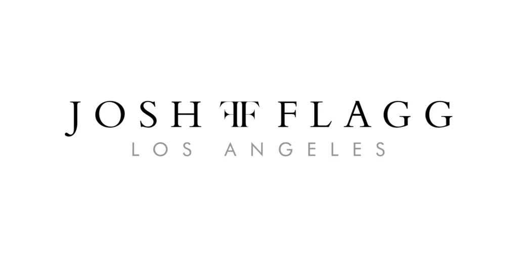
Josh Flagg is a celebrity realtor who deals primarily in million-dollar listings and investment properties. The logo for the company is a combination mark, with a stylized wordmark of the realtor’s name, and a logomark that consists of a pair of “F” mirrored and placed back-to-back.
Top Tips to Create the Perfect Real Estate Logo for Your Realtor Business
To design a fabulous real estate logo, you just need to keep these few tips in mind. They are pretty helpful in making your overall logo unique and aligning its design with the brand’s theme.
Understanding the Brand’s Requirements
Before designing a logo, you need to understand the company’s niche for creating a logo. As defined above, real estate is quite a big industry and has got multiple sub-branches in it. Your intended logo design precisely depends on that subdomain and the area in which it operates.
Having a clear understanding of that domain allows you to become focused and aligned. It simply lets you know about the background of that company and what real estate services it offers to the clients. Whether it deals in a commercial business or residential property, a detailed understanding in the first place allows you to pick up the logo idea effortlessly.
Choosing the Perfect Color Palette that Enhances Your Brand Message
The second thing you need to consider while designing a real estate logo is selecting perfect color combinations. It is essential to pick a suitable color theme that relates directly to the brand to create uniformity in design.
To pick the best colors, you must consider the industry, competitors, and demographics of a real estate business. These core factors are crucial in terms of choosing the suitable color theme for the company. Just keep in mind that each color portrays a specific message and has excellent visual importance for the targeted customers.
Using the Right Font and Typography to Make Your Logo Stand Out
Choosing the right logo fonts for your design is also very important as it determines the visual impact of the design. It is unnecessary always to pick a bold font, as sometimes your logo requires a decent typeface that could enhance its overall simplicity.
To pick the right font, you can take ideas from the industry’s leading real estate companies about how they have designed their own logos using a particular typeface. Many designers like to use modern fonts in their symbols, such as Moneta, Novera, and others. Again, it all depends on the basic design of your logo and the brand themes with which it is related.
Test Your Logo for a Monochrome Palette or Create an Alternate for That Purpose
Ideally, it is recommended to make three versions of your logos. It is advised because sometimes you might need to use different logos at multiple places. Many renowned brands have opted for this technique to bring uniqueness to their brandings, such as FedEx, Virgin, and others.
Using multiple logos gives them a good idea about which type suits a particular channel and how people recognize their brand through it. It can undoubtedly draw good comparisons between all the styles, helping you to know the best performing one among all.
How Can You Create Your Own Real Estate Logos?
Here are some well-known sources where you can get real estate logos as per your custom requirements.
Branding Agencies
If you want to get expert assistance designing unique real estate logos, branding agencies are indeed the best option. According to your demands, these companies offer custom-made solutions, giving your real estate business a solid visual identity. Besides logos, they can also help you to design real estate websites and other related stuff, compiled up in a complete digital branding package. And with the right company, you will be able to create truly unique and memorable real estate logos.
Real Estate Logo Creators
You can undoubtedly design custom real estate logos from different online logo maker websites, created right according to your given demands. They are pretty good at creating different versions quickly, which too without requiring any significant technical expertise. However, there is a problem with uniqueness, as these creators use generic logo elements to create their logos.
Conclusion
Working in the real estate industry, it is pretty vital to optimize your branding with the continuous passage of time. To do that, you need to pay attention to your brand logo as it depicts the central identity of your business.
In this blog, we have tried to cover all the potential tips that you might need to design a perfect logo for your real estate business. Besides that, we’ve also illustrated the types of real estate logos that differ according to the different business domains. These tips will help you design a better brand logo blended with the right mixture of creativity and style for your real estate business.
FAQs
| Where can I download real estate logos in PNG? You can download real estate logos in PNG from multiple top websites such as Freepik, Vecteezy, DesignEvo, and more others. However, for truly unique real estate logos, you need to hire a professional logo designer. |
| What are the best websites to find real estate logos in vector? There are numerous sites available that offer quality real estate logos in vector format. Some of the top among them include freevector.com, vector4free.com, and few more others. |
| Where can I find good ideas for real estate logo design? You can take inspiration from the top industry names to get some good real estate logo design ideas. Some companies like Zillow, Trulia, Realtor, and more others can be an excellent option to perceive a unique brand logo idea. |
| Why should I need to create multiple versions of a real estate logo? The most important reason you should have multiple real estate logo mockups is that it allows you to draw a good comparison between all the versions. This way, you can choose the best mockup for your brand, keeping in view the latest standards. |
| What are the best websites to find real estate logos in vector? Some of the marketplaces like Freepik offer an excellent stock of free real estate logos. You can easily download your desired logo template from this site and customize it as per the needed requirements. |
Conclusion
Working in the real estate industry, it is pretty vital to optimize your branding with the continuous passage of time. To do that, you need to pay attention to your brand logo as it depicts the central identity of your business.
In this blog, we have tried to cover all the potential tips that you might need to design a perfect logo for your real estate business. Besides that, we’ve also illustrated the types of real estate logos that differ according to the different business domains. These tips will help you design a better brand logo blended with the right mixture of creativity and style for your real estate business.

Logopoppin
Logopoppin is a graphic design agency that specializes in logo designing, web development, video production and advanced branding services. We love to innovate businesses with new age technologies, allowing them to improve their visual reputation.

