Table of Content
Let’s Embark on a Journey Through the Iconic Real Madrid Logo History
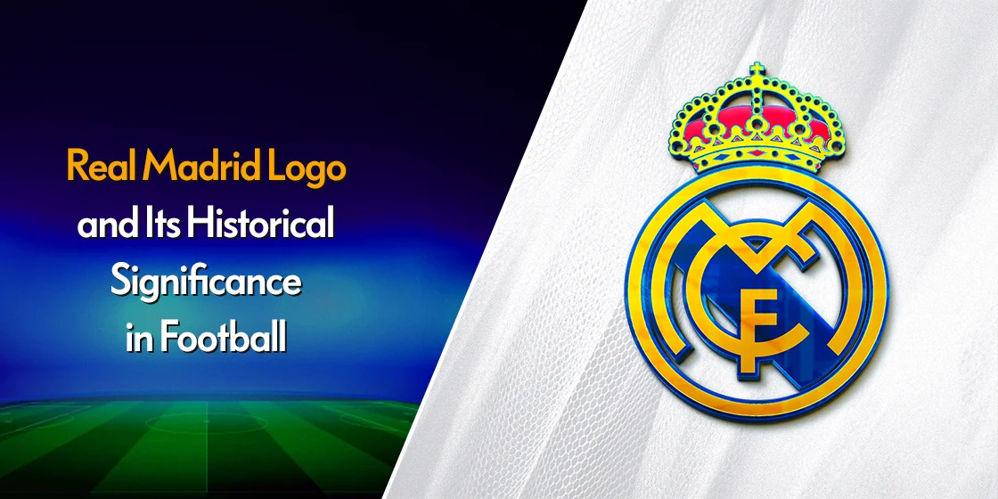
Real Madrid C.F., a renowned Spanish football club, boasts a rich history that dates back to 1902. The club’s iconic logo, featuring a white crown on a blue field with the letters “RMF,” has become a symbol of its success, prestige, and royal heritage. Over the years, the Real Madrid logo has undergone several transformations, reflecting the club’s evolution and its changing identity.
The Real Madrid logo is more than just a visual representation of the club; it’s a powerful symbol that evokes emotions, loyalty, and a sense of belonging among fans worldwide. The logo’s design elements, such as the crown and the club’s initials, hold significant historical and cultural significance.
Join us as we explore the history of Real Madrid’s logo, tracing its evolution from its early days to its current form. We will examine the key elements of each version and understand the symbolism behind the various iterations, gaining insights into the club’s rich history, and discovering how its logo design agency created its enduring legacy.
Let’s begin.
A Brief History of Real Madrid, From Its Inception to Its Current Iteration
Real Madrid was founded in 1902 as Madrid Football Club. The club’s name was changed to Real Madrid Club de Fútbol in 1920 after being granted the title “Real” (Royal) by King Alfonso XIII. This royal patronage elevated the club’s status and solidified its connection to the Spanish monarchy.
Throughout its history, Real Madrid has achieved numerous domestic and international titles, including a record 14 UEFA Champions League titles. The club’s success on the field has been matched by its iconic logo, which has evolved over time while maintaining its core elements, similar to the British Manchester United logo.
Detailed Look at the Real Madrid Logo History and the Designs It Sported Over the Years
For brands as old as Real Madrid, we often see many different types of logos and designs sported over the years. That evolution depicts the transformation of the brand with the changing aesthetics of the business, as well as it fans.
So, let’s take a look at the Real Madrid logo history, and discover the secrets of its various logos over more than a century of representing the Spanish football club.
The Early Years of Real Madrid Logo (1902-1908)
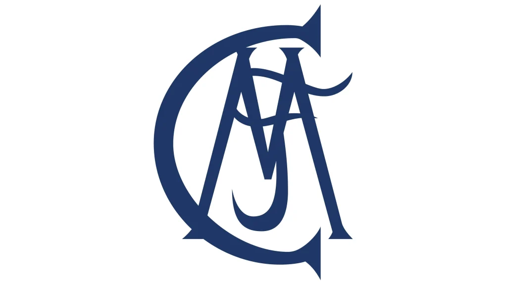
In the early years, Real Madrid’s logo was relatively simple, often featuring the club’s name in stylized script-based logo fonts. This early logo reflected the club’s humble beginnings and its focus on local community involvement.
However, as Real Madrid began to achieve success on the national and international stage, the club felt the need for a more distinctive and memorable logo. In 1920, the club adopted a new logo featuring a white crown on a blue field. The crown symbolized the club’s royal patronage, while the blue field represented the Spanish flag.
The First Iteration of the Real Madrid Symbol Featuring its Modern Form (1908-1920)
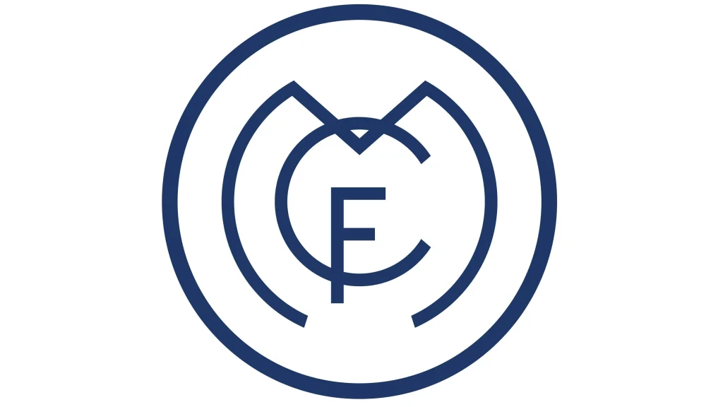
In 1908, the club adopted a more formal logo, featuring the club’s initials “RMF” in a stylized font. This logo marked a significant step in the club’s branding and identity. The “RMF” initials were often presented in a circular or oval shape similar to many wordmark-based monogram logos, symbolizing unity and completeness.
This logo was a significant departure from the previous design, as it introduced a more sophisticated and recognizable visual identity for the club.
The Introduction of the First Crowned Real Madrid Logo (1920-1931)
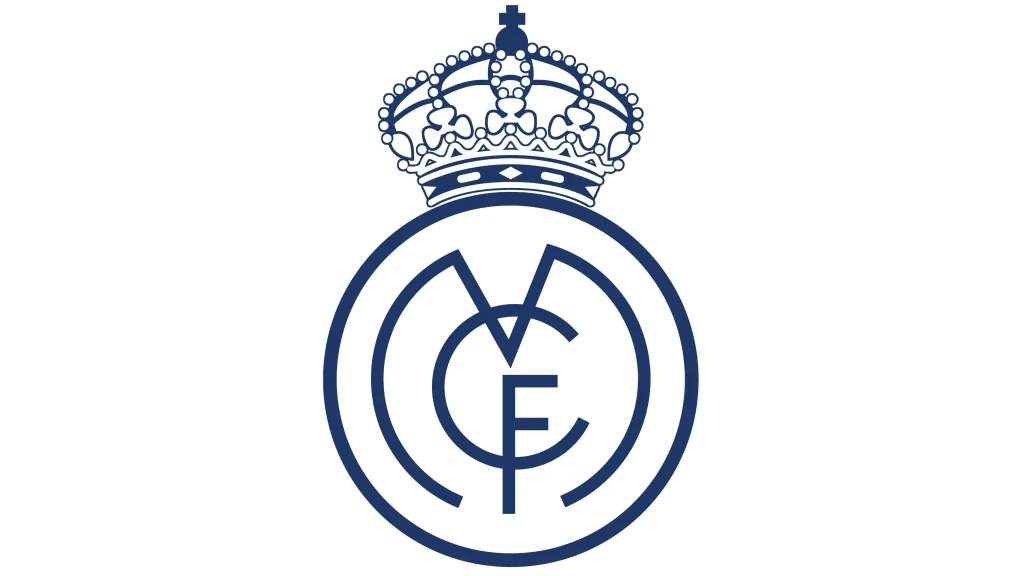
In 1908, a significant milestone occurred when the club was granted the title “Real” (Royal) by King Alfonso XIII. To reflect this royal patronage, the club’s logo was updated in 1920 to include a crown above the initials “RMF.”
The addition of the crown to the brand’s logo symbols elevated the club’s status and symbolized its connection to the Spanish monarchy. This logo marked the beginning of a new era for Real Madrid, as it transitioned from a local club to a national institution.
A Return to the Simpler Real Madrid Logo Design (1931-1941)
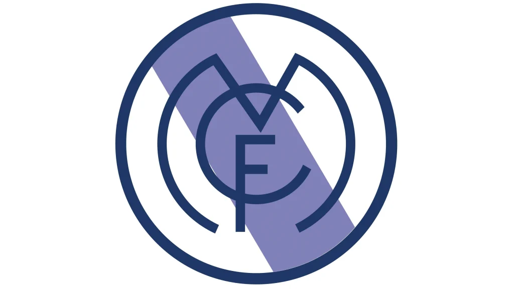
During the Spanish Civil War and its aftermath, Real Madrid experienced a period of instability. The club’s logo was simplified to reflect the challenging times. The crown was removed, and the “RMF” initials were presented in a more straightforward font.
This minimalist logo design focused on the essential elements of the club’s identity.
Bringing Back the Longest Running Regal Crowned Real Madrid Logo (1941-1997)
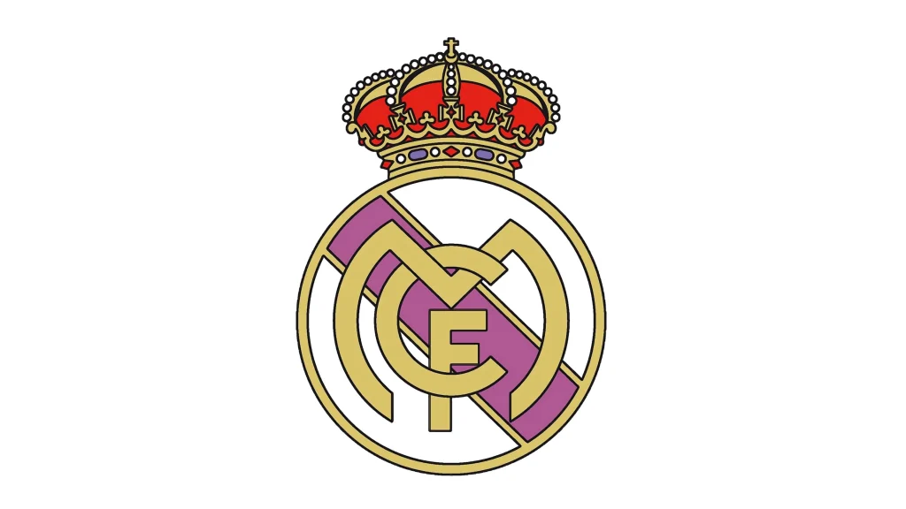
In 1941, Real Madrid reintroduced the crown to its logo, symbolizing its royal patronage and its status as one of Spain’s most prestigious clubs. This version of the logo remained largely unchanged for over five decades, becoming one of the most recognizable symbols in world football.
The crown, with its intricate details and regal appearance, conveyed the club’s prestige and its connection to the Spanish monarchy.
The Introduction of the Iconic Blue to the Real Madrid Symbol (1997-2001)
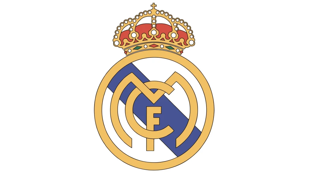
In 1997, Real Madrid unveiled a new logo that was more modern and dynamic. The crown was redesigned, and the letters “RMF” were given a bolder and more contemporary font. The new background in bright shades of blue color was introduced, symbolizing the Spanish flag and the club’s connection to its country.
This logo was a significant departure from the traditional design, reflecting the club’s desire to appeal to a younger generation of fans.
The Modern Iteration of the Famous Real Madrid Logo (2001-Today)
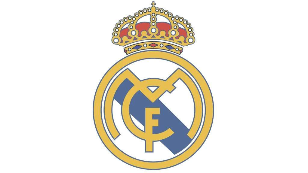
The current Real Madrid logo was introduced in 2001. This logo retains the iconic white crown on a blue field but features a more modern and streamlined design. The logo also includes the club’s initials, “RMF,” in a bold font.
The logo was further refined, with the crown becoming more prominent and the letters “RMF” being slightly adjusted. This version of the logo has remained largely unchanged to this day, symbolizing the club’s enduring legacy and its commitment to excellence.
The Symbolism of the Real Madrid Logo
The Real Madrid logo is a powerful symbol that represents the club’s values, history, and achievements. The white crown symbolizes the club’s royal patronage and its association with the Spanish monarchy. The blue field represents the Spanish flag, emphasizing the club’s national pride. The football at the center of the logo underscores the club’s commitment to excellence on the field.
The Real Madrid logo has become more than just a symbol of the club; it has become a cultural icon recognized around the world. The logo’s enduring appeal is a testament to the club’s rich history, its success on the field, and its ability to connect with fans on a deep emotional level.
FAQs
| Why does the Real Madrid logo have a crown? After being renamed Real Madrid from Madrid Futbol Club by King Alfonso the XIII, the crown was added to represent the royal term of endearment (Real) in the team’s name. |
| Why does the Real Madrid logo feature blue and yellow and its prominent colors? The blue represents the Spanish monarchy, one of the foremost supporters of the club before the Spanish revolution, while the yellow-gold represents their royal connotations. |
Conclusion
The Real Madrid logo is a powerful and iconic symbol that has played a significant role in the club’s success. The logo’s evolution reflects the club’s journey, from its humble beginnings to its status as one of the most globally recognized football brands.
The white crown, the blue field, and the football have become synonymous with Real Madrid, representing the club’s values, history, and achievements. The enduring appeal of Real Madrid’s logo is a testament to the club’s rich heritage and its ability to connect with fans on a deep emotional level.

Logopoppin
Logopoppin is a graphic design agency that specializes in logo designing, web development, video production and advanced branding services. We love to innovate businesses with new age technologies, allowing them to improve their visual reputation.


