
Table of Content
Discover Amazing Recycling Logo Ideas to Inspire Your Own Recycling Brand Symbol
Humans today produce a lot of waste, from simpler biodegradable food waste to toxic waste such as batteries, plastics, and more. And as more and more people are looking to become sustainable, there has been a sharp increase in the number of recycling companies operating around us.
Now, you may have seen these recycling logos all around you, from your simple and generic designs to highly memorable logos that are easy to remember and recall. And at a cursory glance, there is very minor difference between the two types.
So, the question is, what defines the good recycling logo ideas? What are the factors that dictate whether a recycling logo will be good? And how can we incorporate that within our own designs? Let’s dive in and discover the idea behind the creation of various recycling logo designs, and take a look at some real-life examples from expert logo design services, to identify the secrets to their success.
Elements That Give Recycling Logos Their Trademark Sustainable Edge
Let’s start with discussing some of the most common elements that denote whether a logo is depicting the concept of recycling or sustainability. Many elements are used by logo designers to enhance the visual impact of a brand logo. However, a few of those elements can also be used to add meaning and conceptual depth to a design, thus increasing its impact.
In the field of recycling and sustainability, some elements are used quite commonly, in order to achieve that feel. For example, there is extensive use of color theory, as evidenced by the common use of colors like blue and green, to give an aura of sustainability.
Green is considered the color of nature, and a clear, bright blue of the logo complements it perfectly. This is a great combo if you want to create a logo for your recycling or waste management company, like in the logo above. Similarly, another common symbol used in these recycling logos is the recycling symbol itself.
Some of them use the typical, triangular-shaped recycling symbol and incorporate it within their designs. Others modify it to suit the aesthetic of their logo, with a circular-shaped recycling symbol being the most common choice. In any case, no matter the symbology you add to your logo, the result should look like it belongs on the list of good recycling company logos.
7 Highly Successful Recycling Logo Ideas That Will Surely Give You the Desired Inspiration
Now that you know the common elements that go into making your logo’s visuals, let’s take a look at some real-life examples of recycling logos and see how they established themselves. Most recycling company logos you will see around you will be very generic, due to the fact that these businesses often have a monopoly in a localized region.
However, for specialty recycling services, your brand needs an impactful logo design that attracts and appeals to your target audience. The logos below represent such specialty companies, and will be quite useful in inspiring you to create an amazing recycling business logo yourself.
Let’s begin.
Savers – Value Village
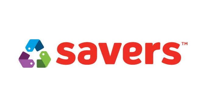
The first recycling company on our list is called Savers Value Village Inc. Headquartered in Washington USA, it is a for-profit thrift store that offers a variety of secondhand merchandise, from clothing, to bedding, and even appliances and gadgets.
With stores located in the USA, Canada, and Australia, the company reduces waste by buying donated goods from local charities and non-profits in bulk, regardless of how much of that is sales worthy. Once done, their staff goes through it to separate out the items that can be resold, and then recycles the rest. Moreover, the company also hold regular checks to identify items that haven’t been sold for a period of time, and recycle them to make way for new merchandise.
While technically not a recycling business in the strictest sense of the word, the company does aim for sustainability by reducing the amount of human-made waste produced annually.
Radius Recycling

Radius Recycling is a well-established American brand that manufactures steel and recycles scrap metal. Inaugurated in 1906, it was previously known as Schnitzer Steel, and it was just in 2023 that the company changed its name to signal a shift a in the organization’s vision.
Over the years, the company has been involved in various forms of recycling. They’ve owned and operated a chain of vehicle scrap yards called Pick-and-Pull, GreenLeaf Auto Recycler, and metal recycling businesses Regional Recycling and Advanced Recycling.
Their logo has featured the element of recycling for a long time. As part of their Schnitzer Steel brand, their logo featured a green recycling symbol displayed prominently in the logo’s design. As for their logo’s design for Radius Recycling, the stylized letter “R” added as a symbol to their logo can also be taken as a circular arrow, a well-known depiction of recycling.
Rubicon Technologies
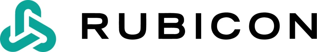
This next one may seem like an anomaly on this list, but bear with us. Rubicon Technologies is a software company that creates custom solutions for waste management, recycling, and even smart city management. The company has a mission to help others reduce waste by providing digital solutions to help businesses identify potential waste reduction opportunities.
When it comes to the company’s logo, the design is made in the style of the triangular recycling logo. While the connection may not seem obvious to someone who doesn’t know about Rubicon’s specialty, the symbol is highly effective in making the brand memorable.
Renewi

Renewi is one of the top European brands that deals with waste management and recycling. Primarily operating in the Benelux region (Belgium, Netherlands, and Luxembourg), the company has been in this business since 1988, when they bought a bought a landfill in north London. And since the mid-1990s, the company sold all other sections of business to focus solely on waste management.
Today, the company deals with waste management, food waste decomposition, composting, industrial cleaning, sorting for recyclables, soil cleaning, and refuse-derived fuel production. The design of the logo is one that represents the idea of the company’s industry perfectly.
First, the design uses one of the color combinations we mentioned earlier; blue and green. Moreover, the word “new” in the name has arrows curving out of both ends of the words, forming a circular design depicting the recycling symbol. Overall, the design is one that perfectly displays the industry of the company.
Bingo Industries
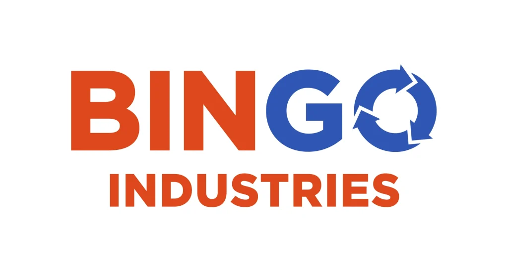
Bingo Industries is a famous Australian recycling and waste management company that grew from a small business to a large, nationwide setup in less than two decades. The patriarch of the Tartak family, Tony Tartak, formed the company in 2005, when he bought a small waste collection company that operated a skip bin setup.
Interestingly, the logo for the company has always incorporated the circular recycle symbol, which perfectly portrayed the business that the company was in at that time. Moreover, the change in color between the letters “GO” and the rest of the logo is quite prominent, without being too on the nose. Except for this change and the addition of the recycling logo symbols, the logo design is quite plain and to the point, making for an effective brand logo.
GFL – Green for Life
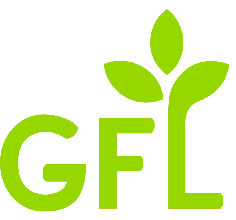
GFL Environmental, also known as Green for Life, is a waste management company that is situated out of Toronto Canada, and operates across the entirety of the country. Founded in 2007, the company deals in industrial, municipal, residential, and commercial consumers, doing so by dealing with various small waste management companies across the country.
With a vision to make waste management more sustainable, the logo of the company is a colored green, and uses the initials of the company as its lettermark. Moreover, to put across its message of sustainability, the logo also adds a trio of leaves to the top of the letter “L”, depicting a growing plant. This way, the company is able to portray its industry of recycling and waste management successfully.
PureCycle
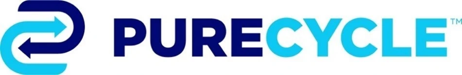
The company PureCycle is a recycling company that deals with purifying plastic waste, specifically polypropylene (PP) plastic for reuse. The vision of the company is to reduce plastic waste that ends up in landfills and the ocean, by sorting, shredding, cleaning, depigmenting, and pelleting PP plastic found in our waste.
With a focus on sustainability with the help of cutting edge science, the logo for the company is done in a color palette featuring two shades of blue. The wordmark is written in bold, heavy sans-serif typeface, while the accompanying symbol depicts an abstract form of the recycling symbol found in many of the recycling logos on this list. Overall, it’s a good design for companies that are dealing with specific materials or niches.
Conclusion
To sum it up, you will be able to find many recycling logos on the internet, considering that these companies are a dime a dozen. However, if you want to know how to design a logo that would be in contention with the best logo designs in the recycling industry, then this article is a great place to get inspired.
Logopoppin
Logopoppin is a graphic design agency that specializes in logo designing, web development, video production and advanced branding services. We love to innovate businesses with new age technologies, allowing them to improve their visual reputation.
