

Table of Content
Discover the Best Restaurant Logo Ideas and Discover How to Create One for Yourself
The restaurant business is a visual industry, where attractive designs are a necessity if you want to survive and succeed. Flavors and aromas of the food you serve may be important factors, but if your business venues, restaurant logos, or the dishes do not look great, chances are you will lose potential consumers.
When it comes to the food and restaurant industry, there is a wide variety in the types of logos used by the businesses. From simple wordmarks to complex brand symbols, you will be able to find the perfect logo for your niche to help inspire your own brand icon.
What Separates the Good Restaurant Logos from the Average and Mediocre?
Frankly, the restaurant business is highly competitive, and extremely crowded. For each type of cuisine, there are a number of eateries catering to that need, and a large percentage of them will be good too. That is why, catchy restaurant slogans and logos are needed to draw consumers to your establishment.
The best restaurant logos are easy to identify and associate with the eatery, and helps draw in new consumers. Moreover, it is a great medium to showcase your creativity and versatility, which is a highly important factor that people look for in restaurants today.
Depending on your target clientele as well as your cuisine type, the best restaurant logo ideas can change drastically. For a relaxed and laid-back kind of pub or café, an illustrated logo with a mascot accompanying the eatery name would be perfect. But for a more sophisticated, fine-dining establishment, a simple yet elegant wordmark might be exactly what is needed.
In order for a restaurant logo to be considered good, it needs to be able to portray the brand and its aesthetics perfectly. Moreover, it should be easy to remember, as well as resonate with your target audience. For example, a restaurant that offers a multi-course fine-dining menu with great wine pairings is targeted towards a more mature crowd, not teenagers or those looking for some casual dining.
The logo for such an establishment should portray the same, if it wants to be considered effective. That is why many of the popular restaurants have hired expert logo design services to redesign their symbol from time to time.
Tex-Mex and Mexican Restaurant Logos
Mexican cuisine is one of the most popular offerings in the United States. However, true Mexican cuisine is often confused with the more common Tex-Mex. This is a mix of classic Mexican tastes and recipes, mixed with the traditional Texan tastes and ingredients. One of the most popular culinary inventions to come out of this union of tastes are the hard shell tacos, as well as flour tortillas in general, whereas Mexican cuisine uses corn tortillas generally.
With that in mid, let’s discover the top Tex-Mex and Mexican restaurant logos in the US today.
Let’s discover the popular Tex-Mex and Mexican restaurant logos.
Chipotle
Chipotle Mexican Grill, simple known as Chipotle, is a US-based chain of fast and casual Mexican dining. The chain also has franchises in the UK, France, Canada, and Germany. Their signature dishes include their tacos and mission burritos, assembled fresh in front of each customer, and known for their great flavoring customization.
Their logo features a single chipotle pepper, which is a smoked and dried jalapeño common in the classic Nahuatl cuisine, which is the precursor to the modern Mexican cooking. The name of the brand encircles the name in white over a burnt red background, giving an overall vibe of subtle spiciness to the restaurant logo.
Taco Bell

Taco Bell is hands down the most popular option when you are looking for cheap yet flavorful Tex-Mex cuisine. Their popular dishes include tacos, burritos, quesadillas, nachos, and more. Over the years, the restaurant has been known to provide value for money with their reasonably priced dishes, as well as a number of amazing restaurant marketing ideas by collaborating with the NFL.
Their restaurant logo features a simple white bell over a medium purple background. The design uses a simple color combination, which is accented using black. The wordmark uses a blocky, sans serif font which uses a traditional shape and style.
Baja Fresh
Baja Fresh is an American chain restaurant known for its fast-casual Tex Mex cuisine. They focus their branding on using the freshest ingredients, as well as allowing customers to choose from their self-serve salsa bars.
One of the more recognized restaurant logos in the United States, the Baja Fresh logo design features a badge like hexagon colored green, containing the company wordmark, over which is an image of a hard shell taco. Overall, it has a subtle but effective logo design.
El Pollo Loco
El Pollo Loco (The Crazy Chicken) is a chain of American restaurants that specializes in Mexican-style grilled chicken entrees. Their unique selling point is their “citrus-marinated and fire-grilled” chicken dishes that they portray as the healthier and tastier alternatives to popular fried chicken restaurants such as KFC or Popeye’s.
Their logo is a simple wordmark, written in a loopy handwritten script. Using red-on-yellow color combinations for their design, they ensure that their logo is highly visible, easy to recognize at a variety of sizes, and most importantly, is memorable.
Del Taco
Del Taco offers a twist on Mexican cuisine, by offering classical American foods like burgers, fried, shakes, and more, but with zingy Mexican flavors. Although quite popular, with over 500 stores located over the US, the company is often overshadowed by brands like Chipotle or Taco Bell.
The logo for Del Taco consists of a wordmark of the company name, behind which are logo elements that portray the sun peeking from behind a pair of roofs. It is one of the more colorful restaurant logos on this list, and one that is simultaneously generic and effective.
Fast Food Restaurant Logos
Fast food is one of the most commonly bought food items in the country. On average, fast food places are able to serve far more customers than other eateries, due to their ready-to-go dining concept. Let’s take a look at some of the most popular fast food restaurant logos in the country.
McDonald’s
McDonald’s is arguably one of the most popular fast food restaurants across the globe. With a presence in nearly every geographical region in the world, McDonald’s is known for a variety of options such their cheeseburgers, the Big Mac, as well as their regional items like the peach and mango pie.
Their restaurant logo consists of a simple golden double arches, which are joined together in a shape that resembles the eatery’s initials. The color palette they use is an iconic red, white and yellow, which has been used since the early days of its inception.
Kentucky Fried Chicken
KFC, or Kentucky Fried Chicken is a well-known fried chicken place in the US. For most of the country, it is the place to go to when you want a nice, crispy, and juicy piece of fried chicken with all the fixings. Besides fried chicken items, they offer a variety of sides such as steamed corn-on-the-cob, mashed potatoes, biscuits, and gravy.
Their logo features the image of the company’s mascot, the eponymous Colonel Sanders who was the original owner of the KFC brand. Their color scheme is red and white, a combination which is quite popular with many fast food chains like Wendy’s and McDonald’s. Overall this is one of the most iconic of restaurant logos in the United States.
Bojangles
Ask any southerner what their go-to place is for fried chicken with all the fixings, and they will say Bojangles. According to its fans, Bojangles is the essence of true southern-style fried chicken, something that many other fried chicken and fast food places lack.
Their logo is a wordmark of their name in rounded letters with a cartoonish, script-like font. The color of the logo bright red, making it one of the many red restaurant logos on this list. The letter J has a star on top of it, and thus this example of red logos has established a strong following.
Sonic
Sonic is the only pure Drive-in fast food restaurant chain in the United States. Its unique selling point is its carhops, who move around on skates to cater to a variety of consumers. Its popular menu consists of a variety of burgers, fries, and shakes. Besides that, you can order onion rings, corn dogs, chili dogs, and even breakfast sandwiches.
Their restaurant logo consists of a pair of blue arrows pointed towards each other and overlapped, with the wordmark of the restaurant in san-serif red font, in all uppercase letters. The color scheme is a simple blue and red color combination, which adds a cheerful element to the design.
Wendy’s
Wendy’s is an iconic US fast food brand, which has become famous for its square burger patties, as well as the eponymous frosty, a thickened milkshake/soft serve ice cream people can use to dip their fries in. they claim that they are the only chain which uses fresh, never frozen beef to make its burgers.
The restaurant logo for Wendy’s is the image of a red-haired girl in pigtails, which is drawn to resemble the original owner Dave Thomas’s daughter. The girl inspired the restaurant name and logo, which has now become one of the most famous fast food icons in the entire United States.
Raising Cane’s
Raising Cane’s is a newer, specialty fried chicken restaurant that is known for its tasty, breaded and fried chicken fingers. A newer entrant compared to its counterparts on this list, the restaurant chain has quickly gained a following for its great taste and innovative USP.
The logo originally featured a Golden Retriever dog in its logo, which represented the dog Cane owned by the company’s founder. However, once the restaurant chain expanded to countries in the Gulf, it removed that imagery from its logo design due to local cultural practices.
The current logo features a well-designed wordmark, with a decidedly vintage vibe to it. Colored red, the logo’s wordmark uses yellow and white for its letters, making the design stand out well.
Wingstop
Wingstop is one of the top restaurant logos in the United States that is associated with delicious chicken wings. Its most popular competitor is Buffalo Wild West, which in itself is a great restaurant. Wingstop has long used the imagery of vintage aviator badges to inspire its own design.
Colored a dark green, even the design today looks like an aviator’s symbol at first glance, and the restaurant itself has a complementary vibe to this logo. Overall, one of the more unorthodox restaurant logos on this list.
Five Guys
Five Guys is an American chain of fast food restaurants that specializes hamburgers, hotdogs, and fries. Known for their kosher-friendly menu, as well as the availability of on-site snacks like roasted in-shell peanuts for consumers makes them stand out in a saturated market.
Their symbol is one of the simplest restaurant logo designs we have on this list, consisting of a simple wordmark with no logo symbols included in the design. Although unorthodox for the fast food industry, there is no denying that the logo is a success.
White Castle
White Castle is a regional chain of fast food restaurants in the United States, with a strong presence in the New York area and the Midwest. Known as the first fast food hamburger restaurant in the world, the restaurant specializes in small, square burgers called sliders.
The design for this restaurant logo makes it one of the best restaurant logos on this lis. It depicts a heavily fortified castle colored white, with the name of the restaurant in large, blue vintage fonts in the style of medieval typography superimposed over that image. Overall, this is a great logo design, perfect for a restaurant as influential as White Castle.
Italian Restaurant Logos
Italian cuisine is one that many people believe they are familiar with. However, what they believe to be Italian might actually be a fusion created by later generations of Italian-Americans. True Italian cuisine has a lot of variety when it comes to the tastes and styles of cooking.
Let’s discover some of the best restaurant logos in the country serving italian-inspired cuisine..
Olive Garden
Who doesn’t know Olive Garden? It is one of the most famous chain restaurants in the US, and is famed for a lot of their items, especially their endless options. Their breadsticks are one of their most popular items, and people come from far and wide to eat the family-style Italian cooking.
Incidentally, the restaurant chain is owned and operated by a Tokyo-based firm. Their logo features a classic wordmark in dark gray, which spells the name in a script-like typeface. The wordmark has a green olive branch above it, representing the theme of the restaurant’s name.
Al Di Lá
It opened in 1998 by Chef Anna Klinger and her husband in the now famous Park Slope on Fifth Avenue in Brooklyn. The venetian style restaurant began at a time when many New Yorkers were not interested in Brooklyn as a high-end food place, yet the eatery soon made itself one of the best in the entire area.
Their logo is a simple wordmark spelling out the name is a script-like font. The letters are all in lowercase, and the color scheme is a simple black on red. The theme of the restaurant is Italian food in a posh way, and the simple logo represents that perfectly.
Carbone
Carbone is famous for its special pasta dishes. They are known for upscaling classic Italian dishes in a way that not only enhances the flavor profile, but the visuals as well. Some of their popular dishes include linguine vongole, tortellini al ragu, their spicy vodka rigatoni.
Their logo is a simple wordmark, which spells out the name of the restaurant in blocky, uppercase letters. The font is a simple sans serif typeface, which makes it easy to read, and simple to display. Most of these high-end restaurants tend to use simple wordmarks emphasizing their name.
Flour + Water
This California eatery opened its doors in 2009, and has quickly made a name for itself in the years since. The restaurant is known for creating home-style pizzas and pastas using local, Californian ingredients. The taste and style of Italy, with the flavors of Californian ingredients.
Their logo is a simple wordmark, which uses a thin white font in lowercase. The result is a unique and contemporary look which stands out quite well among the competitors. The color theme used is a simple, dirty white over a dark background, giving the logo a rustic look.
Buca Di Beppo
Buca di Beppo is a restaurant chain that specializes in Italian-American cuisine. Known for its traditional vibe, the restaurant are often decorated with vintage photographs clustered closely together on the walls.
The logo is designed to mimic the old style of large, halogen-lit restaurant signage ideas of the past decades that was often used by restaurants and other establishments to signal the position of their businesses. A great nod to the history of the brand; this is one of the unique logos for restaurants on this list.
Amato’s
Amato’s is a chain of sandwich shops that specializes in Italian-American style of sandwiches, pizza, pasta, and more that is quite popular in many metropolitan cities in the United States. Paying homage to their homeland, the owner decided on a logo that would signify the italian connection.
The logo uses a large, red tomato that looks similar to beefsteak tomatoes, with the name of the restaurant on it. Overall, the logo is simple, yet effective in conveying its message.
Famous Restaurant Logos
Some restaurants are not just well-known in their localities; they are known across state lines as well. While many fast food chains can be included in this list, there are a few that have people flocking to them from far and wide. This incidentally also requires them to come up with amazing restaurant website design ideas to cater to that clientele.
Let’s take a look at some of the most famous restaurant logos.
Benihana
Benihana is a famous hibachi-style restaurant known for its iconic and showy cooking style. The chefs cook the food directly in front of the customers. And that element of inclusion and interaction is meant to enhance the spectacle as well as the overall experience of dining in their restaurant.
Their restaurant logo is a simple wordmark logo in blocky, sans serif masculine font with all uppercase letters spelling out the restaurant’s name. the top of the logo has a small image of a flower bouquet in a vase, and the bottom of the wordmark has the cuisine style of the eatery in simple letters. The color theme used to be red on white, but now the company often uses a neutral black version of that logo.
Katz’s Deli
Katz’s Deli has been a New York mainstay for decades now. The classic deli serves kosher-style food cooked the traditional way, and has people coming from far and wide to buy their famous roast beef sandwiches or their thick cut pastrami on rye. Generally, there are lines outside the door waiting for the store to open.
Their logo is a simple neon sign spelling out its name. Despite the simple 1950’s looks, the iconic brand symbol is easily recognizable due to its extremely simple design. the color theme used is a simple red neon light over a darker background.
Café Du Monde

Cafe Du Monde is a New-Orleans/French style eatery best known for its coffee and the heavenly beignets. And not only are these two the most popular items on the menu, the customers have been coming here for these items since 1862. Yes, it has been standing since the American Civil War.
Their restaurant logo is simple wordmark in the script-style, referencing the French heritage of this establishment. The cursive font is in a dark, chocolate brown color over a dark gold patterned background. This makes it one of those restaurant logos whose simple aesthetics pair perfectly with its history and style.
Outback Steakhouse
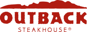
Outback steakhouse is arguably one of the most popular eateries serving meat dishes to the US public. The name and the aesthetic is based on the Australian outback, and their most iconic dis is the giant blooming onion, which is a whole onion that has been cut strategically, battered, and fried whole.
Their logo is a stylized wordmark of their name, with the background being the broken skyline of the Australian outback. The design as well as the dark red color scheme works quite well for a backdrop to this meat-lover’s heaven.
Arby’s
Arby’s is an American fast food sandwich restaurant chain, with over 3300 locations. Known for their roast beef sandwiches, the company uses one of the most artistic restaurant logos ideas for its brand symbol.
The wordmark stands central to the design, with a looping line over, and another beneath it. The result is a design that mimics the classic ten-gallon hat from the American West, signaling the brand’s American origins.
Nando’s
Nando’s is a South African chain of grilled chicken restaurants with locations all over the world. Their style of food is meant to be Portuguese, with their restaurant logo using one of Portugal’s most popular symbols.
The chicken portrayed in the logo is called the Rooster of Barcelos, with the accompanying wordmark completing the logo perfectly. The result is one of the most iconic restaurant logos in the world when people think of spicy grilled chicken.
Burger King
Burger King is an American fast food chain known for its hamburgers and related items. Often being considered a rival to McDonald’s, the company focuses on standing out by offering a unique selling point, which is its “flame-grilled” burger patties.
The logo is quite simple, featuring the classic hamburger bun where, instead of containing the patty and other accoutrements, it features the company wordmark. Although it looks like a design that would come out of your run-of-the-mill AI logo generator, there is no denying that the result is one of the most famous restaurant logos in the world.
Dairy Queen
Dairy Queen is a multinational chain of fast food restaurants with its origins in the US. Besides its hot food items, the restaurant is best known for its frozen delights such as soft-serves, frozen yogurt, blizzards, and more.
The logo of the brand is a simple abstract design that looks like the shape of a eye, where instead of the pupil is the company’s initials. Moreover, the top and bottom of the design have two complementary strokes that make it look like the eyelids. Overall, the design, while nothing special, is quite effective at representing the brand.
How to Create Your Own Restaurant Logo Designs?
There are a number of ways you can create your own amazing restaurant logos. Once you know the details needed to create a brand symbol, the next step is to choose the design method.
The first option you may think of would be to use an online logo maker tool like the Wix logo maker. These AI-based tools are able to create a design by combining in-built illustrations to create a new design. However, as these tools combine stock illustrations to create a new design, they are not as unique as you might hope for, and you may end up with a generic design.
The next option is to hire a professional logo designer. These industry experts will create your restaurant logo from scratch, and will deliver a unique design for your eatery. And while they can be a bit more expensive than your AI tool, you can rest assured that the logo they create would be unique and effective.
Frequently Asked Questions
| Why are there many red restaurant logos? The color red is used in many restaurants’ logos, and is most popular with fast food places. The concept is that the red color helps subliminally message that the eatery is a fast-paced and energetic establishment, rather a calm dining experience. |
| How can I come up with amazing restaurant logo ideas for my eatery business? You can hire a professional logo designer if you have the budget and want a truly unique design. However, if that is not the case, the online logo maker tools are a great option as well. |
| What restaurant logo contains a star? Carl’s Jr. or Hardees has a star within their restaurant logo. |
Conclusion
Now that you know what makes these restaurant logos so great, you are now get started on learning how to design a logo for your eatery.
Want to hire a professional logo design agency to create a logo for your restaurant? Logo Poppin’s expert designers will create a unique and attractive brand symbol which will perfectly embody your brand’s aesthetics.
Latest news you want to know!
Subscribe for cutting-edge design inspiration at Logo Poppin! Elevate your brand with updates on logos, branding, web design, and video animation.
Note that by clicking “subscribe,” users may agree to our privacy policy and consent to Logo Poppin to use your contact data for newsletter purposes.
Logopoppin
Logopoppin is a graphic design agency that specializes in logo designing, web development, video production and advanced branding services. We love to innovate businesses with new age technologies, allowing them to improve their visual reputation.

