
Table of Content
Get Inspired by The Top Retail Store Logos and Discover How to Make One Yourself
Retail stores are popular business model for many people, from groceries to clothing, and more. And with so many of these businesses offering their services to a number of industries, having the right retail logos is a necessity.
An appealing logo that represents your brand perfectly is a great asset to have, as well as a necessary one. A good logo does a lot more than to attract new consumers. It serves as a visual means of ensuring that consumers associate your brand with a relevant image, making your business and its logo easy to remember.
This factor is one of the biggest reasons businesses hire professional logo design services to create their logo, thus making it memorable. Let’s look at some great examples of timeless retail store logos, and see what is it about them that makes them so impressive.
Why Are Logos Important for a Business?
Humans are highly visual creatures. We often base our perceptions and views on how we visually experience something. That is why logos as other visual branding materials are an intrinsic part of a business today, as without them these brands will have a hard time attracting people towards them.
Now, the question remains – why is a logo specifically important for business? Well, the answer to that is quite simple. Logos are the one piece of branding that a consumer is exposed to right at the start. The name of the company itself rarely has the same impact on a viewer, unless accompanied by a relevant logo to with it.
Take, for example, the instance of automobile manufacturer Mercedes-Benz. Reading, understanding, and recognizing the name of the brand will take a longer than viewing the three-point star logo that represents the company. And today, with the market so competitive, the quicker consumers are able to remember or recognize your brand, the better the chance you have of grabbing their attention.
Now businesses can opt for a variety of different types of logos, such as:
- Wordmark
- Lettermark
- Mascot
- Combination
- Abstract
- Emblem
You can choose the style that suits your brand aesthetic the best, and create a unique and appealing logo for your retail business.
Retail Logos That Inspire Creativity in Design
Among the many retail logos you’ll find across the world, you will find designs with highly varying complexities, ranging from the quite basic to the intricate and abstract. If you’re looking for inspiration, this wide range in design complexity can be quite confusing.
That is why, we have compiled a list of the nine most popular retail store logos that have become mainstays in our lives despite sporting simple designs. Let’s take a look.
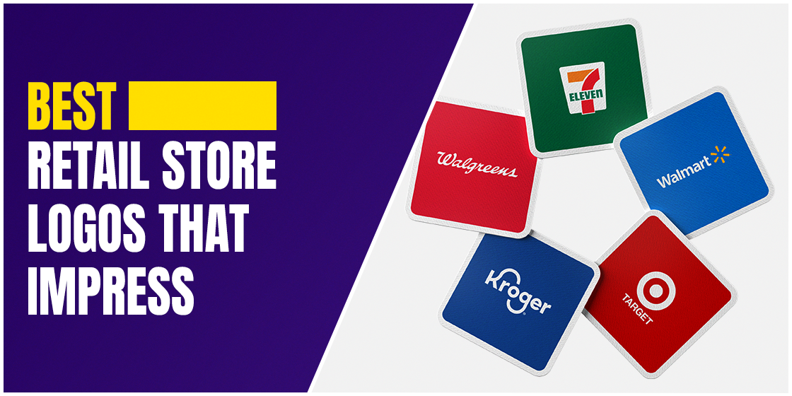
Eleven
7-Eleven is arguably one of the most popular retail store in the world, selling everything from hot and cold food and drinks, snacks, and even gas. The ones in Japan are known to have a far larger inventory of items available, making it the go-to convenience store for many people around the world.
Here the company opted for a combination logo, with a little abstract element thrown in. The color scheme used in this square logo are bright and easy to see, which allows for quick recognition and comprehension for the consumers.
Kroger
Kroger is one of USA’s largest retail department store chains, and has been in business since the late 1800s. also known as the Kroger Company, they own and operate a number of department stores and malls across the US, as either Kroger or as one of their subsidiaries.
Their logo is a wordmark, and a relatively simple one at that. While they have tweaked the look of the logo fonts through the years, the company has retained the general style of the logo, especially the long curving arms of the letters K and g. This has helped them retain a familiar look while upgrading it for the newer generations.
Walgreens
Walgreens is a popular pharmacy retail chain, with branches spread across the wider continental US. It began its origin as a simple, small corner drugstore. But through the years it has grown to become the second-largest pharmacy chain in the country.
This pharma logo is another one of the wordmark retail logos. However, unlike Kroger’s logo, Walgreens uses a script-like type of font, which gives the logo a unique, handwritten aesthetic. Plus, the red logo in a white background makes it highly visible, thus making it easy to recognize.
Whole Foods
In recent years, eco-friendly and sustainable practices in agriculture and food cultivation have steadily been on the rise. Whole Foods is one of the most popular eco-grocery retail shops in the US. They offer a wide range of organic and natural food products, free of pesticides or artificial fertilizers.
Their logo is a combination logo, with greater emphasis on the wordmark part of the design. The simple wordmark of the company’s name, with a little stem and leaf atop the letter O in Whole, is a subtle nod to the company’s sustainable farming focus, which is further emphasized by the kale-green color palette.
Walmart
Inaugurated in 1962, Walmart is now a global retail chain of large supermarkets and discount outlets, who play host to a huge inventory of items. Since their beginning, their logos have sported the name of the company as a central element to their design. And even the current version has the wordmark more visible, especially with the addition of the yellow rays of sunshine to its right.
The bright blue and yellow color scheme is visually appealing. The change from using a heavy and blocky font to friendlier, rounded typeface makes the logo more approachable and friendlier. Overall, the simple design is bright, friendly, and welcoming to everyone who sees it.
Target
Target has one of the most unique retail logos ever. The design has remained the same throughout its life, more or same. The Target logo is reminiscent of an archery target, paying homage to the company’s name. Called the Bullseye, the logo is perfectly suited to the business name, making it easy to remember and even guess the brand itself by just looking at it.
The design uses a thick red dot surrounded by a heavy red circle. The color used is a dark red, which is also used for the company wordmark underneath it. Simple, expressive, and intuitive – all adjectives that can be used to describe the Target retail logo.
Lowe’s
Lowe’s is a chain of retail outlets that sell home improvement materials as well as various hardware store wares. As of today, the company has over two thousand outlets across the United States and Canada, and is one of the go-to places for people looking to tackle a renovation or home improvement project.
It is one of the most unique home improvement logo in list of retail logos. A combination mark, the background features the shape of a house colored blue, with a blocky white font spelling the name of the company across it. This design helps people remember Lowe’s quickly, by perfectly pairing the company’s purpose with its name.
CVS
CVS pharmacy is a subsidiary owned by the American health company, CVS Health. Founded in the early 1960, it was called the Consumer Value Store. Today, the company has almost eight thousand retail pharmacies across the US, as well as nearly a thousand walk-in clinics, and over sixty-five million pharmacy benefits members.
Their logo is a wordmark of the business’s name, which is bracketed to the right by a shape which can be considered a cross between a stylized heart, and a pointer. The small yet distinct design element is a great addition which adds emphasis to the overall logo. Plus, the highly visible red on white color palette is both easy to spot, and allows for greater memorability by standing out among the different pharma logos.
Barnes & Noble
Barnes and Noble is a famous printing house and online distributor of books. Established in the late 1800s, the company has more than 600 outlets across the country, and sells their books via their online platform to consumers across the world.
As a big publisher and distributor, the company has always had a minimalist, understated, yet elegant wordmark logo that exudes a sense of sophistication to those who look at it. Moreover, the design is one that would not look out of place on any genre of book they publish, whether fiction or otherwise.
How to Design Retail Store Logos?
Designing retail logos is all about capturing the attention of the target market by leveraging your USP and the consumer’s wants. Each industry niche follows some specific design requirements in order to create their retail store logos.
For example, a bakery or patisserie would have a logo with some elegant script-like font, as well as colors we associate with sweet items such as shades of pink, chocolate brown, and more. Similarly, when you decide to create your own logo, you need to first take a look at your target market, what interests them, and how are your successful competitors handling them.
Once you understand that, it will be easier to create a logo that perfectly captures what the consumers expect from it, and appeals to their sensibilities.
Clothing Store Logos
Retail logos for clothing stores vary vastly depending on their target consumers. High end boutiques logos often rely on elegant wordmarks, monochrome or soft color palettes, and a minimalist design. More consumer oriented clothing logos rely on a mix of seriousness such as simple, blocky fonts, but they usually balance that with a brighter color scheme.
Clothing stores targeted to kids tend to go for pictograph or mascot oriented logos, which are designed to be more suited to what attracts kids, rather than going for sophistication or elegance.
Creating an Online Store Logo
Online retail store logos usually are similar to the ones we see on brick-and-mortar stores. However, we often see that due to a different business model and mode of operation, these businesses often focus on creating emblem logos that are best suited for the digital platforms, rather than a physically printed medium.
Depending on the industry, the logo might take on different characteristics. However, one element would be constant – their logo would be perfectly suited to all manners of digital mediums, with relevant color schemes and distinct designs.
Follow Popular Yet Proven Logo Design Trends
One of the best ways to ensure that your retail store logo will be a success, is to incorporate proven design trends into its structure. For example, when minimalism started becoming popular, more and more consumers expected their brands to incorporate that concept into their logos. Similarly, brands today can use popular and modern design trends to make sure that their logo is a success.
Let’s look at some of the logo design practices that are in vogue nowadays.
- Gradient Logos
Logo designs use color gradients to give their art a sense of dynamism and intrigue are popular nowadays, which allows users to add depth to their logos without making the design too complicated or congested.
- Overlapped elements in logo design
Overlapping elements serves a couple of very simple purposes. First, it is often used to make the design flow continuously, making for an intriguing piece of art. Second, it allows for the design to add depth to it, without needing to add any unnecessary design elements to it.
- Metallic Color Palettes
Finally, for those who want to make their retail logos pop and use the concept of minimalism, using metallic shades for your color scheme adds mystery and sophistication to your logos. And usually with a monochrome color scheme, it incorporates these two elements successfully.
Tips to Create Amazing Retail Logos
Once you have figured out what it takes to make impactful retail store logos, you might be looking for help on how to design a logo that speaks to its consumers. To help you with that, listed below are some of the most important tips that will help you create awesome logos for retail businesses.
Don’t Underestimate the Effect of the Right Color Palette
Finding the right color combinations can make the difference between an average logo and a spectacular logo. Do not be afraid to add a little color to your logo, especially if it might benefit the impact it has on consumers.
Ensure That Your Design is Adaptable
Adaptability is design is crucial nowadays, as brands have to make sure that their logo is suitable for use on a variety of mediums. Nowadays, a company logo may be printed on digital mediums like websites as well as physical mediums like flyers and billboards. As such, the design needs to be suitable for print in different sizes as well as monochrome color palettes without losing its impact.
Do Not Be Afraid of Negative/White Space
Finally, with the drive for minimalism still going strong, retail logos can benefit from the addition of negative space into their design. When used well, the negative space or white space can end up boosting the logo’s clarity, making it easier to understand what it means to convey.
Frequently Asked Questions
| 1. Are retail store logos important? Yes, logos are important for all types of businesses, from retail to B2B and B2C as well as any other type of business. It allows for an appealing visual representation of your brand’s message, that can be portrayed to your consumers in a way that connects to their desires and needs. |
| 2. Where can I look for retail logo ideas? You can search for inspiration online as well as physically, by visiting your competition and asking consumers what is it about their logos that speaks to them. That way you will be able to come up with good logo ideas for your retail business. |
| 3. How can I quickly create good retailers’ logos? You can use an online logo maker tool to create a quick logo for your store. However, the best logos are ones that are specifically designed for your business, from scratch. So these online tools might not be able to offer you a logo that would have the same impact as one you might get from an experienced logo design professional. |
Conclusion
Creating impactful retail logos can be a daunting task, especially if you do not know what design trends and elements work well in your industry, However, if you follow the tips above, and take inspiration from the retail store logos who have made their designs a success, then you will be able to create a logo that would be perfectly suited to represent your retail brand.
If you want a professional logo design company to help you create a logo for your retail business, Logo Poppin can help you do so.
Latest news you want to know!
Subscribe for cutting-edge design inspiration at Logo Poppin! Elevate your brand with updates on logos, branding, web design, and video animation.
Note that by clicking “subscribe,” users may agree to our privacy policy and consent to Logo Poppin to use your contact data for newsletter purposes.
Logopoppin
Logopoppin is a graphic design agency that specializes in logo designing, web development, video production and advanced branding services. We love to innovate businesses with new age technologies, allowing them to improve their visual reputation.

