
Table Of Content
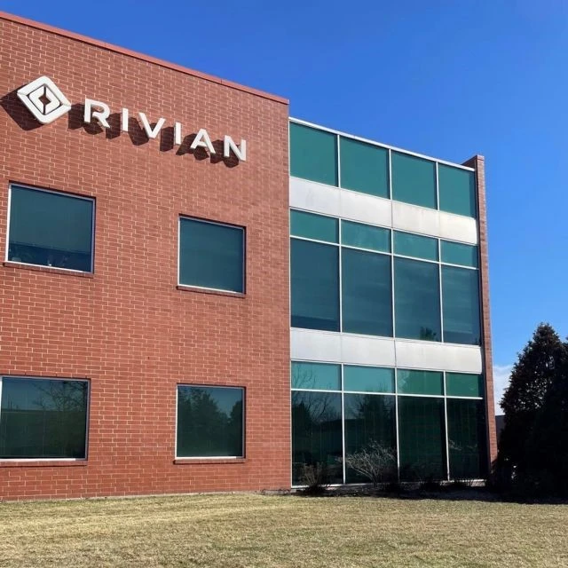
Discover the Rivian Logo History and how it Evolved As the Company Grew
Entering a competitive industry and making a name for yourself is never an easy task. And when your competition is a name directly associated with your industry, aka “ubering somewhere” becoming the colloquial term for using a cab or ride sharing service, success is nigh impossible.
Such was the case for little Rivian, a small automotive company looking to enter the electric-vehicle market and challenge the giant that is Tesla at its own game. Starting production in 2021, the company is slowly but surely making a name for itself, with the Rivian logo soon to be gracing the streets of Europe too.
So what was it about the Rivian brand and logo that made it a success? Let’s face it, the Tesla name is one that has big automotive names like GM on their toes in the electrical vehicle market. So why would a small, up-and-coming automotive brand choose to enter the industry, and play the character of David to Tesla’s Goliath?
Let’s take a look at the history of the brand and the eponymous Rivian emblem, and figure out how the company has managed such a successful start.
1- A Little Background of the Rivian Automotive Company
While its true that Rivian today is backed by corporate giants Amazon and Saudi Arabia Abdul Latif Jameel, and has a valuation in tens of billions of dollars, the company had beginnings that are more modest. But in order to understand its history, we need to take a look at Rivian’s founder, Robert Scargine, and his vision for a sustainable vehicle for the future.
Since high school, Robert had an interest in mechanical engineering, which stemmed from his love for cars and other automobiles. Graduating with a PhD from MIT’s Sloan Automotive Lab, Robert worked on creating a sustainable automotive company.
In all that time, he envisioned creating a car that was both sustainable, yet was a joy to drive. As an avid outdoorsmen, he understood that a vehicle that can keep up with you in the great outdoors should be both hardy and reliable. And if you take a look at the Rivian logo, you will see that their logo design services were top-tier at embedding subtle meaning into the design.
The compass-based arrows within the Rivian emblem are testament to the company and its founder’s vision. With the company entering the market years after Tesla established itself as a leading electric cars manufacturer, the Rivian logo needed to be unique and impactful enough for consumers to be interested in it. Therefore, the automobile logo they went with had a great impact in helping the brand establish a presence in such a competitive industry.
Let’s take a look at the formation of the Rivian automobile logo design and company, and see how they came to be.
The Inception of Rivian as a Car Brand, From Mainstream Motors & Avera Motors
In 2009, Scargine created his company. But it wasn’t known as Rivian at that time. He formed it as Mainstream Motors. However, the company soon rebranded as Avera Automotive. This was the first time that the company created an electric car logo, and announced their plans to develop and release a sustainable electric vehicle for the consumers.
However, the company changed its name to Rivian Automotive Incorporated in 2011. Now Scargine and the company started getting serious about the venture, and decided that they needed help and the equipment necessary to make their vision come true.
They decided that the company needed some R&D premises in order to speed up the development of their first car, thus paving the way towards Rivian becoming one of the top sustainable American car brands.
Rivian’s Expansion of R&D Facilities
In 2015, four years after the Rivian company came into being, the company opened two different research facilities, with one in Michigan and the other in the Bay Area. Before the initiation of these facilities, the company had a prototype designed, called the R1.
R1 was a mid-engine coupe with hybrid technology, which was completely electric. Peter Stevens, who was Scargine’s peer at Rivian at that time, designed the car. However, that idea was soon scrapped in favor of creating vehicles that were more suited to the wilderness and the great outdoors.
Rivian Automotive Company Starts Production
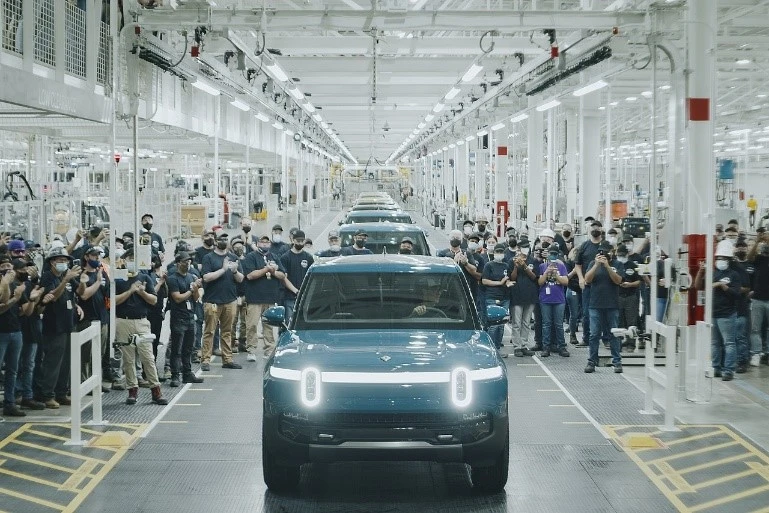
With research and development well on its way, Scargine decided that it was time to produce a few of their finished prototypes, and release them to the market. This resulted in the Rivian company logo being featured on Mitsubishi Motors production plant in Illinois.
The installation was purchased for $16 million in January 2017. And while it may seem like a huge amount, this strategy of buying a prebuilt factory had proven to be a great option, as evidenced by Tesla and NUUMI.
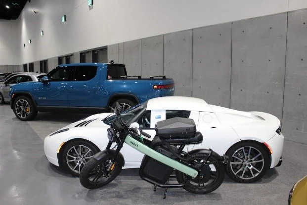
Now, with a production plant in hand, the company was ready to produce their first two options, and just in time for the LA Auto Show. The vehicles featured there paid homage to the company’s original prototype, the R1. The R1T pick-up truck and the R1S SUV were both completely electric, and had a design and features that made them an instant hit with the consumers.
2- The Evolution of the Rivian Brand Logo
Now that we have seen how the brand has evolved since its inception in 2009, let’s get down to the brass tacks and take a look at the evolution of the Rivian brand logo over the years. We know that the company put a lot of effort and thought into their automotive branding and design, which led to its success despite fierce competition from Tesla and economic setbacks in recent years.
So, let’s dive in and discover the visual journey of Rivian logo.
The First, and Only Rivian Logo
Well, to start with, we need to understand that as Rivian started full-scale production in 2018, that was also the first time that they released their logo to the masses. Since then, in a span of barely half a decade, the company hasn’t felt the need to change their iconography.
The complete electric car logo for the brand features the company’s symbol, along with the stylized wordmark of the brand’s name. Both elements of the design feature sharply contrasting colors, aka dark yellow and black, which somehow still retain a connection that uplifts the entire design.
The wordmark uses a medium weight font that uses a mix of angular and straight elements complemented with soft curves and rounded edges. Overall, the look of the logo is one of excellence and balance, which goes perfectly with the style of logo symbols used for the Rivian emblem.
The Logo Symbol from the Rivian Car Brand Logo
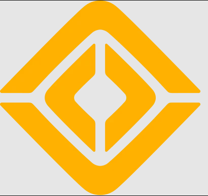
Now, let’s talk about the Rivian car logo design, specifically the symbol that represents the brand, and discover the concept behind it.
The compass, or more importantly the impact of the compass on the world at large inspired the design of the symbol. The car logo design features two pairs of opposing arrows, with the two outer arrows pointing up and down, and the two inner arrows pointing left and right.
The association with the compass is subtle, yet anyone who has used one before would instantly recognize it for what it is. The design uses a uniform thickness in its stroke, whether it’s for the inner arrows or the outer. The terminal edges of each arrow are somewhat sharply angled, while the points of the arrows are soft curves.
3- Demystifying & Understanding the Rivian Automotive Logo
We have seen the history of the Rivian automotive branding logo, and have seen how the company and its symbol has evolved since its inception. But there is a question regarding the design of the Rivian logo, and that is the design concept.
Companies and brands often choose the kind of symbology that suits their needs and the industry association. For example, a corporate law form wouldn’t use the imagery of clouds or bunnies for their logo. So why did Rivian go for that specific design? At a glance, the four-cornered design has nothing to do with Rivian or its logo.
Take, for example, the Tesla logo. the logo doesn’t just look like a stylized version of the letter T, but it also looks like the cross-section of an electrical motor. Now, as an electrical vehicle manufacturing company, that is a symbol that reflects the brand’s core function.
So what is it about this brand symbol that makes the Rivian logo for cars and trucks such a great option? Let’s find out.
Rivian Logo Design Concept
When we talk about the Rivian logo design concept, it has an interesting story about the vision of the company, as well as their goals as a sustainable automotive brand. While its generally rare for car logos to embody abstract imagery in their designs, this is a successful example of it.
According to the company, the compass was an invention that was way ahead of its time. Using this one relatively simple piece of technology, humans changed the course of this world’s history. From coming up with new ways of charting and navigating across the oceans and land, to discovering new worlds and people across the globe, the compass is still an important tool to have.
The ability and drive to have such an impact on the world is what Rivian aspires to have, and they decided to embody that feeling by incorporating the compass within their logo. The four-cornered symbol above isn’t just an abstract design.
It represents the four cardinal points of direction on Earth, with north and south depicted by the larger, outer arrows, and the smaller arrows inside representing east and west. While the concept may seem simple, the execution of the design and incorporating it with the wordmark so successfully makes this design concept a job well done.
Rivian Logo Font Type
The Rivian logo with a white background uses a custom typeface, which is reminiscent of many modern and futuristic fonts that we see designers use. The style of the typeface is simple and clean. The letters are written using a bold, geometric, and sans-serif typeface that helps the wordmark stand out.
The wordmark is written using all uppercase letters, which helps the logo become more prominent, considering that the logo rarely uses the wordmark along with the symbol. However, in case the wordmark is used, the brand can be sure that the wordmark will be able to have the intended impact on consumers.
Rivian Electric Car Logo Design Color Palette
From an innovative standpoint, the color combinations used by many automotive logos are usually quite bland. And there is a reason for it. Generally, a logo should be designed to attract the consumer to the brand it represents.
However, in the case of automobiles, there can be some issues. One of the major problems is that unlike a brand symbol which will have fewer colors and designs to interact with compared to an automotive logo design. A car logo needs to look good on all automobiles from the company, as well as not clash with the variety of colors those automobiles may be painted in. It is for that reason that many brands avoid adding too many colors to their logo color palettes, to reduce the chances of their brand symbol clashing with their product.
Conclusion
To conclude, the Rivian logo trademark is a unique brand symbol that is the perfect representation for brands that are looking to achieve lofty dreams and visions, and aren’t afraid to challenge anyone. It is rare that you find a logo this simple, yet so expressive and deep in its meaning as that representing Rivian.
So, if you too are looking to embody the essence of your business vision into a logo with a simple yet clear design, then what are you waiting for? Logo Poppin can help you do just that. Our expert designers are experienced in helping businesses grow through thoughtful and deep branding elements including brand logos.
Frequently Asked Questions
| What does the Rivian logo mean? The Rivian logo is designed to mimic the compass, with the four points representing the four cardinal points of the magnetic compass. |
| Is Rivian a Chinese car? No, Rivian is not a Chinese company. In fact, it is a pure American car brand, with production facilities in Illinois. |
| Is Rivian better than Tesla? Both Rivian and Tesla produce quality automobiles. And although Rivina has won the coveted J.D. Power award, the fact of the matter is that both companies produce vehicles for different market segments, and at vastly different price points. |
| Who is Rivian’s biggest competitor currently? With Tesla too big of a name in the automotive industry for Rivian to challenge directly, Rivian’s competitors include: – Lucid – NIO – XPeng – Oshkosh – Li Auto – PACCAR – Stellantis |
Latest news you want to know!
Subscribe for cutting-edge design inspiration at Logo Poppin! Elevate your brand with updates on logos, branding, web design, and video animation.
Note that by clicking “subscribe,” users may agree to our privacy policy and consent to Logo Poppin to use your contact data for newsletter purposes.
Logopoppin
Logopoppin is a graphic design agency that specializes in logo designing, web development, video production and advanced branding services. We love to innovate businesses with new age technologies, allowing them to improve their visual reputation.

