Table of Content
Why Designing a Logo is Important for a Band?
For a band to be recognized by the masses, it needs to have a brand identity. While the reason why someone might be interested in listening to your music is your music in itself, the marketing of your band assures that your talent and achievements are highlighted in the best way possible. One of the most essential and basic requirement for marketing is to have a brand. And the resources that help people identify it are part of your brand identity. This includes your musical style, stage presence, signature gear and all kinds of visual and auditory aspects of your band that make a band stand out from all the others. Among these is a band’s name and its logo, which has the ability to convey a band’s character and personality. Designing a logo could be daunting for some people, let aside designing a successful rock band logo, which is why they outsource these tasks to an expert artist or a logo design agency.
What Makes a Good Band Logo?
To come up with a good logo design the designer must first understand a client’s genre and style. For an artist must be fully aware of the band’s tone, and should be able reflect the band’s character through the logo. Moreover, it’s also important to keep it minimalistic and legible, especially because band’s want to have their logo printed on their merchandise.
Iconic Rock Band Logos from the 20th Century:
The second half of the 20th century has seen some of the most legendary bands that have left a significant footprint on the musical landscape. Although some of these bands are no longer active, or have disbanded altogether, the legacy of their music lives on, and is immortalized in their iconic and memorable logos. For the love of graphic designing and rock music, we have discussed the history and origin of these famous rock band logos and names, so keep reading and keep rocking!
Queen:
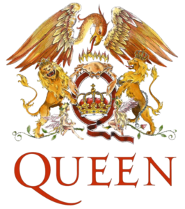
The most famous rock and roll band from Britain, Queen has one of the most memorable classic rock band logos that is quite reflective of the royal aura the band wished to exhibit. Its creator was none other than Freddie Mercury, the lead singer himself. He held a diploma in arts, something that is a lesser known fact about the brilliant rock and roll singer.
The design idea for the band’s logo stemmed from the different horoscope signs of each band member. It depicts 2 fairies for Freddie, who was a Virgo, two lions for Roger Taylor and John Deacon as both are Leo, and one crab for Dr. Brian May whose horoscope is Cancer. In the logo we can see the horoscopes of all the four Queen members holding on the royal crown. Behind them a fiery phoenix can be seen, spreading its wings across them, which is a mythical creature popularly known as a symbol of immortality.
The use of the phoenix hints at Freddie’s vision for the band. As he famously said in the 1986 Wembley Concert that the rumors of Queen’s disbandment were false, and that he’s sure that the band will stay together till they all die. Unfortunately, Freddie died an untimely death on 24 November, 1991.
Rolling Stones:
The Rolling Stones’ band logo was only made for the purpose of a tour’s promotion. However, its dubbed as one of ‘the most famous band logos in the history of rock and roll’ because of the popularity it garnered. It also played a major part in building the band’s brand identity, because of how well it could be used on their merchandise.
It’s reported that the record label that had signed Rolling Stones did not pay much attention towards creating a memorable logo. However, Mick Jagger took things in his own hands and visited the college of royal arts to find a suitable artist for the logo designing task during the final degree shows. There he saw John Pasche artwork and gave him instructions on the kind of logo he wanted for the band.
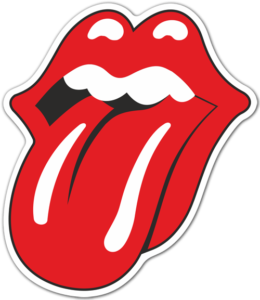
Within 2 weeks, Pasche came up with a draft of the now famous hot lips logo. Mick originally wanted a logo that resembled the Hindu Goddess called Kali. She represented energy, and Mick wanted the logo to convey a similar message. Originally, Mick Jagger wanted a logo resembling Kali – the Hindu goddess of energy. The goddess is usually portrayed with a large mouth and her tongue sticking out, however Pasche found a much bigger inspiration in Jagger himself. According to Pasche, Mick Jagger’s lips were the first thing that one noticed about him.
For making this band logo, Pasche was supposed to be paid 50 pounds. However, the design impressed the band so much that they gave him a bonus of 200 pounds more. This is not enough though, Pasche stayed with the band for four years and became known in the industry, which helped him gain more customers, such as the Beatles, the who, and jimmy Hendrix.
Moreover, although the small amount paid for designing the famous logo seems unfair, the rights of the design remained with John Pasche. Thus, he got to sell the original draft to the London museum for around 92,500 pounds. After the logo became the symbol of the band, most of it was colored with red for obvious reasons. The rock and roll culture, with its passionate, rebellious and wild nature is perfectly represented through the red color.
AC/DC:
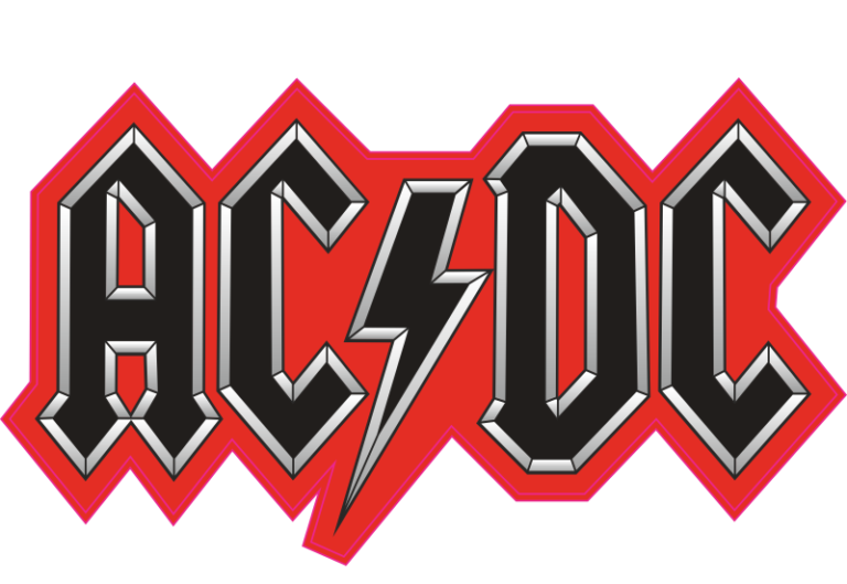
Another one of the famous rock band logos of the classic rock era comes from the band AC/DC. Their logo underwent multiple changes before finally settling on an angular design with a thunder sign in place of the slash. Truly representative of the electrifying music of the band, the name in itself and the design combined with it created one of the most famous band logos. However, it wasn’t made in the first attempt; in the band’s early years, AC/DC changed its logos multiple times before settling on the final design, which has remained the same since 1977.
Unlike the earlier versions, the final one was designed in a gothic font style inspired by the Gutenberg Bible, with a monochromatic color palette, and white and black border outline, creating contrast in the design so that it could be effectively used on various background colors.
Aerosmith:
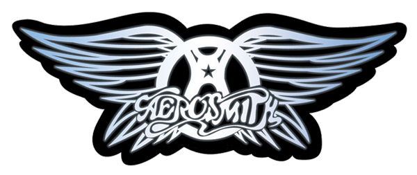
One of the original Aerosmith members, Ray Tabano was the designer of the band’s official logo. It first appeared in 1982 inspired by a combination of the first two minimalist logos for the band.
The logo is a refreshing blend of the two words, Aero and Smith. Aero being represented with the wings in the logo, and smith represented with the metallic design of the entire emblem. The wordmark also has an airy-feel to it with its cursive font, and the encircled letter ‘A’ in the middle shares resemblance with the symbol of anarchy. Overall, the emblem symbolizes the band’s free, rebellious nature and heavy sound.
Nirvana:
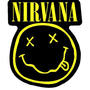
Unlike any other punk rock band with weird names, Kurt Cobain opted for a more elegant name. In search of such a word, he decided on naming the band Nirvana. According to Dave Grohl, Courtney Love and Krist Novoselic, the smiley faced rock band logo was doodled by Kurt Cobain in 1991.
The legend says that it was inspired by the lusty lady club that was located near Seattle city. The smiley face symbol, unlike the elegant name of the band, is representative of the carefree punk genre, and succeeds in depicting the wild and stoned nature of the grunge fans.
Currently, the logo’s ownership is under question because of a lawsuit claiming its ownership. However, the lawyers of Nirvana LLC have claimed that the allegations are baseless. Meanwhile Marc Jacob has been sued by Nirvana LLC with a complaint for infringing copyright laws, because in one of his clothing lineup he used the Smiley Logo with M & J written in place of the crossed eyes. Thus, it’s important to be aware of how to copyright a logo, to ensure no one steals it or claims its ownership.
Red Hot Chili Peppers:

The RHCP logo was made by Anthony Kiedis who made it because the band’s record label pressed them to create a logo that could be used for merchandising. As a result, Kiedis came up with the idea of an asterisk styled logo which went on to become widely popular because of its simple yet very eye catching design. This simple design made it perfect for use in the band’s merchandise. It looked similar to the aesthetic design of Spotify logo which is why it became highly popular.
The Red color of the asterisk perfectly symbolizes the band’s name, although, no deliberate attempt was made to give meaning to the symbol. Kiedis just drew the outline of the logo without giving much thought to it. Still, curious fans keep coming up with their own theories. The logo does have a name however, it’s officially called the star of affinity, and sometimes also called the start of infinity.
This asterisk is circled with a Red Hot Chili Pepper wordmark written in Franklin Gothic font. Usually this is colored in black or white, depending on which of these two is the background color. The blazing red with the peppery black and white combination creates a very attractive visual effect.
KISS:

The most iconic yet the most controversial band logo can be none other than the KISS logo. The double ‘SS’ in the name were shaped in the style of a Schutzstaffel rank insignia. While rumors said that the band deliberately used the insignia, Ace Frehley, the designer of the logo and the lead guitarist from the original band lineup insisted that these allegations were false.
In an interview with MTV’s Eric Spitznagel, Ace spoke in the band’s defense, saying that Paul and Gene were both Jewish, so being Nazi supporters was out of question. When asked by the interviewer as to why despite the widespread outrage against it, they didn’t change the logo, Ace repeatedly said that he doesn’t regret making the logo as it went on to become the most popular logo because of its design. They did, however, change it for the German market, because the original logo had displeased the German Government so much that they actually banned the band’s album and merchandise.
As opposed to what Ace said in the interview, Paul Stanley claimed that Ace Frehley had the possession of Nazi Memorabilia in the early days of the band, and exhibited anti-sematic behavior which is why Ace and Peter were fired from the band. But, on the other hand, where Stanley calls out Ace for pulling anti-sematic pranks, he himself was involved along with Criss in the incident where Ace barged into Gene’s hotel room dressed in a Nazi Uniform.

Van Halen:

The iconic winged design of the Van Halen logo was designed in 1978 by the band’s guitarist and co-founder Eddie Van Halen. However, it took the band several years to perfect their logo. In fact, initially Van Halen was named Genesis, but they had to change it to ‘Mammoth’ because a band was already using the other name. While Genesis sounds generic, Mammoth would have not done justice to the epic music of the band. Van Halen as the final name of the band with its foreign, Dutch roots, sounded as fresh and unique as the band’s music was.

The last and final Van Halen logo is very different from the first logo that emerged in 1972, drawn by Van Halen’s bassist, Mark Stone. The logo, which was more of a wordmark to be precise, had elongated V’s and A’s in it, making it difficult to read for someone who doesn’t know the band.
It was in 1978, when Van Halen got closer to its most iconic band logo, with the help of Dave Bhang’s winged emblem that simply had the initials VH, and a wordmark on top of it with the band’s full name. I say closer to the most iconic, because the later iteration had the wordmark removed. By this time, Van Halen had gained enough success to need no introduction.

Sadly, the band’s identity crisis did not seem to end here, despite coming up with such a fantastic design. They yet again made logo redesign in 1986. This version had three elongated rings that stemmed from the V and H, creating a circle around the emblem. As this design was less popular among the fans, in 2012, Van Halen finally reverted to its 1979 logo design. These frequent changes remind us of the Spiderman logos that kept changing from time to time, albeit most of the time with sound reasoning.

Led Zeppelin:

Led Zeppelin is among the only few bands that have been consistent with their band logo. Since the bands formation Led Zeppelin’s wordmark has stayed the same. As the wordmark is hand-drawn, the lettering is very disproportionate and experimental. It pays homage to the band’s avant-garde music with its experimental and ground-breaking sound. With the band’s increasing popularity the wordmark which the band intended to use only for an album cover had become so iconic that it became the official logo for the band. That’s also because Aubrey Powell and Storm Thorgerson did an amazing job at designing the perfect wordmark in the very first go. It shows that if done right, there’s no reason to make changes to a design.
Scorpions:

The idea for naming the band ‘Scorpions’ was pitched by Rudolph Schenker. While the band may not be considered a legendary band in Britain or America but coming from Germany they’ve managed to be a global success. Initially their wordmark was written in a very simplistic font. However, in 1975 they redesigned it.
Each letter of the new wordmark reminds one of a scorpion, with one end of the font thickened to resemble a scorpion’s stinger attached to its tail. Usually this word mark is accompanied by a sharply drawn scorpion emblem. The logo with its white and black monochromatic colors and innate characteristics gives the impression of elegance, masculinity, and strength.

The Who:
The Who have had a glorious career in the history of rock music. They played a pivotal role in the British rock music scene, all thanks to the very talented lineup consisting of Pete Townshend, Roger Daltrey, Keith Moon, and John Entwistle. Each member has been widely popular for their musicianship, and have been hailed as the pioneers of “Rock Opera”.
Owing to their popularity, the band’s emblem is also quite popularly known and frequently searched. It is comprised of a target logo mark with the band’s name over it and an arrow stemming from the letter ‘O’. The arrow creates a male gender symbol which indicates that ‘The Who’ is what one would call ‘A Boy’s Band’, with an energetic and powerful sound with Entwistle’s unique bass playing style, Townshend’s larger than life guitar sound, Roger Daltrey’s powerhouse vocals and Keith Moon’s mad drumming skills.
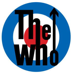
The two adjoining ‘h’ could mean to symbolize the strong bond that each member of the band shared with the others; with each of their unique sound, standing out, yet perfectly harmonizing with other instruments. This is also amplified by the bands use of the white, royal blue and royal red color on the target, representing the Union Jack, which is Britain’s national flag. All of the three colors combined together symbolize unity, truth, and loyalty.
Pink Floyd Logo:
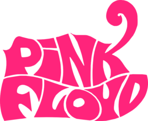
Pink Floyd is unarguably the best psychedelic rock band, famous for their epic sound and theatric shows. Gilmour’s face-melting guitar solos and their profound lyrics can make anyone fall in love with the band. Formed by Roget Waters, initially, the band had a different name at the time of its inception. However, when Keith Barret also known as Syd Barret joined the band, he came up with a new name called The Pink Floyd Sound, combined with the first names of two blues artists, Pink Anderson and Floyd Council. Later, it was shortened to just Pink Floyd; its wordmark in all caps, with the exception of the lowercase letter ‘i’.

Through the years, Pink Floyd used different fonts for its wordmark. However, Storm Elvin Thorgerson’s designed image of a triangular prism emitting rainbow colors as depicted on Pink Floyd’s album The Dark Side of the Moon, became so popular that people starting identifying the band with that image, automatically giving it the status of a logo. This design was no doubt, very catchy for its use of contrasting colors. The white of the light on one side of the prism, and the rainbow colors on the other, which perfectly contrasted against the pitch black album cover, made the artwork pop out despite its minimalism.

From 1979 to 1985, the band had another significant change to its wordmark, this time their album ‘The Wall’ featured a brick wall with the band’s name over it in the style of a spray-paint graffiti. Owing to the album’s success, this became their official wordmark logo. However, when Roger Waters left the band in 1985, the changed lineup needed a new logo. This time, the band deliberately opted for a logo instead of a wordmark, which used the band’s initials to create an abstract logo.

Frequently Asked Questions
| 1. Do a band needs logo? Yes, bands usually identify themselves with a logo or wordmark as they need to create a brand identity. If a band has 5 members, it’s easier to address them with a band name or a logo for visual reference. |
| 2. Do all bands have logos? A band can either use a logo or a wordmark to identify itself. While a band does not necessarily need a logo, both solo artists and bands definitely use a wordmark to personalize their name. |
| 3. What is the most famous band logo? The Rolling Stone’s ‘hot lips’ logo has been dubbed the world’s most famous band logo. |
Conclusion
The bands we’ve discussed have immortalized their musical journey with these iconic and popular rock band logos and have benefited in myriad ways from their use. Today, each of these logos are worth millions of dollars, for they generate a huge revenue from the merchandising business. With their mistakes and successes, the rock icons from the 20th century have taught their successors the importance of branding strategy. Musicians need to be good businessmen as well. For a band’s brand marketing plays a huge role in their success.

Logopoppin
Logopoppin is a graphic design agency that specializes in logo designing, web development, video production and advanced branding services. We love to innovate businesses with new age technologies, allowing them to improve their visual reputation.


