Table of Content
Discover How to Develop a High-Impact Roofing Website Design for Your Brand
The roofing business is an essential part of your building construction and maintenance. From laying down and constructing strong roofs for your new homes and buildings, to repairing and replacing an old roof as part of building upkeep, roofing services are in high demand.
However, most people believe it to be part of the general construction services, when in fact it is a highly specialized and independent service. The relatively small number of roofing website ideas you can find on the web evidences this. Many construction contractors do offer some form of roofing service as part of their building services, the fact is that an expert roofing business can offer a lot more in terms of value for money.
What these businesses lack though, is a proper digital presence displaying the quality of their work, and the various services they provide. While for a new business, even a social media page would do well, an established business looking to grow and excel needs something more. They need a roofing website.
The question though, is what is a good roofing website design? And how can you ensure that your design fulfills that criteria? Let’s dive in and take a look at some of the top examples of roofing websites, and discover the elements used by the top web design services that dictate whether your website would be a success.
The Importance of Implementing Strong Roofing Website Ideas
Nowadays, most businesses need a well-designed website in order to grow. In fact, we would be willing to go out on a limb and say that any business could do better if they develop and deploy a company website. That is because today, in a vastly digital world where everyone, young or old, is connected, a digital storefront can be the difference between a business that rakes it in and one that barely makes ends meet.
In the previous days, if people needed a service provider, they would ask around among their friends and family for any recommendations, or would look it up in the yellow pages. However, today, people quickly look it up on the internet. Not surprisingly, the urge to look for a service provider highly recommended hasn’t faded, only changed to now include reading their reviews online.
Coming back to the point, if the customer looks up service providers near them, and you have no digital presence, what do you think is going to happen? They are going to end up choosing one of your competition. And despite your company having a better track record and a higher quality of service, you would end up losing out.
Let’s take another example. Let’s say your business is well known among your county, having a virtual monopoly on jobs in the area. However, you feel it is time to expand and grow your business, because you know your team can handle more work. Taking out bus bench ads or billboards could end up costing a lot more than what you have to spend, with no way of monitoring its performance. However, spending fraction of that money to establish a website, even if a simple one, and optimizing it for local search for the neighboring counties, could help your business far more.
And the best thing is that you would be able to measure virtually everything, from the number of people visiting your website, and the time they spend on each of its pages. This way you can tweak and optimize your site for better results over time, saving effort and time, and boosting results.
These are just two of the most basic of reasons as to why a roofing business needs a website. Different businesses would have different needs, and therefore different reasons for needing a website. But the ones mentioned above are often the driving force behind a business looking to develop a website.
Top Examples of Roofing Website Design That Establish Trust in Customers
So far, we have discussed why a roofing business would look for roofing website ideas, and the reasons may drive their choice of design. Just like any other industry, different businesses offering the same services may have different specialties.
For example, in the UK, many of the rural areas still thatch roofs to keep their houses well insulated. Now, that is a roofing job that a company that specializes in thatching would be handle, compared to a roofing company that works mostly with tiled or shingled roofs. This means that your website should be developed with your specialty and target consumers in mind. And a best way to do that, after assessing your own company, is to look for websites of successful businesses with a similar clientele and business model.
Let’s begin that journey by discussing some of the top roofing website ideas that are sure to inspire you into creating an amazing roofing website.
Force Field Roofing
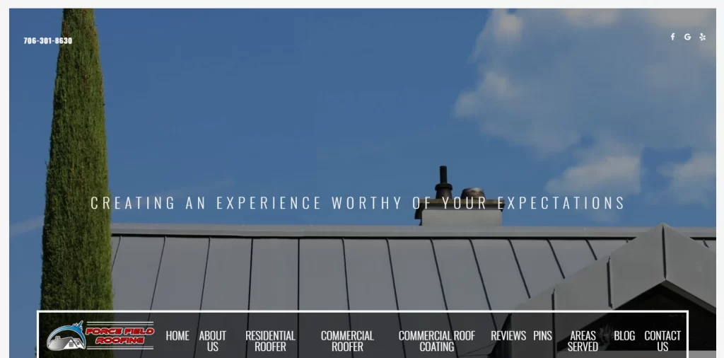
The first one on our list is Force Field Roofing. Based out of the city of Jasper, GA, this company has a clear vision regarding what they want their prospective customers to see on their website. Every visitor, when first visiting their website, is greeted by a full-sized image of a building’s roof, with a translucent overlay on the image presents their value proposition.
This style of on-the-nose design is one that is proven to be effective in filtering out the right leads, thus ensuring a higher conversion rate. Frankly, this is one of the better-looking roofing website ideas, which is designed to help customers know what they are going to get by hiring this company as their roofing contractor. From the carefully curated set of images on the page to the accompanying content, and the carefully placed calls-to-action, this website is a good one to follow for your roofing website design.
Christian Roofing and Remodeling
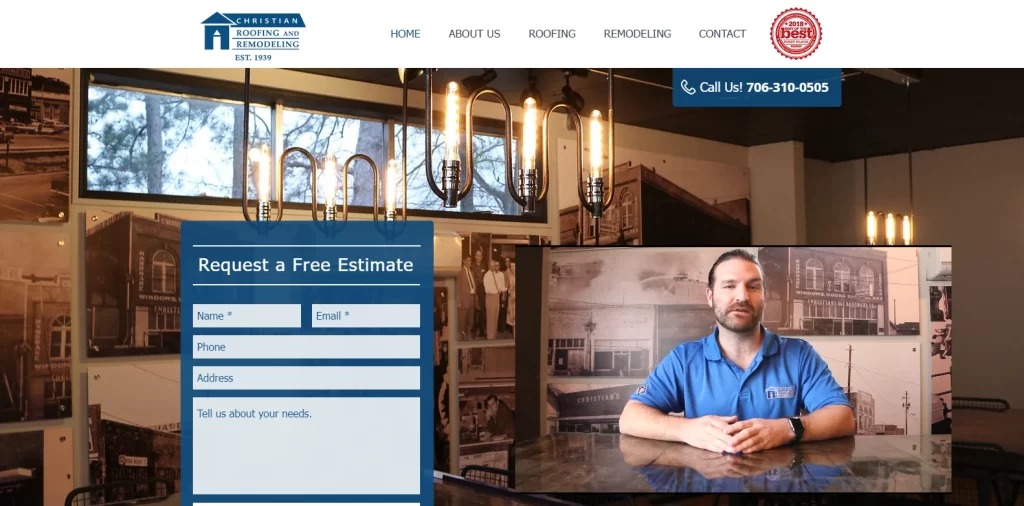
The next roofing website on our list is a personal favorite of ours. Christian Roofing and Remodeling is nothing short of a local institution in Athens, Georgia. With over eight decades of serving the local community, the company has evolved according to their customers’ needs, from a hardware store to roofing supplies provider. Today, the company is a roofing contractor as well as a remodeling services provider, serving the same community as the one the original store did eighty years ago.
When you visit the website, the entire vibe you will feel is one of warmth and homeliness. The homepage has a full-sized image of a room’s interior with warm, vintage style metal and incandescent lighting fixtures. To explain their value proposition, the design incorporates a small video to the bottom right, which has the owner of the business explaining their work and services for a more personal connection.
However, besides that video, they have a small lead generation form; as they trust that their site’s immediate aesthetics and the video combined would be enough to convert some leads. Their technique of using something personal like a video is something that has been proven to be far more effective than a text-based content, which ensures that more people listen to the end of it.
Overall, this is one of the roofing website design ideas we recommend you try to emulate to establish a strong business presence.
Piney Orchard Roofing
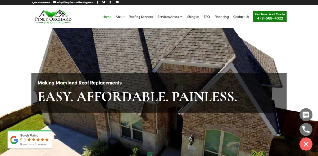
Piney Orchard Roofing is another roofing business website that has a design that is very obviously that of a roofing business. When you visit their website, the first thing you see would be a close-up of a house’s roof, animated using a prototyping tool. Centered on the middle of the screen, you have a banner that displays the company’s unique selling point.
Beneath it, you have a small widget made to look as if showing the company’s Google rating, one of the highly popular web design trends currently, which is at a consistent five stars. The rest of the website has a simple, easy-to-follow flow that is also aesthetically pleasing.
And while it may not have the appeal, both sentimental and visual, as some of the others roofing website ideas on our list, this is a solid approach that can help a business establish a strong identity.
Quantum Roofing Company
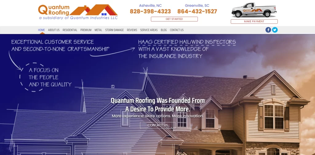
Next up, we have the website for the Quantum Roofing Company. The company has one of the more unorthodox styles we have seen so far in a roofing website design. Yet, it is this uniqueness that helps them stand out from the competition to establish a strong identity.
Among the unconventional things their site shows, is the horizontal top menu, which unlike most websites, is anchored in place while your scroll down. That means that no matter where you are in the page, you will find the menu handy for navigation.
The page layout is a mix of images and content, with a primary focus on text. Although an older technique, the text is broken down and structured for easy readability and the visuals more than make up for that large amount of text.
D&L Roofing
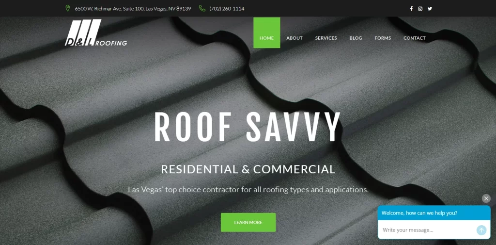
D & L Roofing is the next roofing website design on our list. Of the roofing businesses we have discussed so far, all of them have had their business niche quite clearly displayed in their design, name, and logo. However, despite that, D & L Roofing has a website that seems to have captured the essence of efficient brand messaging in web design.
When someone visits their website, the image that greets them is that of a zoomed in ceiling tile. The dark toned website works well with the imagery provided, and the white text overlaid over the design effectively portrays that they do both commercial and residential buildings. This shows that the web designers had a good grasp on the fundamentals of color theory.
The flow of the homepage is next to none, showcasing an enormous talent in making the process of navigating their website easy and relatively effortless. With each subsequent section after the first numbered properly, it ensures that the reader knows exactly where they are at any point in time.
Overall, this is a great roofing website design to emulate for your site, if you want to go for a simplistic, yet visually appealing design.
All County Exteriors
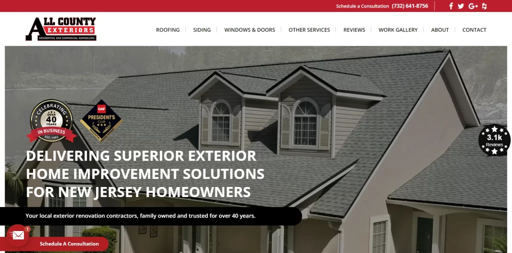
All County Exteriors has a very mid-2000s style web design that shows that the company has been around for a couple of decades at least. And frankly, we feel that there is no need for them to change it to something modern either. The red, white and black design is a sort of classic style that is hard to match, and it helps the brand stand out amongst its more contemporary fellows.
Visiting the website will greet you with a red and white banded banner at the top, with the thinner red band having the company’s phone number and social media links. The white band holds the site’s navigation menu, as well as the company logo.
While you would consider it one of the traditional roofing website ideas, the placement of the elements and the structure of the website is quite logical, and follows well-established web design principles. The first thing you see on the website is a nearly full-sized image slideshow showing the roofs and exteriors of different buildings, some commercial, some residential.
Along with the written content, this slideshow has a little badge to its right, which shows that the company has over 3000 reviews to its name. And to complement that, the left side of the screen has two buttons, one to schedule an appointment, while the other to take them to the review section. And just below that initial fold, there is a form that allows potential customers to request a free assessment and estimate.
All of these elements combine to make this a great roofing website design to take inspiration from.
North American Roofing
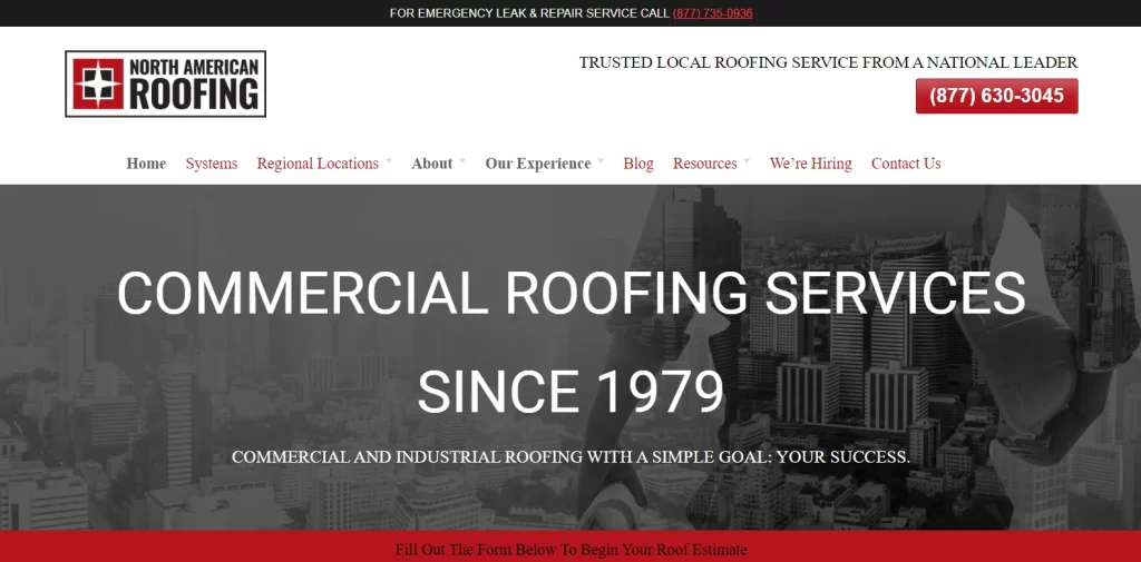
North American Roofing is another roofing company that has a traditional vibe to their website. However, unlike All County Exteriors, which has a true traditional style website, North American Roofing goes for a mix of traditional and modern.
Now the reason it looks like this is because this is a website that is quite text-heavy, with very few visuals used and the content broken into chunks by the design itself. These types of websites are very hard to implement successfully, but North American Roofing seems to have found the right solution to it.
In the end, although the design is simple, the website is expressive and easy to navigate, which is a huge plus in our book.
Vincent Roofing
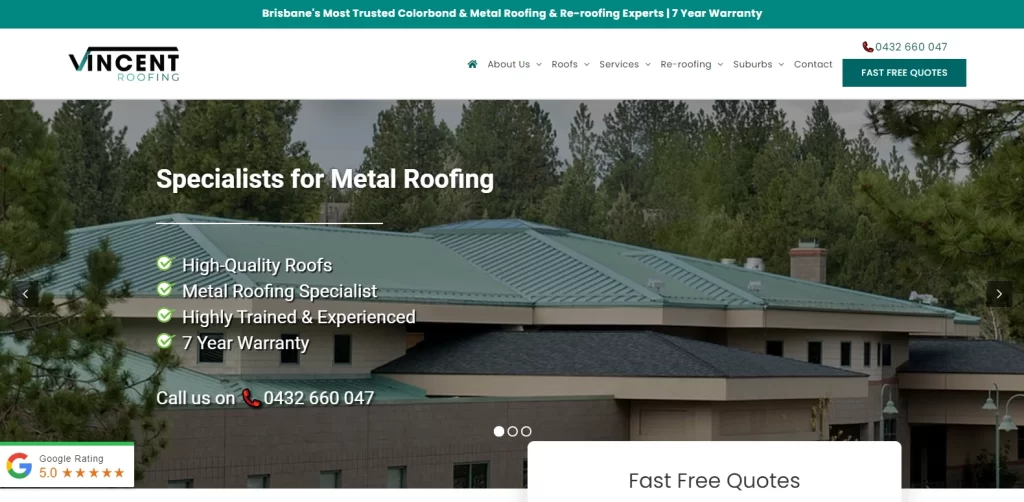
Vincent Roofing has a design that is somewhat similar to the Piney Orchard Roofing Company we discussed earlier. However, this one has a cleaner visual feel, which is necessary when you are looking for new customers. The color combinations used here are cool and relaxing, with the sea-green shade above the navigation bar adding a nice relief to the design.
The flow of the website is easy to follow, and the structure of its homepage is good, with perfectly spaced out text interspersed with calls-to-action to make the buying journey easier for the user. Overall, a great design to take your website’s inspiration from.
Elements that Affect the Results of Your Roofing Website Ideas
Now that we have seen what it takes to make a successful roofing website design, you are ready to begin the next step. However, how could you evaluate whether the design you have developed is going to be a success?
There are some things in the design world that no web design guide can teach you. They are the ones that can only be learned by through experience. And the factors that affect the chances of success of your roofing website ideas, are one of those things.
While there are many elements and factors that may be tweaked to improve your chances of developing a successful website design, the ones listed below are the most common and important ones to know.
- User Interface and UX of your Site
- The Actual Graphics of Your Design
- Page Load Speeds
- Search Engine Optimization
- Your Website and Business’s USP
Conclusion
To sum it up, coming up with good roofing website ideas isn’t too difficult. Despite a small portion of these companies using a website, you would still be able to find dozens of examples of such sites online.
However, what does take time and experience, is finding the right ones to influence and inspire your roofing logo design. And for that, you need to assess and understand your business in detail. Incidentally, in this industry, it is easier to come up with successful roofing logo ideas than it is a successful website. But if you understand your business and its USP, then you will be able to develop something which would help your brand grow and sustain itself.

Logopoppin
Logopoppin is a graphic design agency that specializes in logo designing, web development, video production and advanced branding services. We love to innovate businesses with new age technologies, allowing them to improve their visual reputation.

