Table of Content
Discover the Amazing Samsung Logo History and See How They Changed Their Logo
Samsung is one of the biggest manufacturers of electronic equipment in the world, from smartphones to home appliances like laundry machines and refrigerators. Ruling the consumer electronics market for a few decades now, it hardly needs an introduction. And for those of us who are old enough to remember it, we have seen the Samsung logo evolve too, from the oval design to the modern stylized wordmark today. Yet, despite that change, the company has reached unprecedented heights, displaying a strong sense of determination and domination.
We, as general consumers, have long preferred Samsung products due to their unmatched qualities. Our affection for the Samsung logo has increased rapidly with time highlighting the prominence of its products in our daily lives. Take smartphone for example. Besides Apple, the Samsung brand led the market in smartphones, both in terms of inventiveness and product sophistication. Even today, with dozens of smartphone brands vying for the top position, Samsung still has a sizable share of the market cornered.
But, have you ever wondered about the source of their massive brand presence? Well, with a logo as simple as Samsung’s, how were they able to make such a massive impact in the market?
Join us as we explore the Samsung logo history, and discover why professional logo design services take inspiration from its style to design simple yet effective brand logos. Let’s begin.
Samsung Logo History – An Overview
The Samsung logo history is quite a diverse and rich tale, covering a lot of the major stages of the company, from hardships to triumphs. Starting out in South Korea, Samsung made its way into the top tier of the business world after working tirelessly through the decades.
In the early days of the company, the owners had an entirely different view of its logo as compared to the one that we know today. It was never blue and ellipse in shape and didn’t have typical font styling as well.
What Does the Samsung Logo Mean?
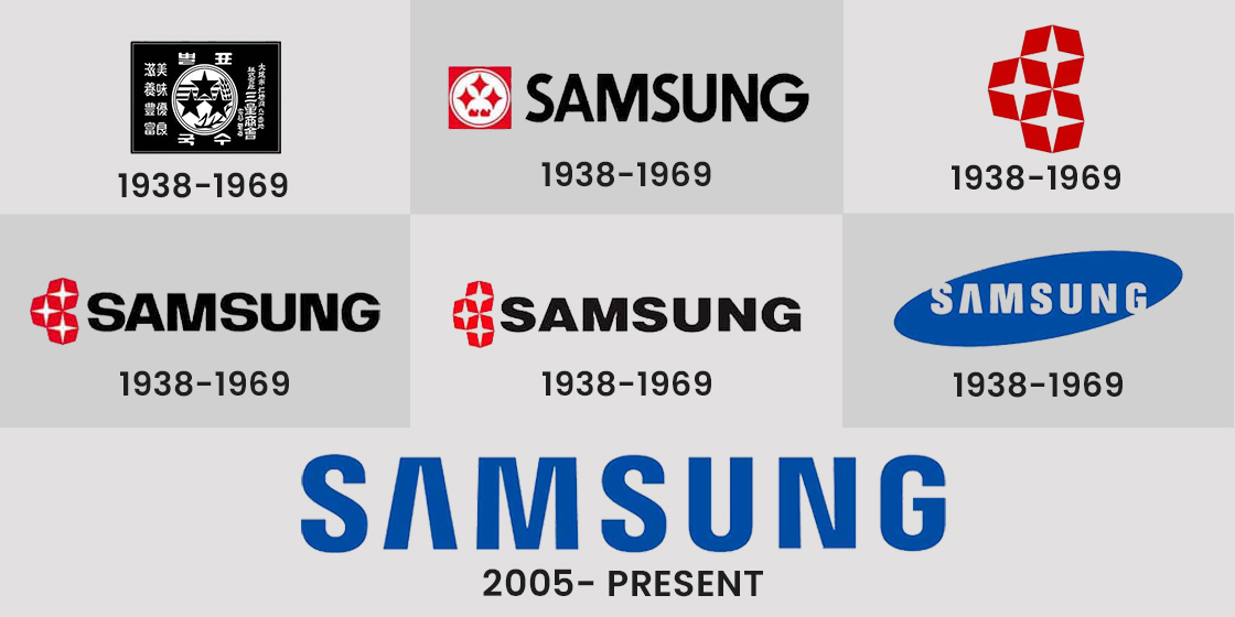
Through the decades, the Samsung logo changed a lot and evolved into a new shape. It came into the market with a traditional three-star logo, just like the classic sports logos. Though the meaning of its logo is not entirely confirmed. But according to sources, it represents “three stars” in the Korean language.
Sounds weird right? Well, many of us think about it in the same way.
The earlier three-star Samsung logo also had a combination of very simple conventional colors i.e. black and white. It looked more like a post stamp and didn’t have any unique factor that could grab people’s attention. But yes, it had a resemblance with the business it was doing during that time i.e. a food supplier company.
Evolution of the Samsung Logo Through Time, From Vintage to Modern
For a brand as old as Samsung, discussing brand history without talking about the Samsung logo history would be a big mistake. That is because many logos like that have their own fame and following, and Samsung, as a market leader in consumer electronics, especially cellphones, is one of those brands.
So, let’s take a look at the various Samsung logo designs that the company has sported over the years.
The Early Age as a Food Supplier

Very few people know about the fact that Samsung didn’t start as a tech company. Earlier, it was working entirely in a different domain. Samsung’s origin began as a food supplier in South Korea. It used to take orders from local vendors to supply rice, fish and other items to neighboring countries like China.
In 1939, the company decided to expand their operations, capitalizing on a lack of shipping companies in South Korea. They incorporated a shipping facility and started exporting record amount of goods to its neighbors, effectively having a significant edge over the competition.
And that is how Samsung’s old logo looks like something a shipping or cargo company would feature, rather than an electronics company. Especially when we consider the black and white color combinations as well as the three-star design on this rectangular Samsung logo. It perfectly depicted the core nature of their business allowing people to easily understand their objective.
Emergence of the New and Improved Samsung Logo After the Second World War

South Korea also faced a wide amount of economic disruptions due to the second world war. It was a time when the whole world was experiencing uncertain conditions. Hence, the companies in South Korea were also not operating in exception.
But, here’s the thing that separated them from the rest.
The government of South Korea selected thirty of the top companies from all over the country and gave them exemption in the taxes. Besides that, the government also gave them little funding for development.
Samsung was one of those companies that came under the radar of the South Korean government. Looking at their performance, they received a good amount of funding for future development.
As a result, they really did a great job and started to showcase their true potential in electronics. It was basically the first time when Samsung truly entered the market with its visionary range of products. The company quickly rebranded itself and came up with a completely new logo to showcase its latest range of products. This new logo is first of the two red logos ever sported by Samsung, before they settled for the blue used today.
Evolution of the Samsung Logo During the 80s

You must be wondering about the old Samsung logo and how it changed? Here’s the thing you should know about.
From the start of the 80s, the technological circuit took a huge boost in the world. Samsung also pushed its limits and worked harder to meet the demands of the changing world. The owners soon realized that they needed to upgrade their branding. They knew that their logo must look more colorful to stay relevant in the business circuit.
Therefore, Samsung introduced its new logo made with a colorful new design. The core three stars were still present in that logo but were restyled with the red colors. This gave them a great attractive look.
The emerging trend of color televisions and other electronic equipment was the main reason why Samsung brought colors to its logo. It worked perfectly for them and allowed them to get a strong competitive edge in the market, especially since they opted for thick logo fonts for the new Samsung logo.
Rebranding to the Iconic Tilted Oval Most of Us Know in 1993

After some years, Samsung felt yet another need of introducing its new logo. Finally, they found their perfect style. This time they came up with an entirely new design that completely changed their identity in the market.
And, what was that?
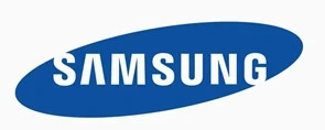
The iconic ellipse-shaped blue logo instantly became the talk of the town. It gave Samsung a stunning redefined presence in the world. This logo was completely unique from its early predecessors, which is why it got more attention from the masses.
This particular logo had everything changed, ranging from font style to colors, etc. To avoid duplication, they quickly opted to copyright the logo as per the given procedures.
It showcased that the company has moved a lot forward from its early origins. This gave a perfect view about their commitment to reach new heights by attaining a global presence.
Modifications in 2005 for the Current Samsung Logo Design

Fast forward to the 2000s, Samsung was ruling the tech industry with its range of products. From mobile phones to televisions, the market of Samsung truly expanded at a massive rate, beating out all others in the race.
Yes, you thought it right, this gave them another reason to alter their style again.
The company once again decided to celebrate its dominance by modifying its logo a bit. The logo that we know today was introduced in 2005. It represents a simpler yet bold look of the company. Till to date, this logo is the global representation of the South Korean tech giant, widely regarded as their best brand imitation.
A Look at the Design Attributes of the Samsung Logo
Now, as we have discussed the origins and evolution of the Samsung logo through the years. Let’s take a look at its attributes & understand its significance in the overall logo. From fonts to shapes and colors, everything is planned perfectly in the Samsung logo. This defines the objective and core goals of the company.
The truth is:
Not only the current, but the earlier iterations in Samsung logo history were also designed with a clear perspective of company offerings. Strategically, all the logos were made to deliver a particular message to the customers. From the very first three-star logo, Samsung showed its company values allowing everyone to understand the nature of the company easily.
Samsung Logo Shape
The oval shape in the Samsung mobile logo is not just merely designed without any reason. It delivers a specific message about the objective of the company. In fact, it is not an oval but a depiction of space carrying the name of Samsung.
So, what does this mean?
Well, this logo is creatively designed to let the people know that Samsung is a new age company. It loves to work with advanced technologies providing advantages to the global market. This is also the key tagline of the company and we all have witnessed the same about it over the years.
Meanwhile, if you look closely at the edges, you can note that both ‘S’ and ‘G’ of Samsung are slightly spilling out from the oval, presenting something unique.
Well, yes, this has also got a special meaning.
It means that the company has got open ideas to work on a range of technologies. There are no bounds or limits to the people working inside it. This gives everyone a clear sense of freedom to work on new ideas. That is the main reason why Samsung has opened new ventures in the field of tech from time to time. It shows their commitment to attaining new heights.
Samsung Logo Color
Just like the shape, the Samsung logo color has also got a bit of philosophy behind it. The enchanting blue shade means reliability and trustworthy services. Whereas the white color represents the elegance of the brand. If compared with the early predecessors, the color scheme of the current logo looks very simple yet catchy as well.
Currently, Samsung uses two colors for the depiction of its logo i.e. black and blue. Black is used as a representation of its classic style, while blue shows its advancement in the new era.
Samsung Logo Font
The current font of the Samsung logo is a basic Helvetica, inspired by the company’s sense of simplicity in style. But to make it a bit unique, the letter ‘A’ in the logo has been designed with no crossbars. This gives it an overall distinctive look and unique style. It supports their claim of innovation in the business, which is indeed the main motto of their domination.
Inspiration for New Samsung Logo
As time evolved, Samsung saw the opportunity to rebrand itself as per the latest standards. The motivation to become the best in the industry-led them towards creativity, specifically in terms of branding.
Yes, that is where we all love Samsung, right?
Its emergence as a leading player in the tech industry has always remained exemplary, so as its rise in the domain of marketing. The inspiration for the new Samsung logo came right from there, and it really did wonders for them.
Using the new logo, they promoted the idea of innovation which we can also see in various fashion logos. They showed how to be different in the market. That is where their core values stand and the representation of their logo perfectly supports this claim as well.
Frequently Asked Questions
| What is the meaning of the Samsung logo? The word Samsung is derived from the Korean language, meaning “three stars”. According to sources, it was carefully chosen by the company’s founder Lee Byung-chull. He had the vision to take his company to the heights of stars, hence came up with this name. |
| How was Samsung created? Samsung was never intended to become a tech giant. It was founded in 1938 as a food supplier company. But later, it quickly emerged as the leading Korean tech organization. |
| What is the Samsung Tagline? Being renowned as the leader of innovation, Samsung has a famous tagline i.e. “Inspire the World, Create the Future”. |
| What makes Samsung unique? Samsung has always believed in the creation of new technologies. From smart watches to smart TVs, the company has always led the tech world by setting up new standards. This has made them unique and stand out among all others. |
| Why does the letter ‘A’ in Samsung don’t have any horizontal bar? Being creative is the main motto of Samsung, which is why it introduced a new logo having no horizontal bar in the letter ‘A’. It perfectly supports their claim of being an innovative tech giant. |
| What do the three stars in the first Samsung logo represent? The three stars in the Samsung logo history’s earliest iteration are a call to the owner’s Korean roots. These stars stand for peace and prosperity in their culture, making it a great design. In fact, the name Samsung means Tri-Star in the Korean language as well. |
| Why does the modern Samsung logo not have a line in the letter A? In order to make the design look modern and aesthetically pleasing, the designers adopted a single stroke design that eliminated the need for the line in the middle. |
Summing it up!
Through the years, the rise of Samsung has shown us that as long as it stays true to its model of innovation, they will thrive. Their logo specifically depicts this approach in a unique manner. With the Samsung logo serving as the brand identity for such a massive business, its evolution through the years represents their journey from being a food supplier to a leading tech giant.
No wonder, Samsung’s branding took a huge boost after the emergence of its new logo. It allowed them to introduce themselves as a new brand that is ready to take on challenges while innovating the tech field continuously.
If you are also looking to design your brand logo uniquely like Samsung, get connected with our logo designing experts today. We can help you to craft the best logo as per latest market standards, precisely at affordable prices.

Logopoppin
Logopoppin is a graphic design agency that specializes in logo designing, web development, video production and advanced branding services. We love to innovate businesses with new age technologies, allowing them to improve their visual reputation.


