
Table of Content
Discover the Transformation of the 49ers Logo into an Example of Simple Perfection
Currently, there are thirty-two franchises playing in the NFL. And each of those teams have logos that are iconic in their own ways. Whether it’s the effective Dallas Cowboys logo that shows the effect of well-executed simplicity, or its something elaborate like the logo for Tampa Bay Buccaneers, there are many examples to inspire us. However, there are some teams that have been in the sport for so long that their symbol reflects a deep rooted connection to their hometown, something that the San Francisco 49ers logo also embodies.
The Niners are the tenth oldest team in the NFL, and originally started playing the sport in 1946 as a charter member of the All-America Football Conference. They were the first major-four sports team out of San Francisco, and the first professional sports franchise from the entire US West Coast.
The story behind the logo has an interesting story behind it. The colors of the eponymous 49ers logo are an homage to the gold rush of 1849. The light gold band around the edge of the emblem signifies the precious metal. While the dark red background is a nod to the typical red plaid worn by the majority of the miners and prospectors of that era.
Over the years, the San Francisco 49ers team won five league championships, all from the Super Bowl era. Moreover, the team holds a record for the number of times it has made it to the playoffs.
So why does a team that is a literal goldmine (wink) have such a simple and minimalist logo? Discover the answer to this question and more, and learn why professional logo design services pair strong brands with simplistic logo designs for truly memorable brands.
History of the San Francisco 49ers Logo and Team, and Its Entrance into the Sport

Originally formed by a lumber transport businessman named Anthony J. Morabito, the team has been part of the NFL since 1946. Since then, the franchise has been family-owned and operated by Italian-American families. Joining the NFL later, it became a member of the NFC West division, with the team having seen widespread success over the years, with many records to its name.
The 49ers name and the first of their various NFL logos was a nod to the many gold prospectors who came to the San Francisco Bay in 1849 to try their luck during the California Gold Rush. An infamous time in the history of California, where hundreds of prospective miners succeeded and failed, the Gold Rush led to the economic and infrastructural growth of the area, including the San Francisco area.
Over the years, the San Francisco 49ers logo has been quite successful in representing the city of San Francisco and the state of California as one of the big-four sports teams. And in its nearly eight decades of play, the team has successfully amassed a long list of accomplishments and accolades, including five Super Bowl wins. And while the team is fully named as San Francisco Forty-Niners, the fans know them as the 49ers, or simply, the Niners.
Evolution of the 49ers Logo and Design Concept over the Decades
Throughout its nearly eight decades of playing professional football, the 49ers logo has seen just a couple of any significant changes and a few minor ones as well. The first custom logo design used by the franchise was an elaborate image representing the gold rush. Still, over the years, the logo has been simplified for better visibility and greater memorability, with the 49ers colors also evolving slightly in that time.
Over the years, the various sports logos used by the team can be broadly categorized into three groups.
- The first group are the primary logos, which are the ones used by the team as their core visual representation. They are the symbols that are used by the fans to identify the franchise.
- Text-based logos, also known as wordmark logos, are used alongside the primary logos as well as independently. These logos show the team’s name in stylized design, using some elaborate vintage fonts, making it easier to identify its name.
- Finally, the commemorative logos are used to celebrate special milestones or achievements for the franchise. These were used in addition to the primary and wordmark logo designs, and was used to add greater meaning to the team’s brand.
Variants of the Primary 49er Logo through the Years
Like many other teams on the NFL, as well as other major sports leagues, San Francisco 49ers too has seen its fair share of logo variants. These primary 49ers logos range in style from the elaborate mascot-style design used in its earliest iteration, to the simpler, subtler design later that was similar to the Green Bay Packers logo of today. Throughout the nearly seventy-five years of playing in the league, the San Francisco 49ers have had their logo modified a few times, with only a couple of significant changes.
So now that you have had an overview of the evolution of the 49ers colors and designs, let’s have a look at the transformation of the primary 49ers logo.
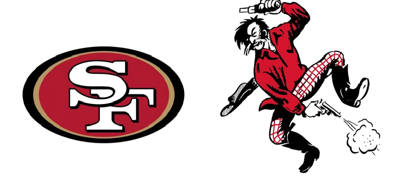
1946-1967 (The Image That Inspired the Original 49ers Logo and Name)
In 1946, the year the team came into being, Allen Sorrel, who co-owned the franchise with Tony Morabito, proposed the first 49er logo. Inspired by the image of a plaid-clad gold prospector he once saw, drunkenly waving and firing a brace of six-shooters besides a rail car, he decided to implement something similar. That is because Allen thought that the image was a perfect representation of the team name and the history of the team’s hometown, and decided to adopt that imagery for the team logo.
The resultant San Francisco 49ers logo featured a mustached gold prospector, waving a pair of guns around drunkenly, firing one above the head and the other downwards towards his foot. The prospector was clad in a red shirt and plaid trousers, with his wide-brimmed hat flying off behind him due to his vigorous movements.
This old 49ers logo represented the wild and lawless nature in the area during the gold rush, and the owners felt that it was a good image to accompany the team name.
1968-1995 (The Simplified 49ers Logo Taking a Departure from the Image-Based Design)
In 1968, more than two decades after the launch of the original mascot-based logo, the franchise revealed a new logo design that featured an oval-shaped canvas representing a football. The logo featured a dark, cardinal red interior, which was enclosed by a thick black bar all around.
The red oval featured the initials of the team’s city, the letters S and F, centered in the middle of the design. The letter S overlapped the letter F in the left top corner, breaking the letter into three fragments, offering a unique depth in the design. The letters were solid white, depicted as if the interiors of those letters had been cut out of the original shape, with bold and long serifs at the ends of the logo’s characters.
Later, around 17 years after the second version of the 49ers logo was released, the design saw a slight tweaked. The 1985 redesign saw a minor change being made to the logo.
The logo’s initials were now outlined in black, which made it easier to differentiate individual design elements from the background. It also made the fragments of the letter F more distinct, which made the design a little better to identify visually, and significantly enhanced that cutout effect.
1996-2008 (A Revamped Logo with New 49ers Colors That Led to the Modern Design)
After the slight tweak of the logo seen in 1985, the logo saw another change in 1996, albeit a greater change then the previous one. In 1996, San Francisco 49ers logo saw a major tweak, making the new design more visually assertive than the previous iterations.
The oval shape of the logo was stretched and elongated, with the ends being made more pointed, and making it more similar to the football shape it was meant to resemble. Additionally, the next change was the to the letters featured within the design. This change was the joining of the letter F’s fragments into a single piece, with the new design now showing the letters properly overlaid one over the other. The shadowed outline added to both characters made it look as if the S was overlaid over the letter F.
The base color was now a darker red as well. The outer black border was made thicker at the left and right points. A metallic gold bar was added to the inside edge of the logo signifying their ties to the California gold rush of the mid-19th century. This new design was even more visually striking, eclipsing many others in the league at the time.
2009-Present Day (The Current Form of the Iconic San Francisco 49ers Logo in All Its Glory)
The current version of the 49ers logo is the same as the previous iteration; the only difference is the change in the design’s colors.
In 2009, the owners changed the shades of the colors used in the logo, which included:
- The dark red background was made a deep scarlet color, making it easier for the other design elements on the logo to pop instead of blending into the back.
- The white letters making up the team’s home city’s initials were changed from a dull white to a brighter shade, making the letters stand out better even at a distance.
- Similarly, the black and gold colors used were more saturated, making them more distinct and helped make them stand out better when outlining the logo design.
Wordmark 49ers Logos and Their Evolution over the Decades
Text-based logos or wordmark logos are a necessary part of every NFL team’s branding. Image-based logos are a great way to help fans identify a franchise. However, wordmark logos are a great tool when the purpose is to help new people recognize or identify the team imagery with the name.
Wordmark logos can be used alone or used alongside the team logo, based on the scenario. Many NFL teams use wordmark logos to get their imagery out to new prospective fans. Let’s have a look at the text-based 49ers logos that have been used over the years, especially the ones featuring an elaborate vintage logo design.
1972-2004 (The Iconic 49ers Original Logo Wordmark)

The first wordmark logo design was released in 1972 and featured the deep red characters spelling out the team’s nickname. The characters were outlined in red, with a white bar separating the main body of the characters’ outline.
An alternate version was also created that featured a metallic gold color instead of the deep red. It signified the California gold rush and allowed an option to print on darker mediums without losing impact.
The font was a custom design and featured intricate serifs, which made the design quite elaborate. The result was a highly stylized wordmark logo that represented the old-world aesthetic of the team’s name.
2005-2008 (First 49er Logo Wordmark Revamp with an Early 2000s Design Aesthetic)

The 2005 redesign of the wordmark logo was done to upgrade the design per modern graphic design trends to make it more relevant to that era’s fans.
The new wordmark logo now featured the team nickname in bright white with thin gold and black outline over a rectangular maroon background. The script for the logo was quite simple – a bold serif font used to write the team’s name, with the rest of the name after the letters 49 written in a slightly smaller size. Except for the 49, the rest of the logo featured a metallic gold bar as an underline.
Another iteration was also created, similar in design to the one described above, with minor changes. This version featured the white characters now colored a deep red over a white background.
This wordmark logo was quite different from the previous wordmark iterations, which made it better suited to the design appeal of the mid-2000s.
2009-Present Day (The Final Wordmark San Francisco 49ers Logo That Is In Use Today)

The 2009 redesign kept the design mostly the same, with minor changes to the shades of the color combinations used.
The previous two designs were still used, the only change being the shade of red now changed to a bright crimson. Additionally, the lines of the logo were made cleaner and more precise, adding to its overall visual appeal
A third version was added to the lineup. This version featured the same design, albeit it removed all shades of red from the logo. The only color now was the black and gold outline of the characters and the gold bar underneath the characters.
Commemorative San Francisco 49ers Logos That Celebrate Special Milestones
Commemorative logos are a great way to celebrate significant achievements or milestones. They have been used in sports for quite some time. Even the National Football League created a new commemorative logo for its 100th anniversary, which was part of all player uniforms and the game balls during the 2019 season.
Many franchises hire an external logo design service to help them create commemorative logos that effectively portray the essence of the achieved milestone.
40 Years as a Team – 1986
The 40th anniversary of the San Francisco 49ers was celebrated in the year 1986, which featured a new team logo for that year, commemorating this achievement.
The new logo featured a monogram-style design. A bright red 40 encircled by a golden banner featuring the team’s registered name. Below it was a stylized bar that had the team’s timeline, from the year of its inception to the year of the anniversary.
The logo also featured the iconic Golden Gate Bridge going through the zero from the 40.
This design was a great way to commemorate four decades in the league and signify their roots in the San Francisco area.
50 Years as a Team – 1996
The golden jubilee for the team occurred in 1996, for which a new commemorative logo was designed. The new 49ers logo featured a shield with four quadrants in alternating metallic gold and red colors.
The top two quadrants featured five golden diamonds signifying the five Super Bowl titles. The anniversary year was written in the classic golden jubilee style, with a classic set of logo fonts. The bottom two quadrants feature the team’s initials in the bottom left and the team’s timeline in the bottom right.
The bottom two quadrants feature the team’s initials in the bottom left and the team’s timeline in the bottom right.
All in all, it is a fitting yet classic way to commemorate half a century in the sport.
60 Seasons Playing Football – 2006
The 2006 commemorative 49ers logo was used to celebrate six decades in the NFL. It featured a different design from the previous iterations.
The new logo featured an upright red oval shape signifying a football, outlined by a black bar that traced the red oval and widened at the sides. . The top point of the logo featured the five diamonds signifying
the NFL championship rings, below which was a bold white 60 with a black outline. A black fluttering banner below the 60 featured the year the team was formed and the anniversary year.
It is their most visually bold commemorative logo to date.
70 Years Playing Football – 2016
The 70th-anniversary commemorative logo was quite similar in design to the golden jubilee logo, featuring a shield with four quadrants outlined in gold and alternating quadrants colored red and white.
The top left quadrant was white and featured five golden diamonds signifying the Super Bowl wins. The top right red quadrant had the last two numbers of initiation and the year of the anniversary written in it.
The larger quadrants below featured the number of years the team has been active in the league, with the word YEARS written in white on a thin gold bar below the number of the commemorative anniversary.
Unlike the 50th anniversary logo, which used brighter and deeper colors, the colors used in this version were lighter and more subdued.
A Comparison between the 49ers Original Logo and Its Modern Iteration
The current San Francisco 49ers logo has become one of the most iconic logos in the NFL, having been used for more than five decades. The design of the logo is simple yet effective, featuring an elongated oval that is excellent at signifying the relationship between the team’s logo and football game in general.
The initials of the team’s home city are centered in the logo’s middle, making them highly visible. The white of the letters stand out well against the dark red background and black outlines. And the gold line encircling the logo is a great accent to the overall design.
The font for the logo’s wordmark, as well as the wordmark logos themselves, was custom-designed, with each letter drawn carefully by hand. Based on the vintage typographic style, the characters featured blocky serifs and a bold character weight, making the font visible easily, even at a distance., making it great for a sporting logo.
This logo is iconic and is a design that generations of 49ers fans identify with the team. But it does not do the name of the San Francisco Forty-Niners justice. The current logo does not relate to the image the franchise founders had for the team, which was to pay homage to the gold rush prospectors from 1849. However, as times change, so do the perception of target consumers. And for brands that are as long-lived as these sports teams, its important to change with the times in order to sustain themselves successfully.
In that respect, the vintage 49ers logo from 1946 captured the essence and concept behind the team’s name. The drunk gold digger jumped around and fired their pistols, randomly capturing the theme of the gold rush era perfectly.
So while the new logo does work well with the team’s current vibe, the first logo was the one that captured the true essence behind the team’s name. Nevertheless, the logo is iconic and has been able to rally a large fan following known as the “Niner Nation.”
Frequently Asked Questions
| 1. What is the 49ers Logo? The original logo for the team was made up of a mustached man meant to depict a gold miner from the 1849 California Gold Rush. The man was dressed in a red shirt and plaid pants, long western boots, jumping in the air while shooting his pistols with his hat falling off. |
| 2. Who Do the 49ers Represent? The word 49er or Forty-niner signifies a gold miner who came to California searching for gold during the 1849 Gold Rush. |
| 3. Why Do the 49ers have 74 on their Helmet? The football players from the San Francisco 49ers wore a decal of the number 74 on their helmets to honor their former 49er player and Hall of Famer Fred Dean. He died due to complications arising from his COVID-19 infection. During his time at the 49ers, Dean wore a jersey featuring the number 74. |
| 4. What are the San Francisco 49ers Colors? The San Francisco 49ers wear kits featuring two primary colors – scarlet and gold. |
| 5. What is the emblem for the San Francisco 49ers? The current 49ers logo features an elongated oval design that depicts a football. Released in 2009, it has remained the same without any major or minor tweak even during the 2023-2024 NFL season. |
| 6. What is the font for the San Francisco 49ers logo? The font used by the 49er logo is called Faithful, which is featured specifically on their primary logo’s initials design. |
In The End
The story behind the evolution of the San Francisco 49ers logo image is quite vast.
Over the years, the team has shown itself to be one of the best teams in the NFL. It is the third most valuable NFL team and the twelfth most valuable athletics team in the world. Their dedication to excellence drives them to greatness, signifying the never-ending hardiness of the people who popularized the San Francisco area during the gold rush.
With such a historically significant name as the Forty-Niners, the San Francisco football team has proved themselves capable of rising to the challenge and proving themselves worthy of that legacy. Other NFL team logos are also worth exploring such as Chicago Bears Logo and LA Rams Logo.
Latest news you want to know!
Subscribe for cutting-edge design inspiration at Logo Poppin! Elevate your brand with updates on logos, branding, web design, and video animation.
Note that by clicking “subscribe,” users may agree to our privacy policy and consent to Logo Poppin to use your contact data for newsletter purposes.
Logopoppin
Logopoppin is a graphic design agency that specializes in logo designing, web development, video production and advanced branding services. We love to innovate businesses with new age technologies, allowing them to improve their visual reputation.

