
Table of Content
Discover the History of the Seattle Seahawks Logo Transformation
The Seattle Seahawks is an NFL team that is part of the NFC West division. Introduced as an expansion team in 1976 by the NFL, they hold the auspicious record of being the only NFL franchise to have played the AFC and the NFC Championships.
The team unveiled its original Seattle Seahawks logo in its first ever season of the NFL, and since then has made only minor changes to the design. In fact, in nearly six decades, there has been only one major design change and that too due to the changing industry aesthetics, similar to the Dallas Cowboys logo.
So what is it about this this design that appeals to the fans, and brings them in massive numbers to the support of the team that sports that logo? Is the style of the design, or the color theme and visual tone of the logo?
Let’s read on and discover the inception and evolution of the Seahawks logo, and learn how a professional logo design services specialist can incorporate its special characteristics in their design.
Seattle Seahawks – History of The Pacific Northwest’s Sole NFL Team
By 1970, professional football had established itself as a major sport in the United States. However, the presence of two major professional football leagues playing in the same season was causing both of them to lose money in the long run. Moreover, it also established a mismatch of teams, with both leagues having teams that were often too far away to play each other regularly.
Of these two leagues, the NFL was arguably the larger one with more teams, while the AFL had better popularity due to its more vicious style of play as well as elements such as the play clock in the game. Therefore, in 1970, the two leagues decided to merge into a single entity, with the NFL absorbing the AFL due to it being the larger of the two.
As part of that merger, it was decided that the league would add two new teams to the roster, for a total of 28 teams, divided into two sets of 14 teams, one set per Conference of the NFL. With respect to that, the league added two new teams to the roster; the Tampa Bay Buccaneers in Tampa Bay, Florida, and the Seattle Seahawks in Seattle, Washington.
The team joined the NFC West division in its first season but was reassigned to the AFC West region for the next season as part of the conference realignment. From 1977 to 2001, the team played as part of the AFC West, returning the NFC West division in 2002. With 10 division titles and 3 Conference championships to their name, they hold the unique distinction of being the only NFL team to have played the conference game for the both the NFC and the AFC.
Since their inception, the team has made three Super Bowl appearances, winning once. Several of the Pro Football’s Hall of Famers have been inducted purely or majorly for their performance as part of the Seahawks.
Before their first season, the team wanted to decide a name that they would be known as from that day on. The then GM of the franchise, John Thompson, decided to hold a naming contest, which resulted in the franchise receiving over 20,000 responses to the contest.
Of those names, the team chose the Seahawks name as the bird is considered ferocious and unrelenting. Moreover, the team developed a logo that complimented the name, and incorporated the elements that represented the Seahawks name into their logo’s concept.
Up until the 2000s, the team generally faced a number of lackluster and losing seasons, with a total of five playoff appearances until the turn of the century. Since then however, the team has turned around its luck, and has qualified for the playoffs a further fifteen times.
This change of fortunes occurred after Microsoft’s co-founder Paul Allen bought the franchise in 1997. In 1999, Allen brought in Mike Holmgren as head coach, under whom the team won their second division title, and got a wild card entry to the playoffs. Under his coaching, the team would break their 21-year drought of not winning a playoff game since 1984, winning the 2005 NFC Championship.
Their loss to the Steelers in 2005 for the Super Bowl would not be their only appearance in the League championship. In 2013, the Seahawks returned to the Super Bowl XLVIII with a franchise-best season record, and defeated the Denver Broncos to win their only Super Bowl in team history. And while they did return to the Super Bowl again the next year, they were defeated by the eventual champions, the New England Patriots.
Since then, the team has had successful seasons, qualifying for the playoffs several times, but have not managed to win another Conference championship again.
The Idea Behind the Inception of the Seattle Seahawks Logo
The Seahawks have a unique design aesthetic among all of the 32 NFL logos. As the only team in the Pacific Northwest of the United States, football fans from a number of states in the area, including Montana and Idaho, support the team. Moreover, many fans from the nearby Canadian provinces of Saskatchewan, Alberta, and British Columbia also support the team.
Now, coming back to the design of the Seattle Seahawks logo, the design is reminiscent of the style used by the native indigenous tribes of the Pacific Northwest in Northern America, including both the US and Canada. This was done as an homage to the team’s home region, as well as the name chosen by the team.
The shape of the logo is design to portray the sense of determination, focus, will, and ferocity. Moreover, the heavy shape of the seahawk’s beak, and the slant of its eyes, shows strength and power. That, combined with the color combinations used, with the mix of light and dark shades of steely ice blue, as well as a deep arctic green, makes the logo a truly great one.
Evolution of the Seattle Seahawks Logo Through the Decades
Now that we have seen the inception of the Seattle Seahawks logo, and have gone through a brief history of the team, let’s take a look at the team logo and its evolution over the years.
Since 1976, the team has changed its logo only twice, with the second iteration being a simple one related to the color scheme of the design. That means that the Seattle Seahawks has only ever taken two forms, with the second one being what most of us are used to today. This is highly uncommon, and very few teams have had three or fewer iterations of their logo, even with minor iterations, such as the Philadelphia Eagles logo.
So what was it that made the company change its logo? And what did it drive the transformation of the Seahawks logo? Let’s read on and find out.
1976 – 2001
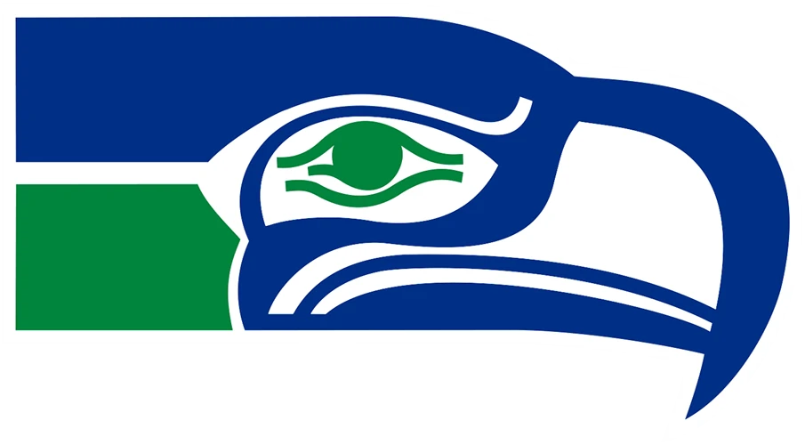
The first design ever introduced as the Seattle Seahawks logo was a unique one. It featured a traditional indigenous style of a hawk’s head. The color scheme was medium blue with dark green, which was a few shades lighter than the green used by the Green Bay Packers logo. The overall design had lines and designs that made it difficult to catch all the details at a glance. The head’s profile was facing to the right, and the eye of the hawk was designed to stare right at the viewer, which sometimes made for an awkward aesthetic.
Released in 1976, it is understandable that the logo design would have a somewhat primitive style. However, as time went on, especially after the turn of the century, the design aesthetic changed. People were now looking to something different, something more unique and stylish.
Thus, for the first time in the team’s history, and two decades after it was first introduced, the logo was modified. However, the team made sure that all of the important elements of the first design, were also incorporated successfully into the new logo.
2002 – 2011

In 2002, the team unveiled their second iteration of the Seattle Seahawks logo. The new design was more similar to the style of the natives in the Pacific Northwest, and had an overall more aesthetically pleasing design than the one previously.
This new logo featured a better-balanced design of a hawk’s head, made to look as if the hawk has straightened the neck and the head while diving towards its prey.
The straight-lined design gives way to the slight curve of the head, and the more sharper curve of the beak, which is designed to look more aggressive. The design of the beak however, was better proportionally compared to the previous iteration. The line that separated the upper and lower part of the beak was made more apparent, and the direction of the hawk’s eye was more naturally facing towards the front, portraying a sense of focus and will.
Additionally, the color scheme was also changed. The main part of the head and neck, along with the outline of the face, was done in a dark navy blue, with the bottom part of the neck done in dark steel blue, similar to the color of the 1997 Detroit Lions logo. The eye however remained green, which gave a wonderful contrast to the rest of the design.
2012 – Present
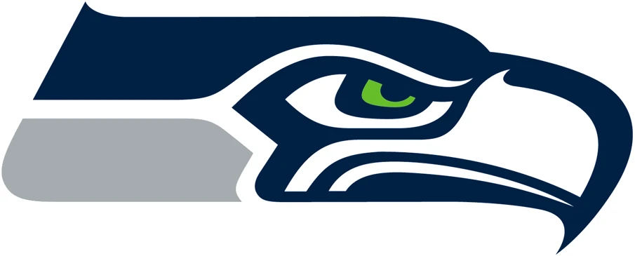
The year 2012 saw another change made to the visuals of the Seattle Seahawks logo. This time, rather than making a change to the design of the logo, which had already achieved a sweet spot between modern aesthetics and traditional design, they tweaked the color scheme.
However, not all colors were changed or tweaked. The green eyes remained the same, while the dark navy blue of the majority of the logo also retained its look. The dark steel blue at the bottom of the hawk’s neck however, was changed to a medium-light icy gray, with a slight blueish hue.
Overall, this was done as a way to complement the new Nike Elite 51 uniforms, which were being introduced for the first time that year, and which featured a massive uniform design change. Other team logos like the Carolina Panthers logo was also changed around the same time for this very reason. And this new look was so well-received that it is still being used to this day, more than a decade later.
1976 Seahawks Wordmark

When it comes to wordmarks, the original Seattle Seahawks logo wordmark was one of the simplest ones in the league. It used a classic serif font, with the name of the team written in normal sentence case, meaning that all letters except the first one would be in lower case.
The design was simple, plain, and to be fair, slightly boring. Compared to the Tampa Bay Buccaneers logo wordmark, which represented another team formed around the same time as the Seahawks, this wordmark was an uninspiring design.
However, this wordmark was still used throughout the entire run of the first Seahawks primary logo. it used the same shade of blue as the one used by the primary logo, connecting the two separate entities into a single branding design.
2002 Seattle Seahawks Wordmark Logo

In 2002, with the introduction of the new primary logo for the Seattle Seahawks, a new wordmark was also introduced. Unlike the previous iteration though, this design was more up to the speed of the modern NFL team.
This time, the typeface used was another serif font. However, this was no generic font as the serifs were designed to give more of an avant-garde look to the wordmark, unlike the previous font used. At the end, the wordmark looked like it had a similar aesthetic as that of the Arizona Cardinals logo wordmark, only with more aggressive and dynamic serifs.
The color scheme was the same as that of the primary logo, with the lighter shade used for the name of the city in smaller, all uppercase font, while the dark navy color was used for the name of the team.
2012 Seattle Seahawks Wordmark

Again, the team kept up with its practice of changing the wordmark along with the primary logo. This time however, the design wasn’t changed per se, just like with the primary design. The only change to the wordmark logo was the changing the color of the lighter shade used, which now featured a shade of bluish steel gray instead of the blue in previous designs. These kinds of minor tweaks are common among the NFL, as evidenced by the last few changes in the New Orleans Saints logo wordmark.
FAQs
| What was the idea behind the Seattle Seahawks logo? The original owner, Thompson, held a naming contest that had over 1700 different naming options suggested. Out of all of them, he liked the name Seahawks the best because it brought to mind a fierce and tough predator of the sky. Based on that name, local Seattle artist Martin Oliver created a design for a logo, and submitted it to Thompson, who liked it and adopted it as the team’s first logo. |
| Did the Seahawks get a new alternate logo? Yes, the Seahawks did introduce a new alternative logo in 2017. Unfortunately, it became the source of a lot of jokes and ridicule for the franchise. The design is made to look as if looking at the subject of the Seahawks logo face to face. The resultant design looks comical, and loses a lot of the impact that is portrayed by the primary logo. |
Conclusion
To sum it up, the Seattle Seahawks logo represents one of the last four teams to join the NFL. However, despite that, it has proven itself to be able to stand its ground with the established players of the league in terms of branding. In nearly six decades of gameplay, the team has only felt the need to change their logo design twice, with the second one being a superficial change at best.
Compared to some other team symbols, such as the LA Rams logo, which has fielded eleven different variations of its logo from 1975 to present; this shows a unique understanding of the target market. The designers for the Seahawks studied their target market, and what they expected from the only NFL team representing them, and created a logo accordingly.
So, if you are looking to create a sports logo, studying the evolution of the Seahawks symbol could be of great help.

Logopoppin
Logopoppin is a graphic design agency that specializes in logo designing, web development, video production and advanced branding services. We love to innovate businesses with new age technologies, allowing them to improve their visual reputation.


