Table of Content
Learn How to Design Quality Security Logos with Perfection
When it comes to branding, security companies always need a logo design that can elevate their identity. It is one of the core things that helps to market their services, especially when they are new in the industry. Their security logo design enables them to get market attention. It is basically an emblem that lets the people know about their existence in the market. Their branding depends heavily on it as all the marketing stuff is designed using the company logo.
A lot of times, security companies also commit mistakes while designing these logos. This mostly happens when they take logo design services from the non-professional and inexperienced agencies. It not only wastes their money, but also plenty of precious time in the whole logo design process.
It is therefore advised to always know about the techniques that can help to develop quality security logos. If you do not have much knowledge about what those techniques or tips are, read this article in detail. It will help you to know about some specific tips that can help to create a quality security logo design.
But, before moving straight into the design tips, let us first understand the importance of these logos for any security company.
Importance of a Security Logo Design
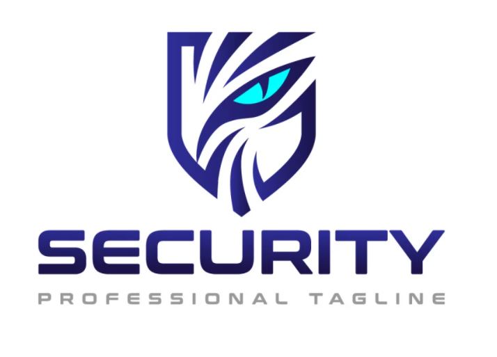
A security logo design helps to identify the main identity of the company. It is an emblem that lets the people know about the offerings of the security company. Its uniqueness can help them to differentiate one company from another. Those logos that are more creative will always get more attention in the market. It allows the branding of the security company to get prominence, only if the design is made creatively.
Considering marketing, the security logo design plays an important role everywhere. It is used on different branding elements, ranging from business cards to brochures, flyers to email templates and more others. This tells a lot about the importance of a logo for any company. It comes handy for them at every stage of branding. That is the major reason they cannot compromise anything on its quality, as their business reputation is hugely dependent on it.
These security companies usually hire experienced digital agencies to design their logos. There are plenty of such logo designing companies working in the market that offer quality results. They work according to the given requirements and provide design solutions that fits best as per the latest industry trends.
Tips to Design Quality Security Logos
Being a designer, you could get different types of logo designing projects depending on the nature of clients. In context to this blog, security companies regularly look for those designers who are well versed in creating unique logos. Hence, you should be well aware of its designing tactics as well.
Here are some of the best tips you need to look at to design engaging security logos. It has broken down each designing phase specifically, so that you can understand the whole security logo design concept better.
Conduct Deep Research
Research is always considered the first part of initiating any work. Same goes in the case of logo designing, as it also requires extensive research right at the start. You cannot skip this step because it plays a very significant role in logo designing. It helps to know a lot more than just regular designing stuff. If you are doing the research properly, then you could know various aspects about the logo designing, including typography, color selection and more others.
Good research also lets you know about the competitors’ work. You can get a good idea about what other companies are doing and how they are designing their security logos. Having this detailed knowledge will allow you to design them perfectly, outclassing the quality of other competitors.
Color Selection

Colors play an important role in the visuals of any artwork. They bring an impact into the design, if chosen perfectly as per the requirements. Their usage in a logo design is therefore termed very important. They can optimize the whole appearance of the logo, allowing it to look more attractive even with just a simple design.
The color selection should always be done prior to the designing. A lot of times, people choose colors after creating a sample logo design. It only brings confusion for them because selecting the colors depending on the design refers to a mere ill skillset.
Always remember that colors represent the main theme of your brand, hence it should be finalized before creating any design. You basically have to pick the right shades that illustrate the main identity of the company. It allows the whole logo to portray the same image that has been chosen for the actual brand theme.
Picking the Typography
We have seen many security logos designed using lettermarks. It is a common practice followed by different companies just for the sake of making their brand identity simple. The wordmark logos are not only easy to read, but also sophisticated in appearance. They can also be designed in a glitzy style, but most of the time they are not opted for such depiction.
Another reason why people prefer wordmark is when they have got no exact designing idea. They rather go for simple wordmarks instead of experimenting with any shape of figure. It gives them a decent solution to showcase the company name, provided they have chosen the right typeface style.
Meanwhile, not just for the main logo, but typography is also very important for the taglines. It brings a clear sense of boldness in the sentence, allowing it to become more impactful.
Selecting the Right Logo Shape
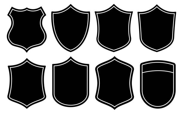
The selection of shape for a security logo should also be done very precisely. It should be picked by looking at the requirements of the theme. Generally, security companies prefer to select the shape of a shield to design security logos. It looks relevant to the concept of security, allowing the logo to showcase an exact brand identity.
Meanwhile, these shield-shaped security logos have multiple types of designing options. Some are created with a conventional avatar, whereas some are designed in a more fashionable manner. It basically depends on the companies how they want to design their logos. They must remember that their brand representation is totally dependent on it. Hence, it should not be compromised with any type of visual quality.
Besides the shield logo design, the security logos are also created with other shapes. It includes circular logo, square logo, triangular logo and other relevant shapes. You can choose anyone of them, but just make sure to align their relevance with the main brand theme.
Pick The Correct Size
The sizing of the logo also matters a lot. Many times, designers create them without knowing properly about the sizes. It looks inappropriate in looks, affecting the overall appearance of the logo. The seasoned designers are well aware of this fact that they have to create the logos with perfect sizes. Sometimes, they have to create them with different sizes for multiple platforms as it also becomes necessary for the perfect demonstration.
The logo for a business card is created with a different size as compared to the logo for a brochure. Similarly, when it comes to digital branding, the logo size for a website is different from the one used for social media channels. This type of alterations could only be done by professionals that are well versed in designing a security logo. They precisely know how to create a logo with a custom size, allowing it to look perfect on the relevant channel.
Frequently Asked Questions
| 1. Why do security companies need a logo design? Security companies must need to market their services using a strong emblem. A logo design helps them to do that, provided it is designed using the right theme and brand color combination. |
| 2. How logo design helps to provide a branding edge to the companies? A logo design always helps to optimize the branding image of a company. Its creative look instantly grabs the attention of people, enabling them to take interest in knowing about the real services of the company. |
| 3. Which type of colors should be used in a security logo design? The color selection depends on the core theme of the company. As a designer, you need to first consult with the owners of the security company to let you know about their brand colors. This will help you out to choose the best colors for the respective logo design. |
| 4. What type of shape should be picked for a security logo? Generally, businesses choose the shape of a shield to design their logo. The reason is that it looks highly relevant to the idea of security. However, if you are not comfortable with this old school thought, you can always choose any other shape that suits your company theme. |
| 5. How to design a security logo? To design a security logo, you need to first understand the main theme of the company. This will help to simplify color selection and other elements, enabling you to design the emblem perfectly. |
Conclusion
That concludes our entire article in which we have discussed about the security logo design in detail. It has defined some fine concepts that will help you to design the security logos with perfection. A lot of times, designers face difficulty only because of not knowing the core design concepts. They commit mistakes while designing the logos, which eventually affects the overall branding image of the company.
If you are also running a security company offering similar types of services, then you must need to know how to design its logo. We can certainly help you to design it with perfection, as our digital agency is quite experienced in creating various types of brand emblems. Get in touch with us today and we will assist you to create a stunning security logo design as per the modern trends.

Logopoppin
Logopoppin is a graphic design agency that specializes in logo designing, web development, video production and advanced branding services. We love to innovate businesses with new age technologies, allowing them to improve their visual reputation.

