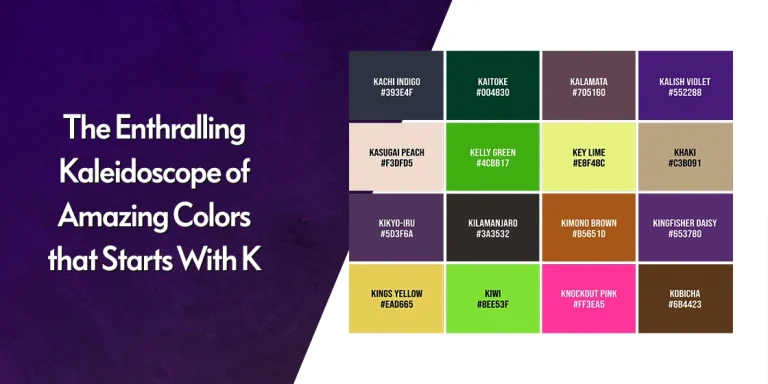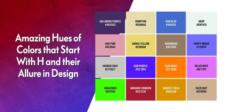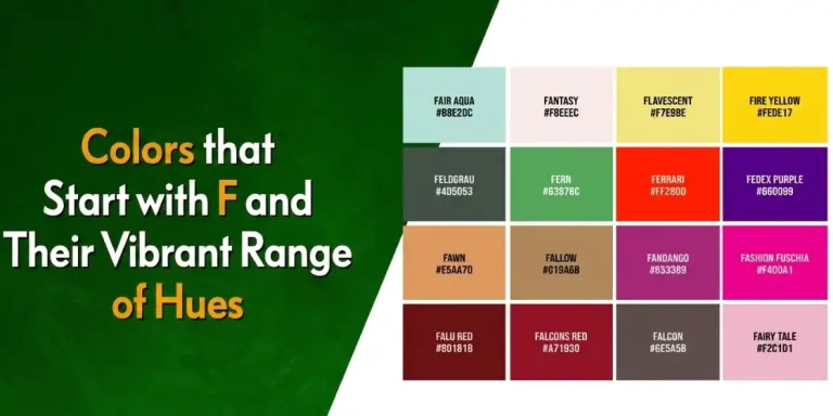
Table Of Content
Discover How the Two Font Styles Differ and Where to Use Them
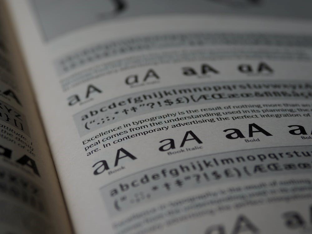
When we talk about fonts, there are a lot of options out there to choose from. Each one of those differs from one another. But there are some characteristics that allows us to lump them together into specific categories. One of those characteristics is the presence of serifs, and the root of the serif vs. sans serif debate we are going to discuss today.
While there are many different and more effective ways of classifying specific fonts, such as graphic or scripts, the presence or the lack thereof of serifs is the simplest way to classify a typeface. Those little elements at the beginning and end of different character strokes carry a lot of meaning, believe it or not. And there are many instances where having a font with serifs can actually be more impactful than a sans serif typeface.
So, let’s take a look at the differences between serif and sans serif fonts, and see when and how professional logo design services use each of them effectively.
What are Serifs?
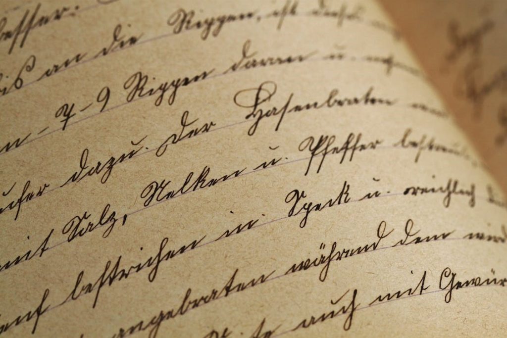
Serifs are a design byproduct of the early era of writing, before the advent of the movable typewriting tools. In fact, the style element actually draws from the style of stone chiseling, which is how these characters and letters would be written before the advent of proper printing.
Now, what it does is create little stroke continuations at the beginning and the end of letters, created by the inaccuracy of the chisel finishing properly at the edge.
The vintage style of serif fonts have a certain classic feel to it, which is great if you want your designs to embody an archaic feel. With the modern style of serif fonts, it serves to give a certain character to the typeface, which helps improve the impact of the overall design.
Today, designers categorize serif fonts into three distinct styles. Let’s take a look.
Old-Style Serif Typefaces
This style of serif fonts can usually be found in the literature from the 15th to the 18th century AD. The serifs are very slightly rounded, are usually inclined at an angle, and are often cupped. The characters of these vintage fonts can be said to be inspired by classic calligraphy, as the letters often have a diagonal stress point instead of a vertical stress found in later examples.
The stroke width generally does not vary, and can be said to be low contrast. Some of the common styles of this font include:
- Garamond
- Palatino Linotype
- Goudy Bookletter 1911
The Transition Serif Typefaces
During the mid-18th century, the style of the typefaces was slowly starting to change, due to the practice of printing becoming more common, and hence, refined. As this was the period that led to the formation of the modern style of serif fonts, it is commonly referred to as the transitional serif period.
Now, unlike the old style of serif fonts, the serifs for the transitional fonts were sharper. They were also more vertically stressed than the ones before them, and the characters employed a higher contrast between strokes, having a healthy mix of thin and thick strokes. That is why for a few decades, they were one of the most preferred type of logo fonts.
Some popular examples of this style include:
- Times New Roman
- Baskerville
Modern Serif Typefaces
By the late 1700s, the printing process had becoming quite advanced than that of a century earlier. And with the serifs now becoming more and more fine, this era is known as that of the modern serif typeface.
The characters in this style of printing are generally completely straight, flat, and with a high vertical stress. Moreover, these fonts are also characterized by the extremely high contrast between their thick and thin strokes, which makes for an interesting design when used effectively. That is often why they aren’t preferred for applications besides headings, titles, and other prominent pieces of content, and make for some of the best fonts for business cards and stationary.
Some of the most common examples of this type of font are
- LTC Bodoni 175
- Didot
What is a Sans Serif Typeface?
Sans serif fonts are those that, as the name suggests, do not have any serifs at all at the ends of their characters. For their simpler design, they are considered more progressive and modern compared to serif fonts, due to the fact that their minimalist design boosts their legibility quite drastically.
The reason many people prefer them over classic serif fonts is because the omission of any flairs at the end of these characters makes the design look clean and efficient. However, that doesn’t mean that there is no stylistic variety between the various font families of this type.
Let’s take a look at some of the popular styles of sans serif fonts we see around us.
Grotesque Sans Serif Typefaces
One of the most prominent characteristics of grotesque sans serif fonts is that there is little to no variety or difference between stroke widths. This makes characters, especially in uppercase, look quite uniform in design.
That is often why grotesque typefaces like the Franklin Gothic are often considered as some of the most prominent masculine fonts, due to their extra-bold and clean design.
Neo-Grotesque Sans Serif Typefaces
Neo-grotesque style follows a simple theme of neutral design that emphasizes legibility over everything else. Unlike the traditional grotesque fonts, the design of neo-grotesque typefaces is quite refined and cleaner.
Arial, a popular example of neo-grotesque, has fewer strokes, soft and full curves, and terminal strokes that end on the diagonal. Another example of this style is Helvetica, which features a high x-height and tight spacing between letters. However, despite that, the clean design makes it easy to read and identify, even at a distance.
Geometric Sans Serif Typefaces
As the name suggests, the design of the characters and letters in this style of typeface is geometric in nature. This makes for a modern-looking font that goes well for applications where cutting edge design is needed without affecting legibility.
Futura, one of the best-looking futuristic fonts, is one of the most common examples of a geometric sans serif typeface. Avant Garde Gothic, another geometric sans serif font, however takes a different approach to the design, giving the classic gothic-style typeface a modern touch with geometric logo design.
Humanist Serif Typefaces
Finally, we have the humanist fonts that prefer the sans serif approach. The font is considered humanist if it has traditional style of character design with a natural progression between thin and thick strokes. Loose letter-spacing, wide contours, and a larger than normal x-height makes the text highly easy to read and understand. This makes it great for supporting text, or applications where simplicity and high legibility is of the order of the day.
One of the most common examples of humanist typeface is Calibri, with embodies a warm and comely appearance, making it perfect for applications where comfort and relaxation is what you want portrayed, such as pillow or mattress logos.
Choosing the Best Typefaces for Your Design – Serif vs. Sans Serif Debate

When we talk about the differences between serif vs sans serif fonts, the debate boils down to a few key factors. And while it may seem that the presence or lack thereof of something as small and seemingly insignificant as a serif may not be such a massive issue, the fact is that it can affect your design drastically.
Some of the key differences include:
Decorative Strokes
These decorative strokes can add a lot to a design’s aesthetic, which is why serif fonts have been so popular through the ages. And while it is true that in many circumstances the absence of the serif is more of an advantage, we cannot say that serif fonts like Garamond, Times New Roman, and Georgia are better or worse than their sans serif counterparts like Arial, Futura, or Helvetica.
Change of Mood
Another primary difference is the perceived mood when someone looks at the design. Serifs add a touch of vintage to the design, which is why they are often considered more rigid and formal. Sans serif fonts on the other hand, are the rebels. The typefaces with minimalism at their core, utilizing the minimal number of strokes required to form a design.
That is why we often say that each of these styles has their own place and application.
Legibility of Characters
Finally, as we all know, any design element that isn’t visible to the viewer despite being a focal point of your design, is an element that is entirely useless. Which is why your font legibility is such an important factor.
A serif font is the better choice when it comes to large and prominent printing, such as newspaper headlines, billboards, and other mediums of physical print. Sans serif on the other hand, are more suited to the digital medium, due to the different screen resolutions and clarity affecting how legible a font may be.
Now that you know what sets serif and sans serif typefaces apart, let’s dive in and see how to use each of them to their advantage.
Factors that Affect Your Font Choice
When you want to know how to choose the best types of fonts and styles for your design, there are multiple factors that can affect your choice. Let’s take a look at some of the most prominent of these factors.
- Your medium is an important part that affects your choice of font style. Depending on its tone, to the purpose of the design, your choice can vary quite drastically. For logo designs, especially those that want a font with a little flair, its best to use a serif font. For a business sign on the other hand, a sans serif font would be a better choice.
- You also need to take a look at popular examples within your industry, which will help you decide what type of fonts are more successful in your niche. For example, a toy store with a corporate font for its logo and signage will not be as successful as say, one with a fun and loopy design.
- You also need to shortlist some fonts to test out and try to see what fits your scenario better. During planning and brainstorming, it may seem that a font may not be so perfect. However, when you test it out, it may actually be more perfect than your primary choice.
Conclusion
In short, we can say that the result of the serif vs. sans serif debate is one of need and preference. Depending on the message you want to portray, or the aesthetic you want to embody, you can choose the style of font that suits your purpose better, whether it’s with serifs, or sans it.
And if you like a font that suits your need, but isn’t available in your editor of choice, you can easily find a number of tutorials on how to add fonts in Photoshop or other graphics editors easily.
People Also Ask (FAQs)
| 1- What is more readable, serif or sans serif? Sans serif fonts are more readable due to the absence of any flairs, resulting in a clean and legible design. |
| 2- What are some popular serif fonts? Some of the most famous serif fonts are: – Times New Roman – Garamond – Georgia |
| 3- What are some popular examples of sans serif fonts? Some of the most popular sans serif fonts include: – Arial – Futura – Helvetica |
| 4- What are four types of serifs? The four styles of serif fonts include: – Old style – Transitional – Didone – Slab serif |
Latest news you want to know!
Subscribe for cutting-edge design inspiration at Logo Poppin! Elevate your brand with updates on logos, branding, web design, and video animation.
Note that by clicking “subscribe,” users may agree to our privacy policy and consent to Logo Poppin to use your contact data for newsletter purposes.
Logopoppin
Logopoppin is a graphic design agency that specializes in logo designing, web development, video production and advanced branding services. We love to innovate businesses with new age technologies, allowing them to improve their visual reputation.